
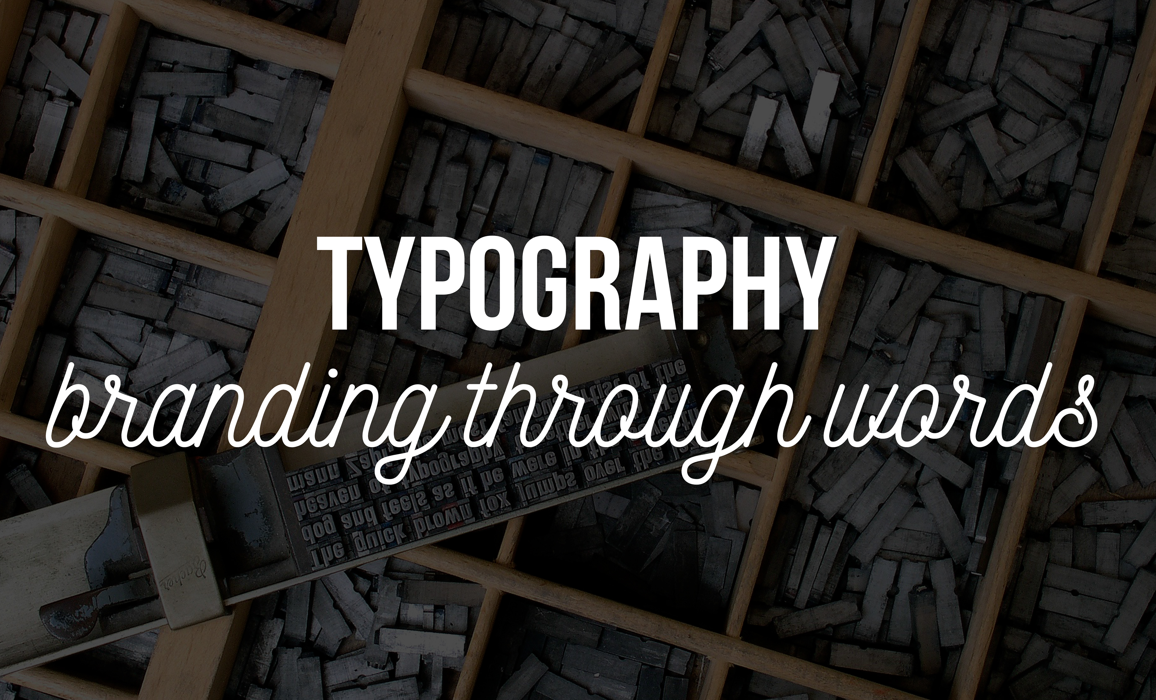
One of the most underrated factor of branding is typography. We tend to think that a good looking logo or a nice combination of colours would go so far that we would not need to pay attention on how we write our copy. In fact, not only we need to, but we can even achieve a much richer outcome if we spend some extra time on forging the right visuals for our text. Typography silently talks, so as true style. It stays unnoticed as long as it is done correctly, but becomes loud, when used inapproprietly. Like clothes, nobody notices if your tie is tied well, but everybody sees if you made it wrong. If nobody looks at your typography as a strange asset and the font hides itself in your branding, it is a sign that was well developed and placed. Typography is not only the visual form of our thoughts written, but it sets the tone of voice, influences our mood, could spark interest and communicate personality. In todays' time we are all amidst the flow of information, yet we lack of structured knowledge, this is why we need tpyography so much. It helps to give hierarchy to our communication, a form to our words. A good typography is not only legible, but as a guide, takes the lead gently to bring the reader through the text, collects information in a way that it would be understandable, highlights inportant sentences, summarizes complex thoughts, all of these without aggressively selling the content itself.


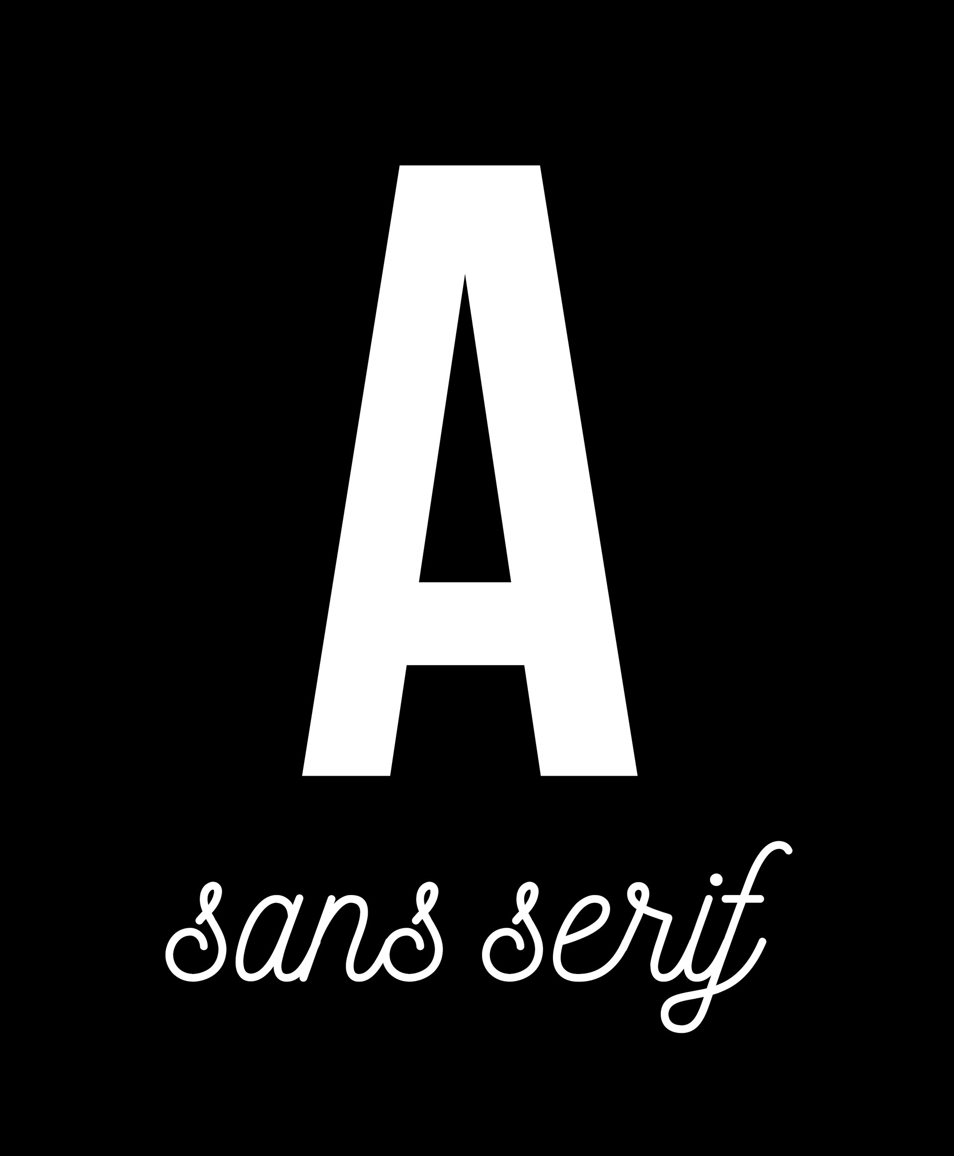
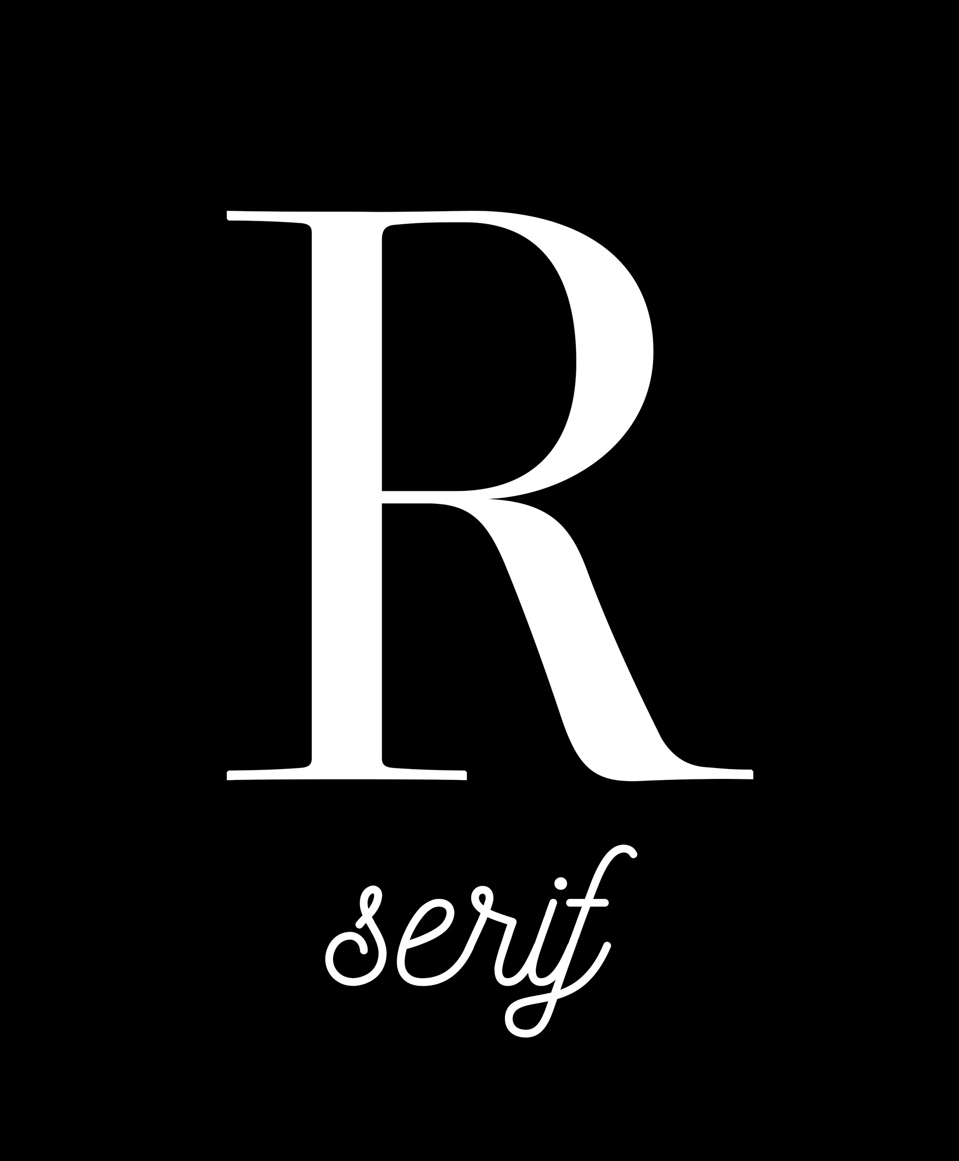
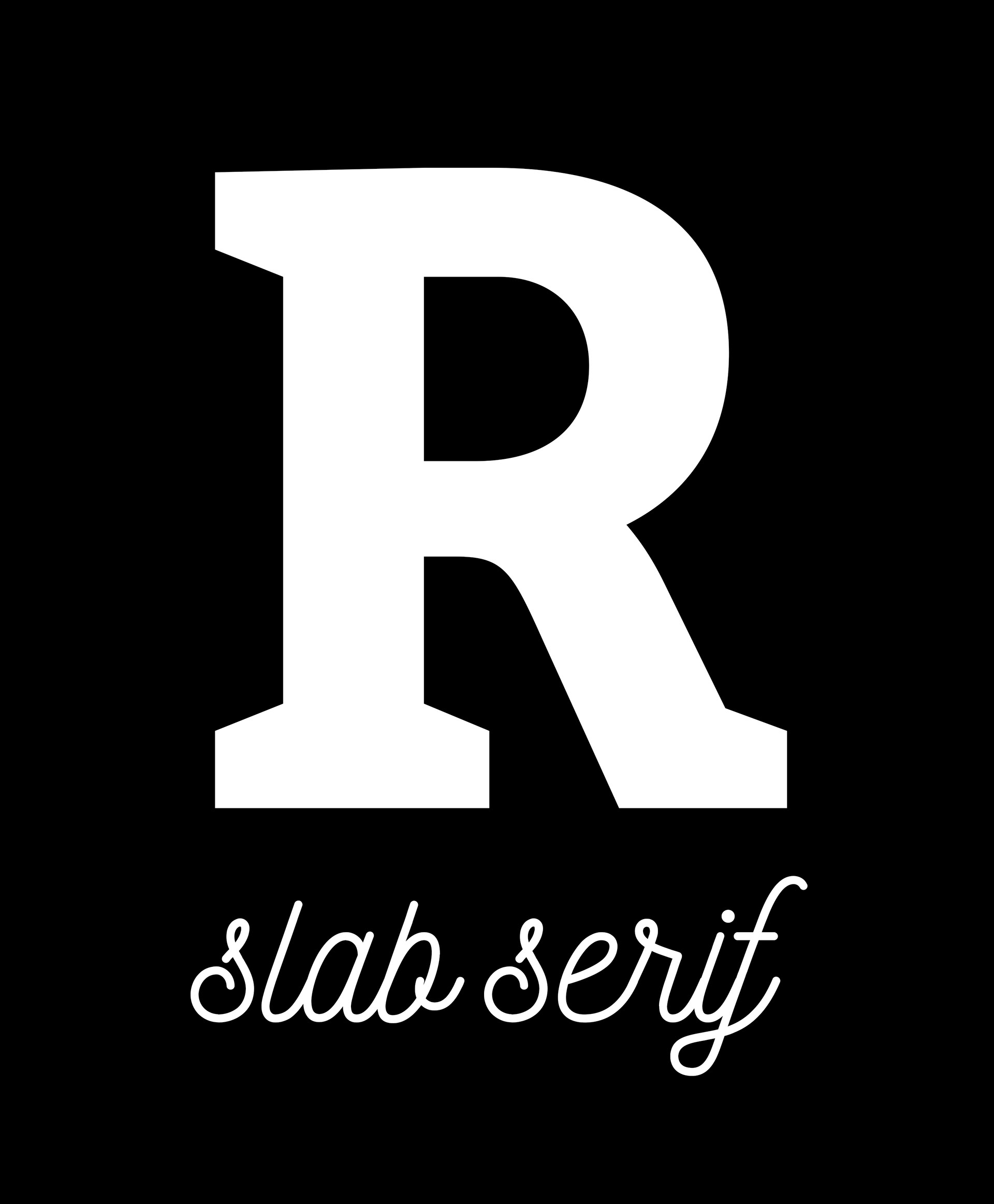
1.) Serif or sans: There are two basic types of typefaces exist. The one with the little "feet" is called serif. It is more traditional and better for longer text as it was intended to lead the eye through the printed line of the page. Serif fonts make archaic impressions, they stand for traditional values, however they can also be emotional and decorative. It shows status and strength, mostly used in print. On the other hand sans serif fonts (sans means without, because they do not have "feet") are usually giving a modern impression. They are user friendly, clear, crisp and since most urban signage is written by such fonts, they are institutional too. Sans serif fonts are commonly used for digital purposes. It exists a very trendy and nowadays popular thrid variant too, somewhere between serif and sans, the slab serif. Its characteristic is that the "feet" is missing on one side.
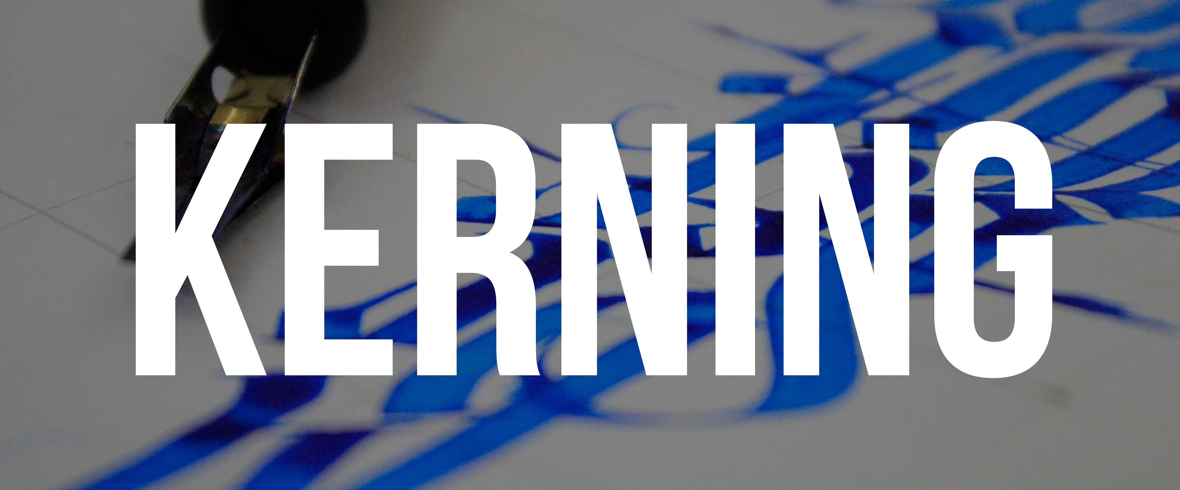
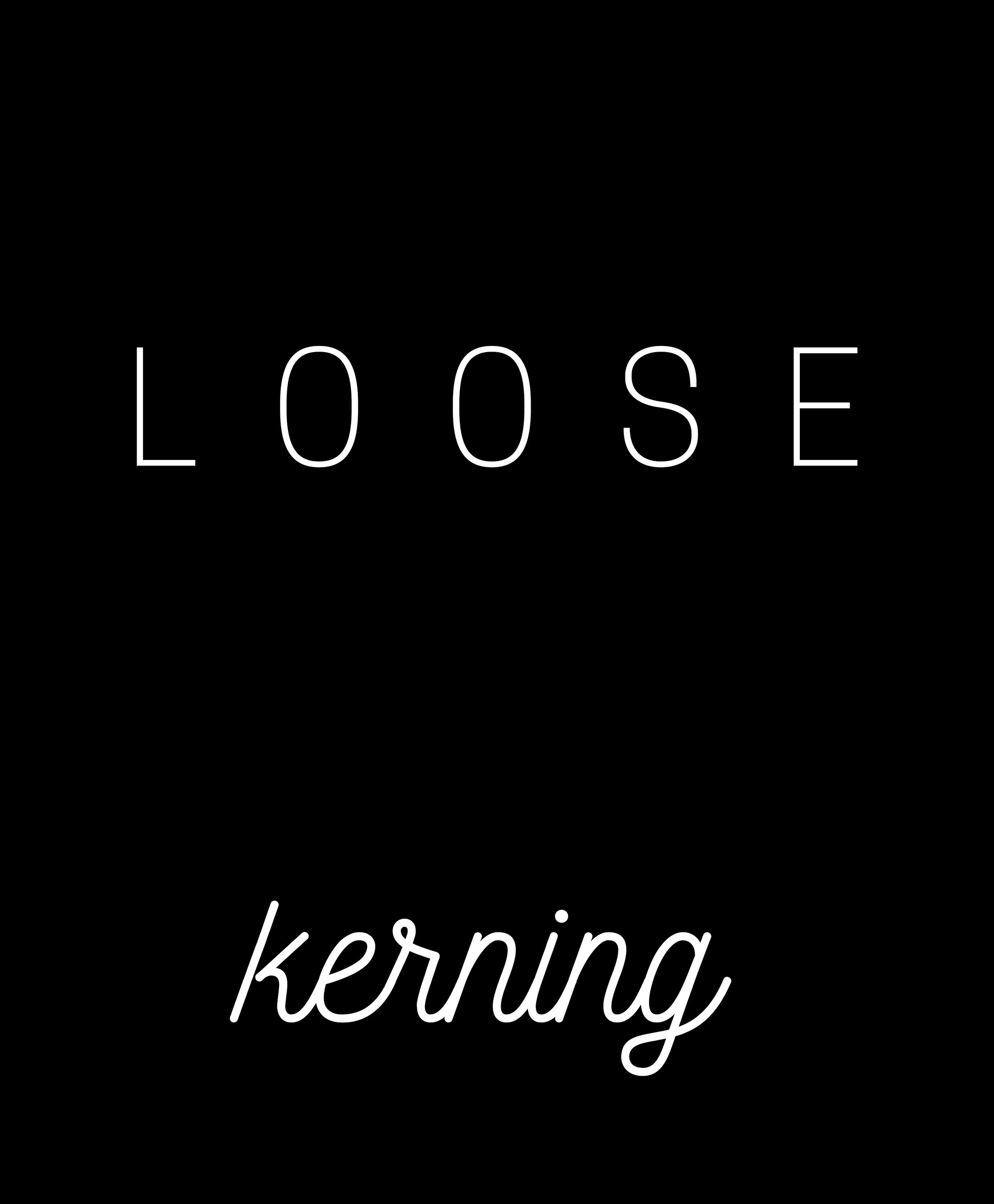
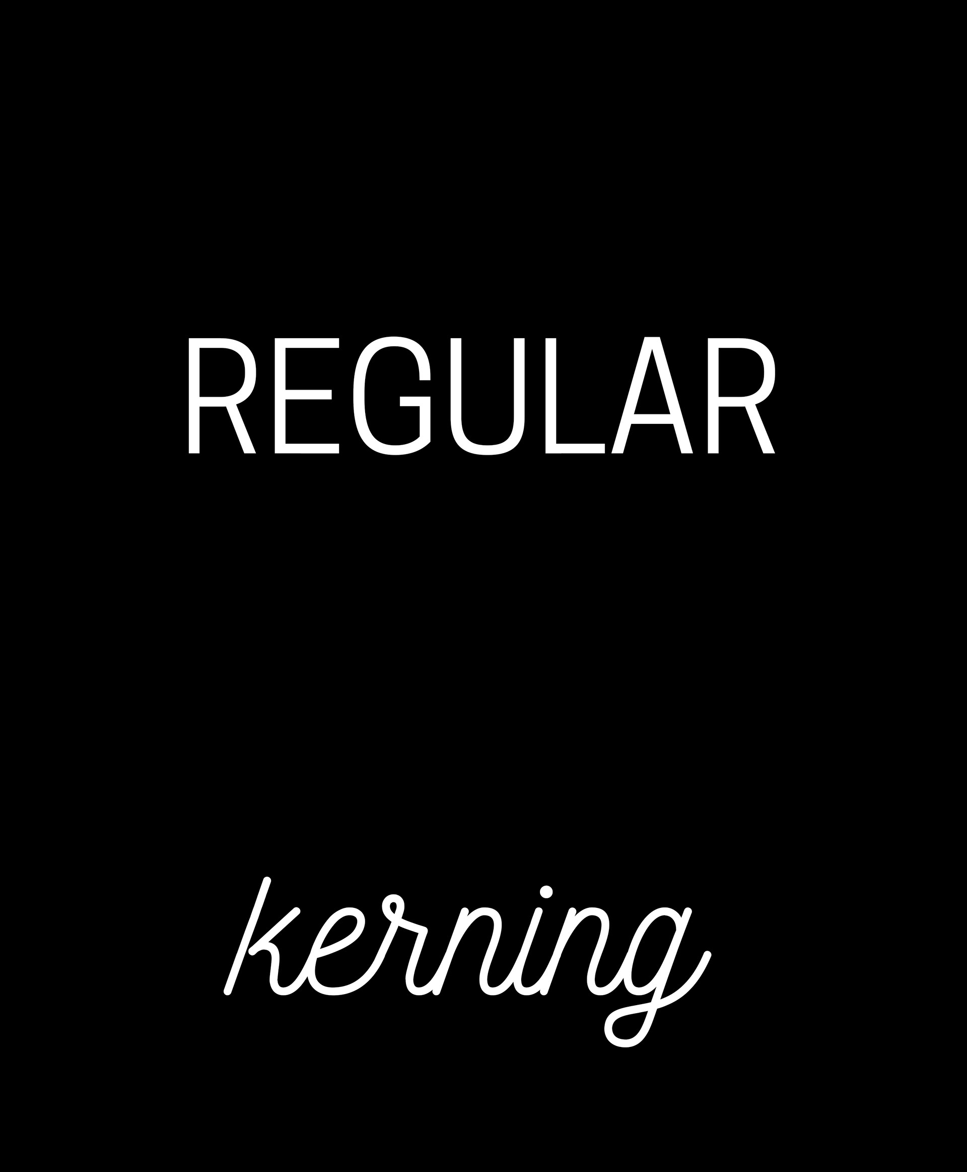
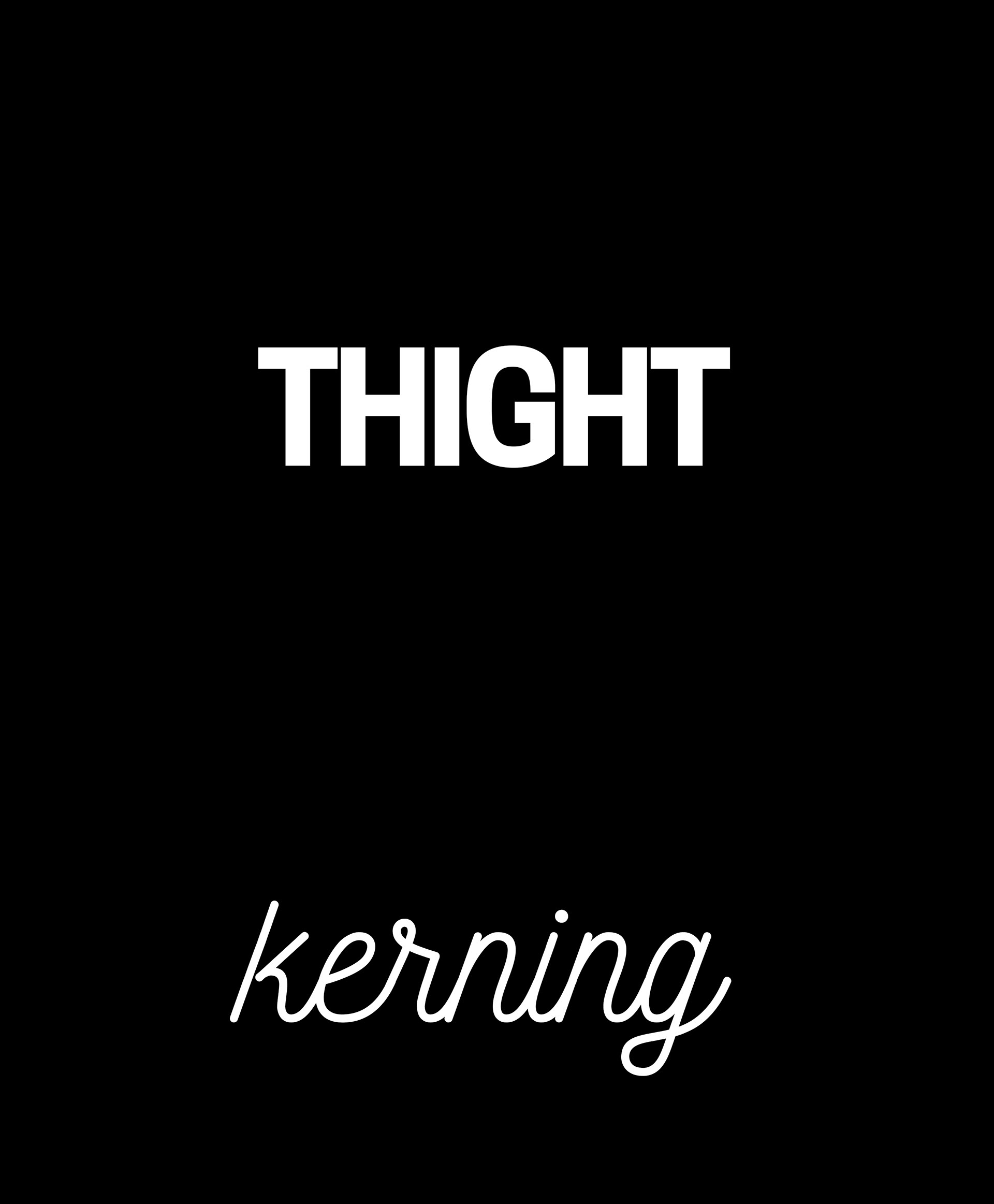
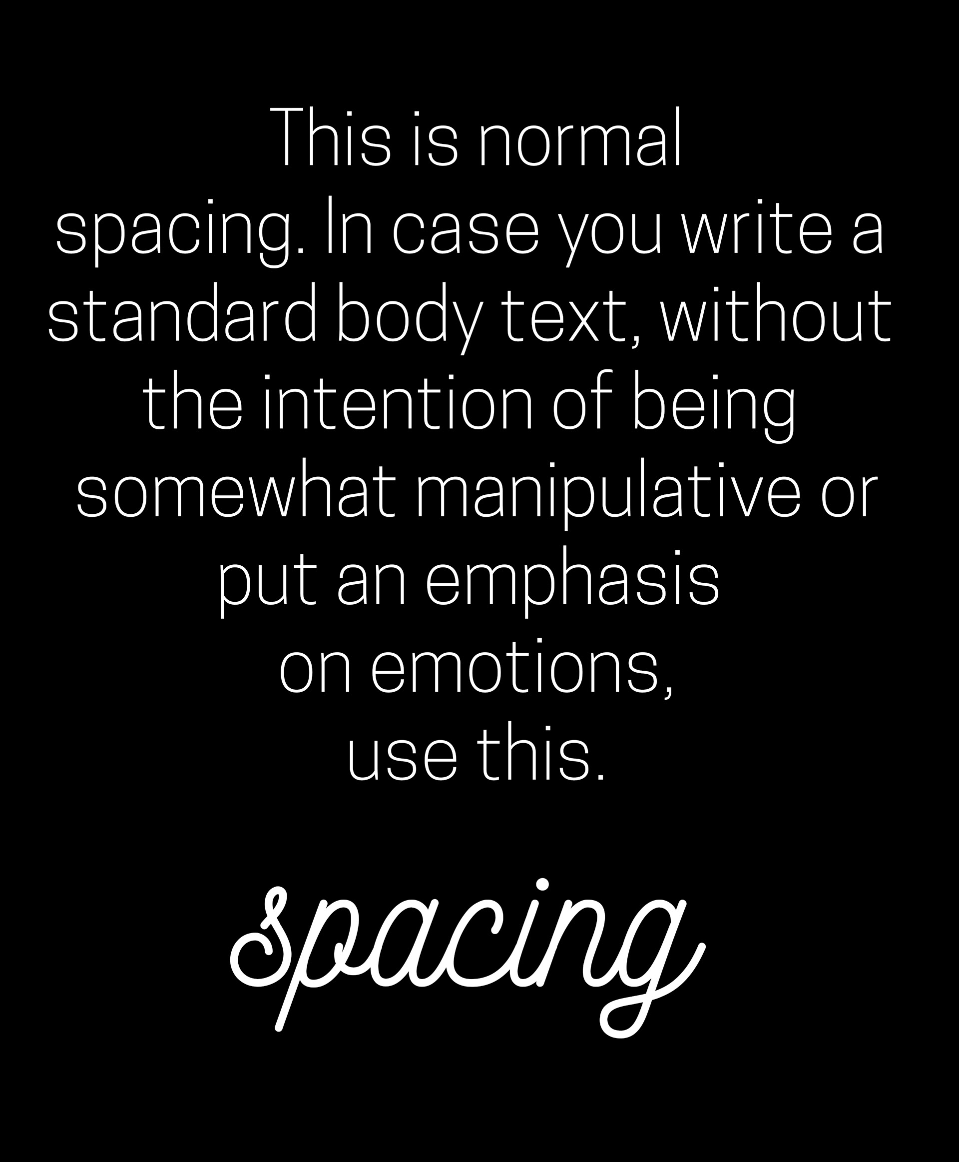
2.) Kerning and spacing: these words refer to the empty spaces between - in case of kerning - the characters and - in case of spacing - between the lines of a longer text. With using them the proper way, they can communicate tension and drama (if the spacing is tight) or luxury (if the kerning is loose), just to mention a few.


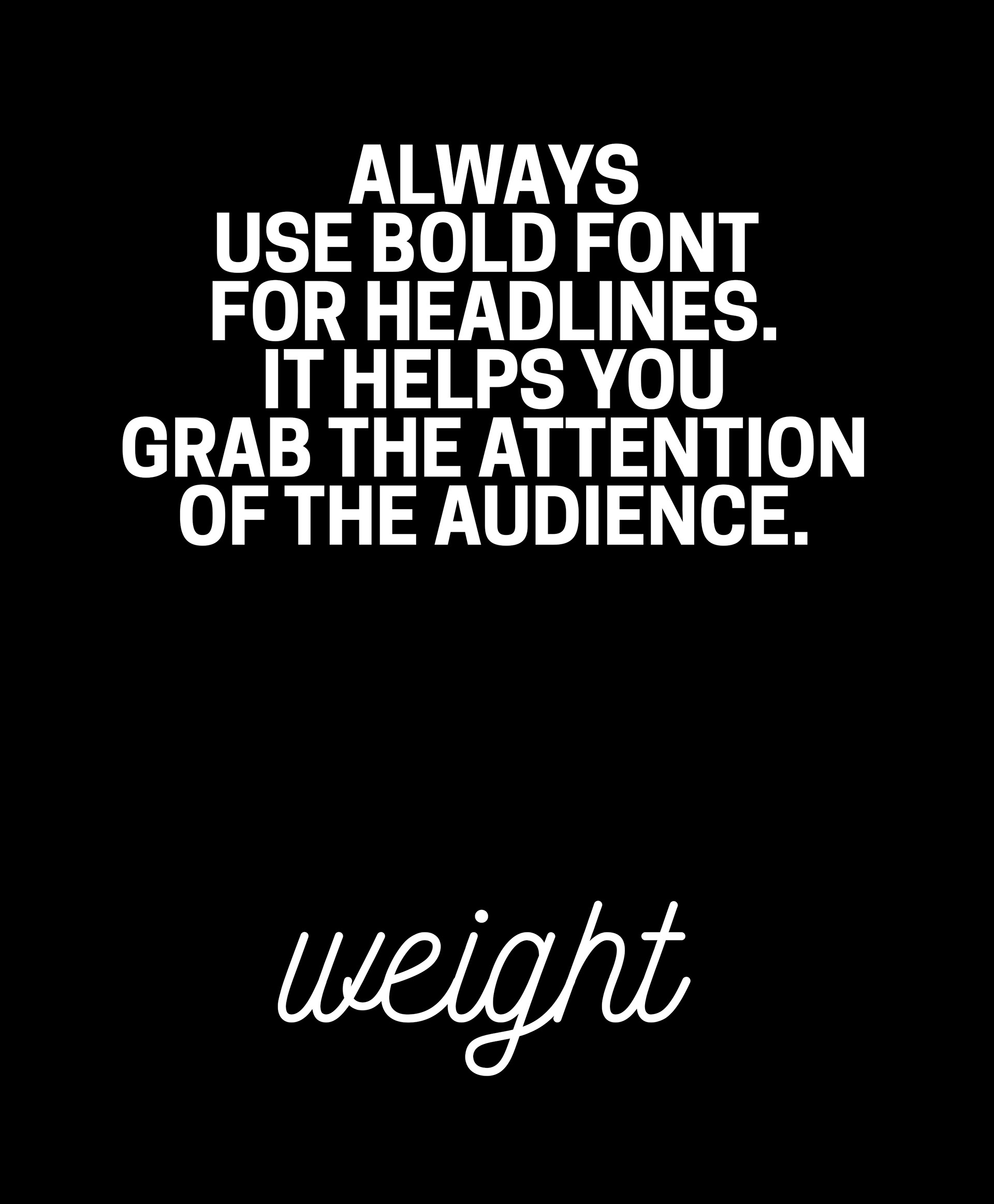
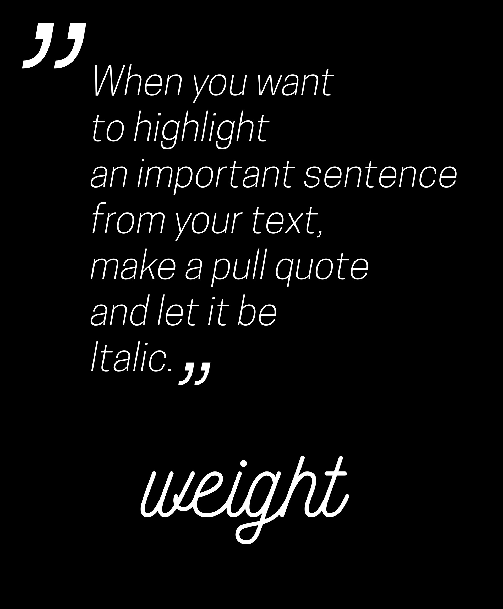
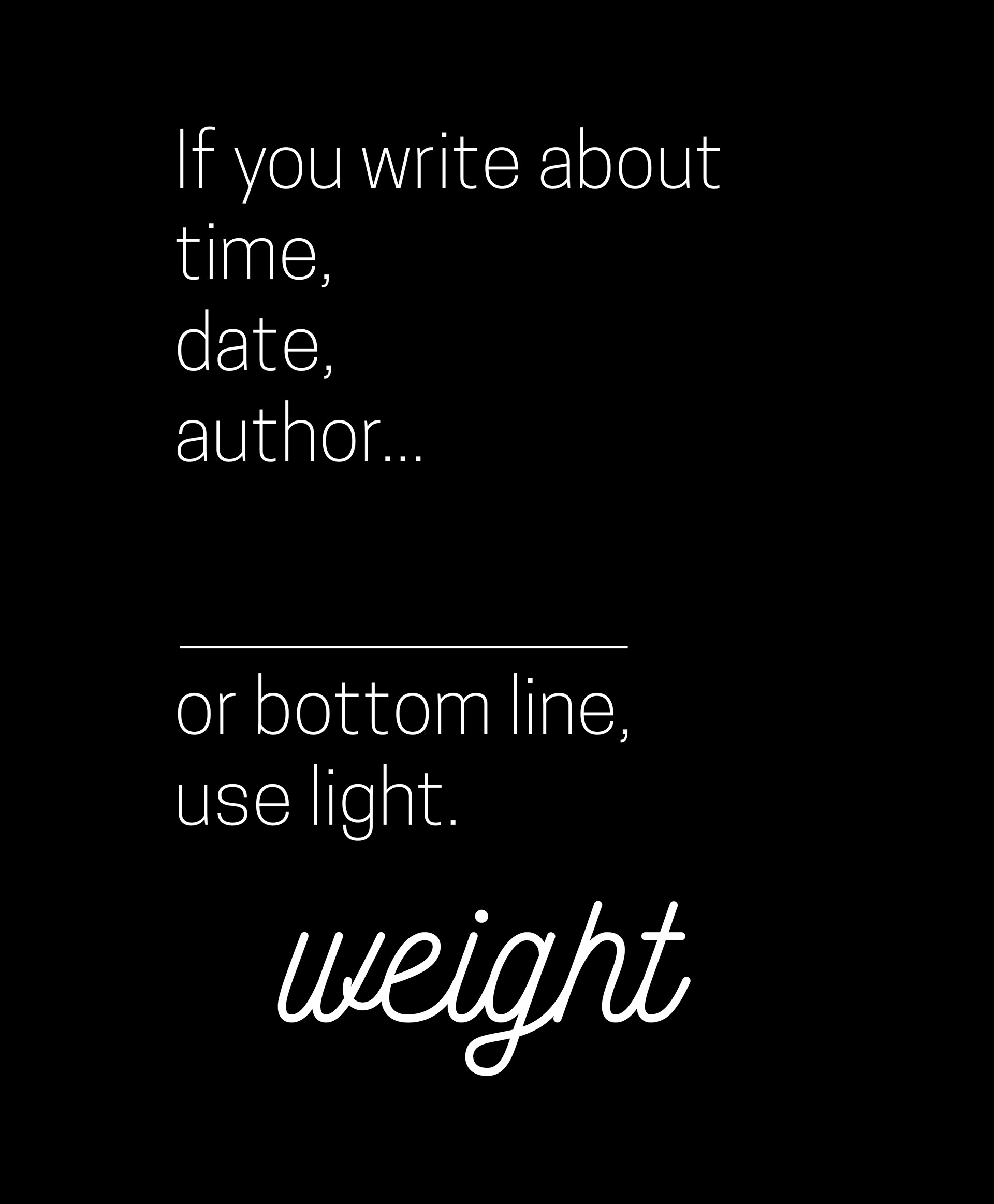
3.) Weight: there are a lot of weights available for font families, but the most common are light, regular, bold. In the typographic hierarchy they have their own position, bold fonts are commonly used for headlines and pull quotes, regular fonts for body text, light for bottom lines and indexes. There are in most typefaces Italic fonts, they are tilted and often used for subheadlines.
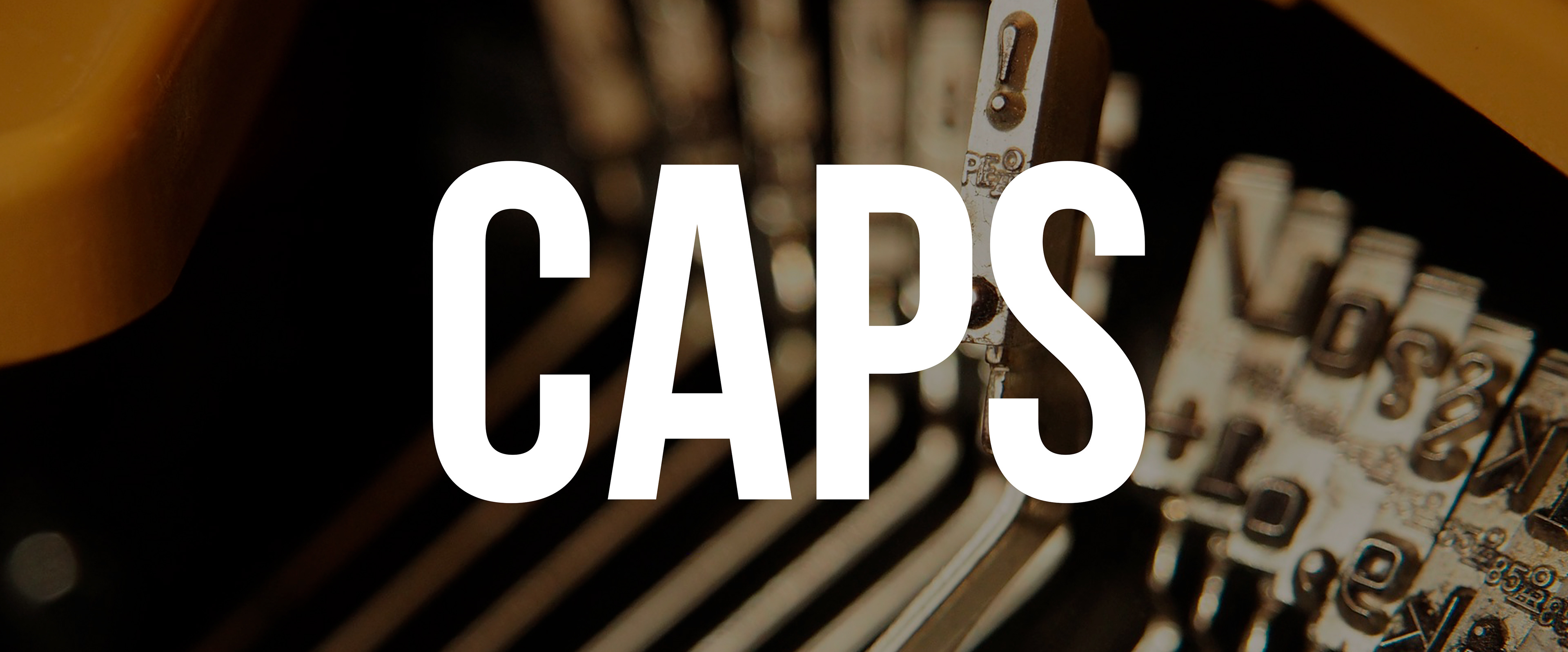
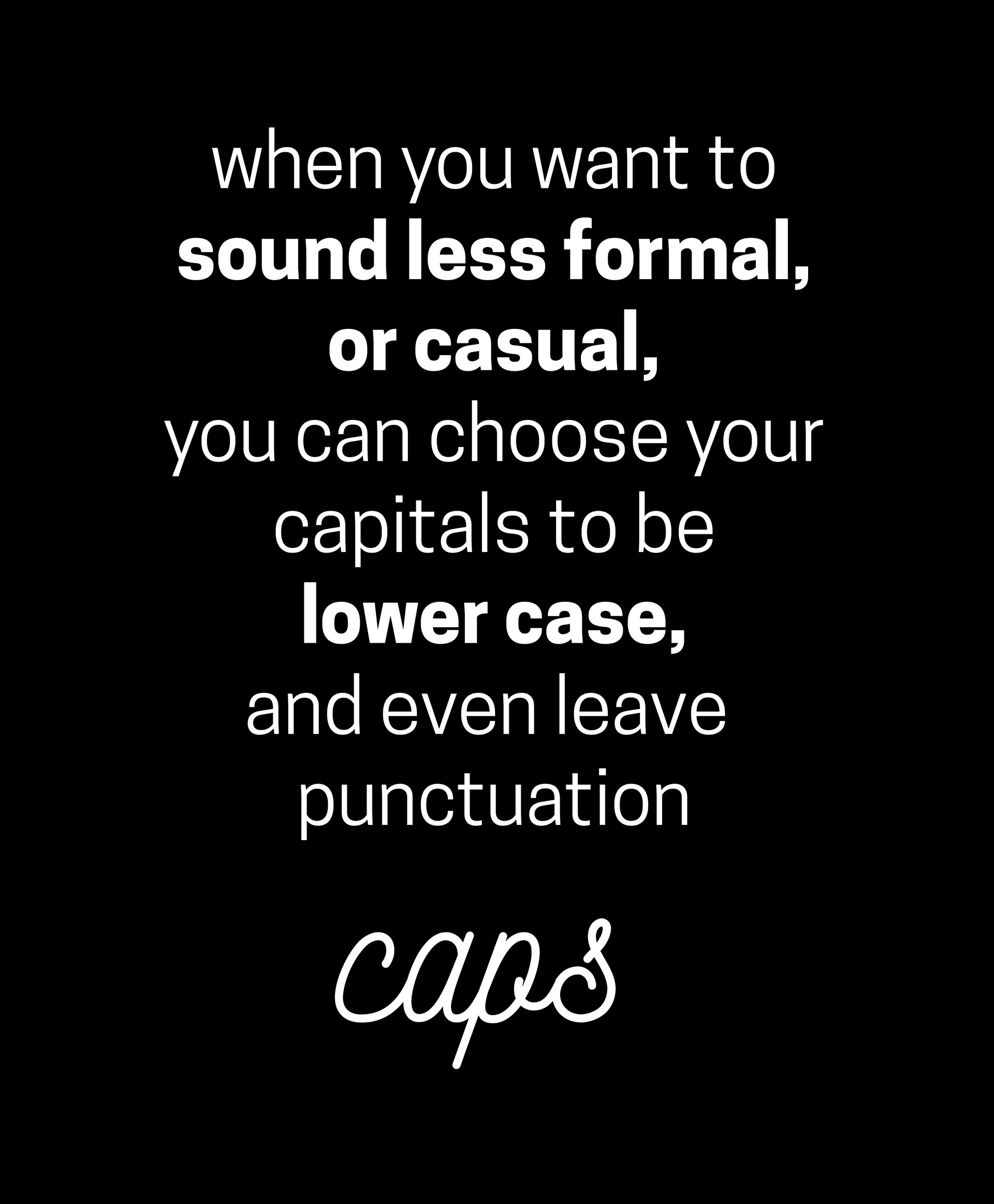
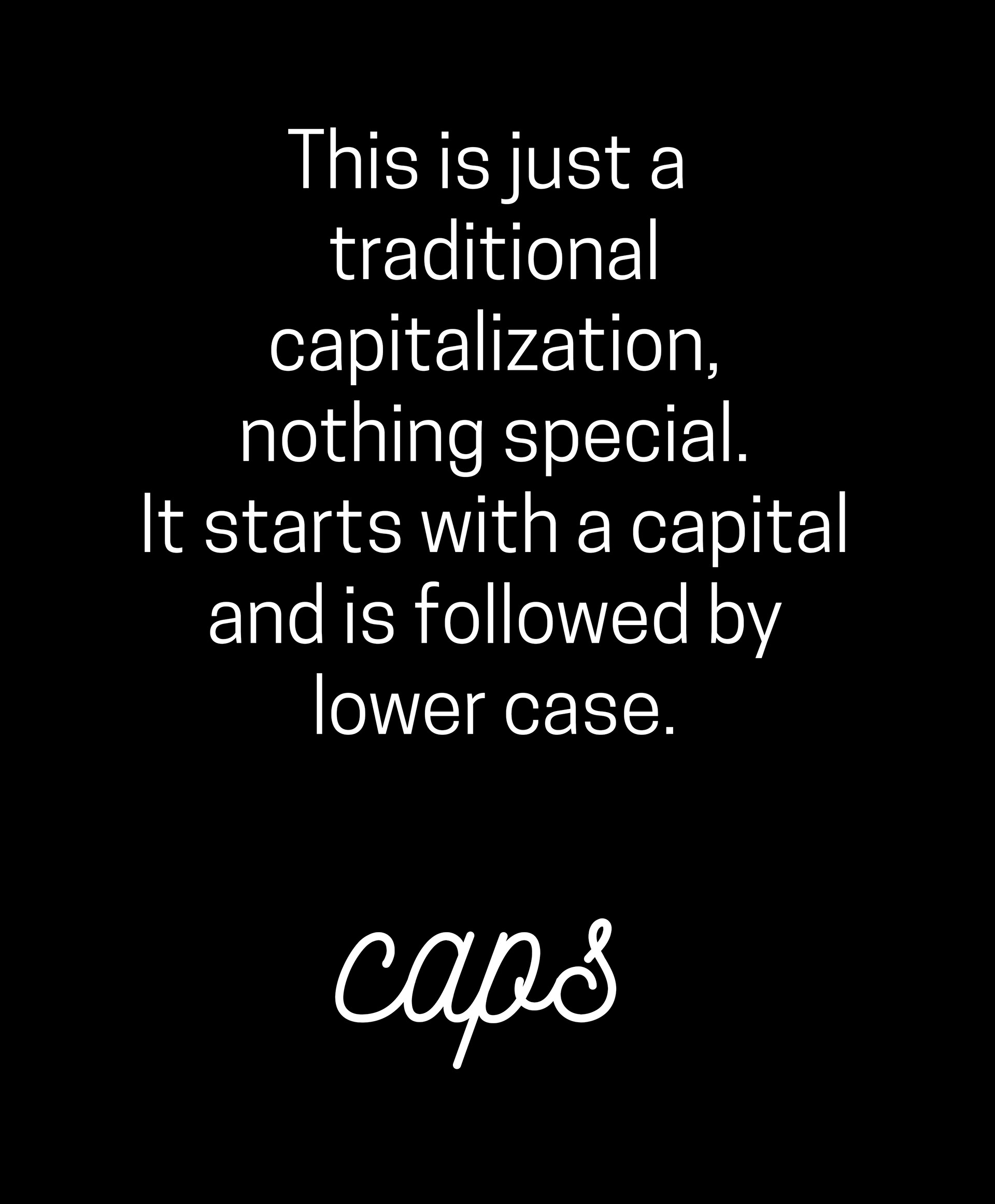
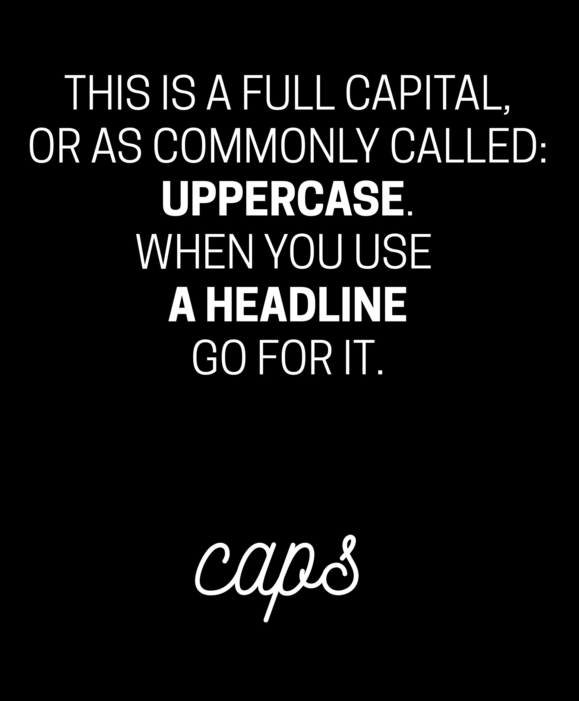
4.) Capitalization: a tpyography can be uppercase (when all letters are capitals) or lower case (where no letters are capitals). Traditionally every sentence starts with a capital letter, continued by lower case letters and finishes (and divides) with some kind of punctuation. A full upper case is usually used for headlines, because it is eye-catching and striking, while a lower case text is more casual and informal, therefore is used in body copy. The legibility of a full upper case text is short and low, and is not fitting to longer sentences, recommended only for highlights.
Fonts, if they are selected wisely and used consistently across all media and platforms can work together harmoniously to transmit your brand values through the art of writing. But if they are dissonant, not fitting to your brand or collected without a system behind, they can cause problem for your audience in aesthetics, understanding and brand recognition. Before you select your corporate typeface, it is recommended to consult with a professional or make a user interface testing. Most designers agree that the best amount of different typefaces for a brand is between two and five, but ideally two or three. That gives enough freedom for being creative in writing, structure and design, but easy to keep it under control.