
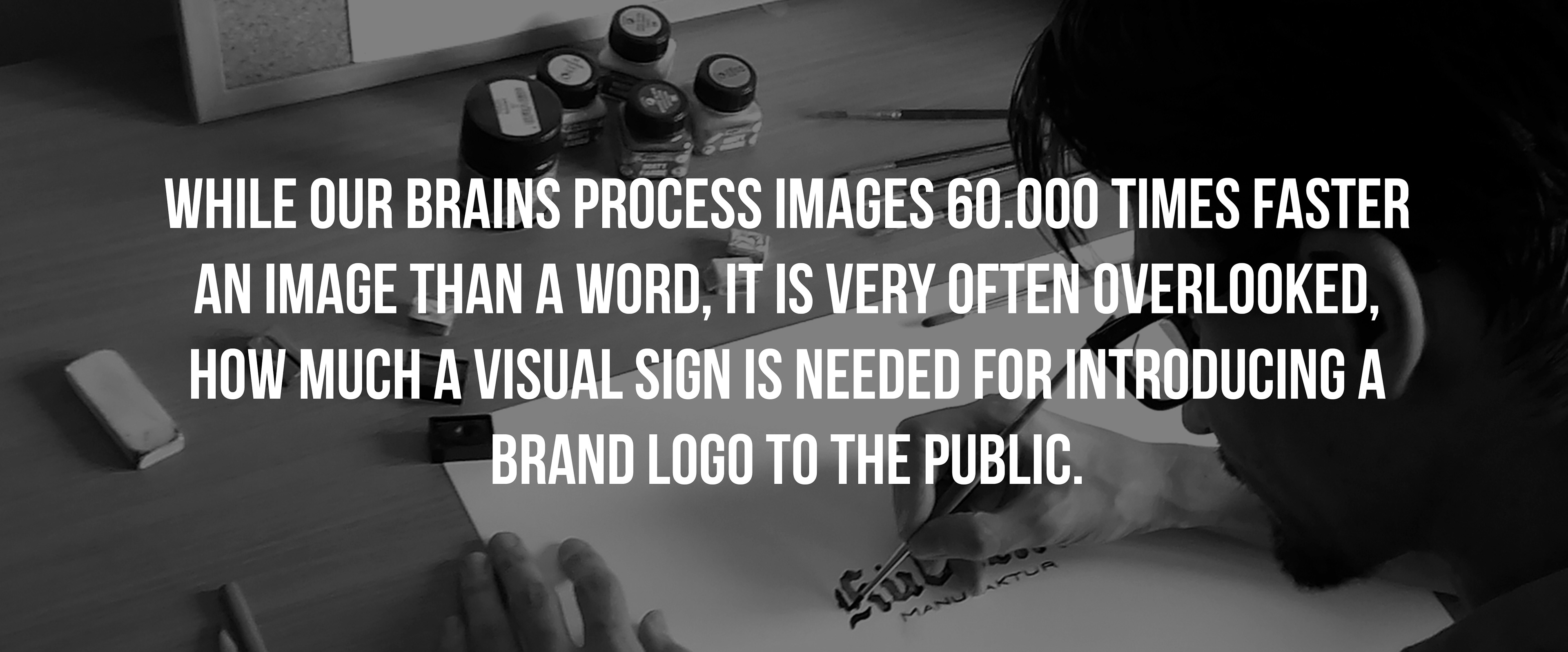
According to surveys, it takes only 10 seconds to judge about a logo, which is a fairly short time for a customer to decide if the logo is pleasing to the eye or not, but it has to be repeated 5-7 times that they would recognize it. It means that to like your logo or not, is a short time to decide, but to make your customers remember it and create a cognitive bond to your brand and product/service, well, that requires repetition and a longer time. While our brains process images 60.000 times faster an image than a word, it is very often overlooked, how much a visual sign is needed for introducing a brand logo to the public. Yet the facts 41% of all companies are using text only logos, many of them with a generic font. If you add all of these information, you can be sure that the first and most important feature what your customers will see and judge about is your logo. Remember, not your product, not the customer service, but your logo. The base for all of your visual identity, what holds everything what your brand is all about in a simple, colourful image. Do you think it is worthy of a perfect execution? I do so. So, let's see what make a logo great!
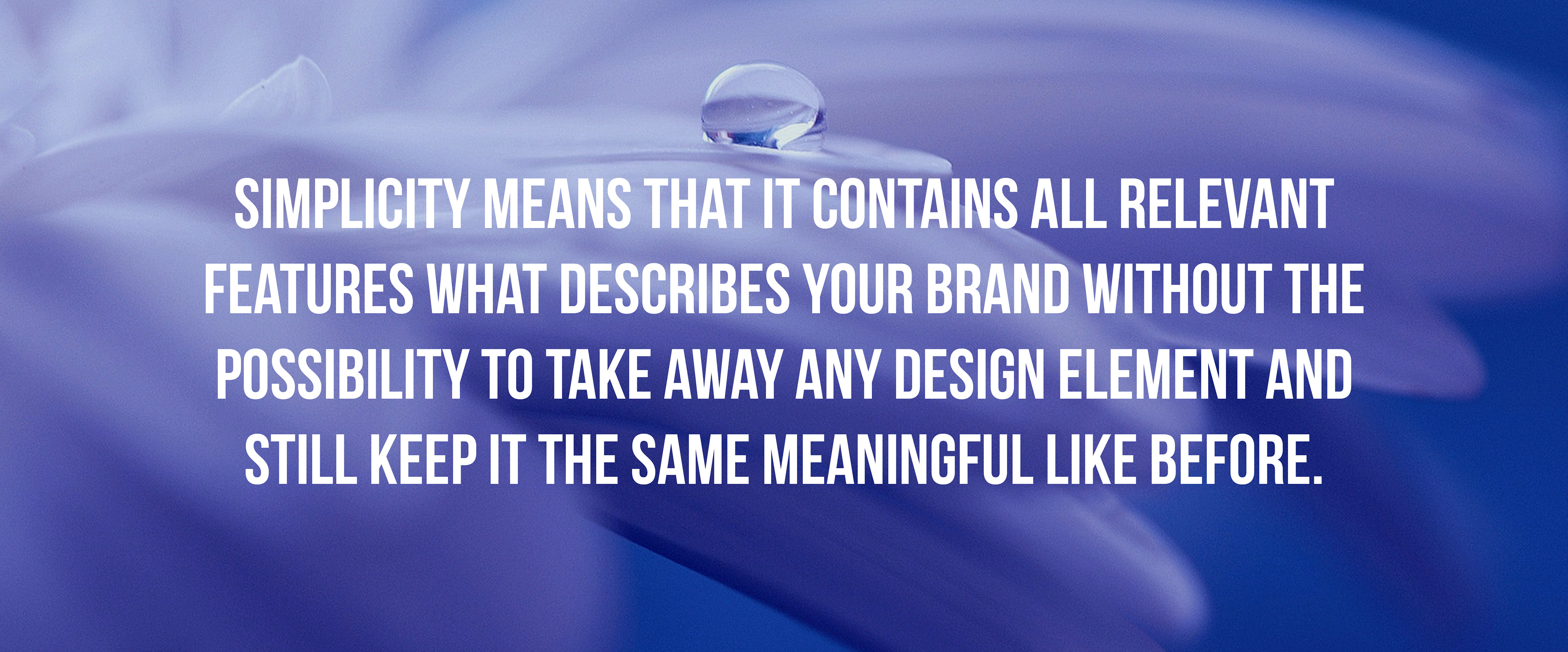
1.) Simplicity: do not mix simplicity with genericity. Genericity means for a logo that it could be anyone's logo, simplicity means that it contains all relevant features what describes your brand without the possibility to take away any design element and still keep it the same meaningful like before. Simplicity helps to be recognizable and therefore memorizable. If your customer remember your logo, they need less time to pair it with the quality of your product or the core values of your brand, in the way you would like to communicate. Remember, sometimes there are no space or time to show your logo twice and make an impression. Tailor it to reach the form, when one impression would work its way for good. If you have a wordmark, use a clean font style, like 84% of companies worldwide. Or become iconic like Coca-Cola.
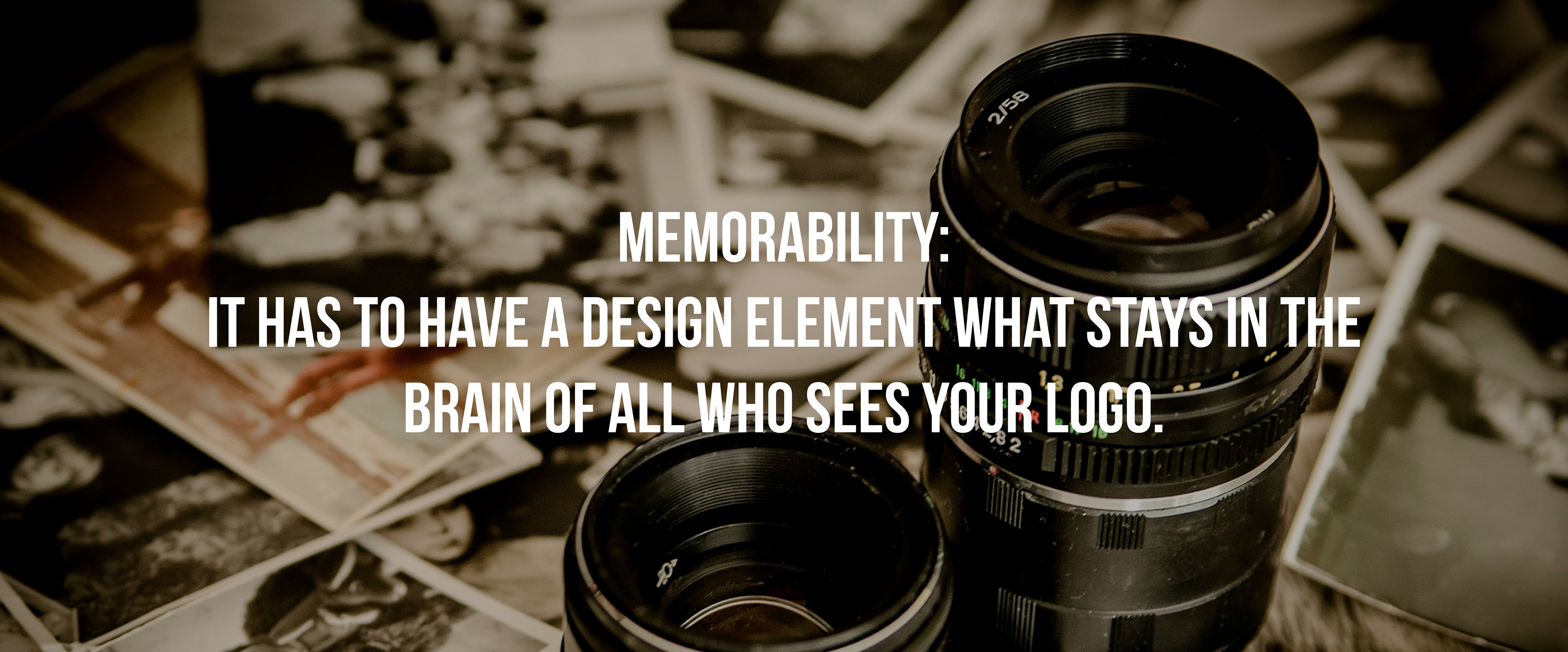
2.) Memorability: as mentioned before, one impression is for judgement, more on the other hand creates a memory, it makes people remember. It has to have a design element what stays in the brain of all who sees your logo. Think about Apple, what makes this logo memorable is not the fruit shape itself, but the missing part, what adds secondary meaning to the logo. Or let's take Nike. Its logo, the swoosh, as commonly called, is not only representing the tick in an athletic way, which says 'Done, success', but also refers to the greek goddess of victory.
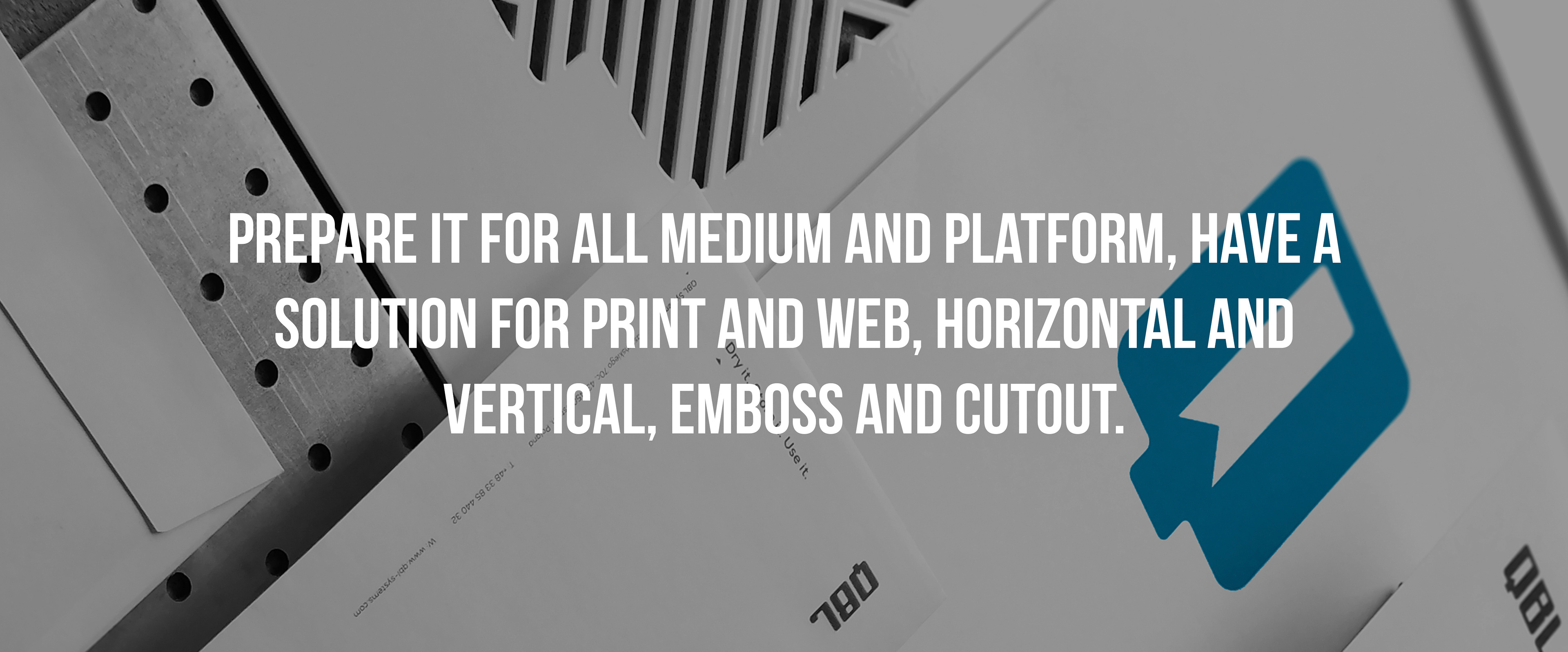
3.) Versatile execution: think about it, where your logo will appear. Now, imagine how it will look like. Is it the same great on dark background as on light? In small and big? Print and digital? If so, then your logo is versatile. You logo is not for your eyes only, it is first and foremost not even made for you, but for your customers. Therefore use it well, prepare it for all medium and platform, have a solution for print and web, horizontal and vertical, emboss and cutout. It has to be a vectorized logo for the ease of use, especially at scaling it.
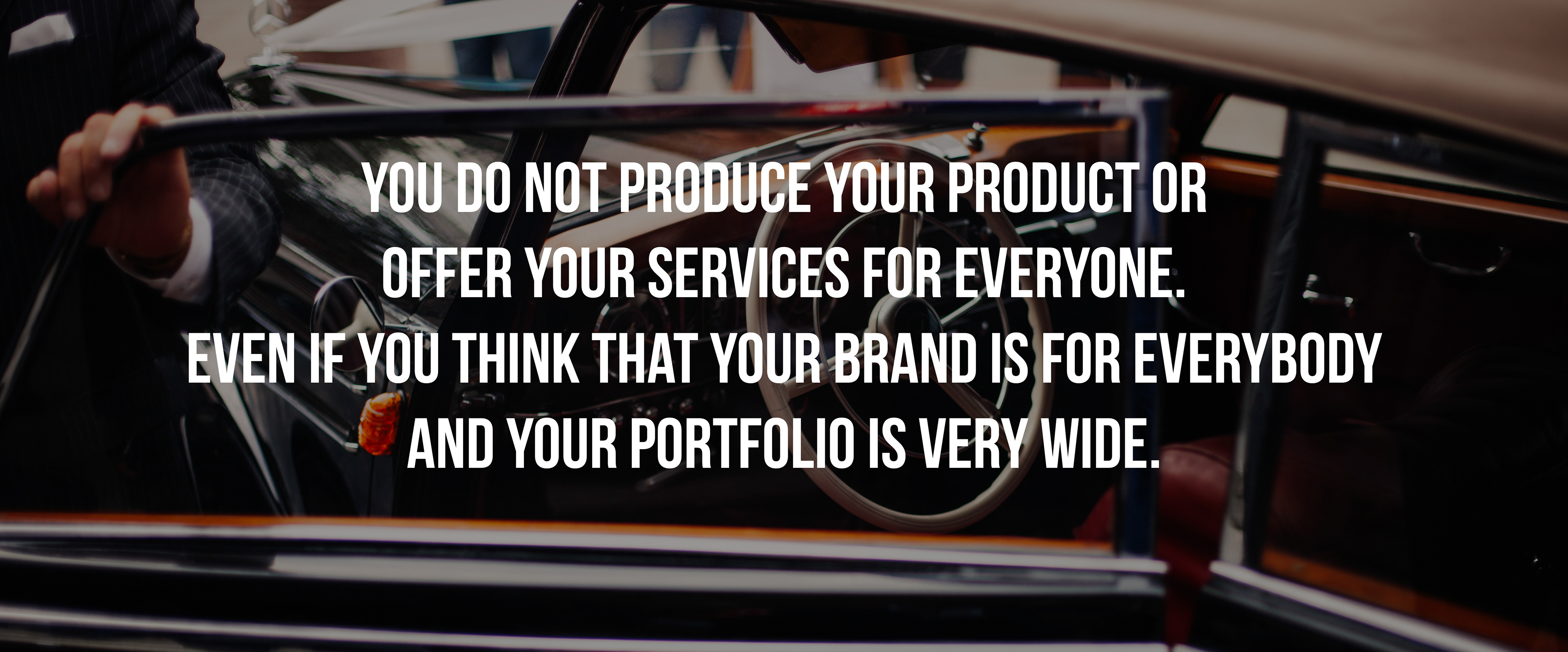
4.) Appropriate to the audience: believe it or not, you do not produce your product or offer your services for everyone. Even if you think that your brand is for everybody and your portfolio is very wide. You have your target group, get to know them and allign your visual appearance to their needs and show yourself how you would like them to precieve you. If you are a sports brand, look like one, if you have serious clients with long-time reputation, be timeless and elegant, if you are doing something creative, add playfulness to your logo. You might think that a retro font logo can be a good representative of a modern sports equipment manufacturer with a short history of existance, but your audience can say something different.
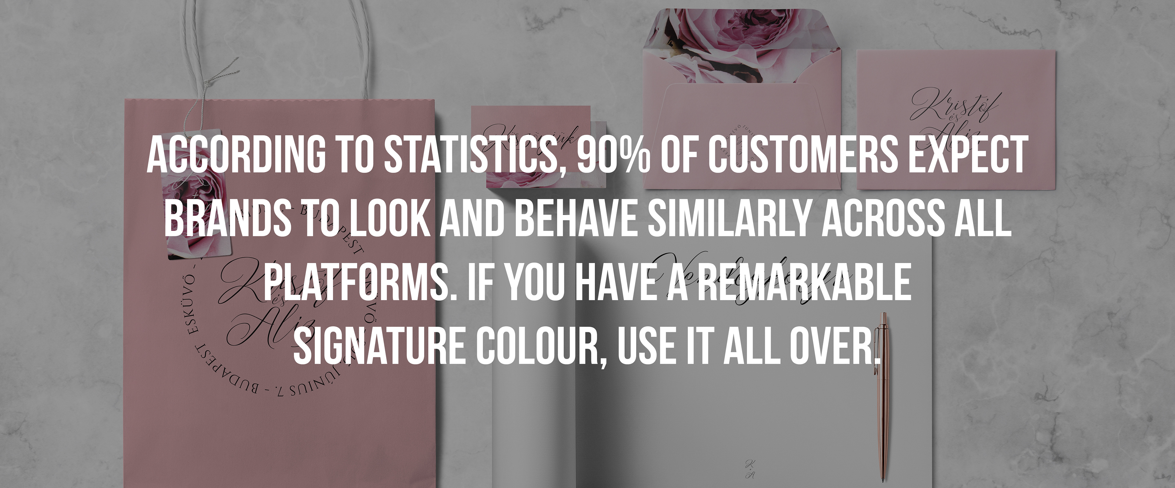
5.) Consistency: does your logo looks different on your packaging, website, product and event POS? Well, its time to manage it consistently! According to statistics, 90% of customers expect brands to look and behave similarly across all platforms. If you have a remarkable signature colour, use it all over your mediums and products, literally everywhere it is possible. It can increase your brand recognition with about 80%.
6.) Tested and approved: if you have a great idea, test it, and test it again. If it stands and your market proves it to be a good one, go for it. It sounds to be a great idea to have a logo designed in-house or by a non-professional. It will be cost-effective on the short term for sure, but on the long run, it might cost you a smaller (or bigger) fortune to change it. To avoid all the problems and issues could appear later, consult with a professional. Search for someone who is familiar with your profile, your industry, your competitors, your market and let him or her do what she learned for years and specialized in. Your logo has to be significant for years, not only be trendy for a season. Colours has to be made well for print and digital, fonts have to be legal and readable, symbols to be at the right place on the scale from abstract to literal. These are just a few to mention, but they need a lot of wisdom and experience while creating the perfect formula for success. Your brand and your logo is yours, but it has to be appealing to your customers, it has to talk to them. You know your own values, but they have to learn them to trust you and occasionally purchase. Your logo will tell your story by its appearance, so I assume that we agree that it has to be well-made and worth the higher price to make it right for the first time, rather than changing it over and over again.

However your logo will not be the onl element of your branding, it is one of the most important one. It summarizes of who you are and communicates it to the public, especially your target group, your customers. It has to be simple, stay in the memory of the viewers, last for a decade, work well everywhere, behave the same on all platforms and talk to your audience. But when you have all these features represented in your mark, make sure that everybody knows it and recognizes it. Use it everywhere, but use it with style!