
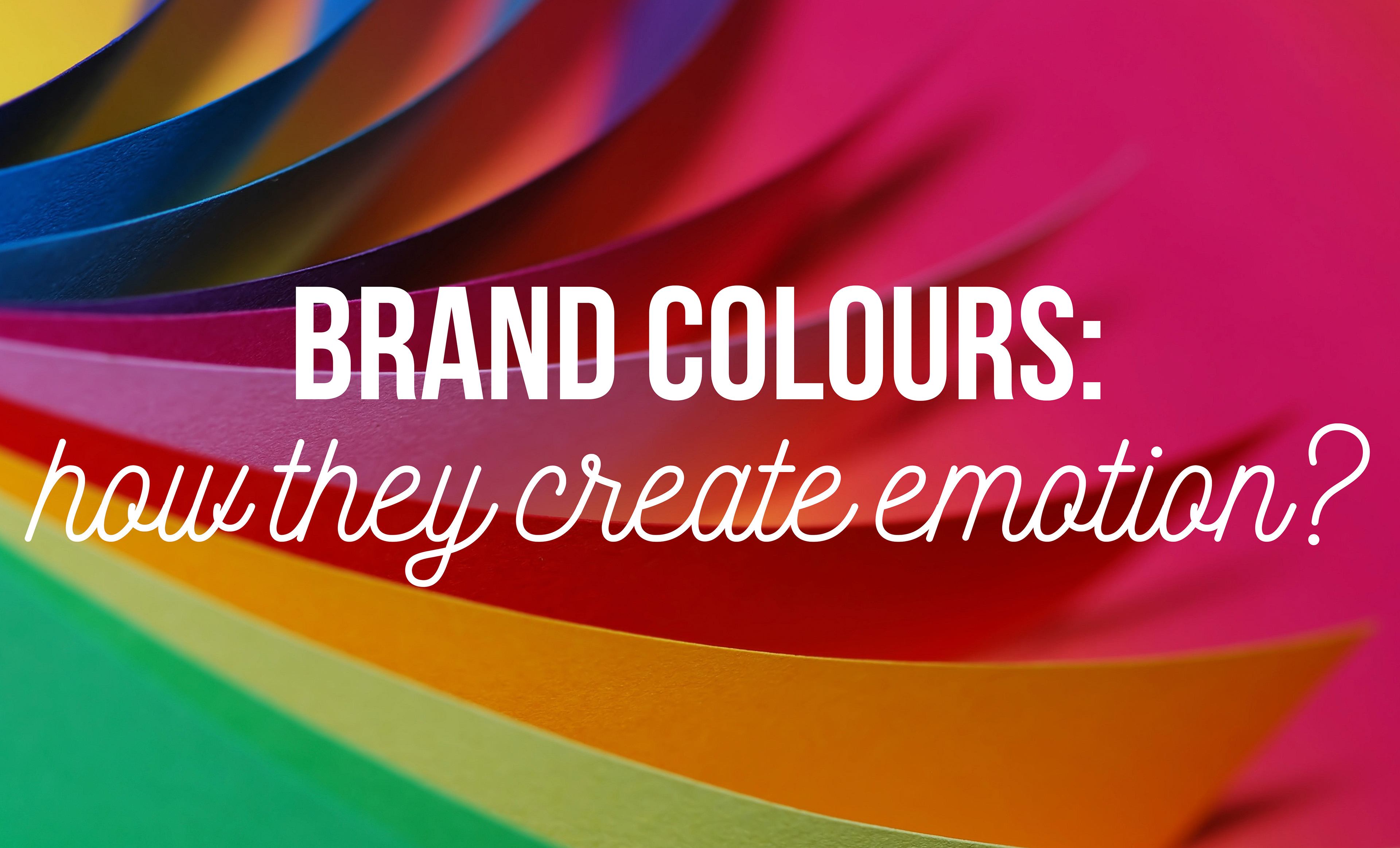
After you have developed the main characteristics of your brand, crafted your story, precisely phrased your philosophy, you would need to find the most fitting colour or colours (why plural, we will go into that deeper in a minute). When you are developing your logo and choosing an indicator for your brand, keep in mind that people will make their first judgement about your company, based on your logo and their first visual conncetion will be towards your primary colour. Surveys show that when buying, people take their decision on wether buy or not the product, they take about 90 seconds to decide, during this time almost 85% of them chooses according to appearance and at least 62% of them is basing the decision solely on colour. In case of some products or brands this can be even 90%. Especially if the significant colour in the industry is established by a company that communicates that particular colour as their primary brand asset, for example UPS brown, John Deere green or Cadbury purple. In the world of sports, colours get a highlighted position, especially in teamsports. But manufacturers also often use a primary colour, even if they leave it during the time, like Nike did with its orange hue. What could stand behind this decision? The answer is very simple: practicality and usability. For a sportswear brand it is technically difficult to work with one standard colour always. They focus on the product aesthetics, therefore cut short on the corporate colours and tend to use their logos monochrome or black and white. But if you have to stick to a primary colour, choose it carefully, as researches say that if you do it right, you can win big, because an established signature colour can increase brand avareness by 80%, like in case of Starbucks' Green.
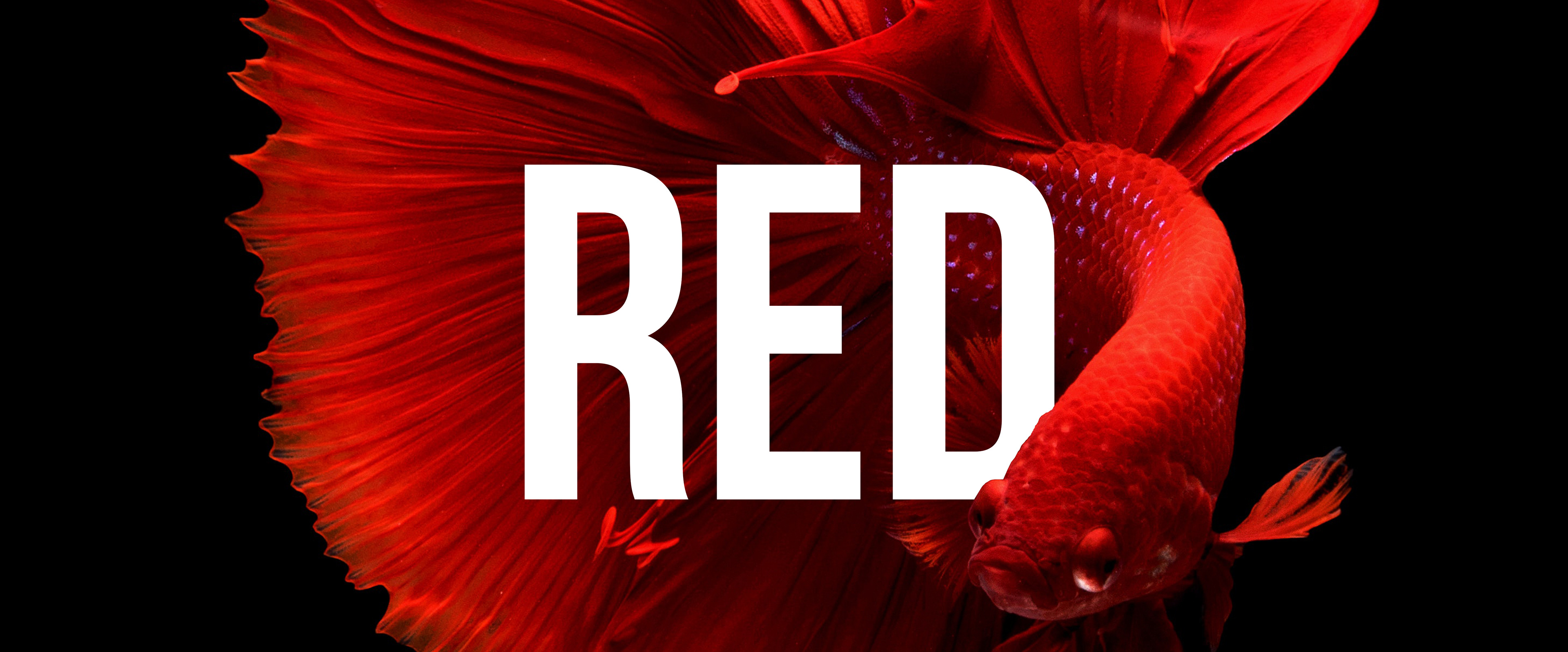
1.) RED: If you want to communicate power, strength, upbeat, tension, intensity and passion, your colour is red. Use a stronger hue if your sport is connected to speed, agility or competitiveness. When using it, be aware that it increases heartrate, impulsiveness and appetite. Some red brands on the market: Coca-Cola, Adobe, Puma, Target, Beats by Dre, Netflix, H&M, Marvel, Fisher Price, Vodafone, Virgin, CNN, KFC, Red Bull, Rossignol, New Balance, Wilson, The North Face, Spalding, Kappa, Li-Ning, Reebok.
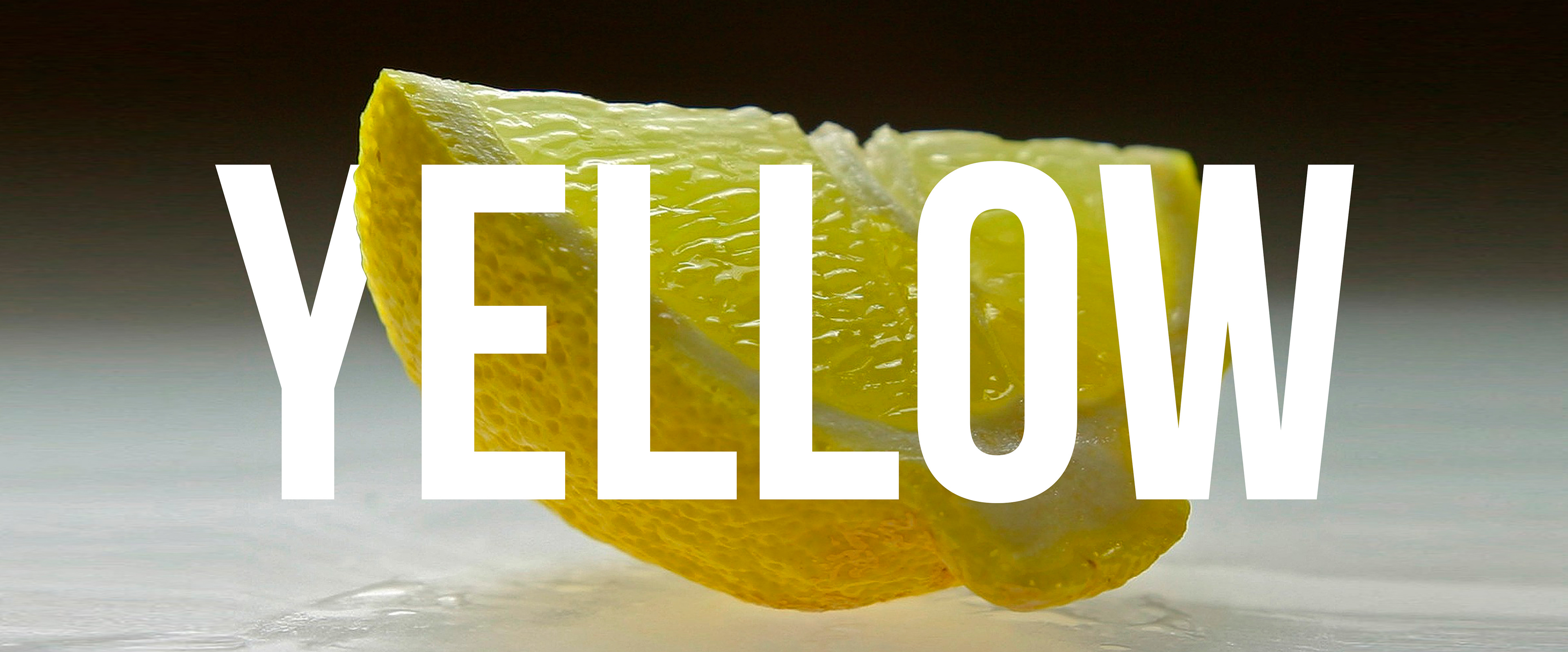
2.) YELLOW: In case your brand is young, fun and has a good vibe, your choice should be yellow, as it stands for joy, represents the sun, it is alarming (just right after the red, combined with black) and encourages communication. Some brands what use yellow as their primary colour: Nikon, Yellow Pages, McDonalds, Hertz, CAT, IKEA, Continental, National Geographic, Ferrari, BIC, Renault.
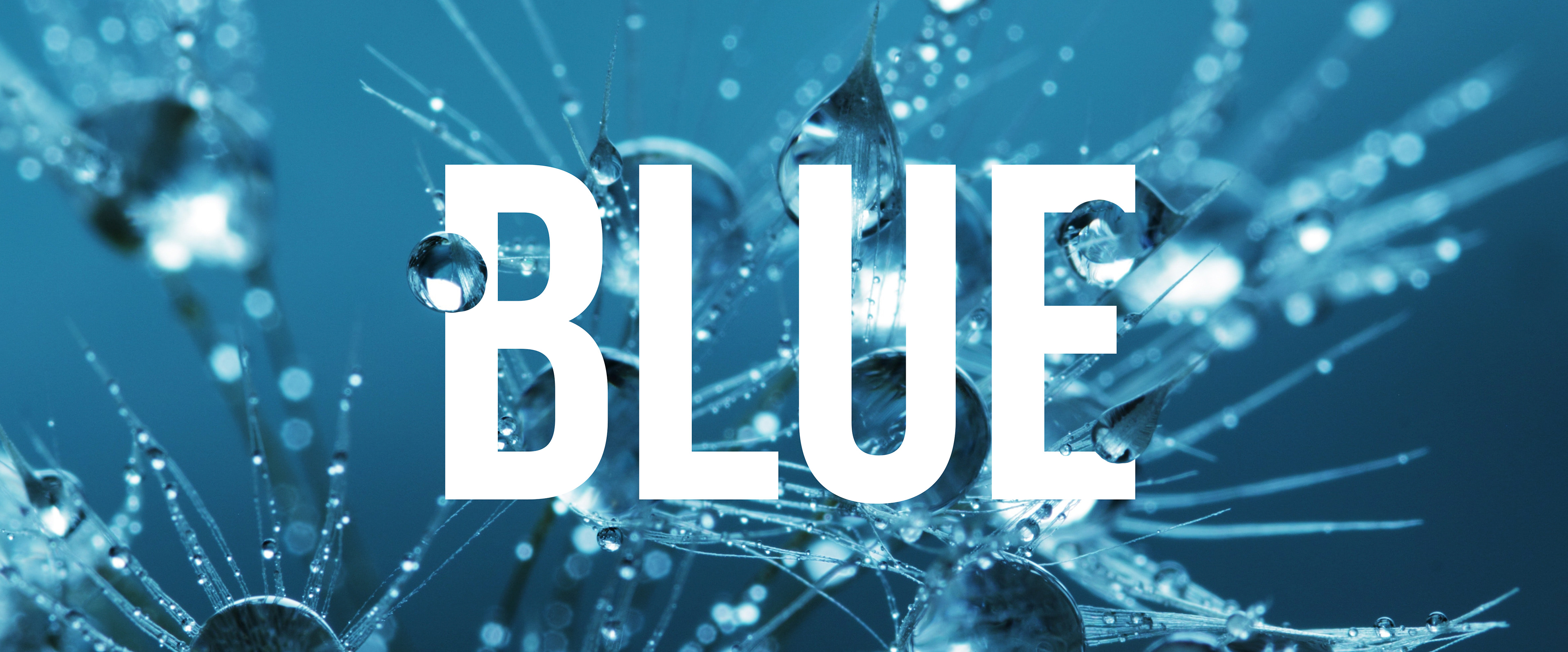
3.) BLUE: Is your brand comes from wintersports? Is it connected to technology? Or simply wants to visually show trustworthy characteristics? Choose blue! It is also your first choice if you have mainly male audience, you stand for watersports, or you want to be very corporate. Blue-brands: Facebook, Twitter, LinkedIn, Skype, BMW, Samsung, IBM, Volkswagen, HP, Intel, PayPal, SAP, Kleenex, DELL, Vimeo, Unilever, Pepsi, Mizuno, Amer Sports, Chelsea FC, New England Patriots.
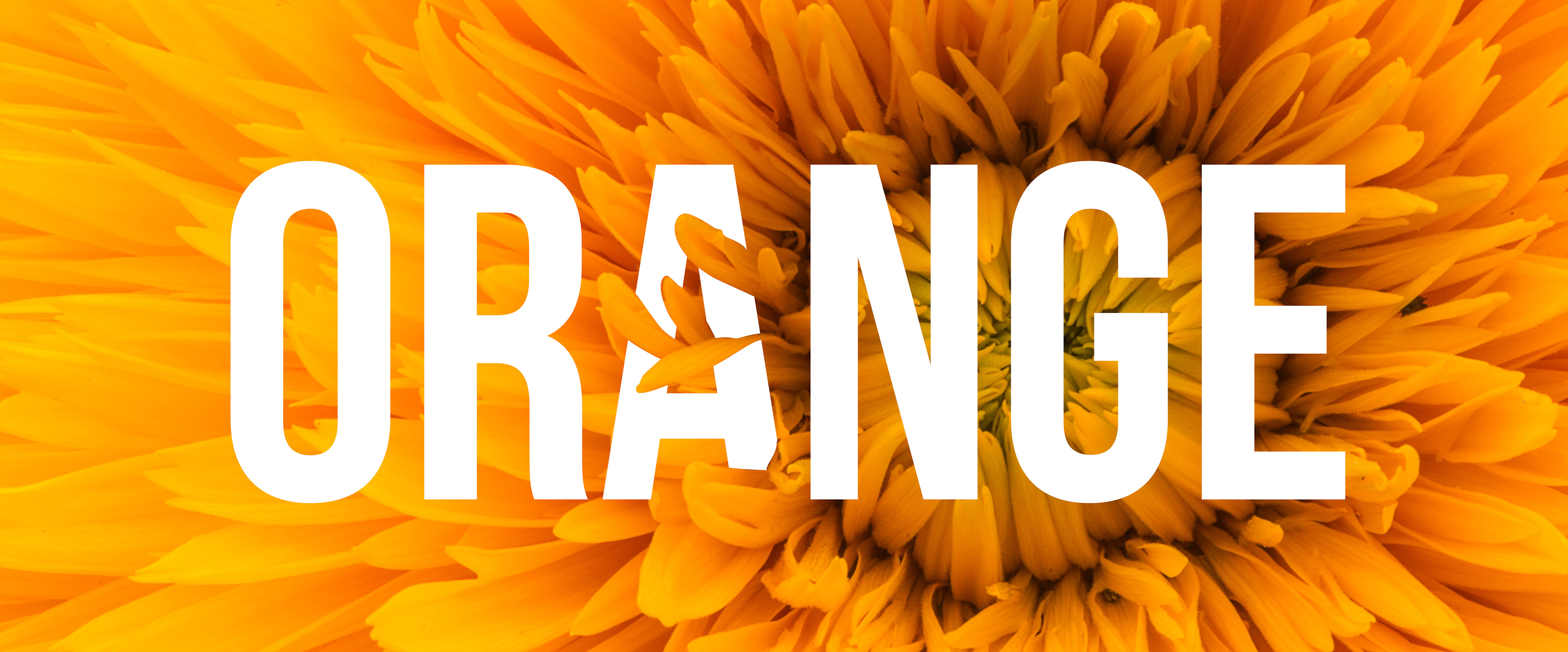
4.) ORANGE: Confidence, warmth, held back aggression? If your brand holds these features, you can go for orange as your main colour. It also shows enthusiasm, warning, and some level of creativity. Brands that feature orange as their signature: Orange, Nickelodeon, Harley Davidson, TNT, Fanta, JBL, Black&Decker, Nike, EasyJet, ING, Head, Everlast, Sainsbury's, Hull City Tigers.

5.) GREEN: If you want to work with a big variety of hues while defining your primary colour, use green, as human eye is capable of detect the most of green's depth. If you are an outdoor company, o somehow related to nature, or simply want to communicate sustainability, the perfect choice will be green. If you have ever visited a hospital, you know that green calms you down, relaxes and also helps to prevent or lowers the impact of a stomach ache. Green brands: Starbucks, John Deere, Carlsberg, Spotify, BP, Land Rover, Animal Planet, WholeFoods, NVIDIA, Android, FSC, Recycle, Heineken, Boston Celtics, Aston Martin.

6.) PURPLE: Is your brand smart, creative, unique? Purple is the right colour for you! It shouts wealth and power, a tipical symbol of nobility and royalty. Use it if you want to create a clear view about your values, express philosophical depth or strenghten pure consciousness. Brands that have chosen purple as their primary signature colour: Cadbury, Milka, Hallmark, PLAY, Mercure, Mondelez, WIZZ!, Prince, LA Lakers, Yahoo!, Taco Bell, SyFy, Premier League.

7.) BROWN: Are you down-to-earth literally? Eco-friendly, organic, simple or maybe your field of profession is somewhat connected to the soil under our feet? Then, the perfect choice is brown for your brand. If you are out of earthy associations connceted to your profession, you should rather be careful, as the colour also refers to dirt and might have a negative tone. Some of the brands that dare to use brown: UPS, Dakar Rally, Hershey, Magnum, M&M's, Timberland, Nespresso, UGG Boots, FC St.Pauli.
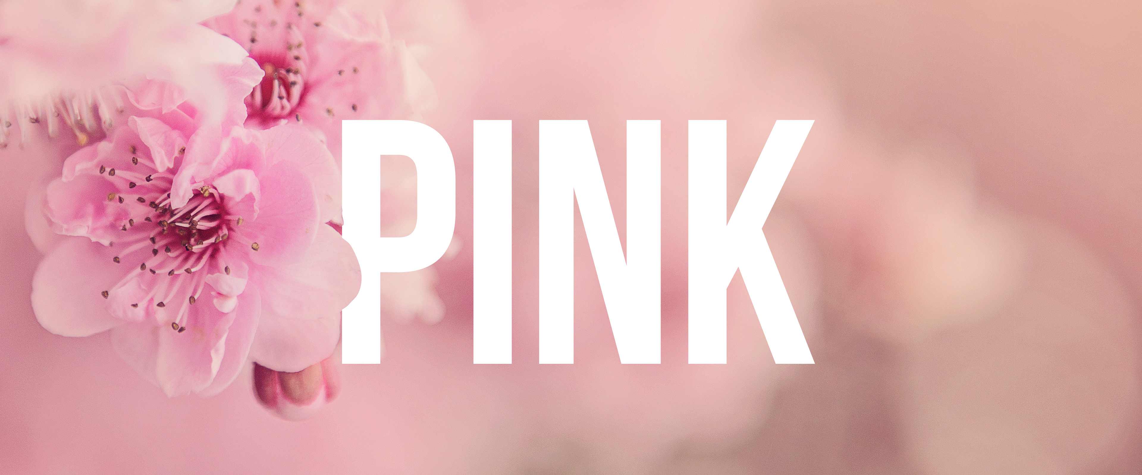
8.) PINK: Is your target group 'girly'? Or you are full of bright energy, fun to engage with in any activity and trendy? Then choose some of the hues of pink. But be careful, what tone you use, as it might bring surprising results if not handled intentionally well and professionally. Brands with pink in their palette: T-Com, Barbie, Hello Kitty, Roxy, Victoria's Secret, Glamour, Pink Panther, IndieGogo, Breast Cancer Foundation.
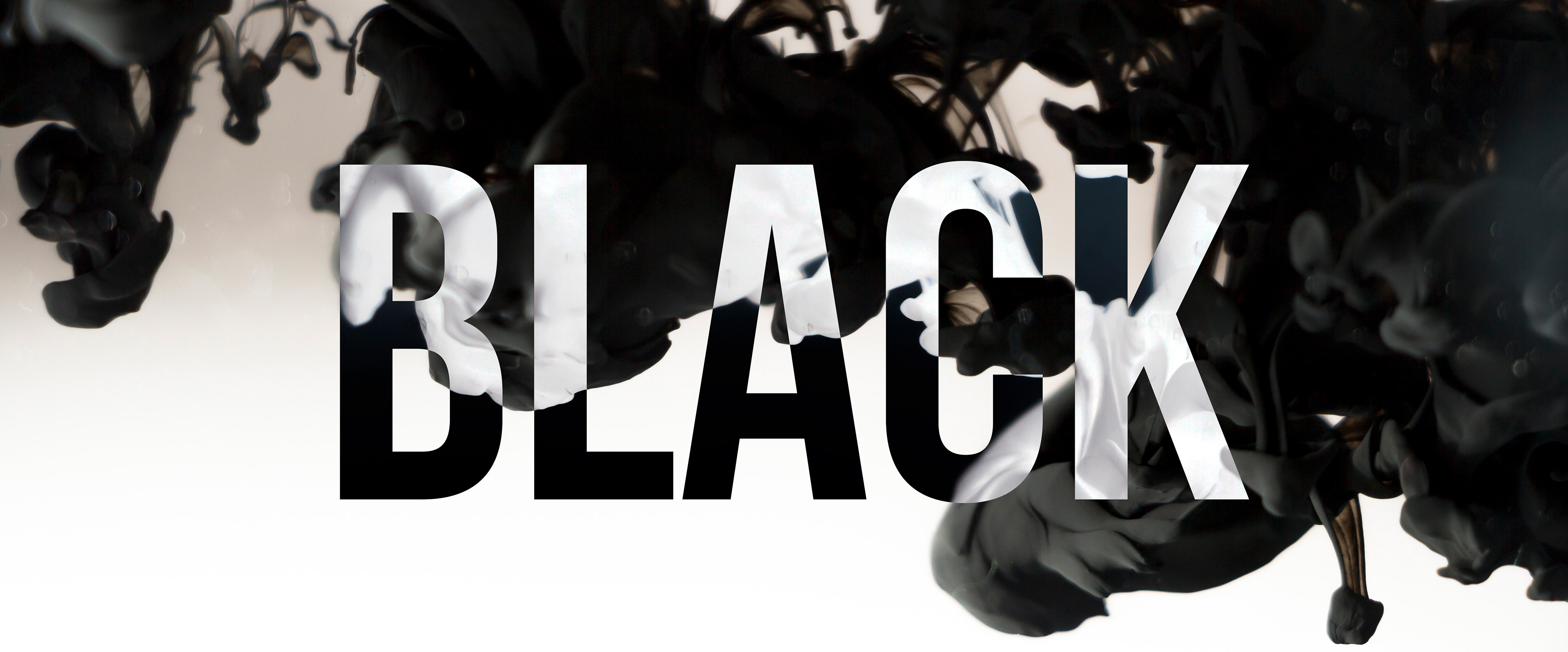
9.) BLACK: Are you luxury, elegant, classical, bold, powerful and yet sophisticated? Then your primary colour might be black. Of course, in most cases we see the usage of black at a certain level in every branding, but you have to be serious to have it as your primary colour. Be aware of the cultural aspect of this colour, when using it worldwide. The black brands: Adidas, DC Shoes, Louis Vuitton, Yamaha, ZARA, Chanel, Burberry, WWF, Sony, Armani, Calvin Klein, Hugo Boss, Prada, Mont Blanc, Under Armour, ASICS TIGER, Cartoon Network, YSL, Osprey, Omega, Hilton, Converse, Raiders.

10.) WHITE: Do you want to say about your brand that is clean, transparent, pure, calm, professional? White communicates all of these and brings attention to the text written or sign created in this colour. If you want to be a bit more subtle, tender and less strong in appearance, you can go for some off-white tone. Be careful, white has a lot of various deeper meanings dependent on different cultures. Some white brands from around the world: Apple, Snapchat, Playboy, Juventus, Real Madrid, Oakley, Jack Daniels, Marshall, Newcastle United, UBER.

If you choose only one colour as your primary and significant sign, make sure that you choose the right hue. Since the colour gamut of RGB (for digital, above on the right) and CMYK (for print, above on the left) has large differences in some shades, do a research on how your choice of palette will look like on screen and on your stationery. Be also aware of the fact that what you see is often cannot be reproduced by printing. If you decide to keep your brand duotone (using two colours), pair your primary colour with another colour that creates a large contrast and aesthetically fit to one another. Of course, as always, the best is to consult your decision with a professional.