SyVento is a biotechnology company offering comprehensive services in the development of lipid-based nanocarriers and LNP technology. they specialize in the development of lipid-based formulations for pharmaceutical products, including RNA-based drug products, agricultural products as alternatives to synthetic pesticides and nanocarriers for cosmetics and dietary supplements.
The company's unique, global scale end-to-end service gives the opportunity to design and implement projects to encapsulate and deliver therapeutic molecules such as small molecules, RNA, DNA, and proteins to targeted cells or tissues. Their expertise includes the development of liposomal formulations, RNA synthesis, and finally cGMP production in our state-of-the-art facility, along with support services at all levels of product development.
Thanks to many years of experience in the development of liposomal carriers, their R&D team guarantees that each project will be delivered successfully.

SyVento’s brand hierarchy contains a main unbrella brand that covers all business activities, organizes and manages its assets. Below the main umbrella brand there are three business units: BioTech - the biotechnology initiative that focuses on encapsulating and delivering active substances for the pharmaceutical industry; BioProtect - the agricultural sub-brand providing fungicidal and herbicidal formulations to replace synthetic pesticides; Care - creating nanocarriers to encapsulate active substances for cosmetics and dietary supplements.
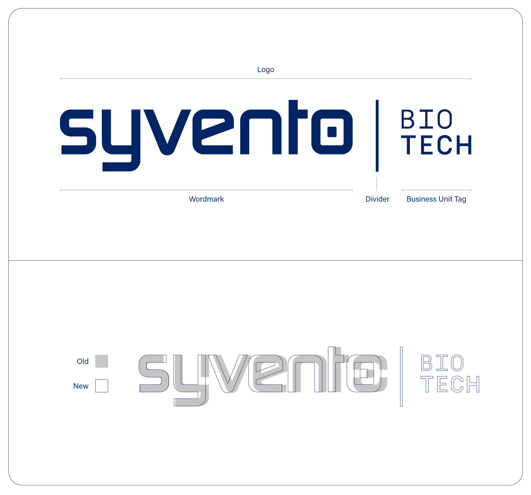
The SyVento business unit logos are derived from the main brand’s wordmark, with an added divider and a tag representing their specialty. The ‘O’ letter of the wordmark works also as a standalone symbol that can be used as identifier of the business unit it resembles. The sub-brand logos’ wordmarks are slightly modified versions of the main one’s, with an updated kerning, realigned x-height, throughout consistent lineweights and simplified curve radiuses.
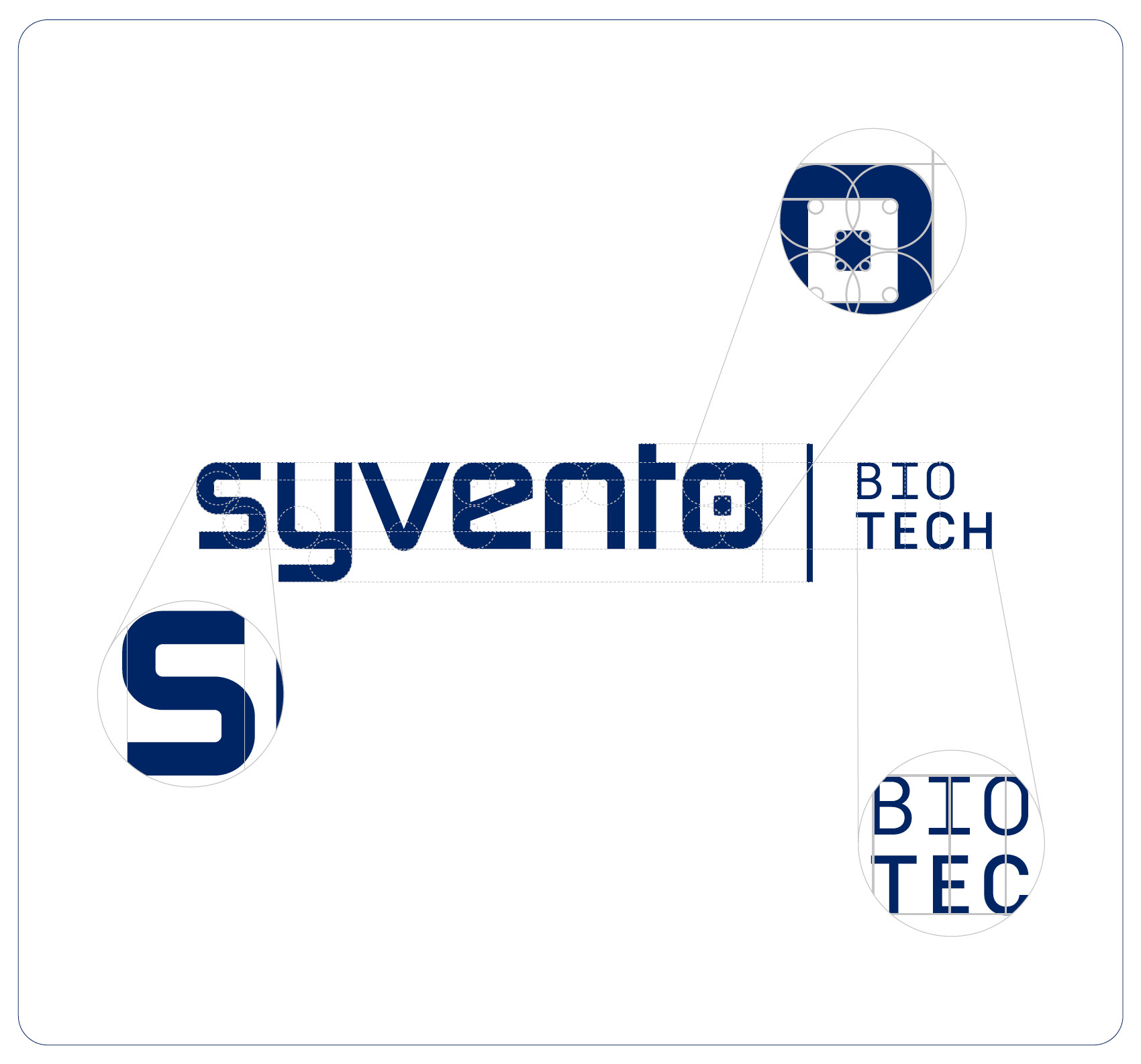
Modern shapes and timeless aesthetic principles. These were the key points to consider when the SyVento sub-brand logos were created. The logo holds a modern - even by some standards a futuristic - vibe and characteristic by having a geometric, rounded square, sans serif font, with an accent of a monospace-esque tag. To balance this modernity, simplified curve structure and lineweights, as well as clear optical alignment and gentle kerning adds timelessness and class.
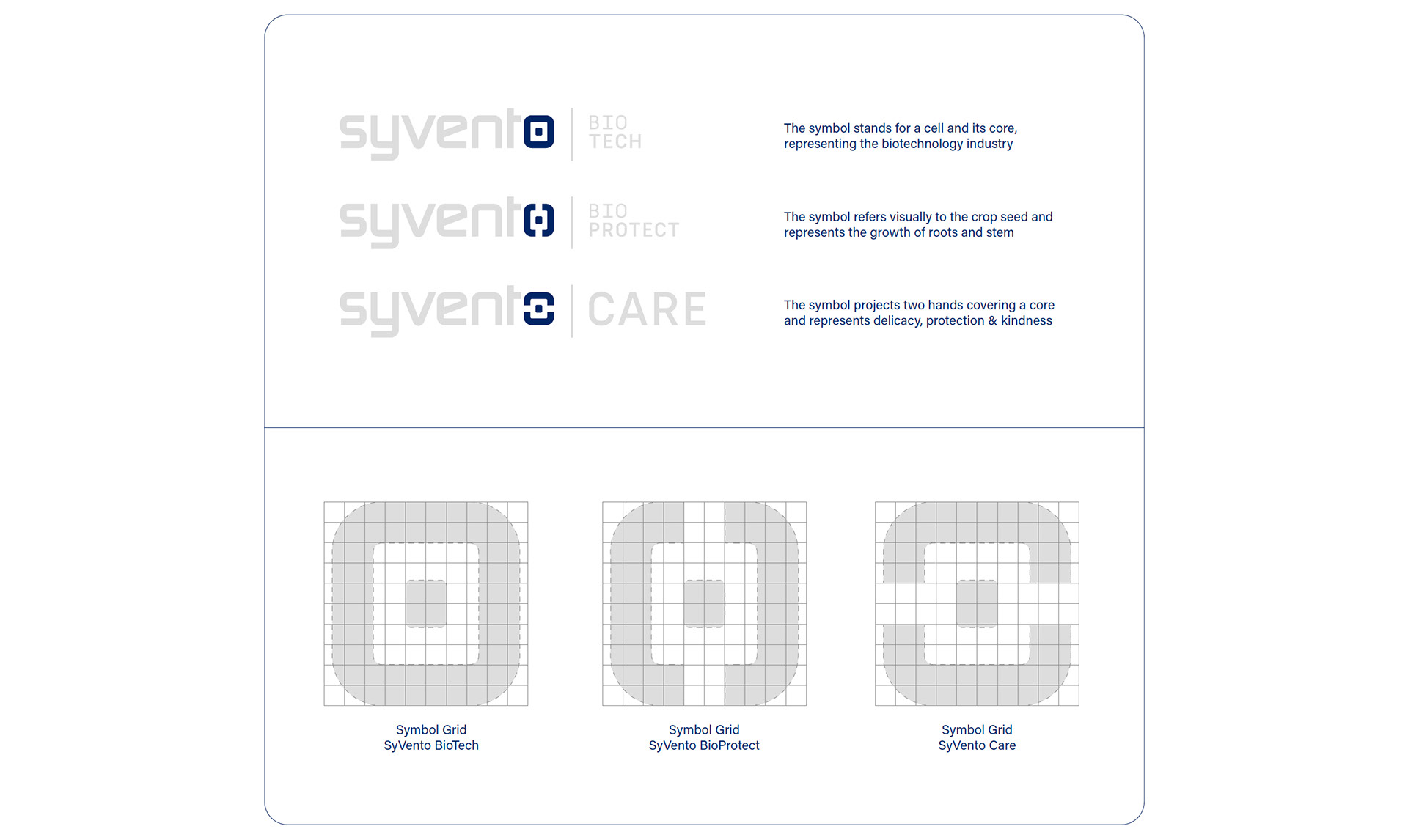
The letter ‘O’ of the SyVento logo functions as a symbol, and also works as a key differentiator for the various business units. The horizontal and vertical cuts on the curves - of the Care and BioProtect logos respectively - are having the size of the core’s width. The way of how they are cut also holds a hidden message.
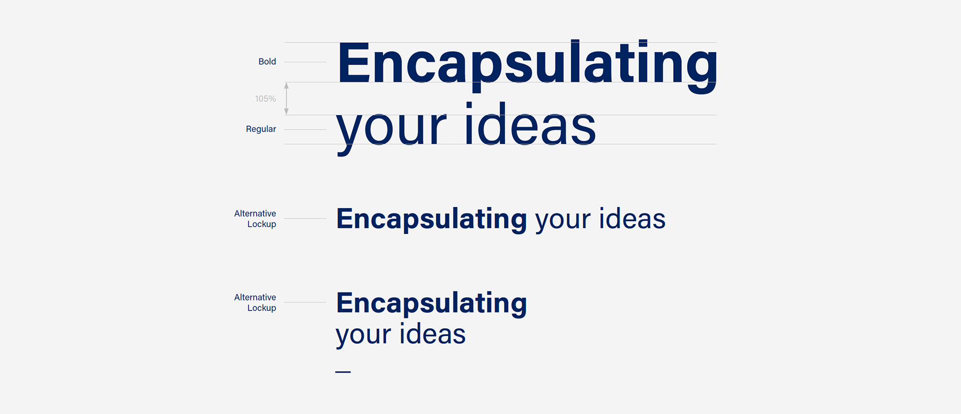
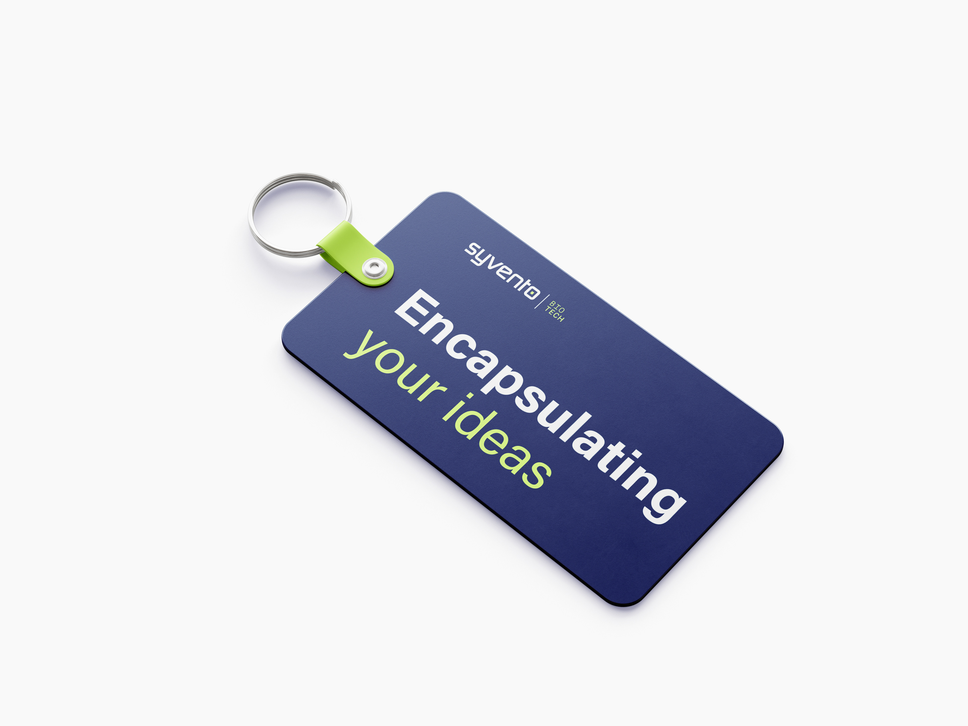
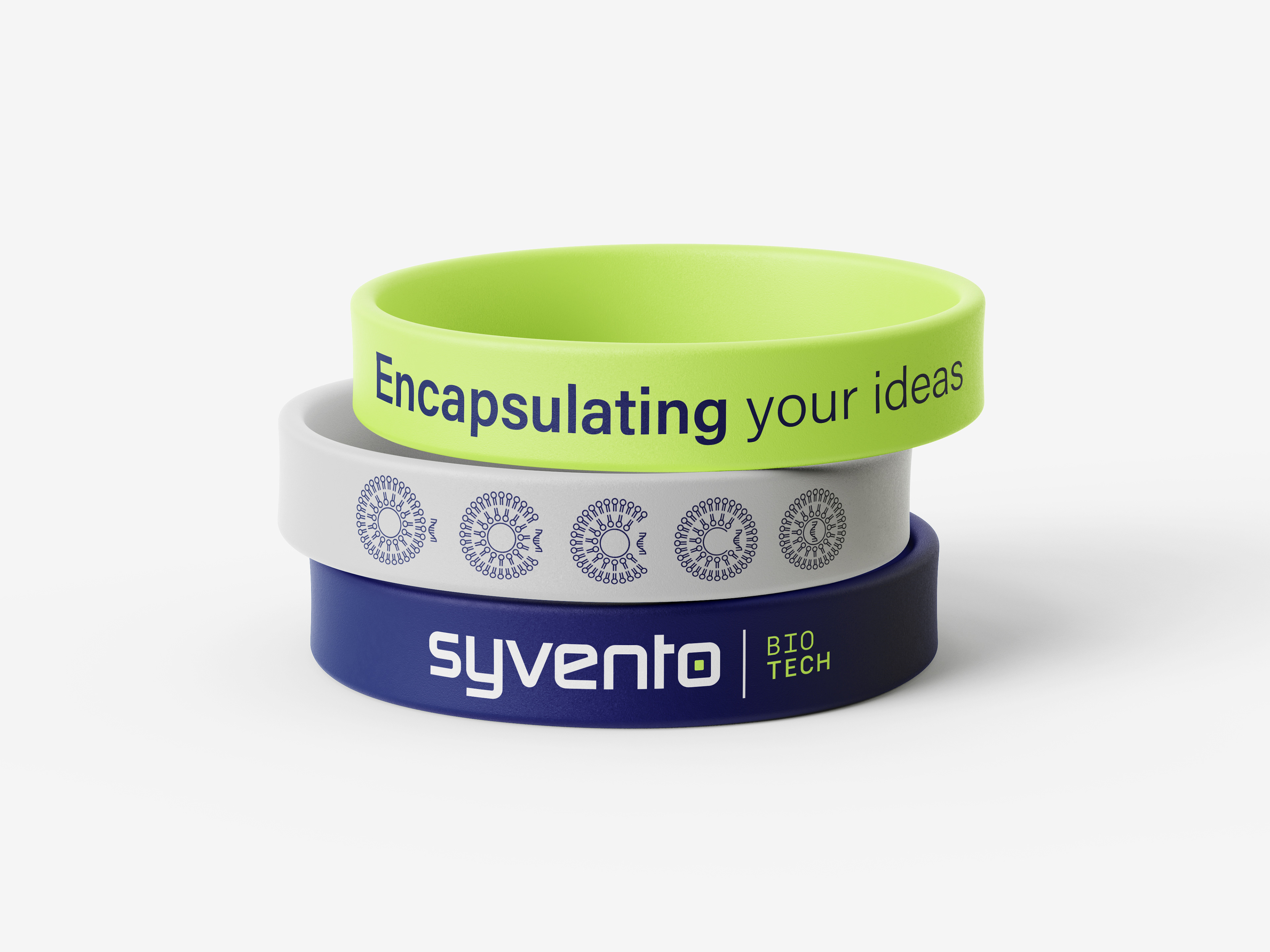
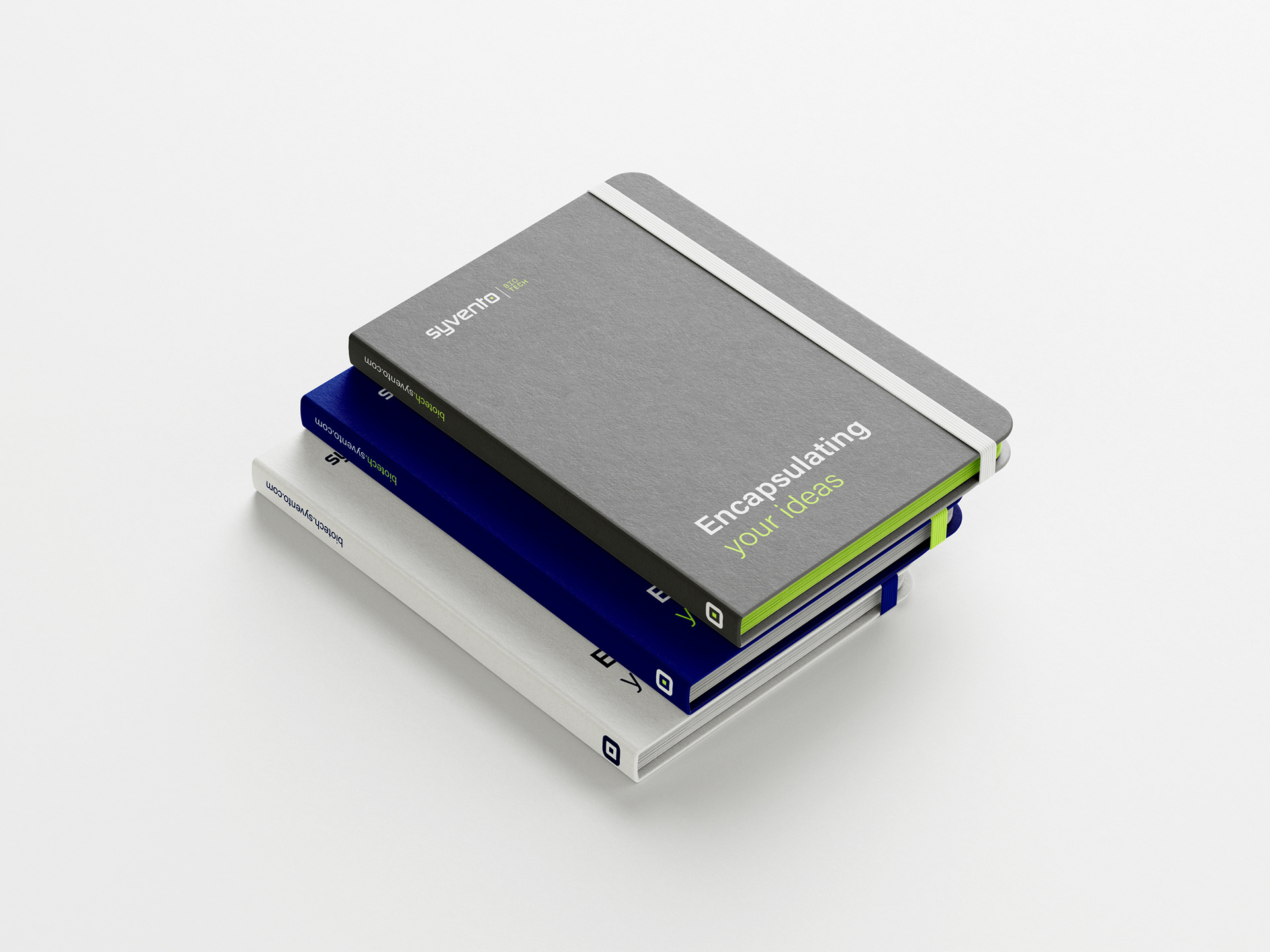
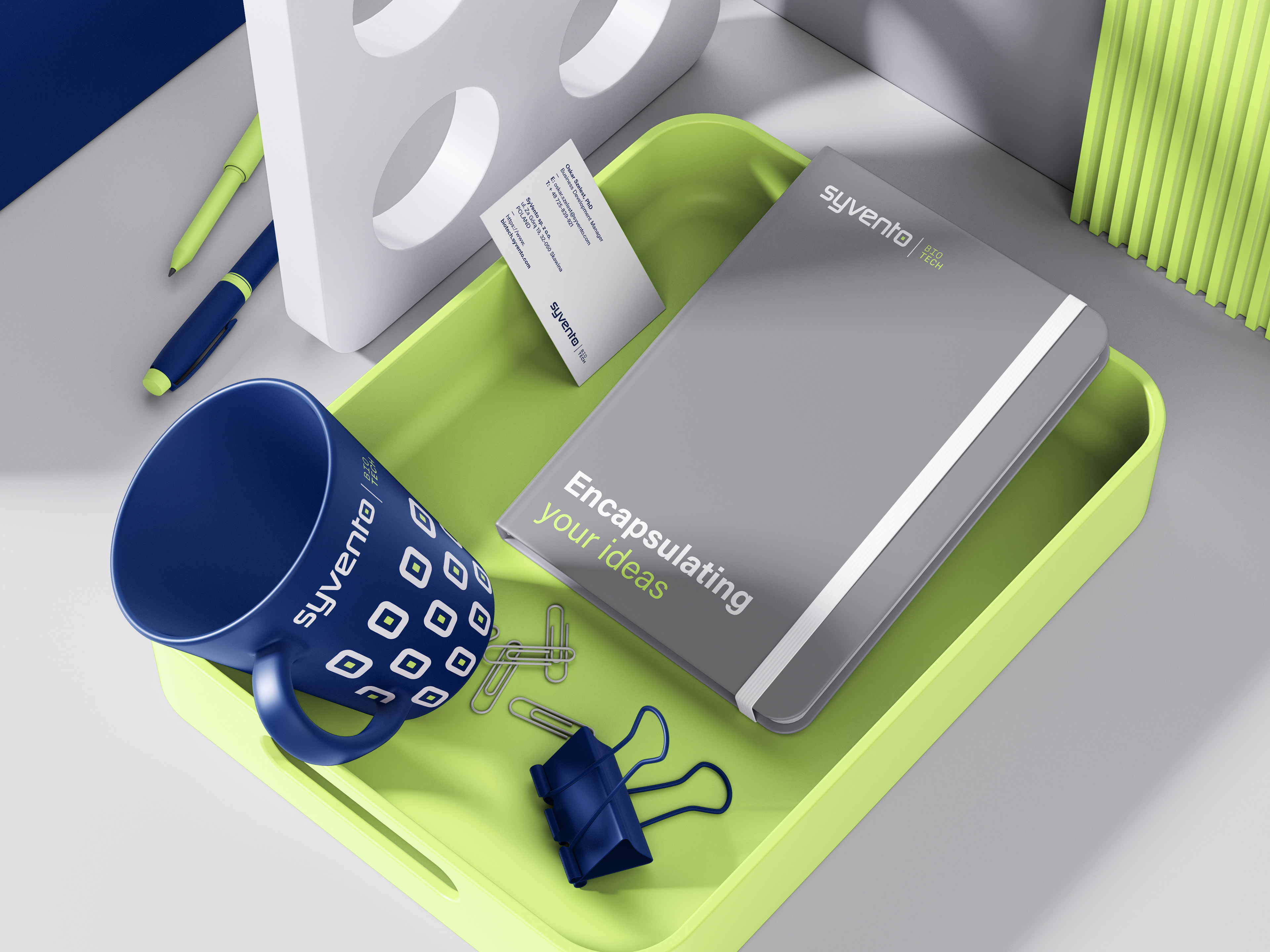
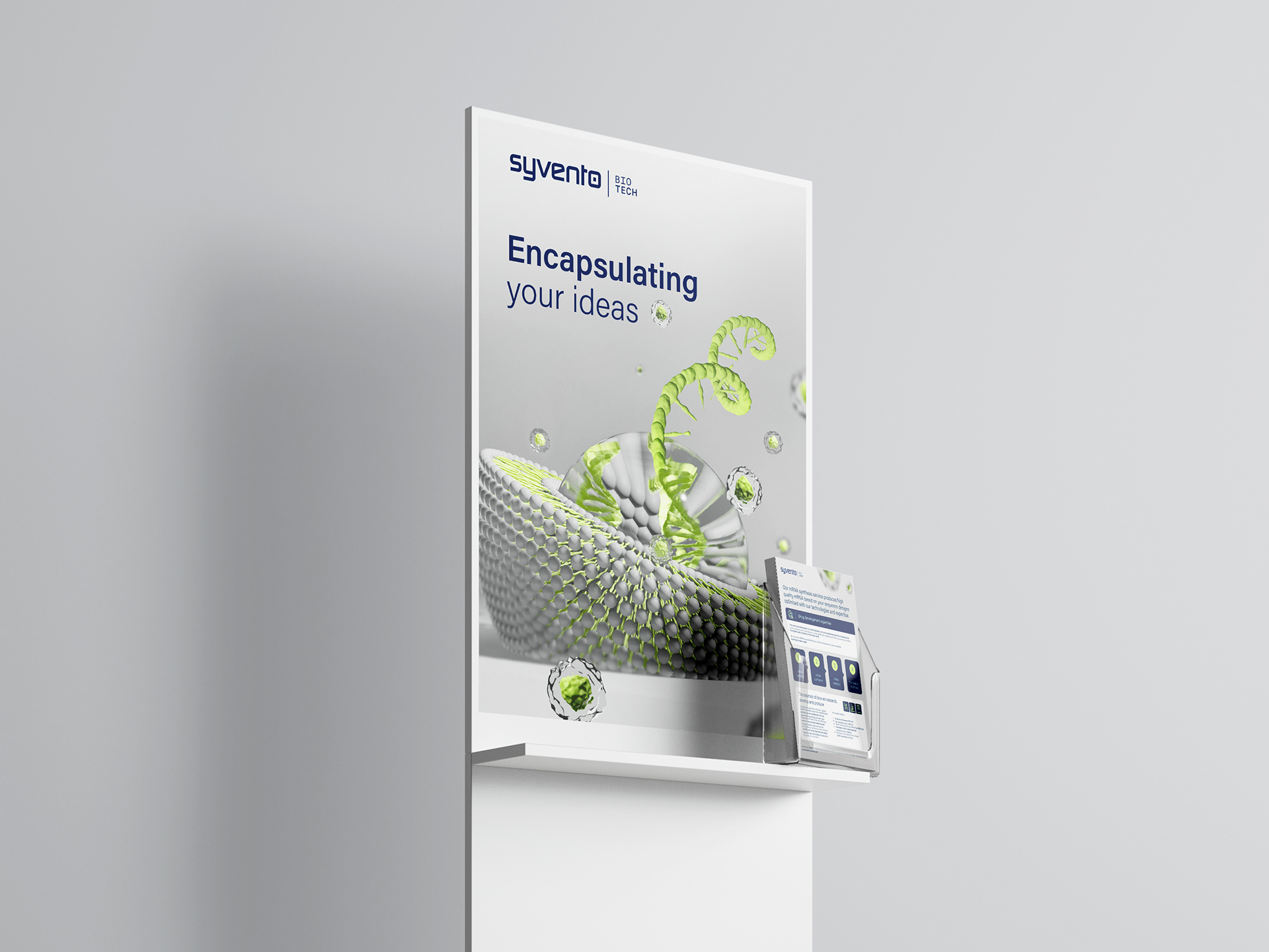
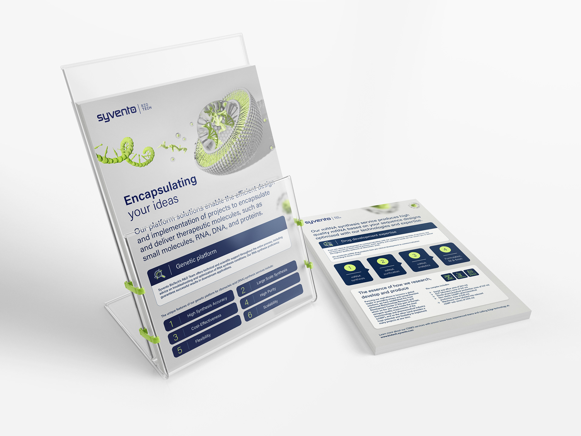
The SyVento brand has its own claim - Encapsulating your ideas - that is used accross all main and sub-brands consistently.

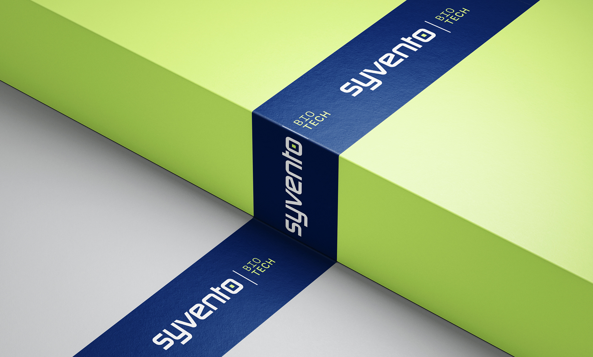
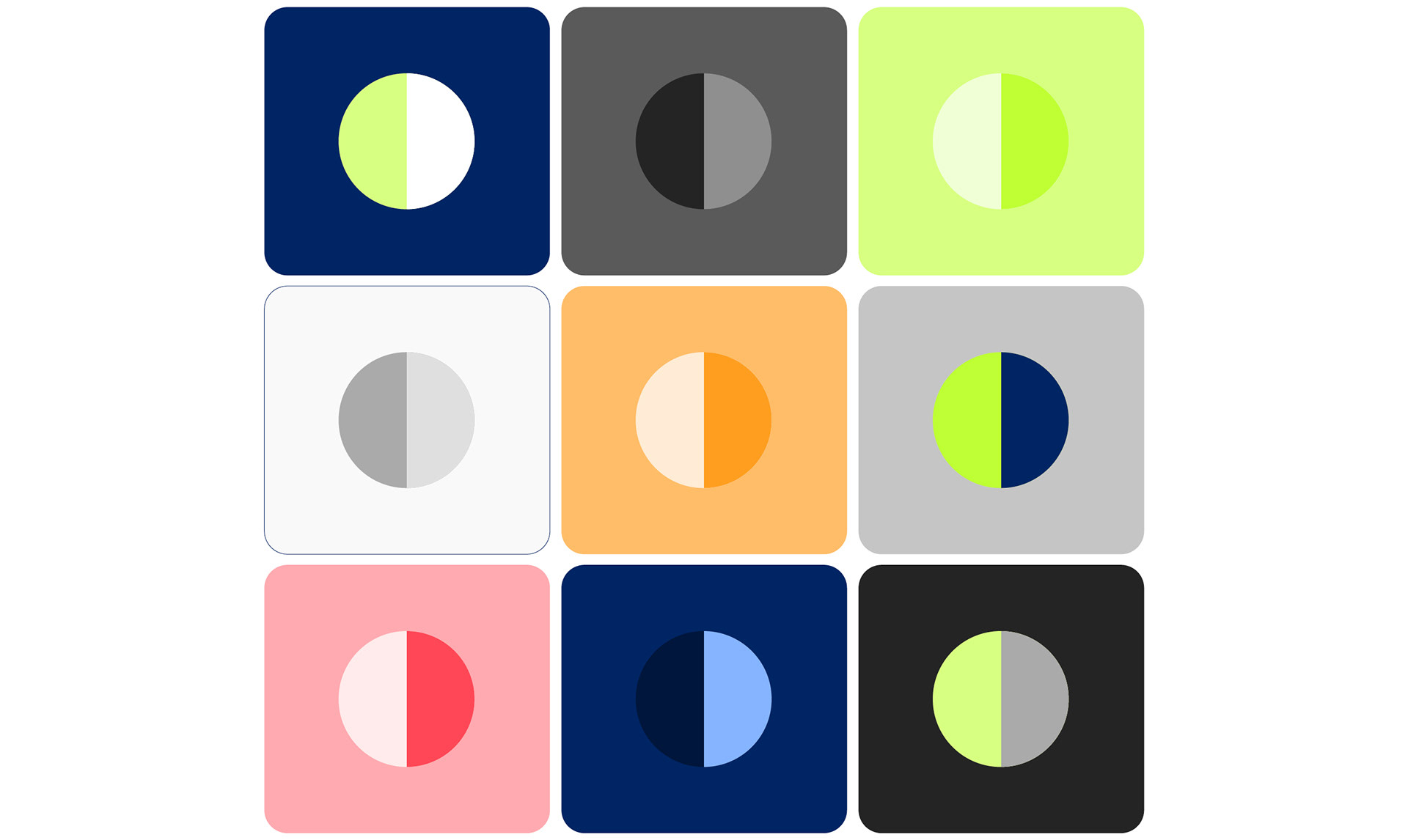
The SyVento palette reflects their brand values: effectiveness, clarity and sophistication. SyVento’s main colour is blue, a darker shade of royal blue that stands for stability, trust and professionalism. The SyVento blue is then contrasted with Business Unit-specific highlight colours to convey dynamism and perspective. Additional shades of grey colours are added to the core colour for neutral completion of the palette.
SyVento colour theory in practise. Large contrast and key visual elements in deep blue and light grey neutrals on coloured backgrounds and images, as well as text in main colours on light hue backgrounds.
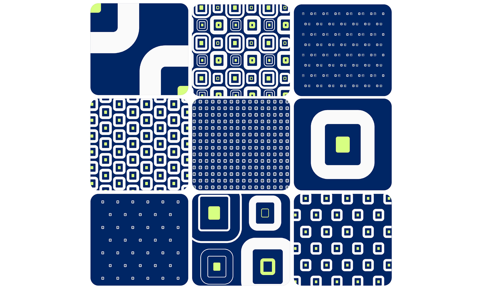
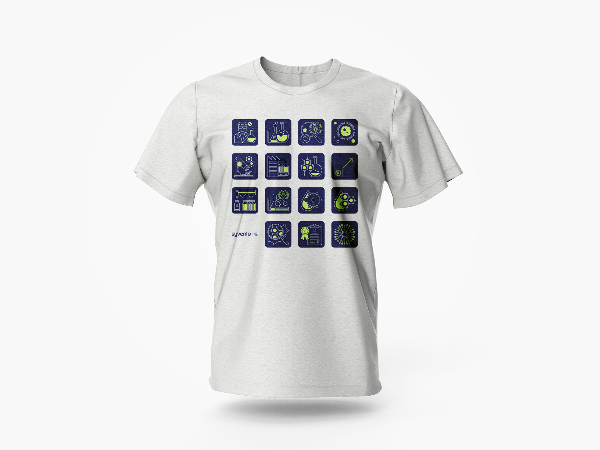
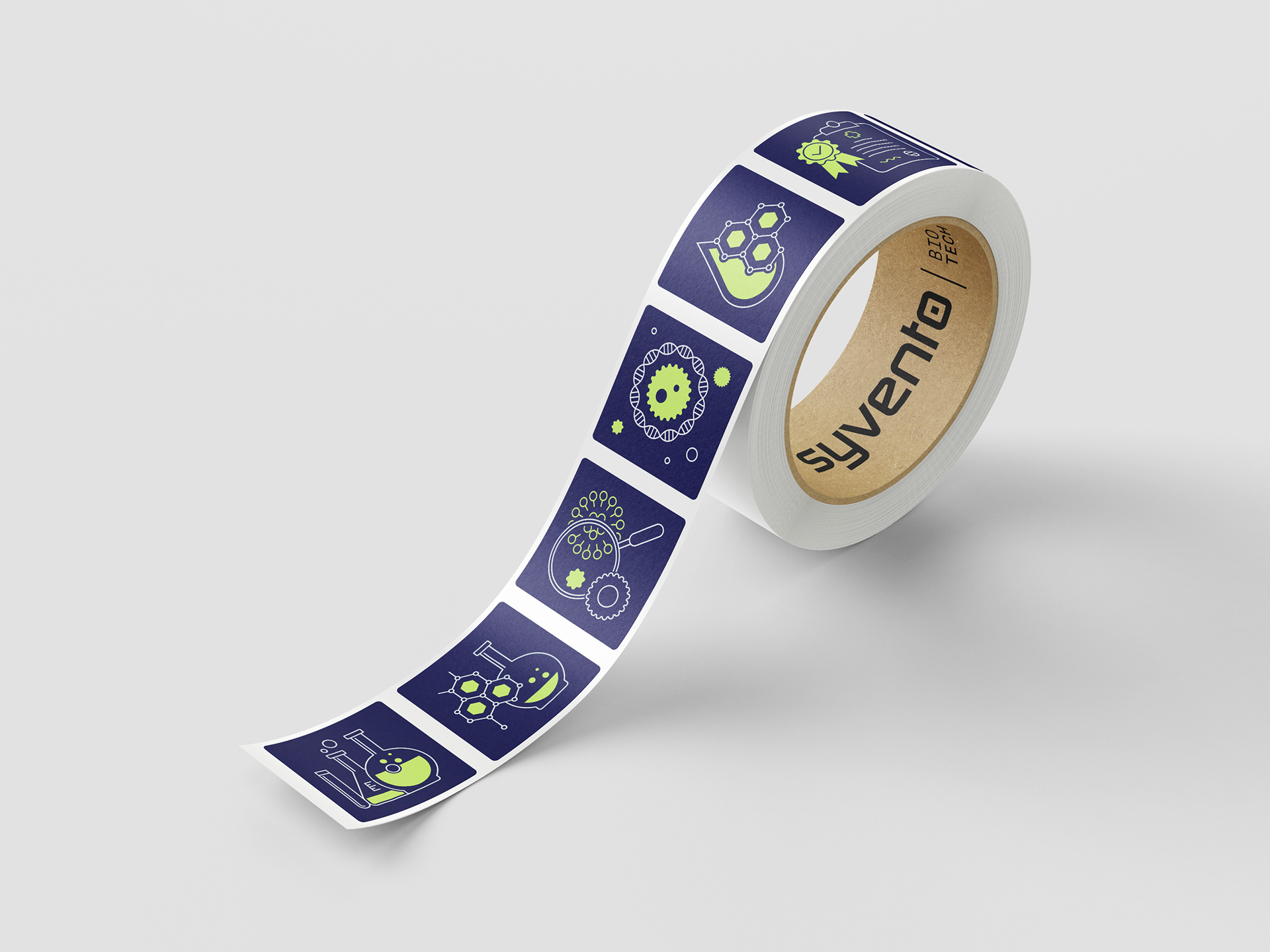
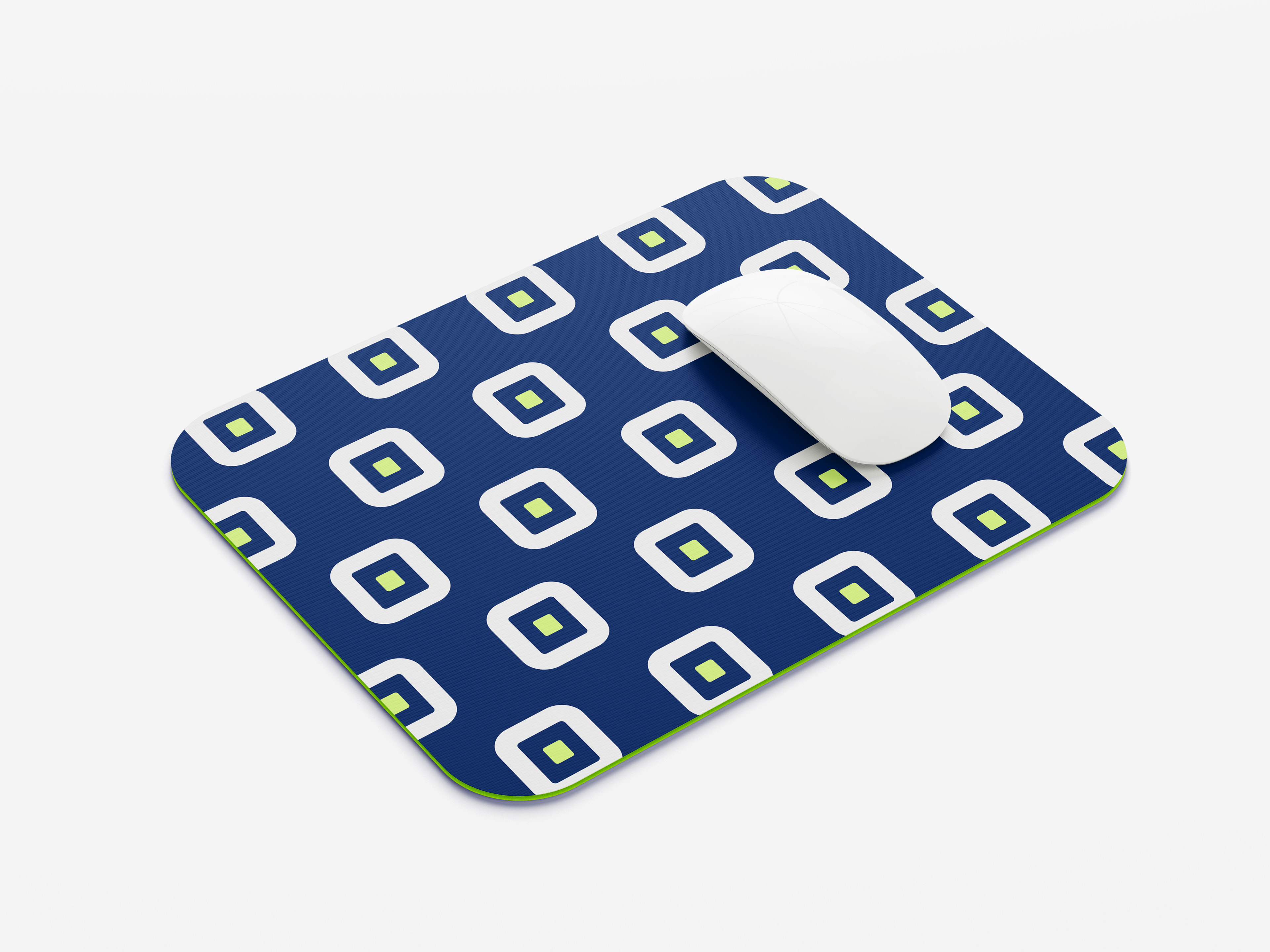
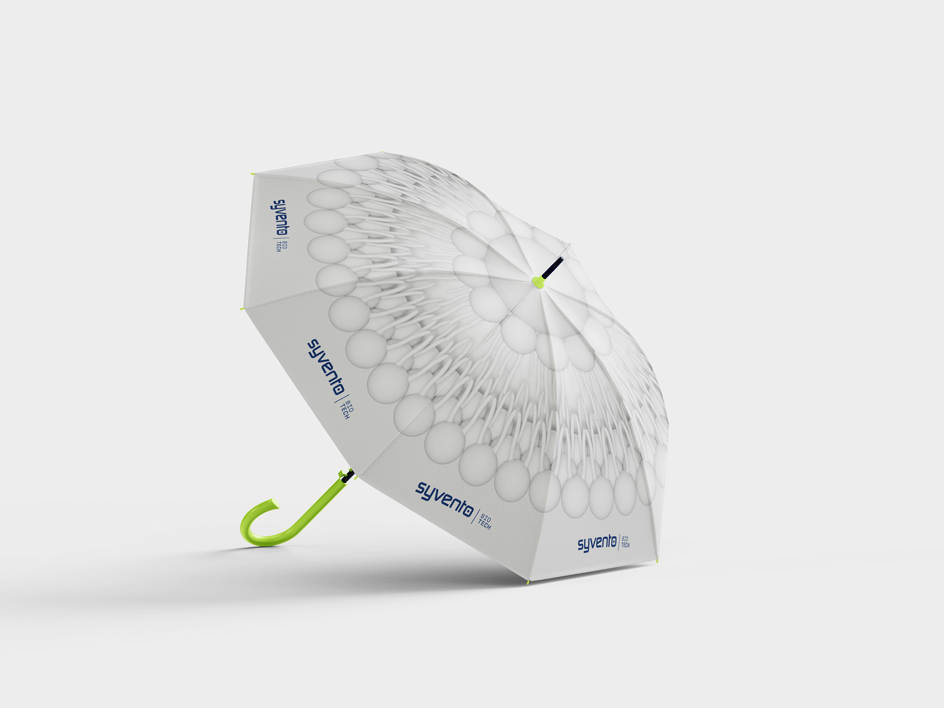
The SyVento pattern set uses the symbol to create visually stunning decoration elements by using the main brand colour, light grey neutrals and business unit-specific colours, as well as the combination of monochromatic hues at various alignments and component density. The purpose of the patterns is to create a supportive aesthetics for apparel, accessories and giveaway items.
Applied patterns.
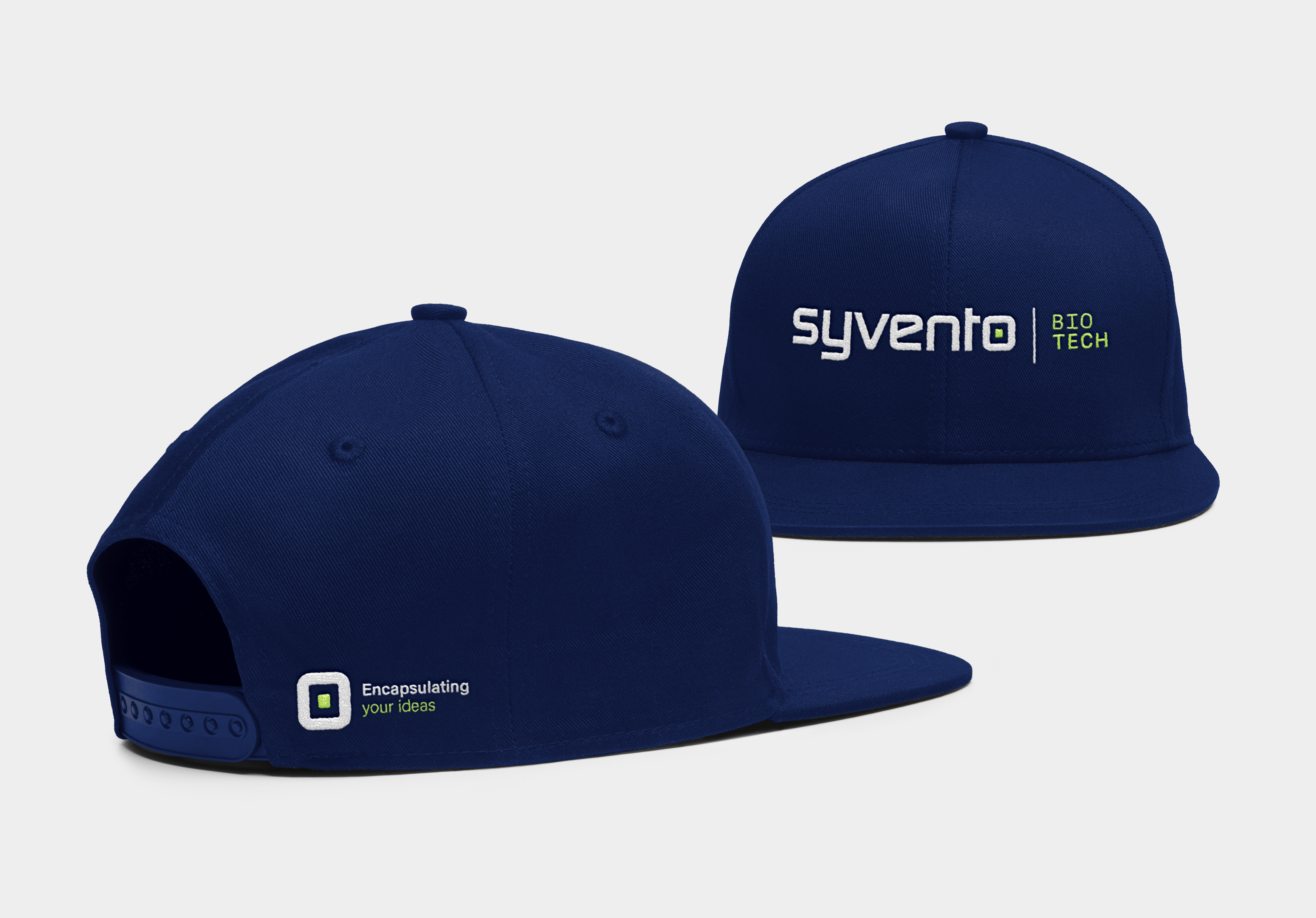
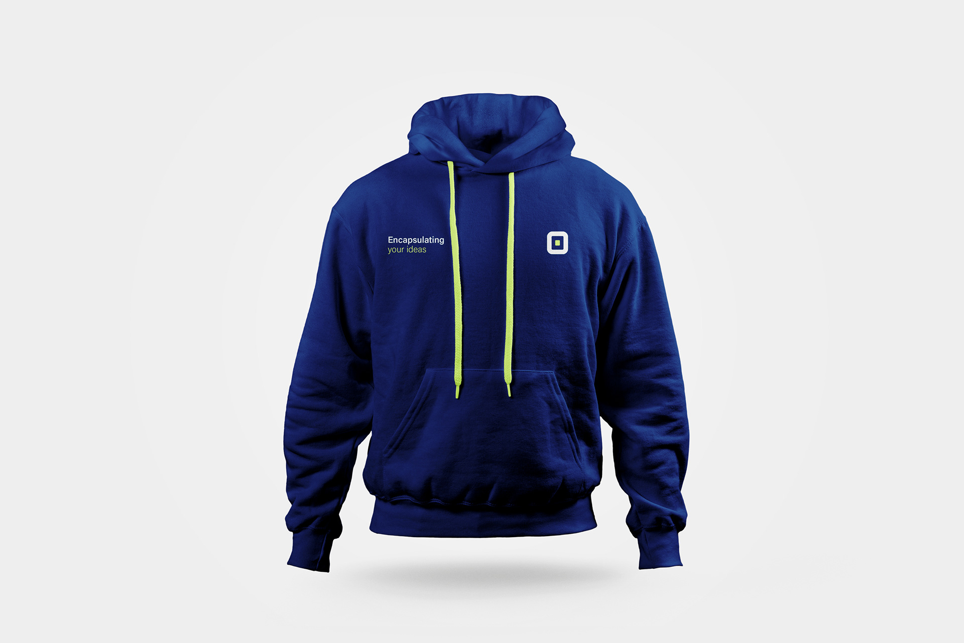
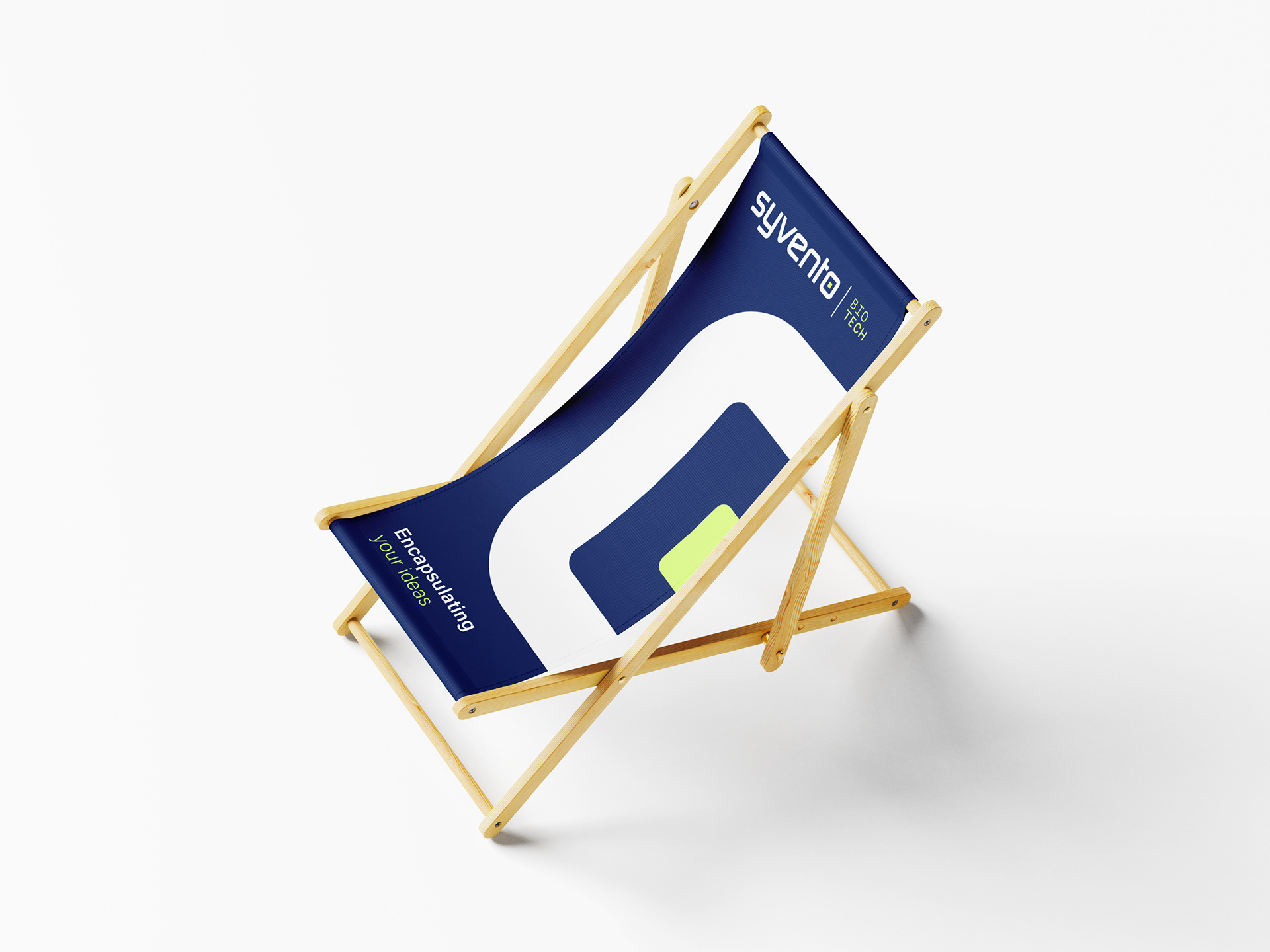
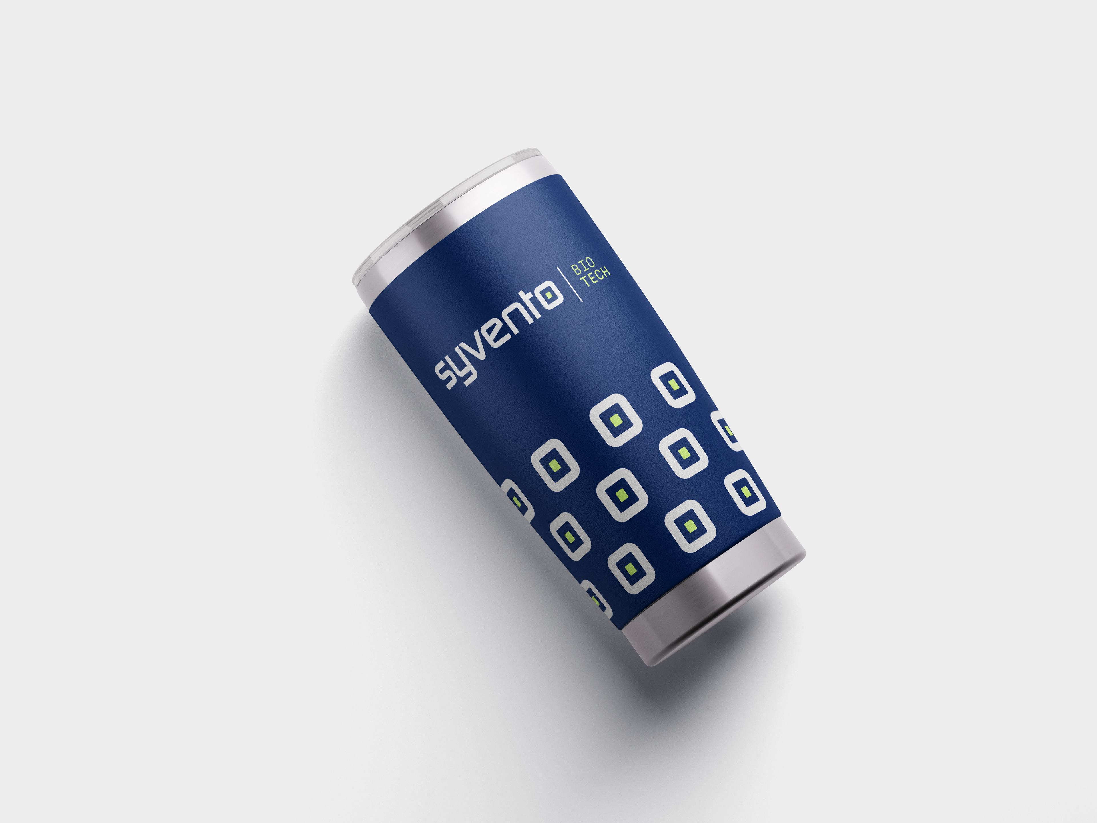
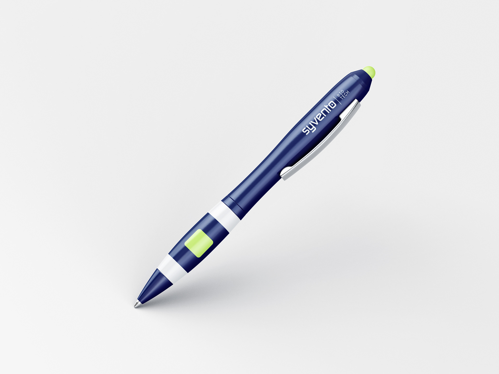
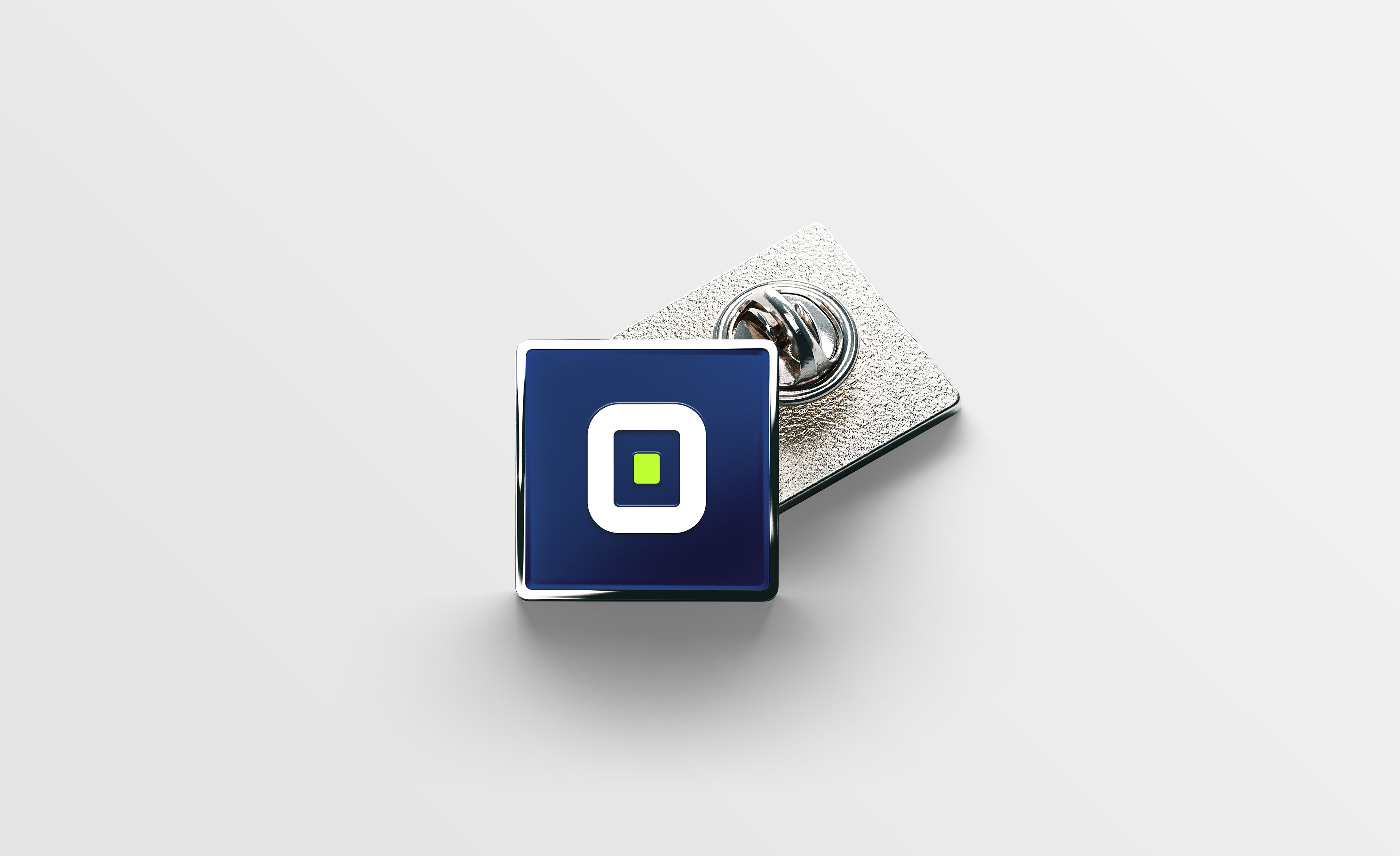
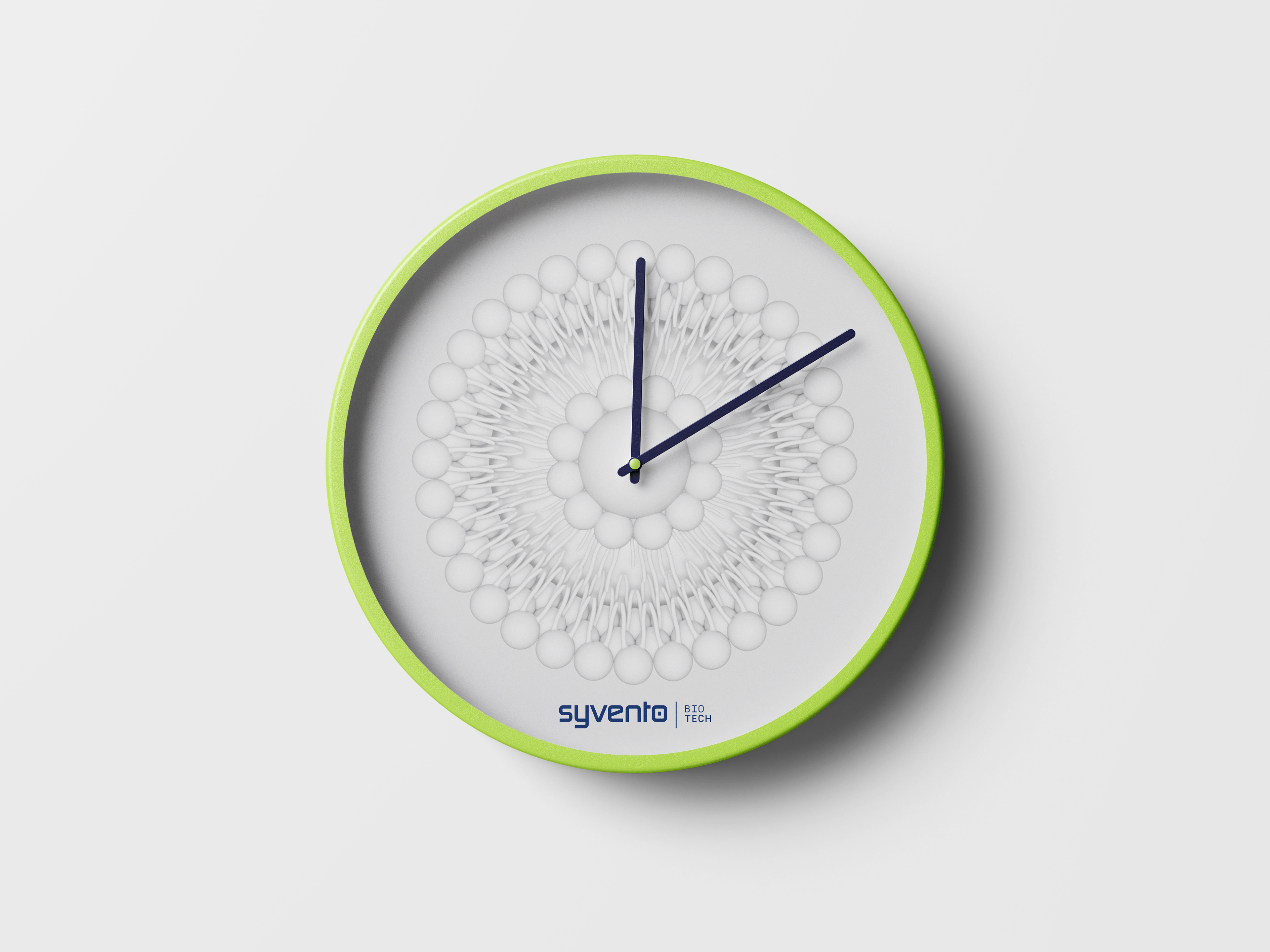
Branded giveaway items using the symbol or pattern.
The SyVento Layout is grid-based and highly structured. Due to the complexity of the industry where the brand and its business units are active, its content is scientifically manifold, therefore information has to be carefully arranged both copy-wise and visually. To effectively convey SyVento’s message, the layout has to be as straightforward as possible.

Best practices: basic grid of columns of 2, 4, 8 or 12 with significant gutter and 3, 4 or 8 rows with a simple basline.
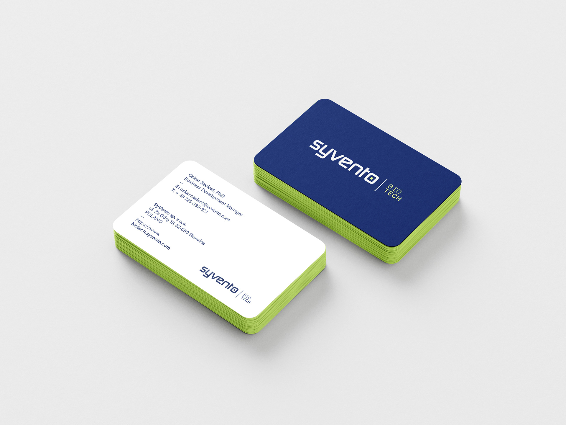
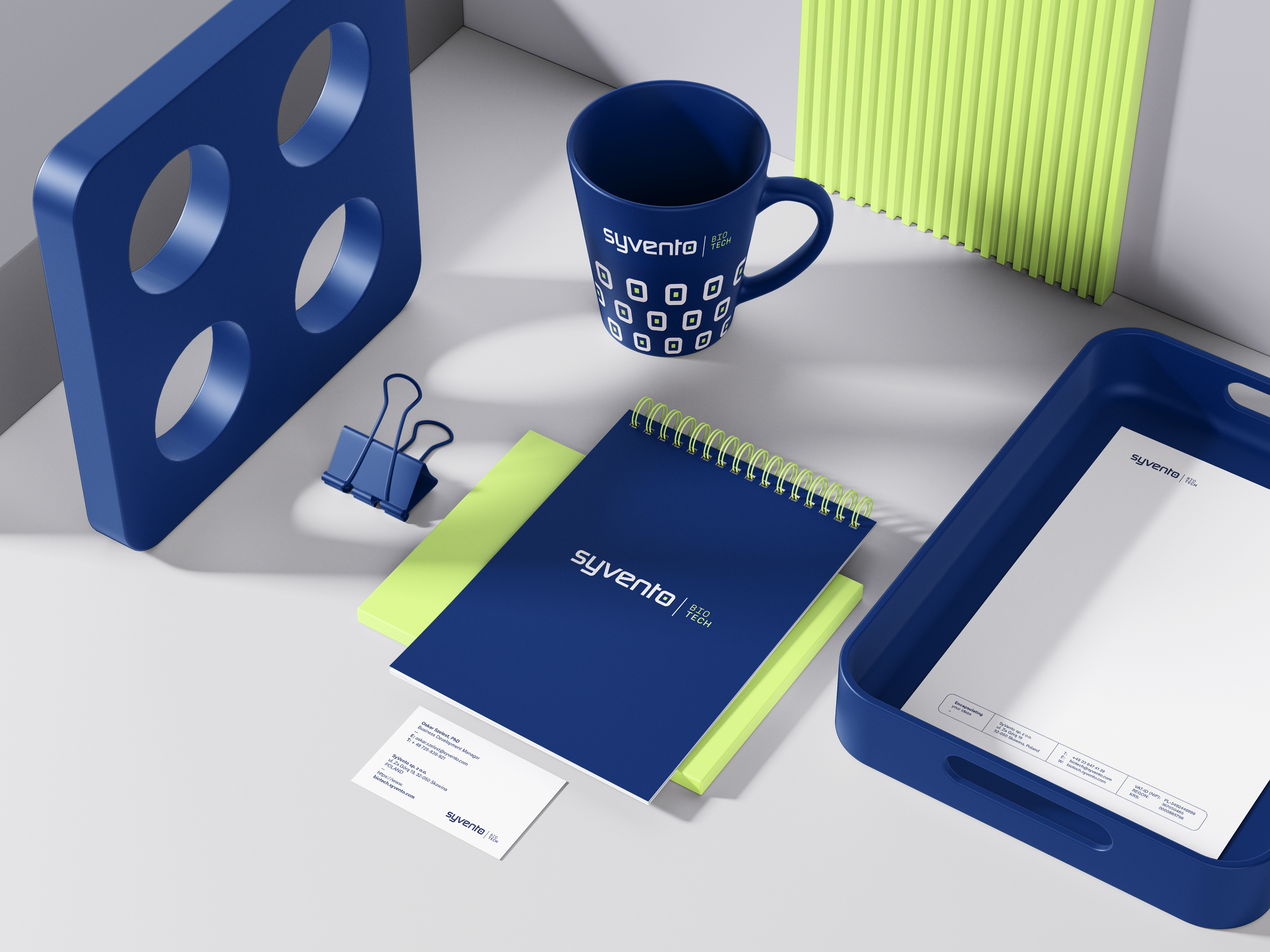

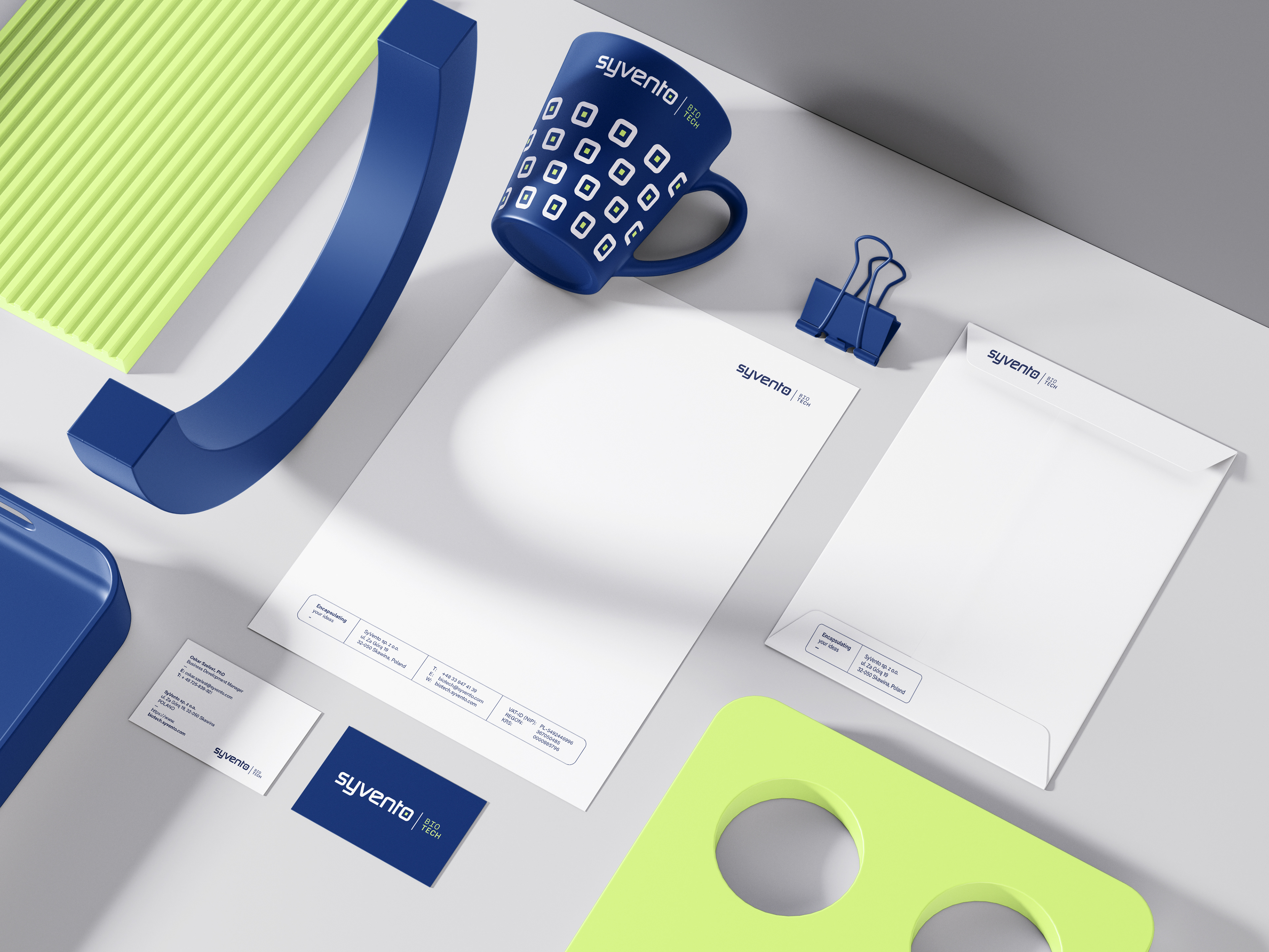
Stationery applications of the design principles.

There are custom 3D Key Visuals created exclusively for SyVento to show and explain how encapsulation of mRNA, DNA and other active substances work at the microscopic and molecular level.
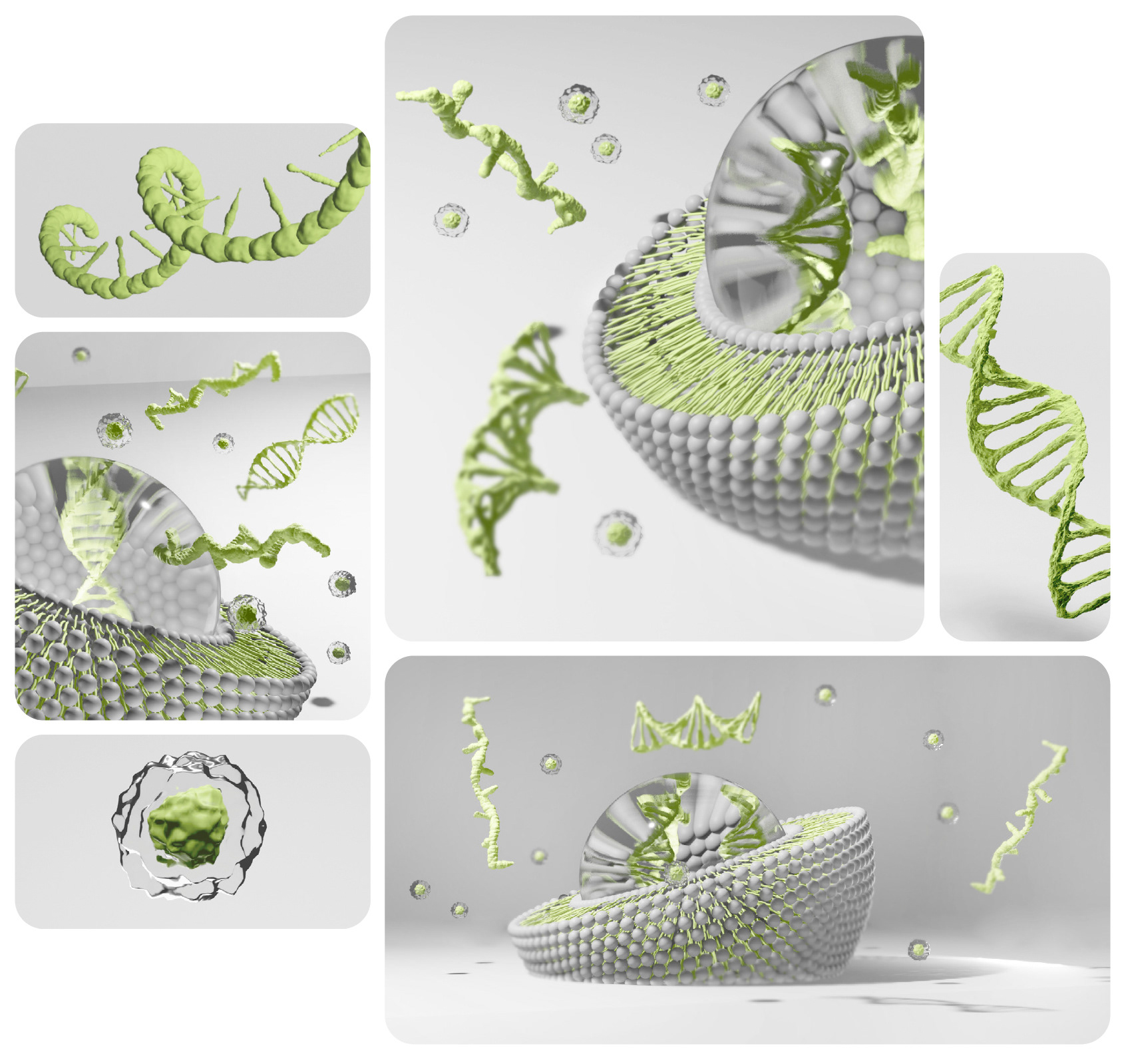
The scenes are light grey neutral infinite backgrounds with diffuse light and key elements in Business Unit-specific colours. Such elements are the cores of stem cells, RNA and DNA spirals, as well as the hydrophobic tails of the lipid bilayers.
With decorative purposes in mind there is an additional set of 3D shapes of the lipid nanoparticles existing, in white matte.
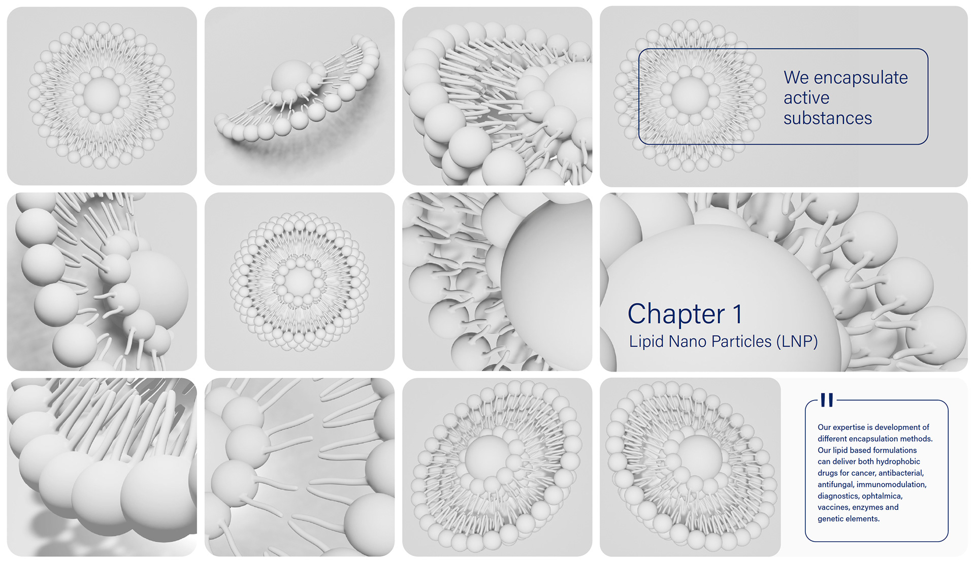
The function of these 3D secondary Key Visuals is to appear as backgrounds in various publications, presentations, even on giveaway items or office walls.
The main SyVento graphic element is the rounded rectangle, which can be horizontally or vertically elongated or square. The corner radius depends on the platform where it is used. The rounded rectangle can be used as an outline to drive visual focus, it can be filled as a bounding box for copy, or function as card for digital design items and content box for images.

The SyVento typeface has been attentively selected in order to carry out the core brand message of being state-of-the-art, innovative yet subtle and highly efficient. The main umbrella brand’s font family is Klavika, while the Business Units’ is Acumin Pro, with the first fallback option being Robot and the second Arial.
Other than being functional and aesthetic, the typeface also serves the purpose of being recognisable and distinct among competitors. When in use, typography has to be legible, structured by high contrast and feature generous applied spacing.

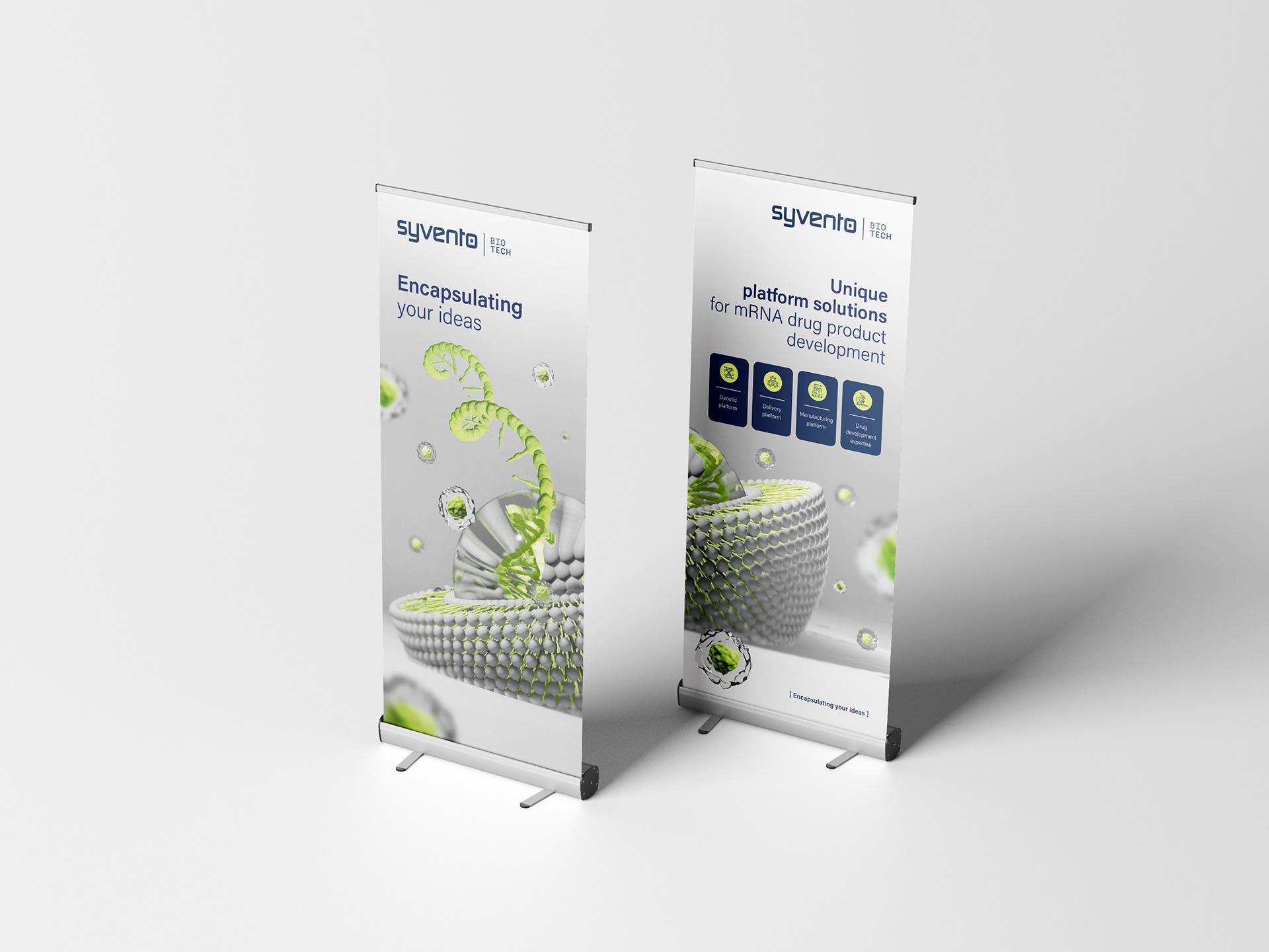
The SyVento icon set is a great tool to draw attention to content and visually express complex, sometimes even abstract topics. The SyVento icons always feature rounded corners and a mix of outlines and fills. Suited to be used on a dark background, icons use light grey neutral outlines and Business Unit-specific highlight fills in their respective colours and hues.

The icons are simplified, but also convey a complex message when paired with the highlighted details.