

ZIIJN has been commissioned in late 2016 to recreate the corporate identity of the storage and drying specialist QBL.
History's very first Polish ISPO Award Winner company required us to communicate visually what they stand for: innovation and craftsmanship. As one of the fastest growing storage and drying machinery manufacturer in the sports industry, they set high standards for themselves. To offer the most flexible solution on the market.
We worked closely with the in-house team to create a way to show stability and flexibility in all channels of visual communication. The original logo got crisp curves and a bright hue of blue, representing the sky and the mountains, where the idea of QBL is born. At the highest peak.
Our biggest challenge was to equally fit the visuals into the traditional iron-manufacturing and the dynamism of sports. We also needed to find the best fitting motto and a sign that stands alone and being internationally recognizable.
If you love wintersports and next time you check in to your favourite resort, remember that the 'Q' sign is a guarantee that your gear is at the best place when you are resting and relaxing.
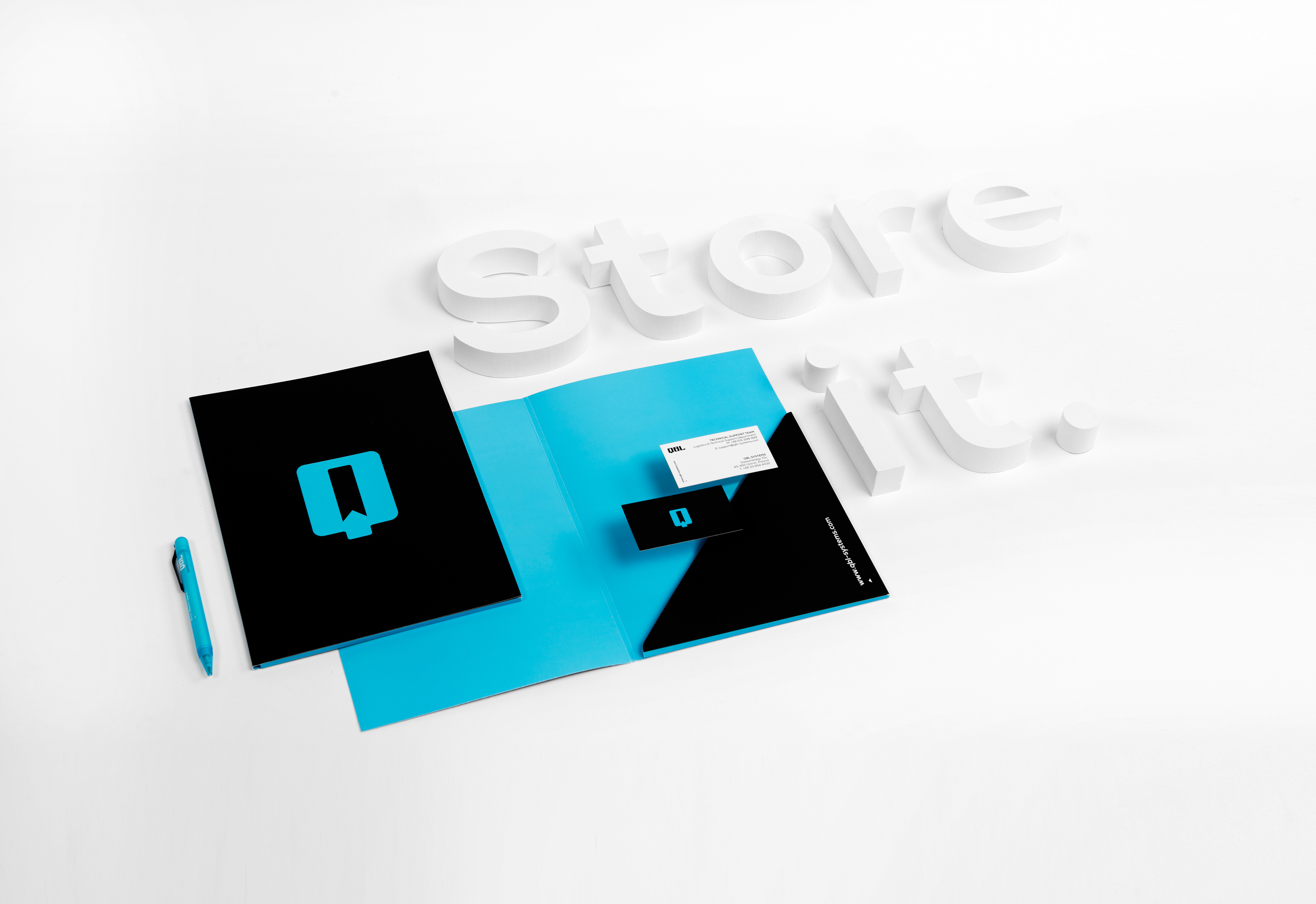
QBL - Dry it. Store it. Use it.
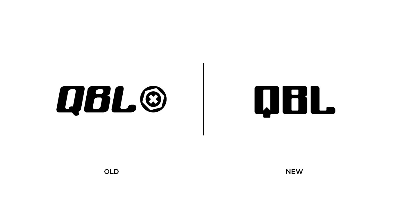
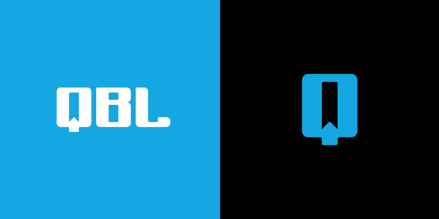
Logo anatomy.


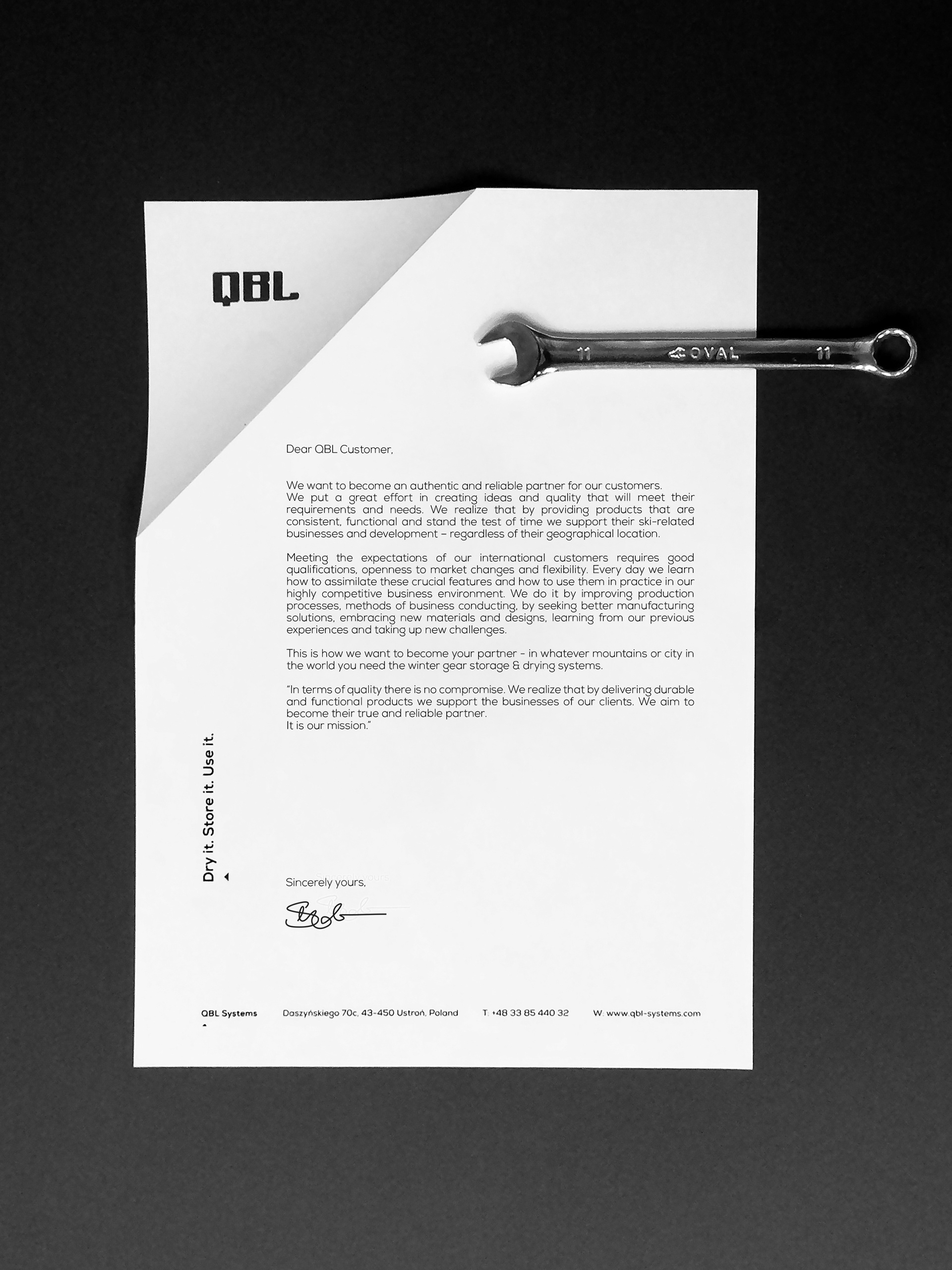

Corporate layout.
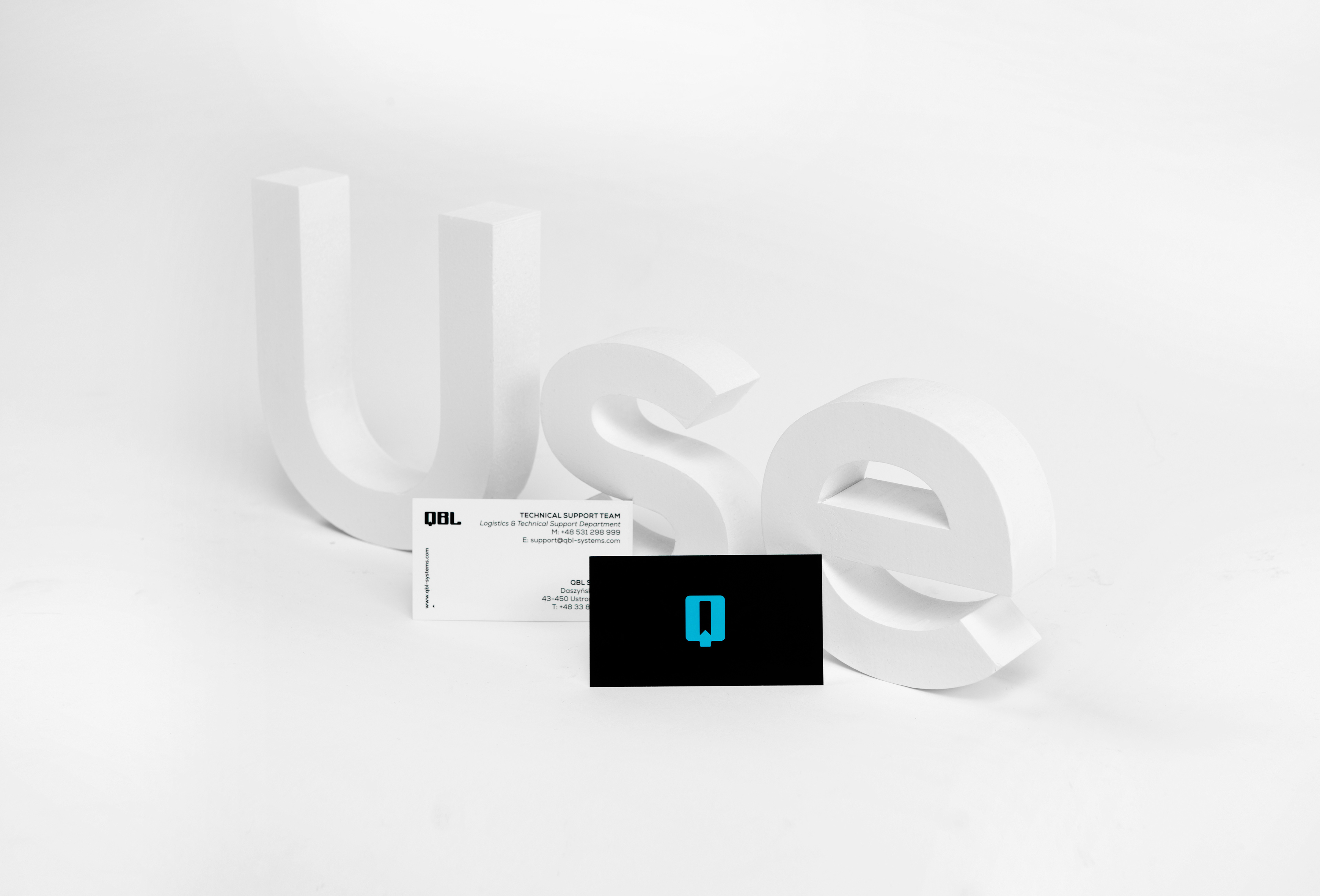


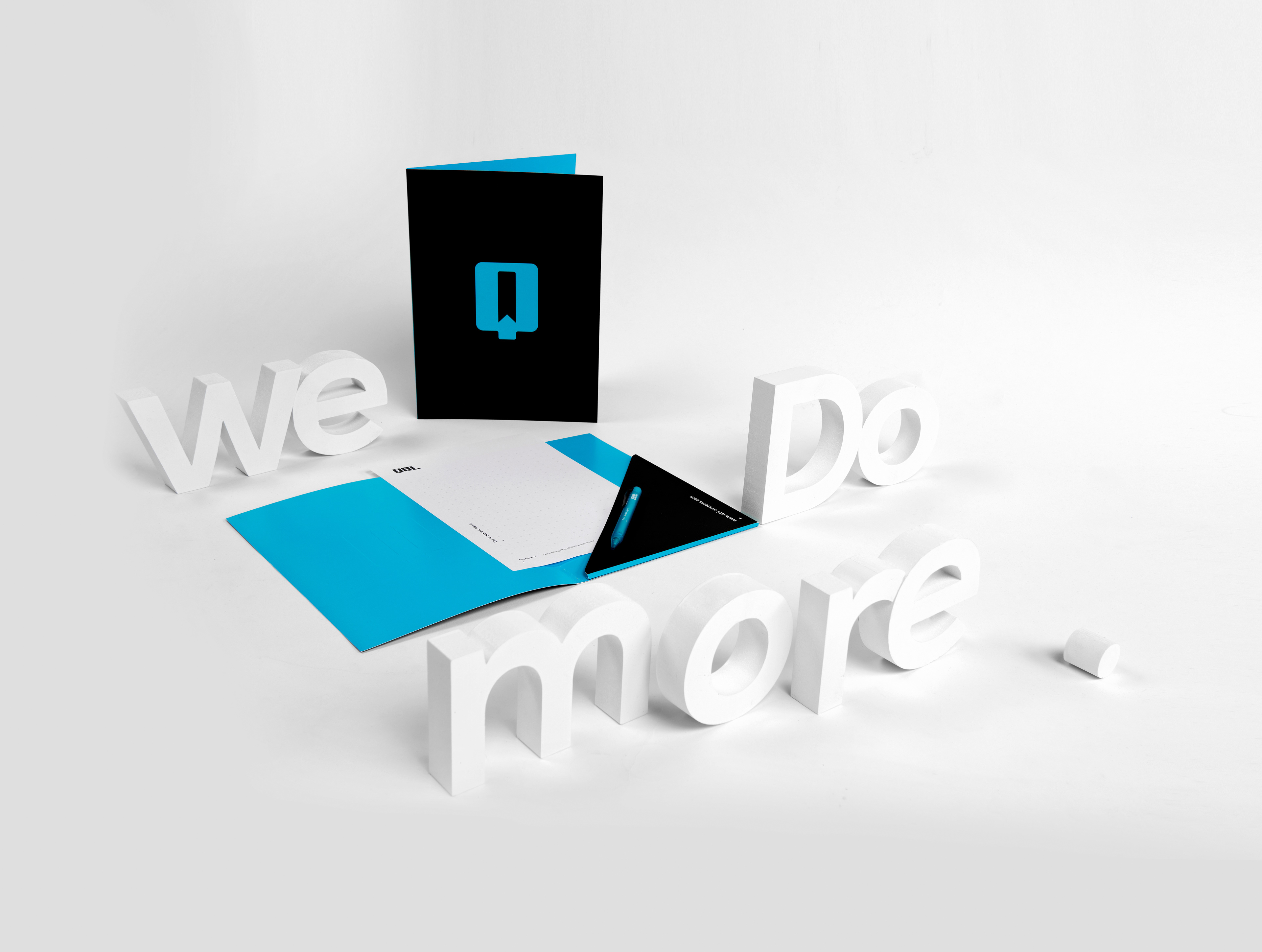
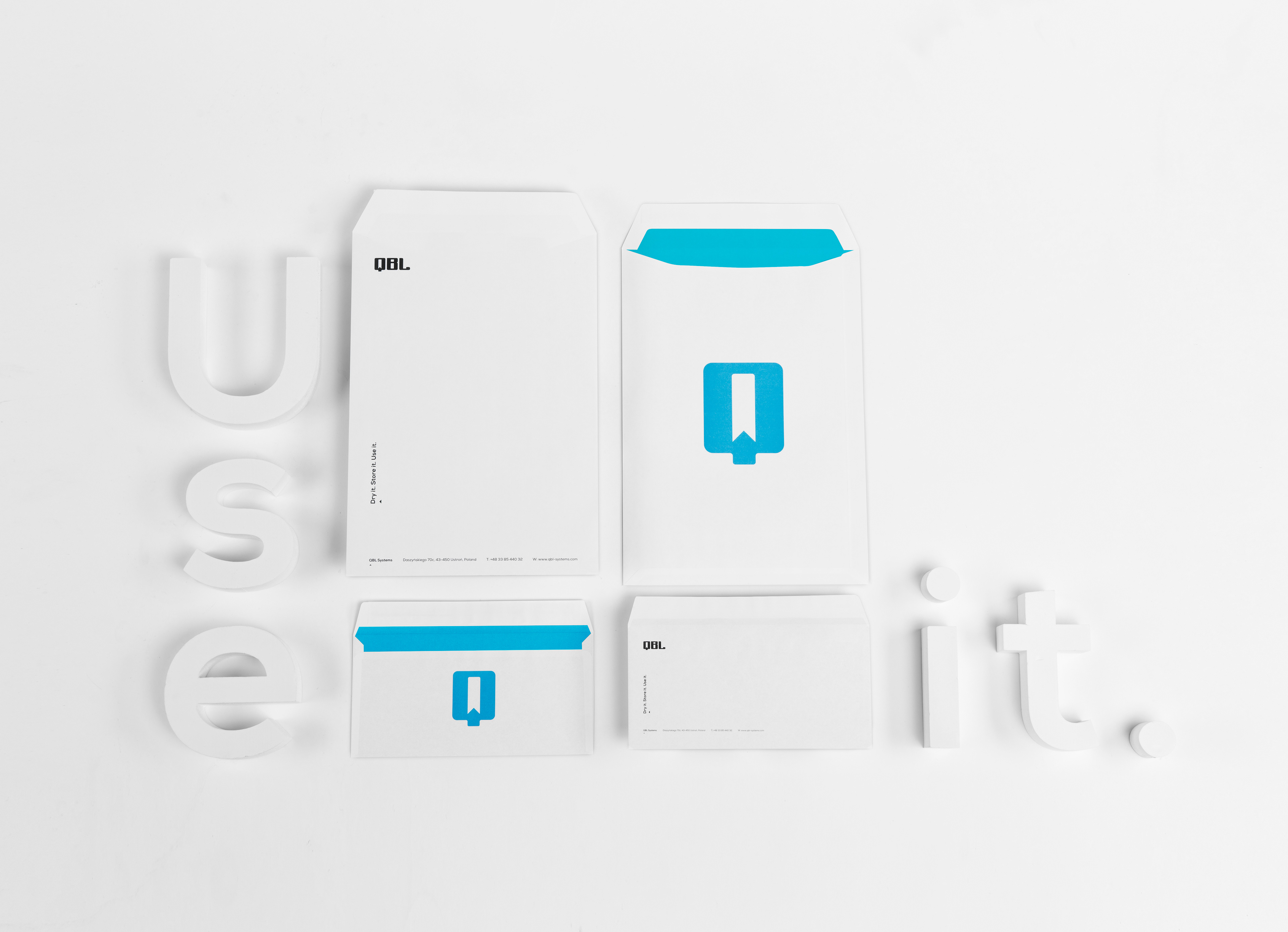
Stationery.
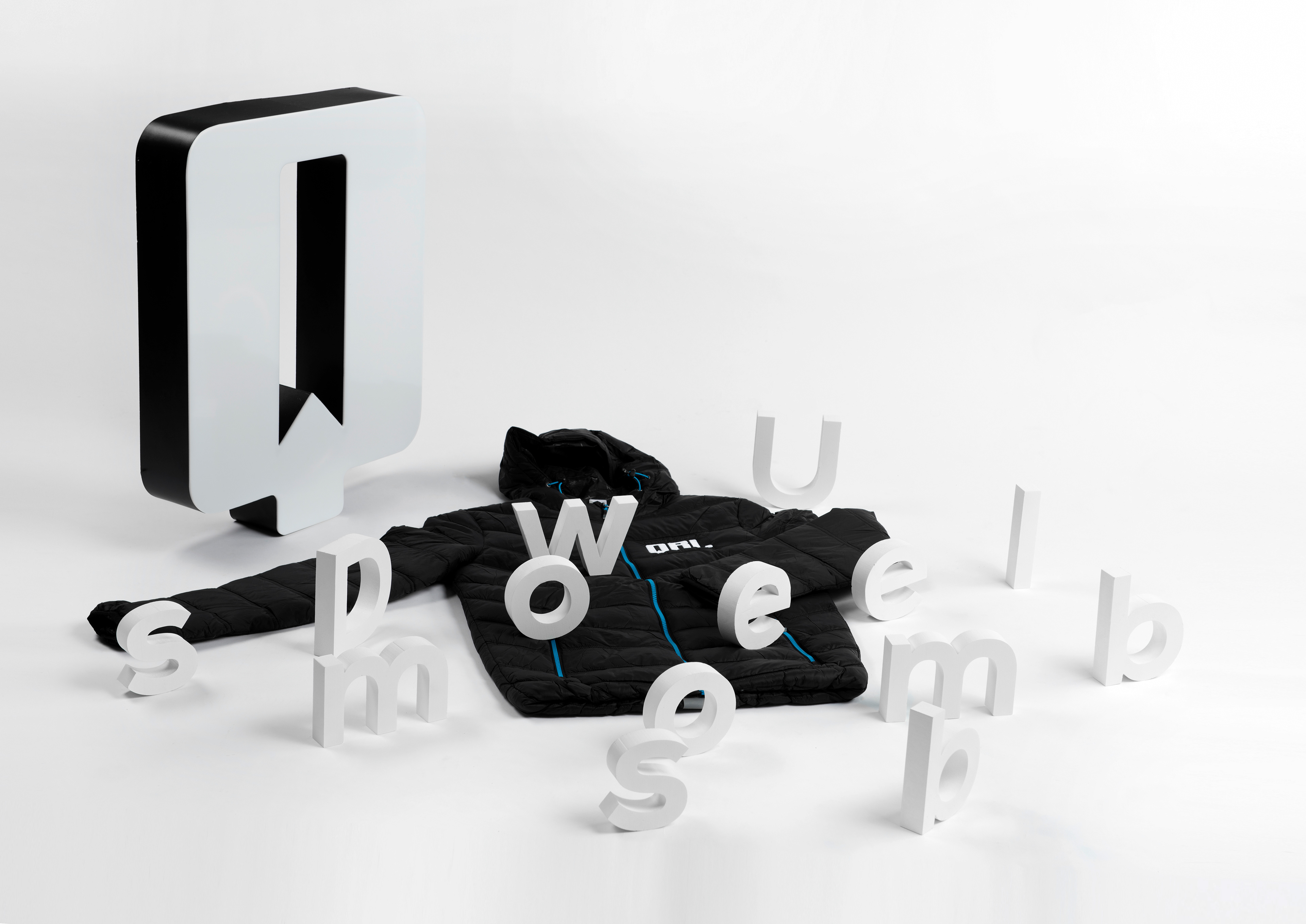
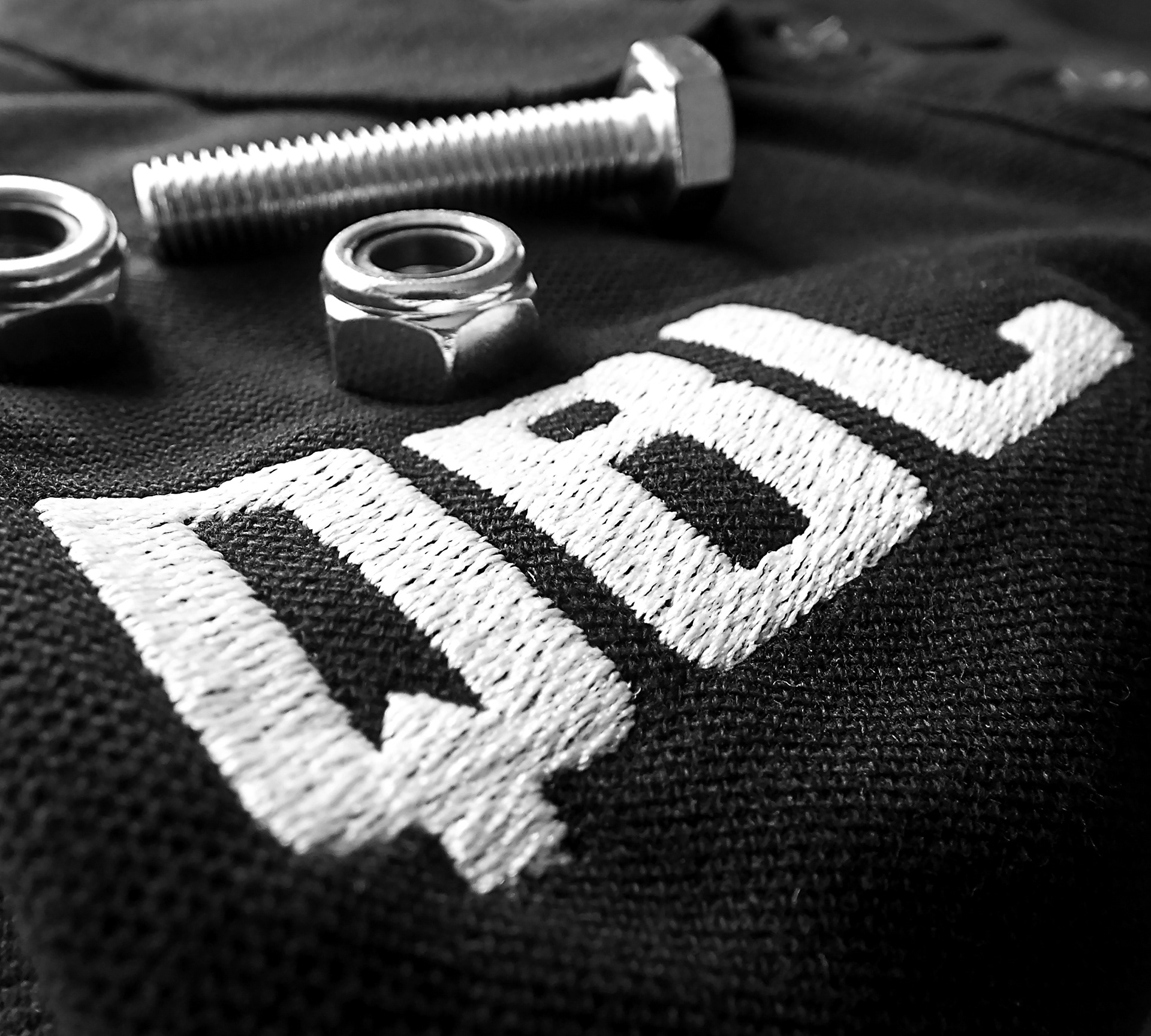
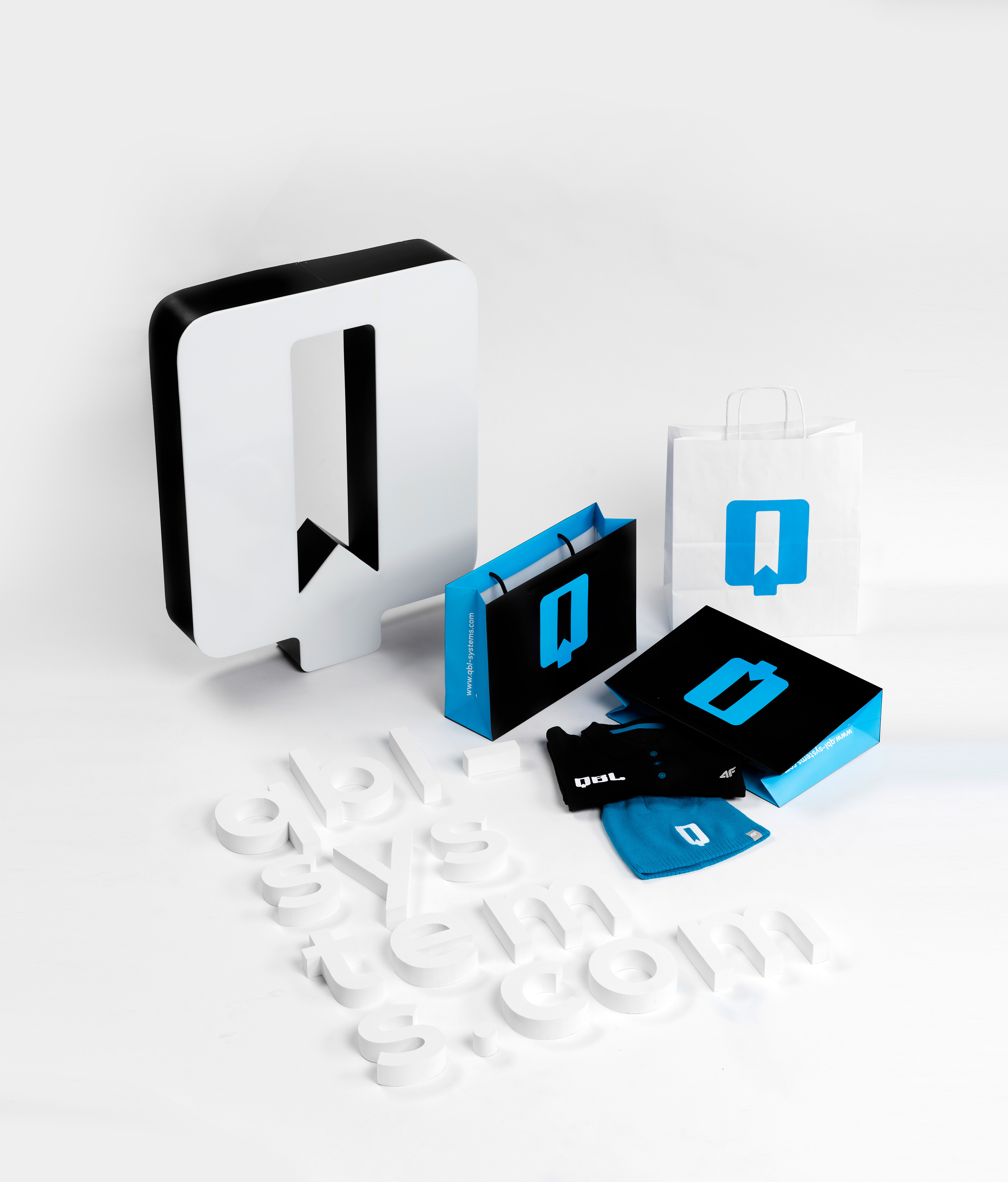
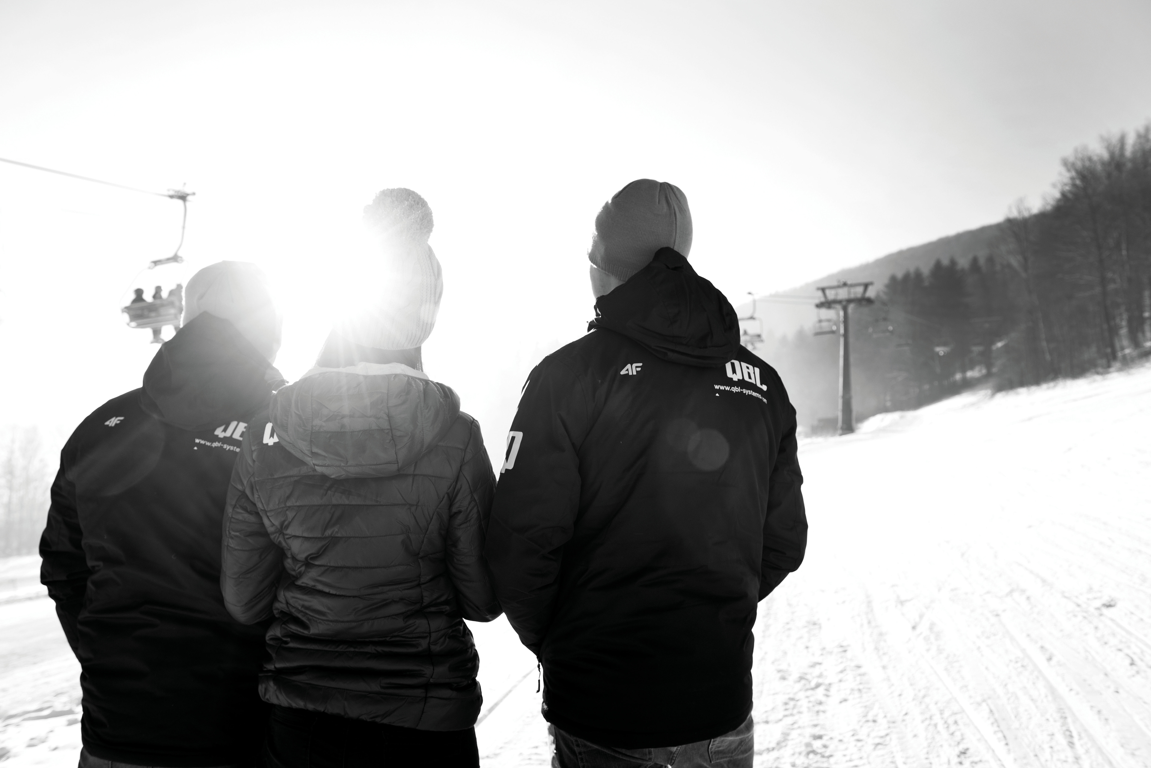
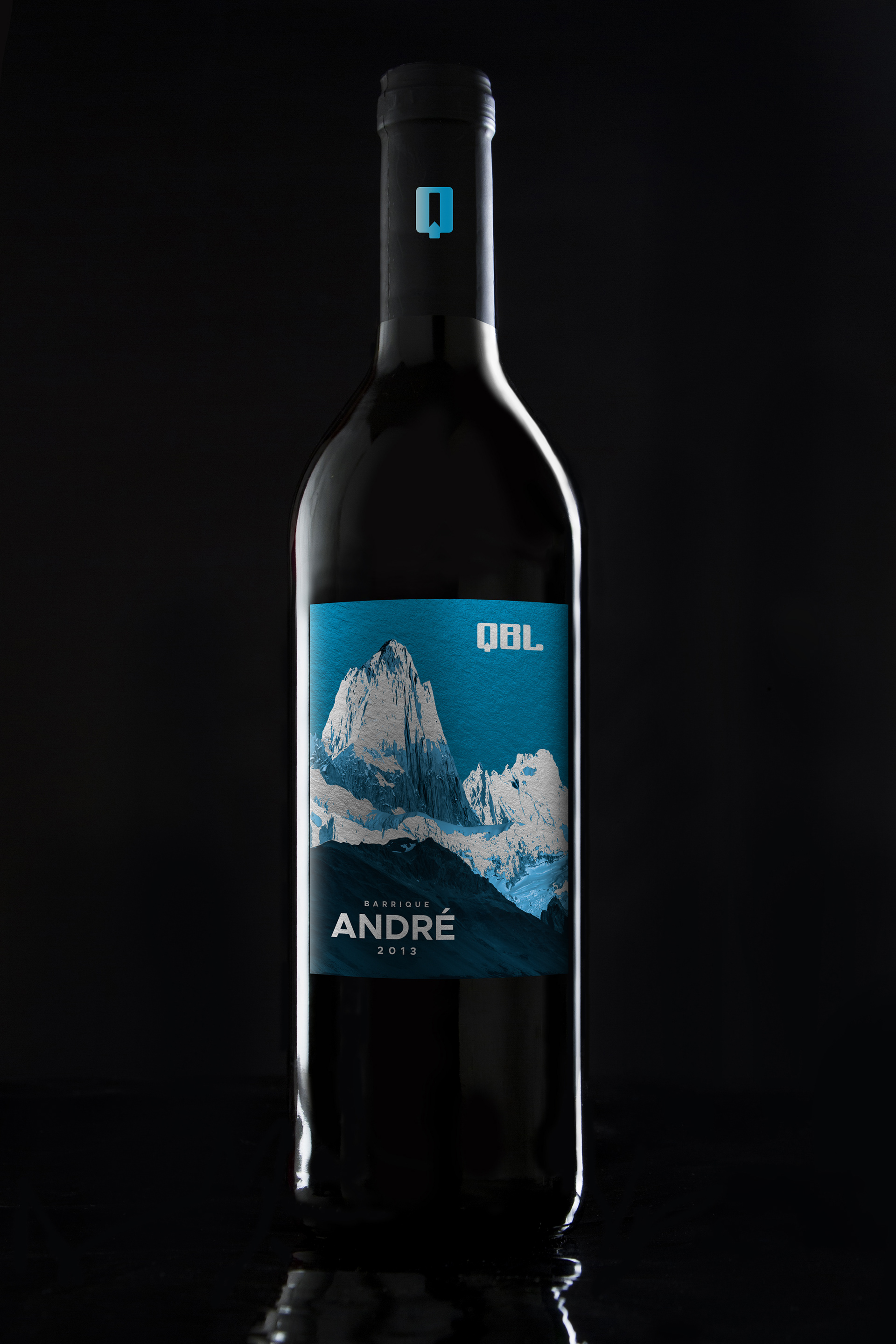
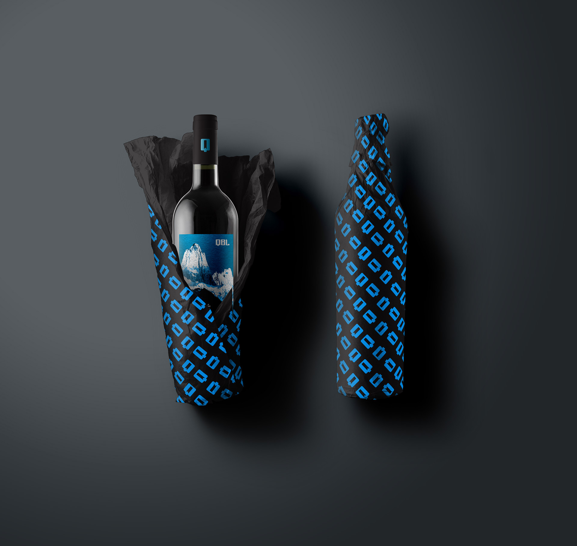
Corporate apparel.
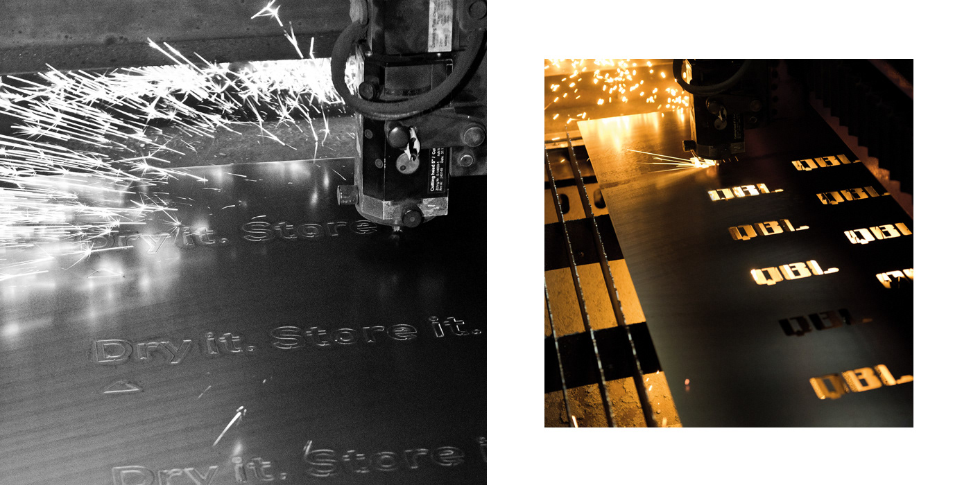

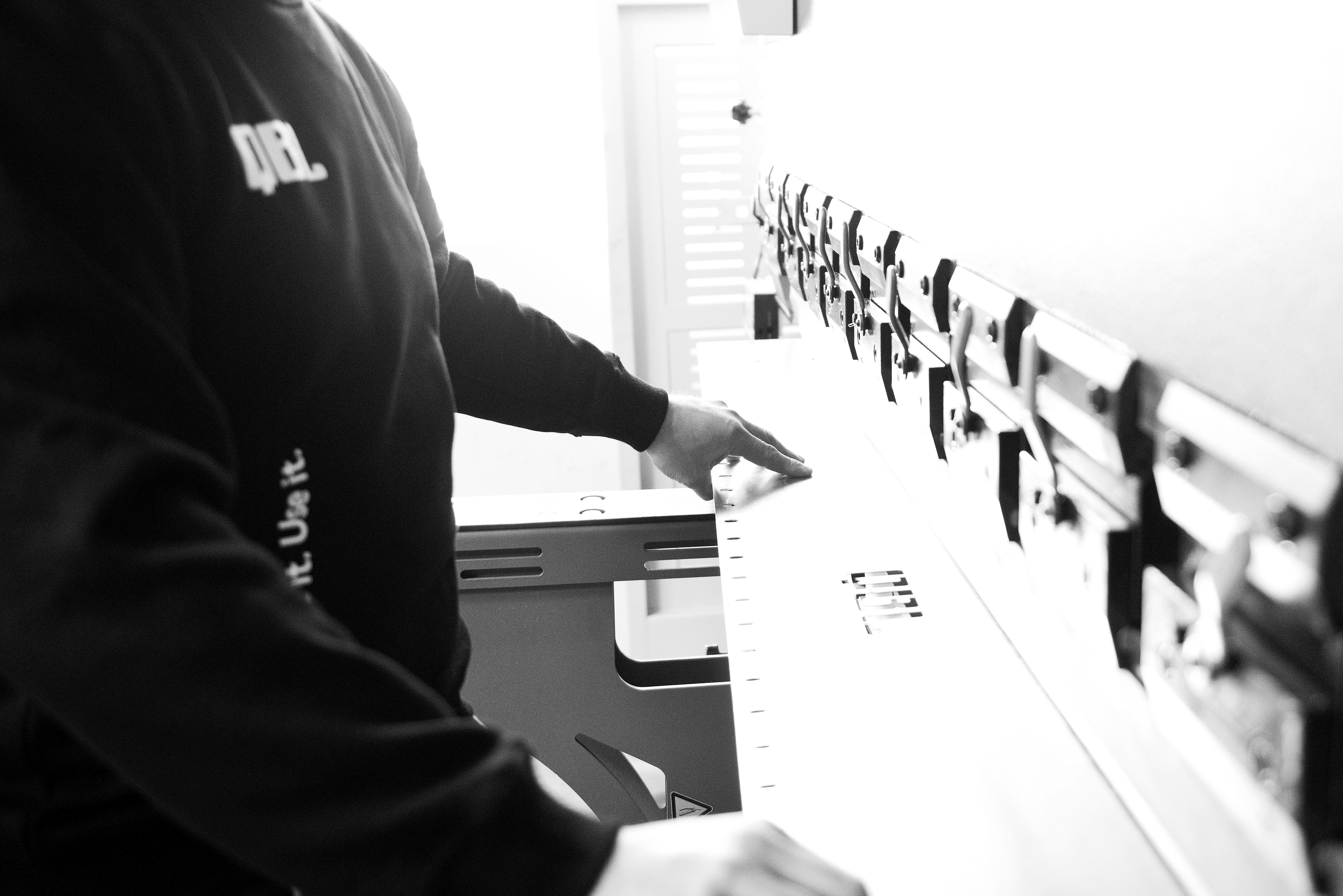
Manufacturing.
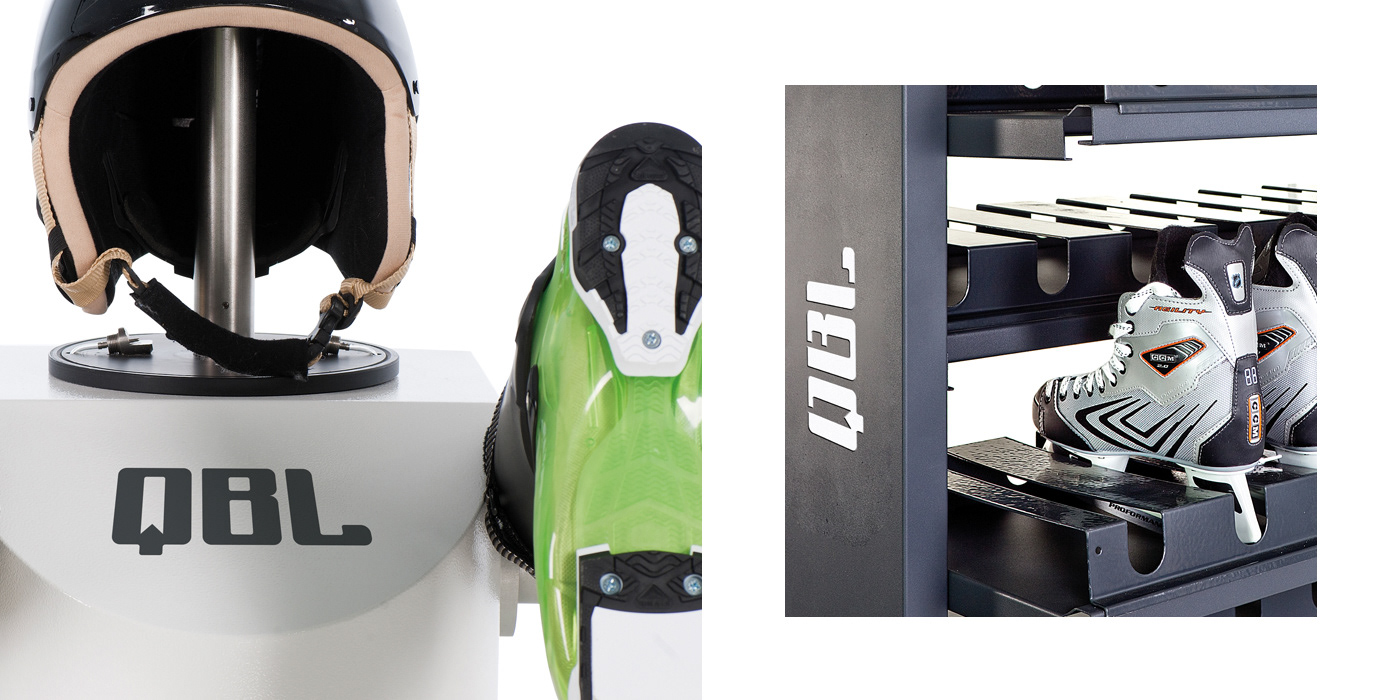
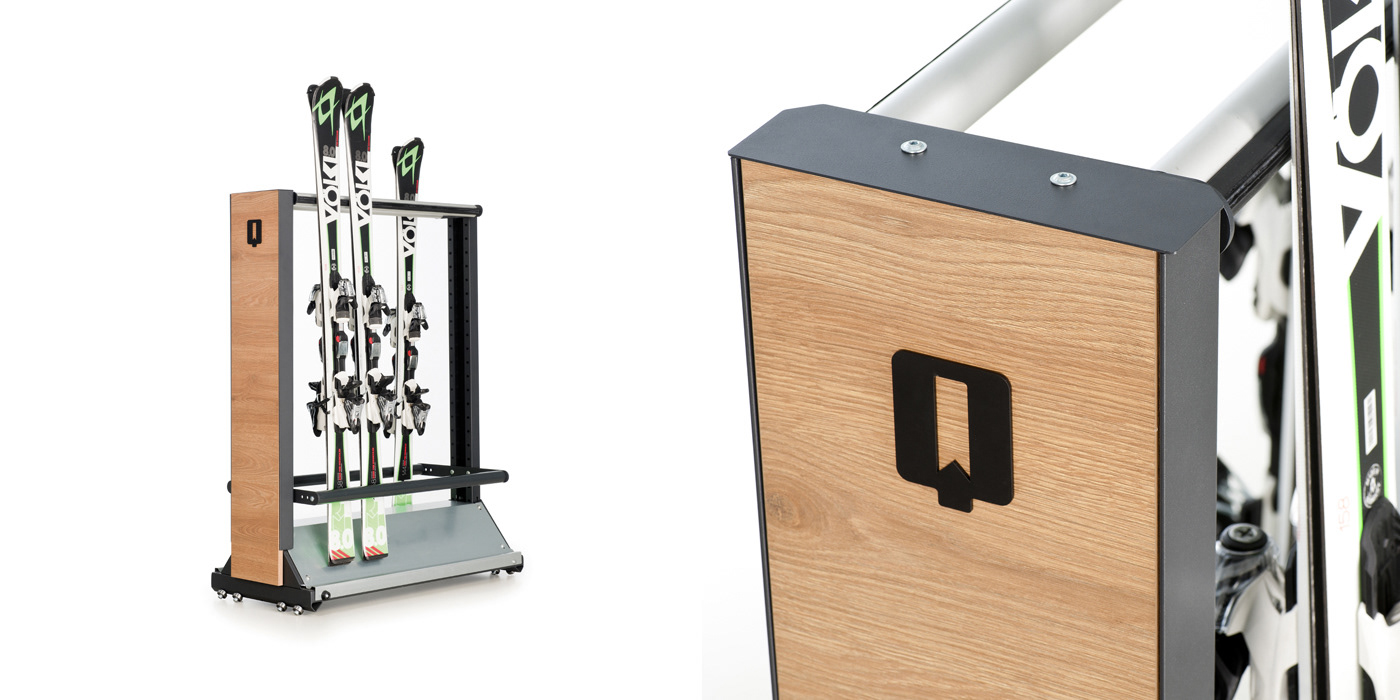
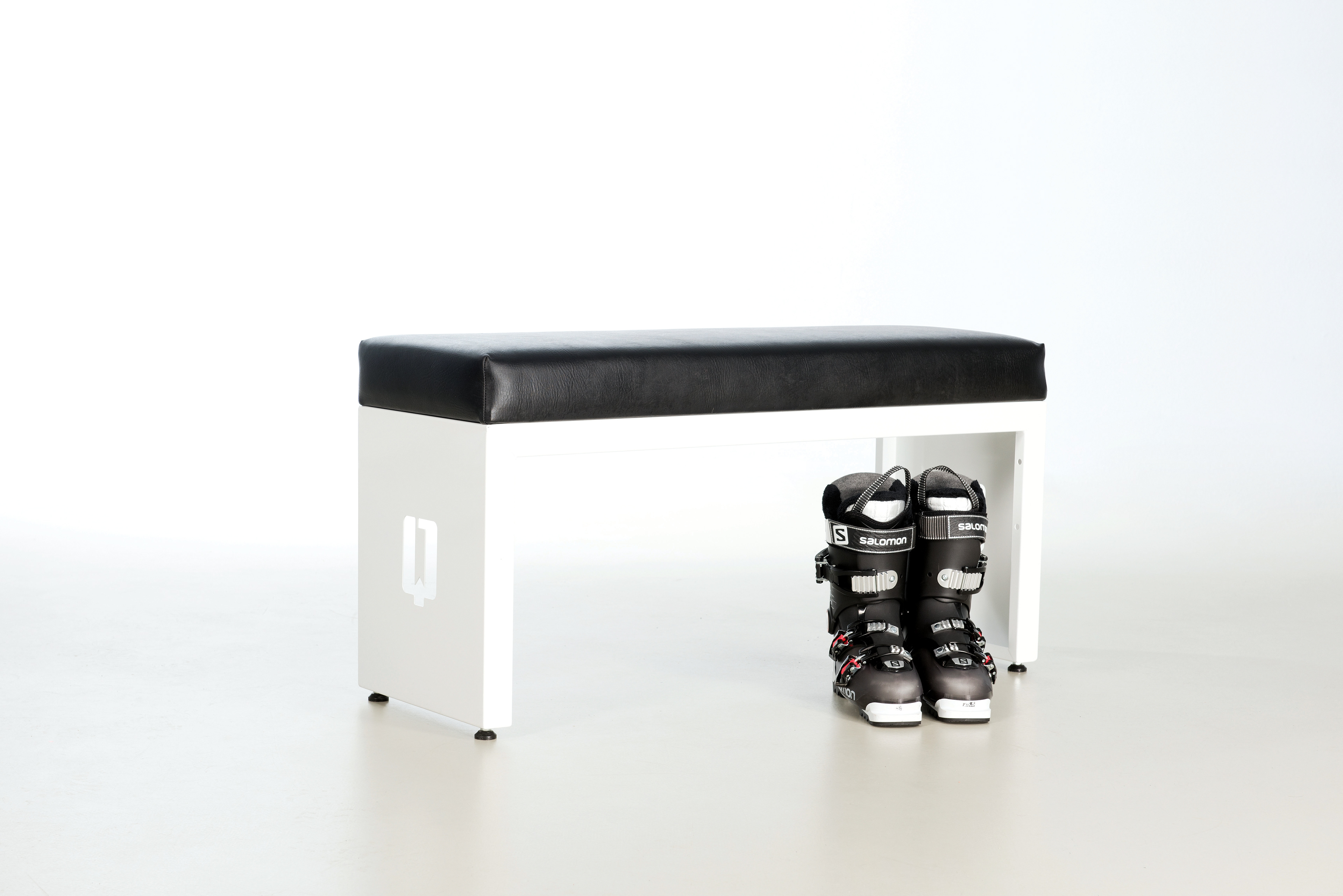

Product sortiment.
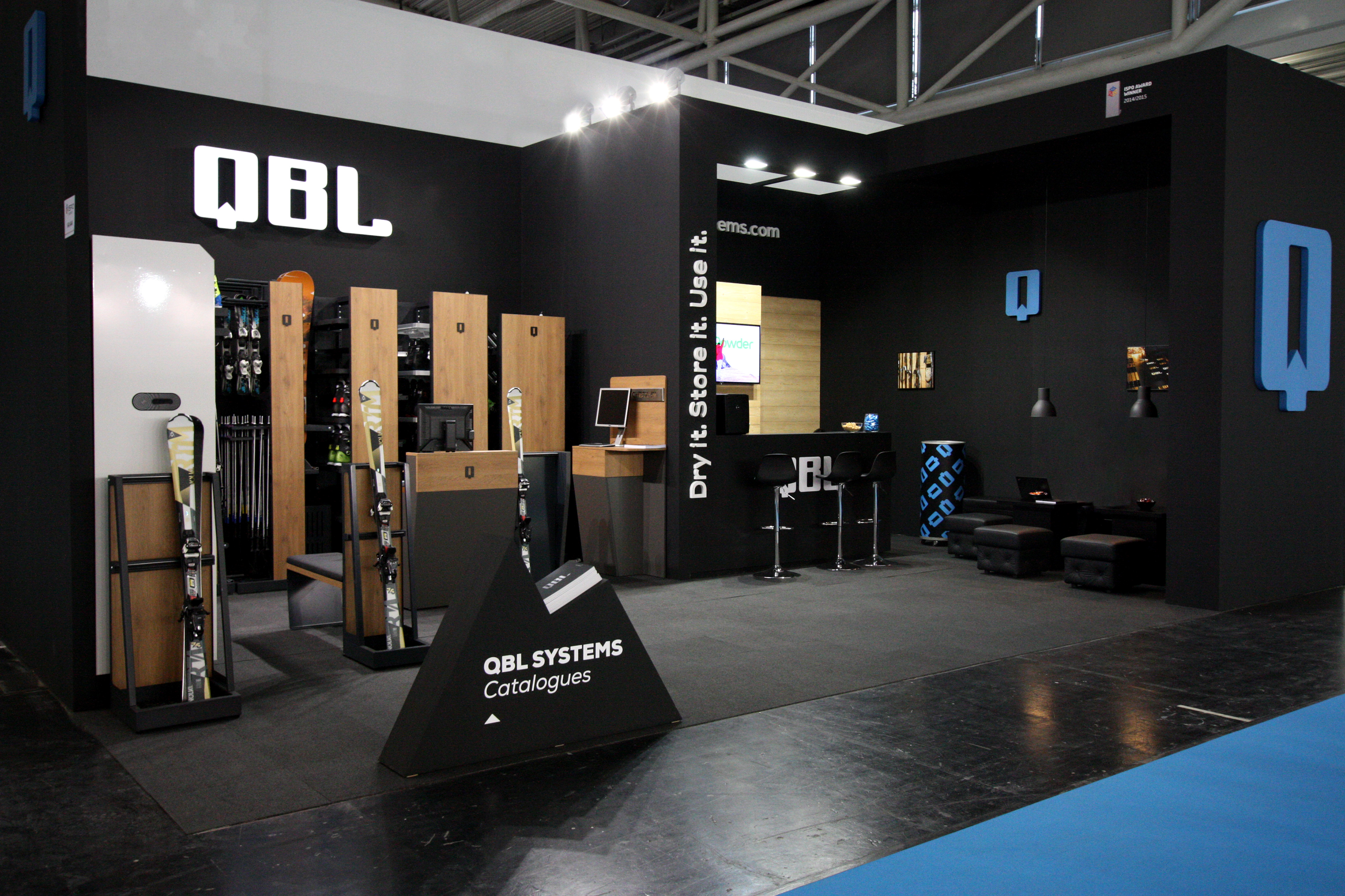
ISPO 2017 trade show booth design and corporate giveaway gift.

Special thanks for the photos to Mariusz Gruszka.