
New Era Materials is not an average B2B firm on the advanced composites manufacturing landscape. The company has developed a breakthrough technology that allows serial production of composite elements based on snap cure epoxy resins. Thanks to this advantage they accompanied in their material and application development with various industry leaders and major players in sports, renewal energetics, aviation, 3D printing, consumer electronics, mobility, medical and construction.
But how did it start?
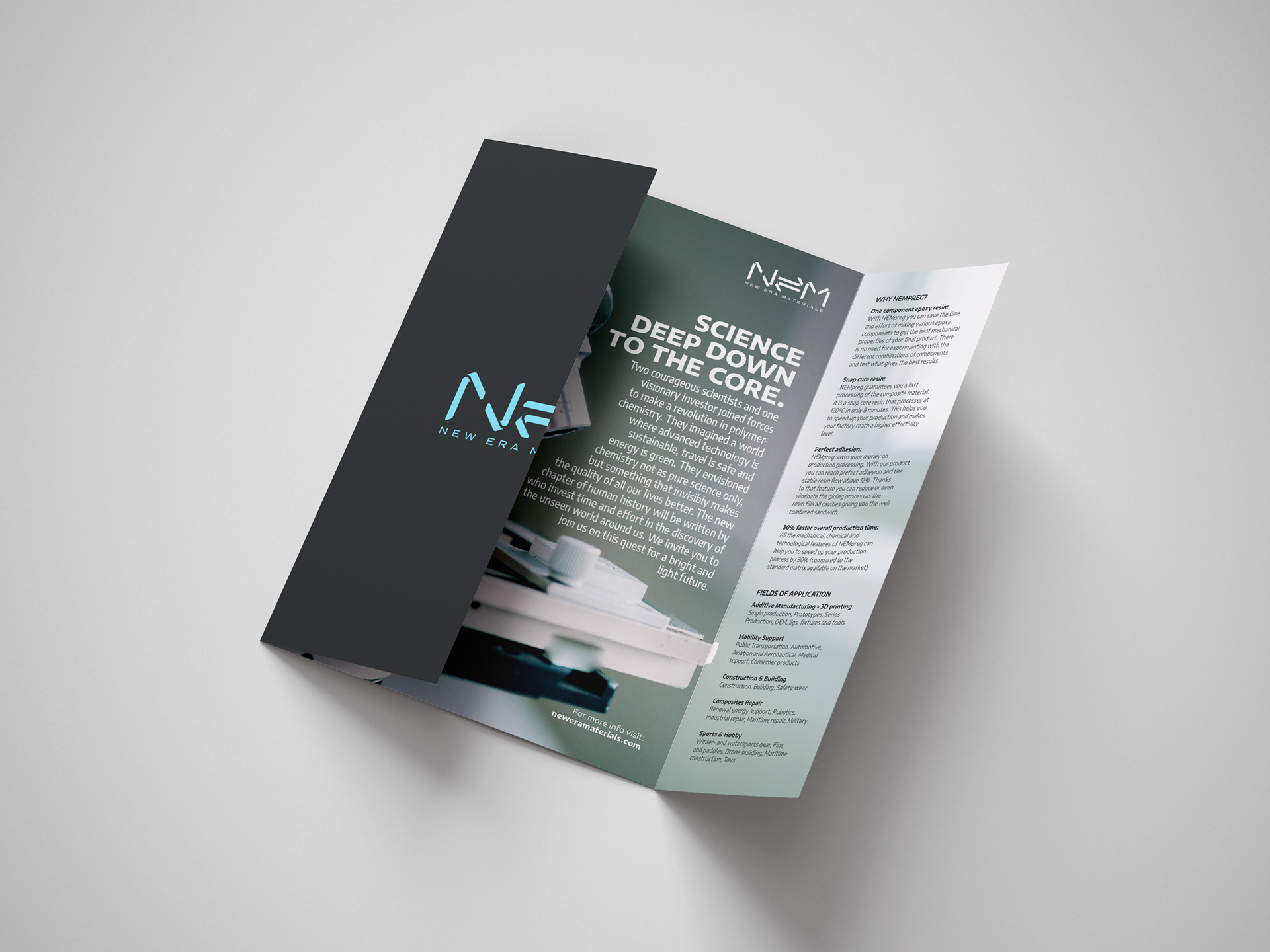
Two courageous scientists and one visionary investor joined forces to make a revolution in polymer-chemistry. They imagined a world where advanced technology is sustainable, travel is safe and energy is green. They envisioned chemistry not as pure science only, but something that invisibly makes the quality of all our lives better. The new chapter of human history will be written by those who invest time and effort in the discovery of the unseen world around us.

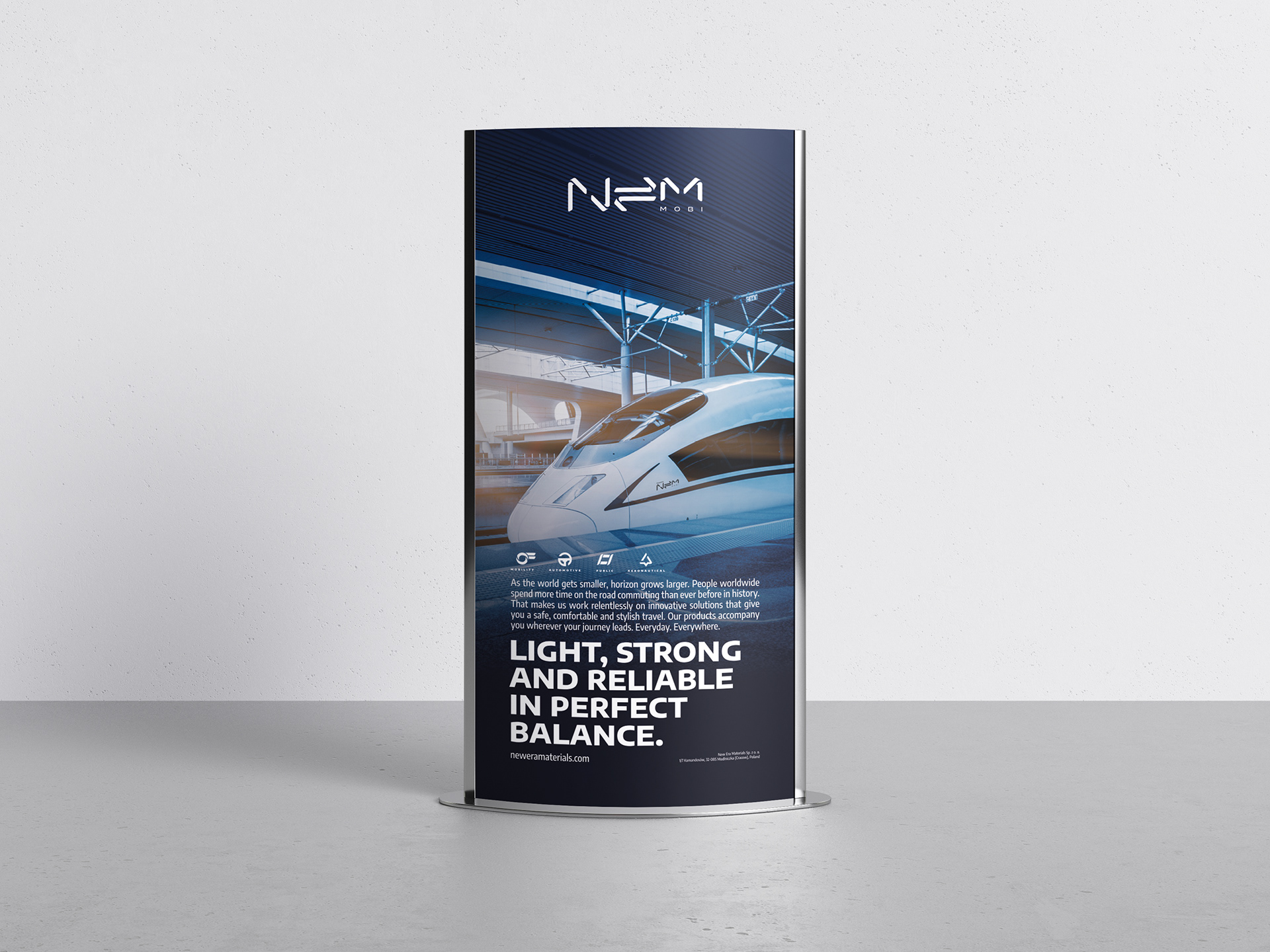
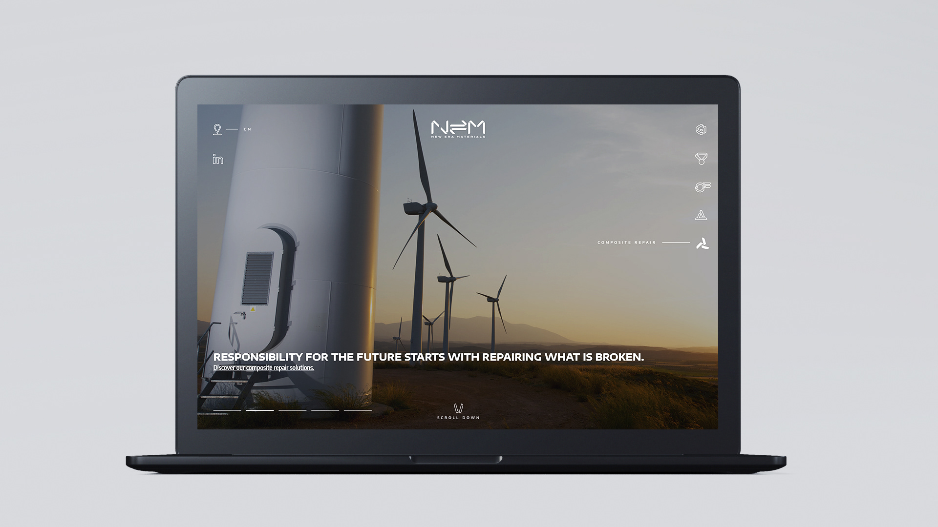
Over the last years we have helped to shape the brand strategy of New Era Materials and developed together with the in-house team of experts a cohesive vision for the future of the company. Keeping in mind the various fields of their activity, such as sports, mobility of all kind (aviation, urban, public, commercial, automotive maritime), construction and building, composites repair and additive manufacturing, we have co-created an identity that is technologically advanced, flexible throughout all channels and platforms and still visually subtle and neat.
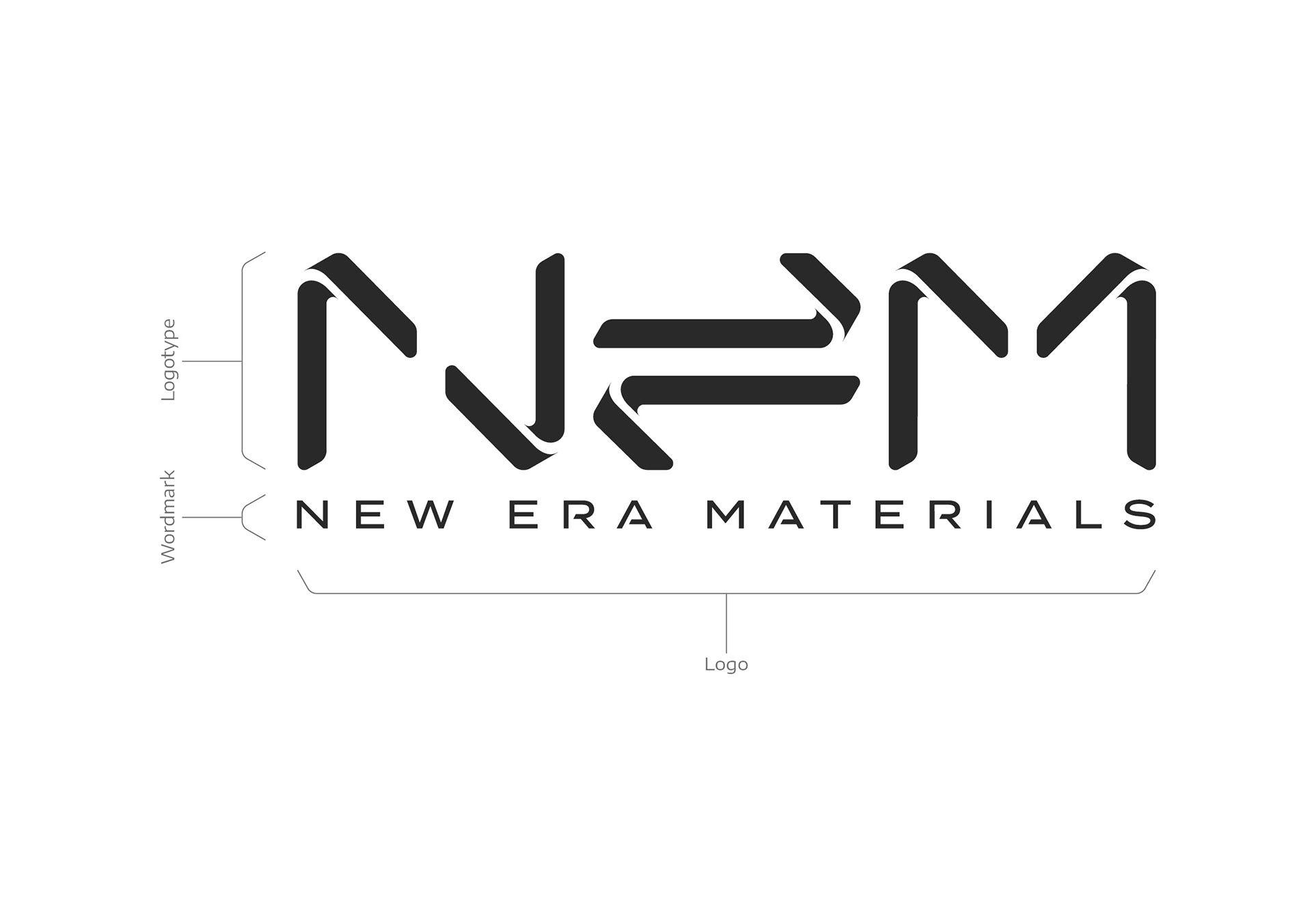
The main logo is a combination of a logotype and a word mark, where the stencilled custom fonts enhance the layered structure of modern composites and its capacities of forming, shaping and curing in any possible angles, yet holding their shape in balance.
The key element of the logotype is the equilibrium sign that represents the balance between weight and strength, so as between the elements in the molecules. A hidden message of the logotype is its scientific meaning, where energy is in balance with the weight of the material. That is highly important and significant for an advanced composite, where ultimate sturdiness and extra light weight materials and mechanical microstructures go hand-in-hand.

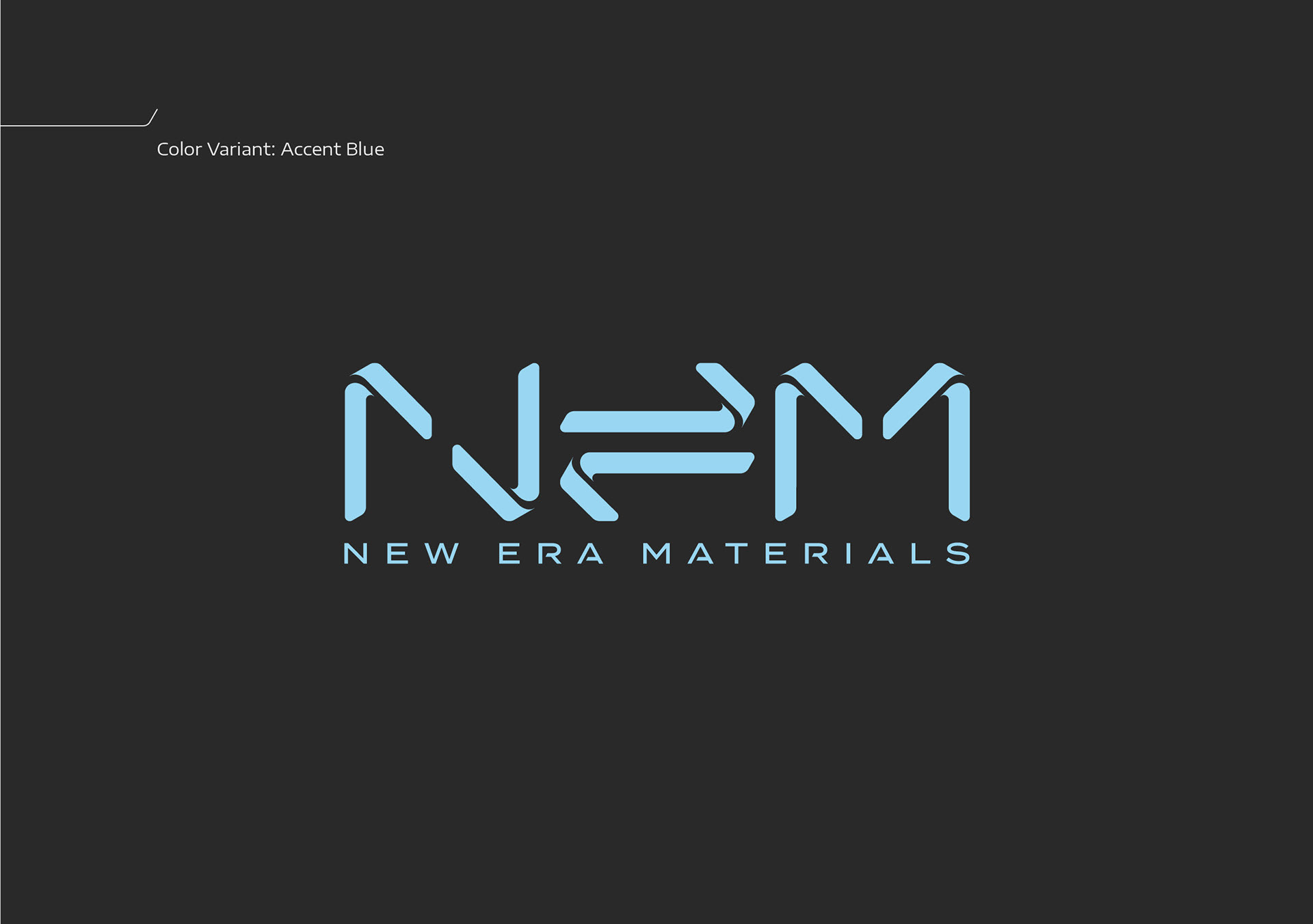
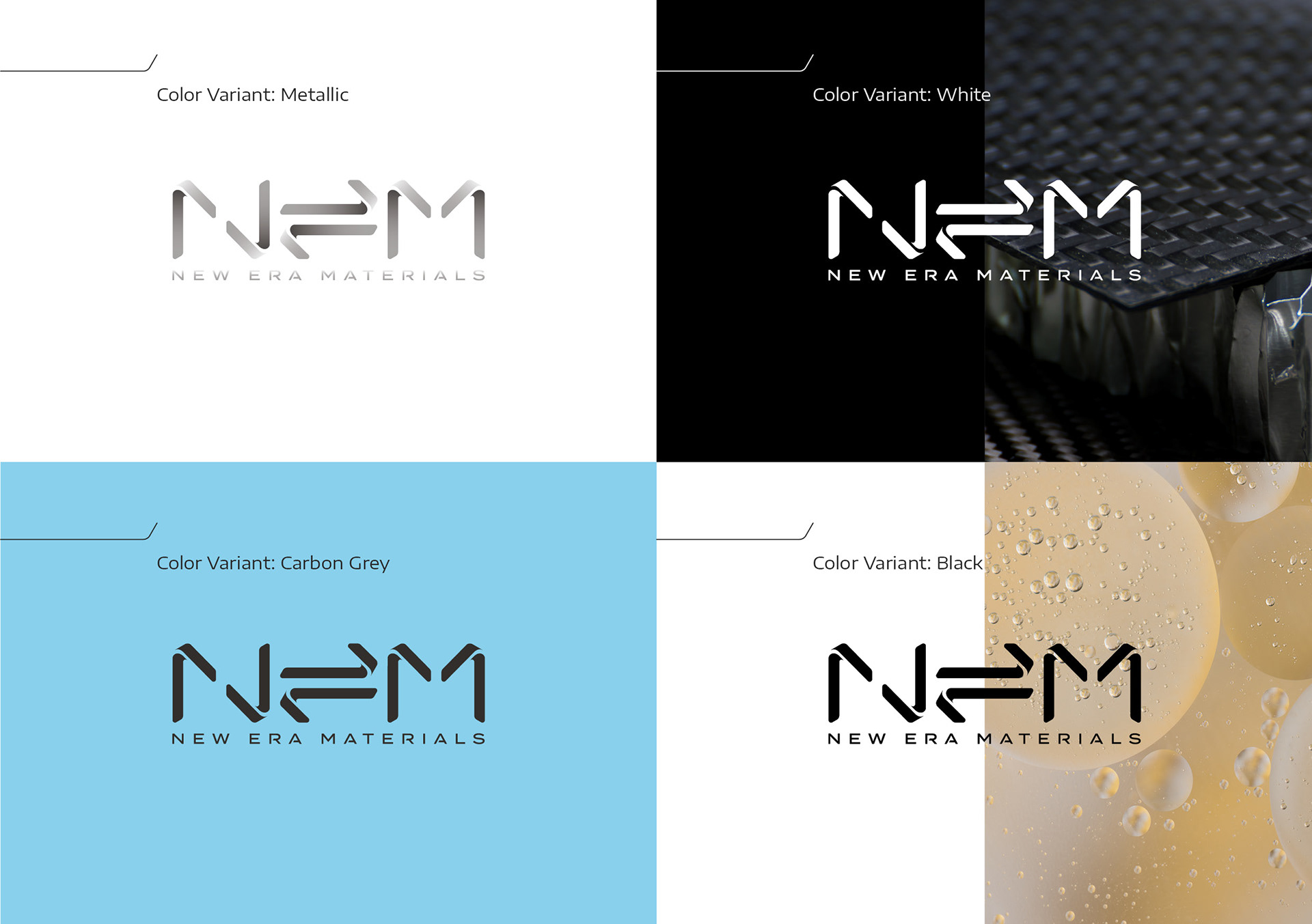
While creating a design system for the brand to unify its look, we have put an emphasis to find the right balance within the NEM palette. Our goal was on one hand to colour-wise represent core materials, such as carbon fibre, basalt fibre, glass fibre, bamboo fibre and also give them an electrified accent that stands for the possibilities of integrated electronic circuits to be built into the composite layers in the making of a smart material. On the other hand, we wanted to visually represent science, laboratory cleanliness and space as the ultimate test environment for all materials. Therefore we have created NEM’s custom palette: carbon grey, moondust grey, and accent blue.
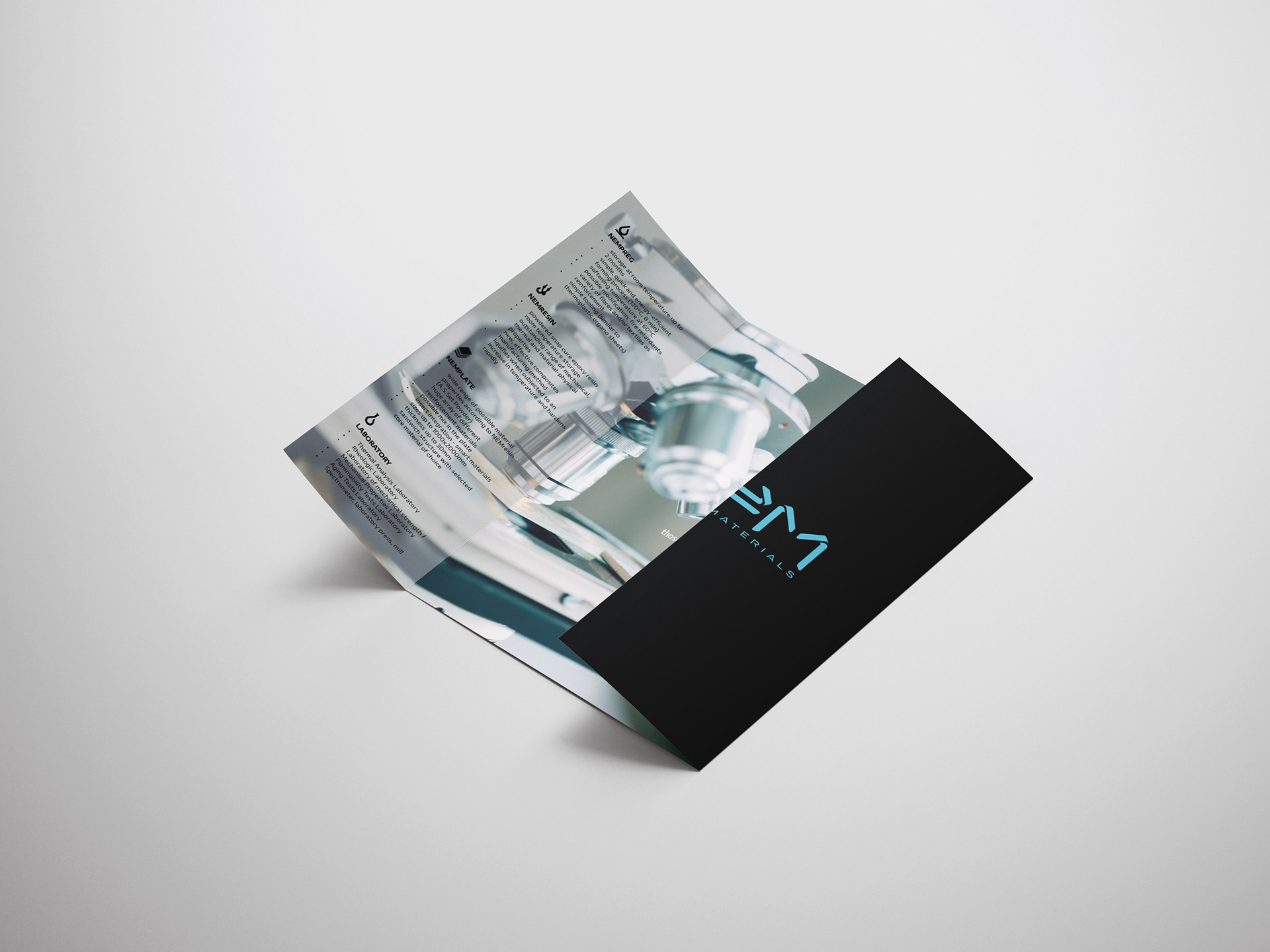
The custom icon pack also represents the layered structure of advanced composites and keeps the stencilled design established for the logo.

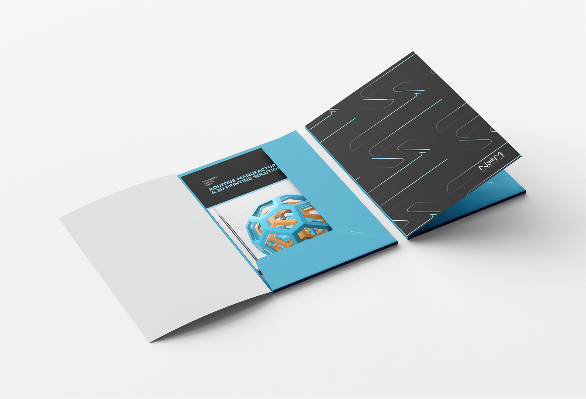
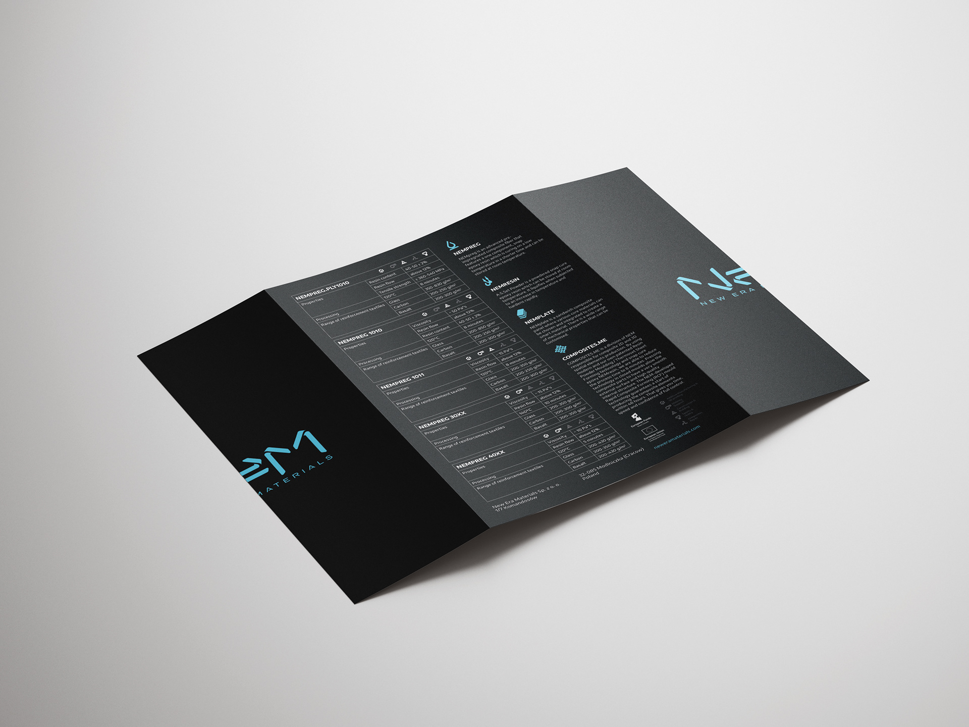
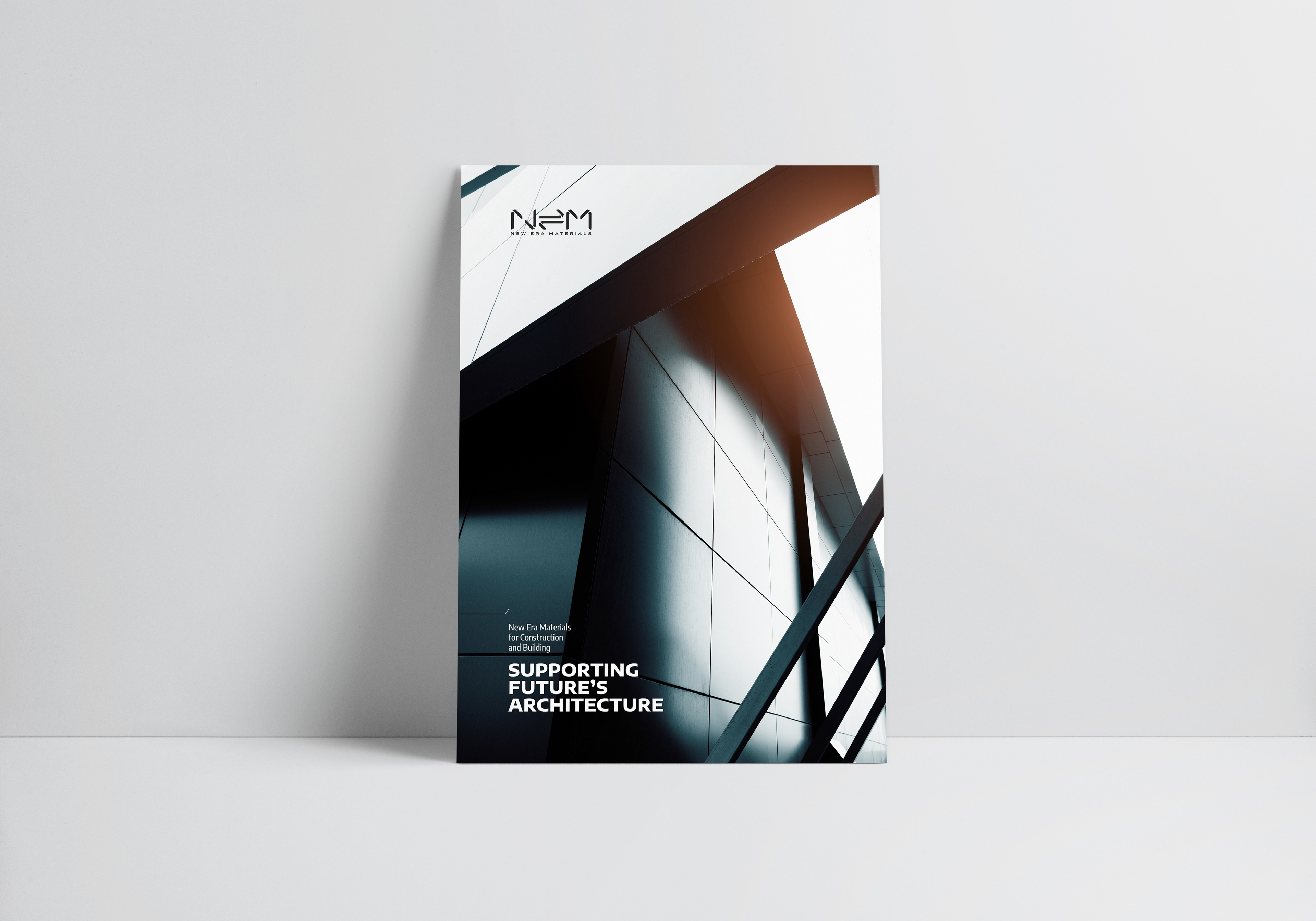
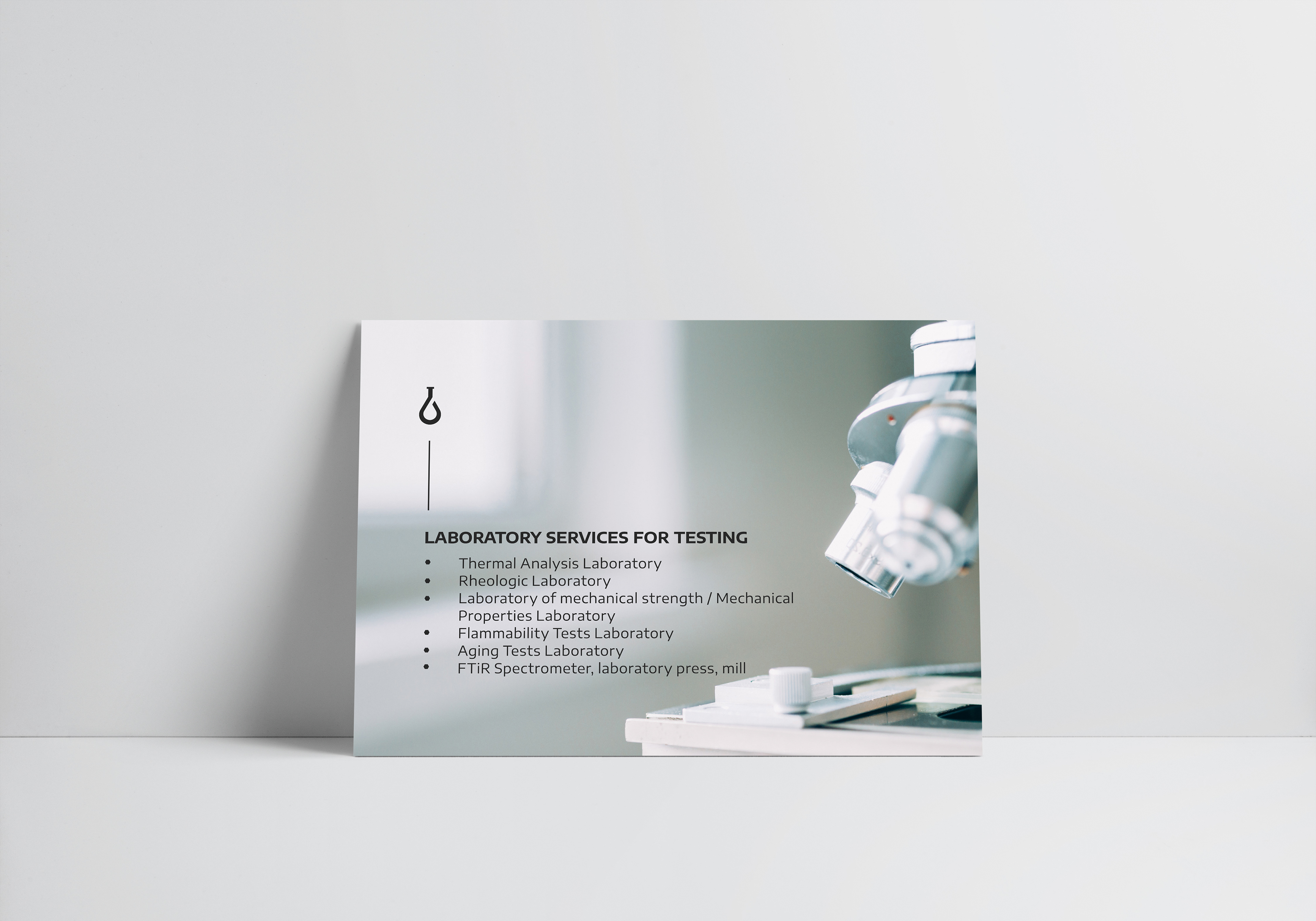
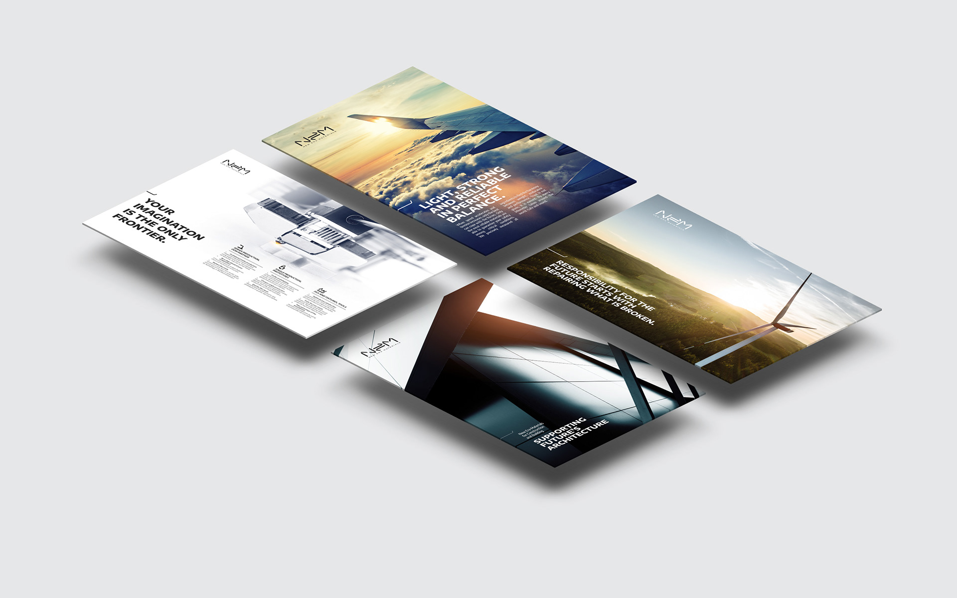
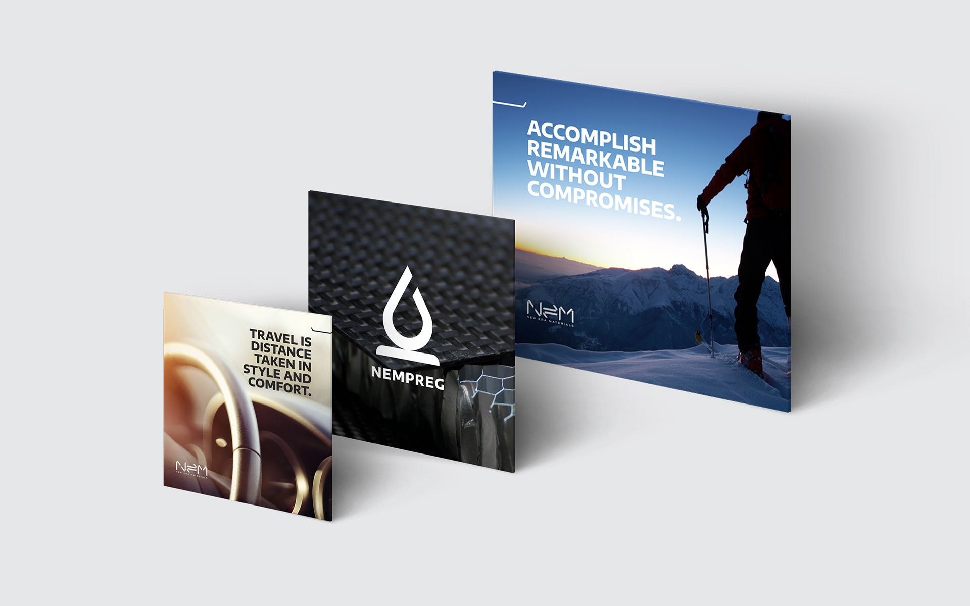
New Era Materials has currently seven key industries where the company provides custom solutions to their partners: Additive Manufacturing - Sport & Life - Composites Repair - Aviation - Public Transport & Automotive - Construction & Building - Laboratory Services for Testing.
A part of our strategic work was to identify the advantages of New Era Materials in each of these fields and allow the brand to actively gain recognition in the B2B sector among product owners, designers, entrepreneurs and fellow scientists.
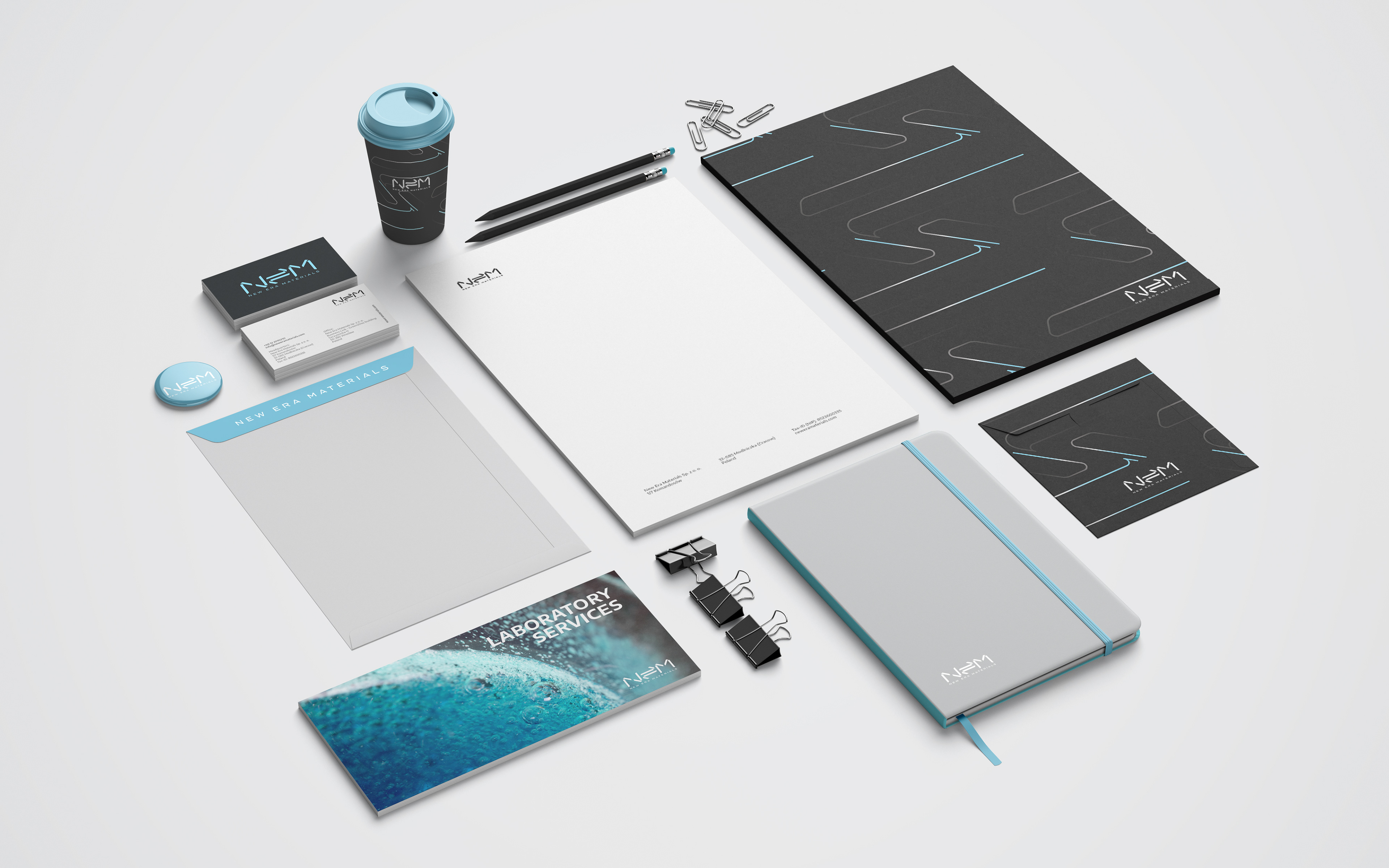
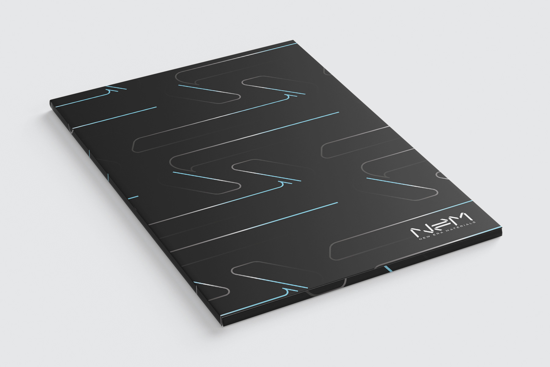

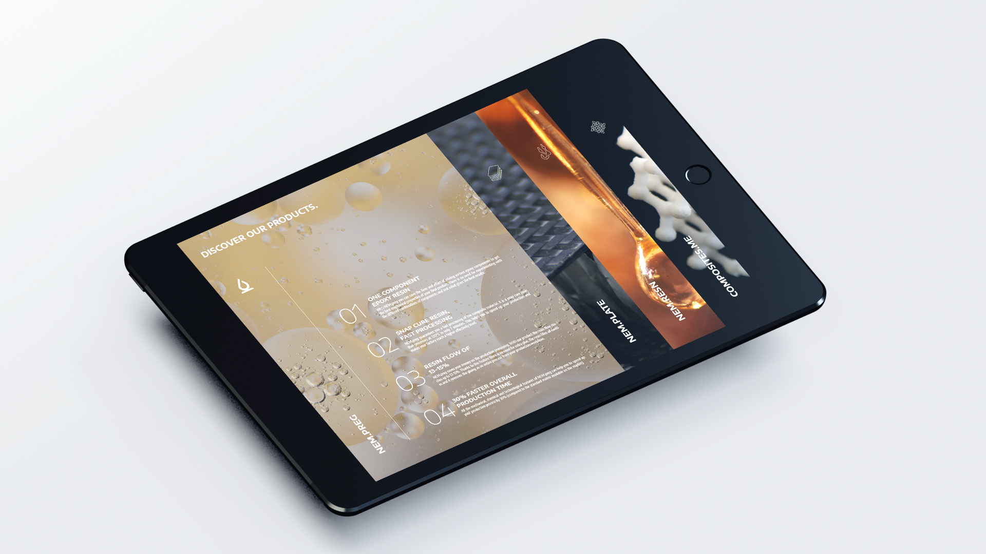
The process of designing the NEM brand experience included the creation of various graphic assets, like a custom layout grid, rules on typography or a set of patterns to support the visuals and give dynamics to the corporate identity. Symbols in chemistry, macro views of materials and physical structures of elements give an endless source of inspiration in growing the numbers of these patterns.
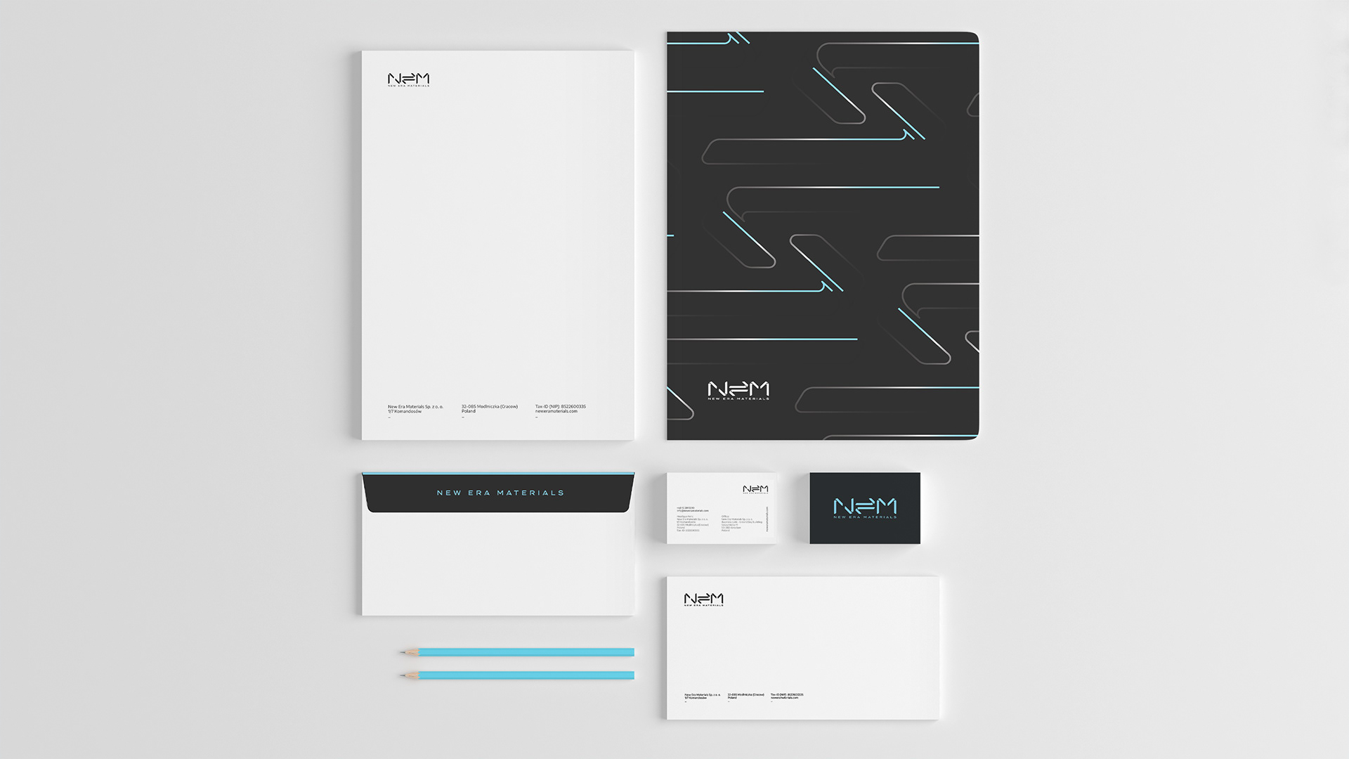


Corporate stationery with fine details.
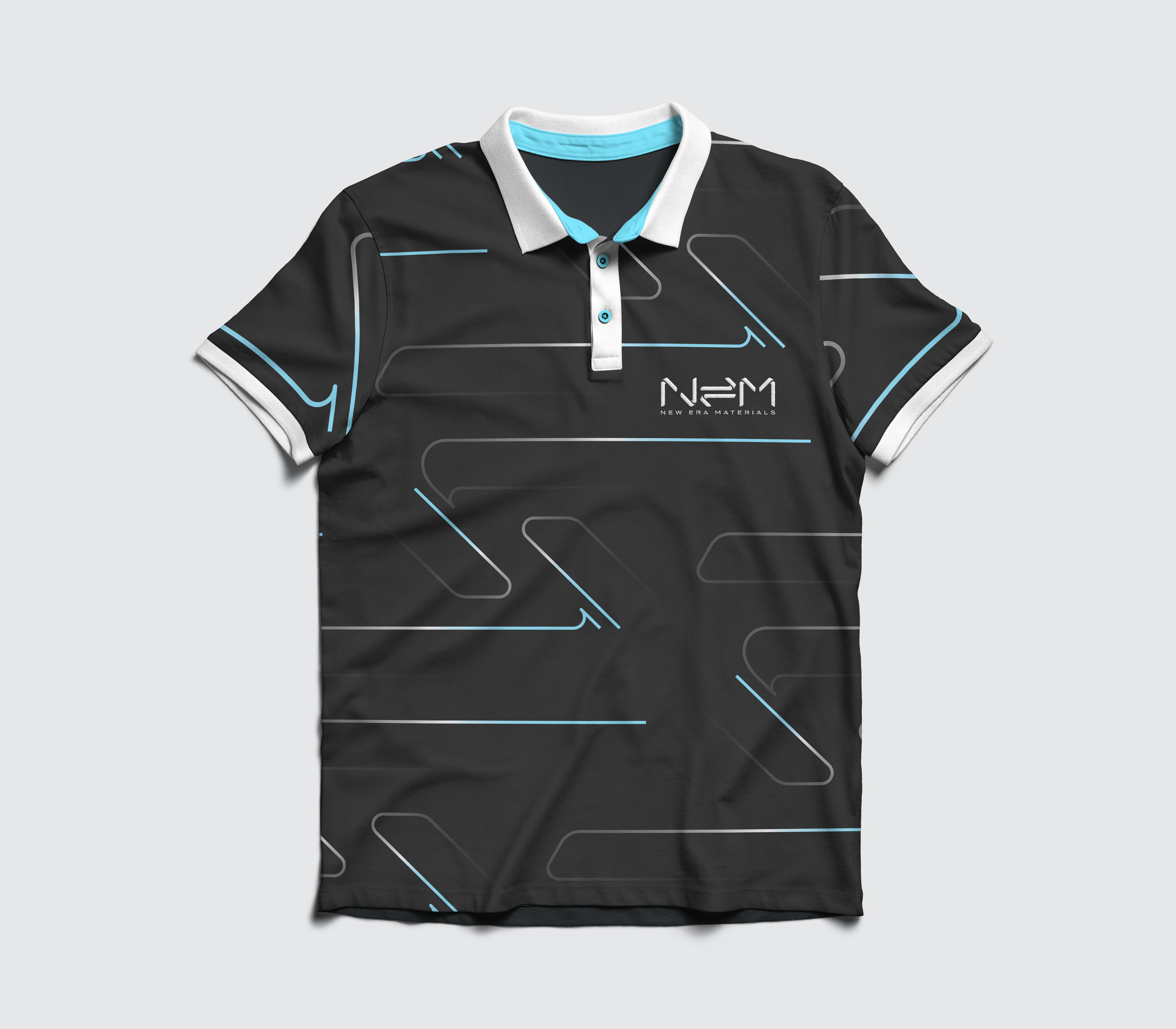
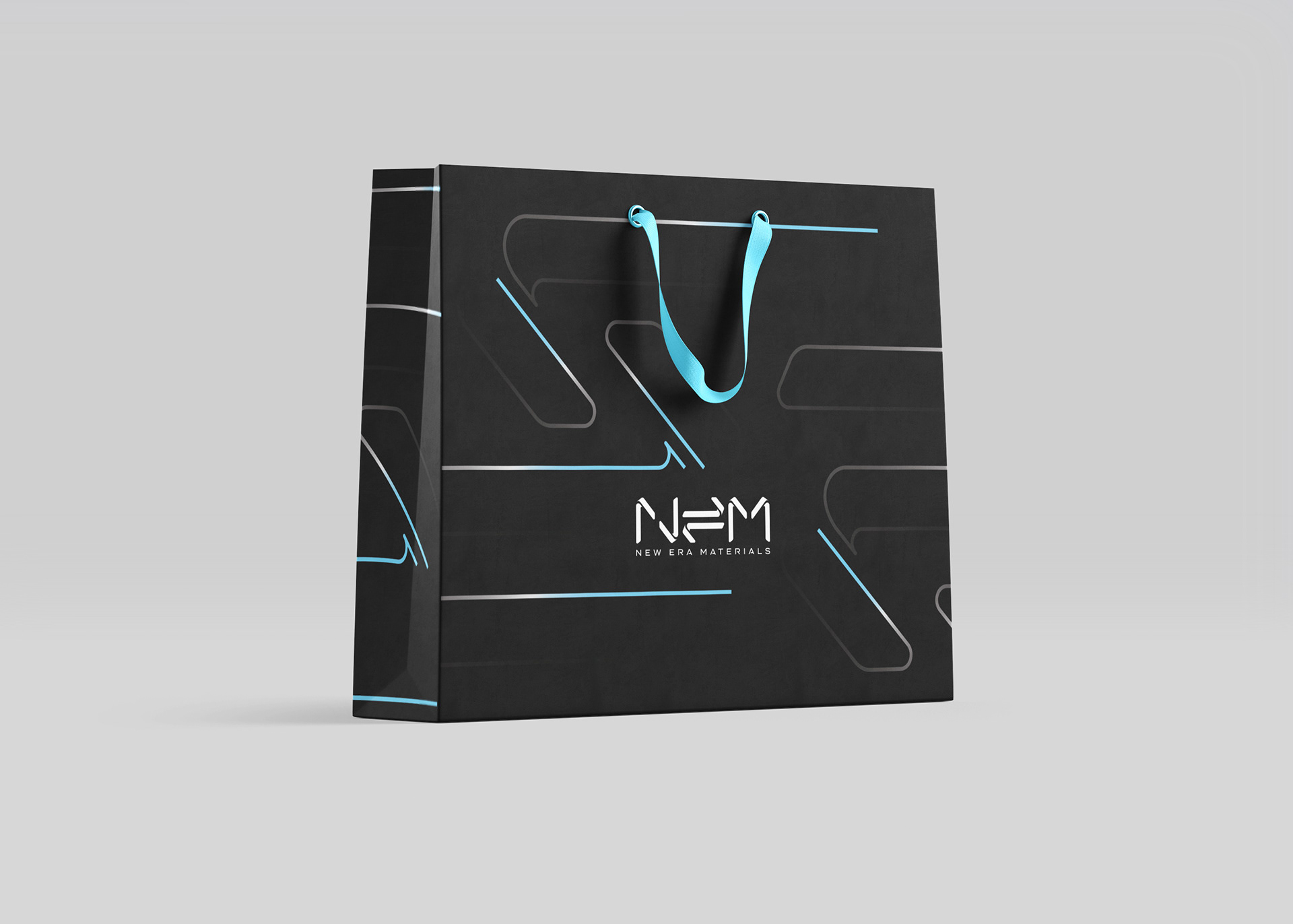
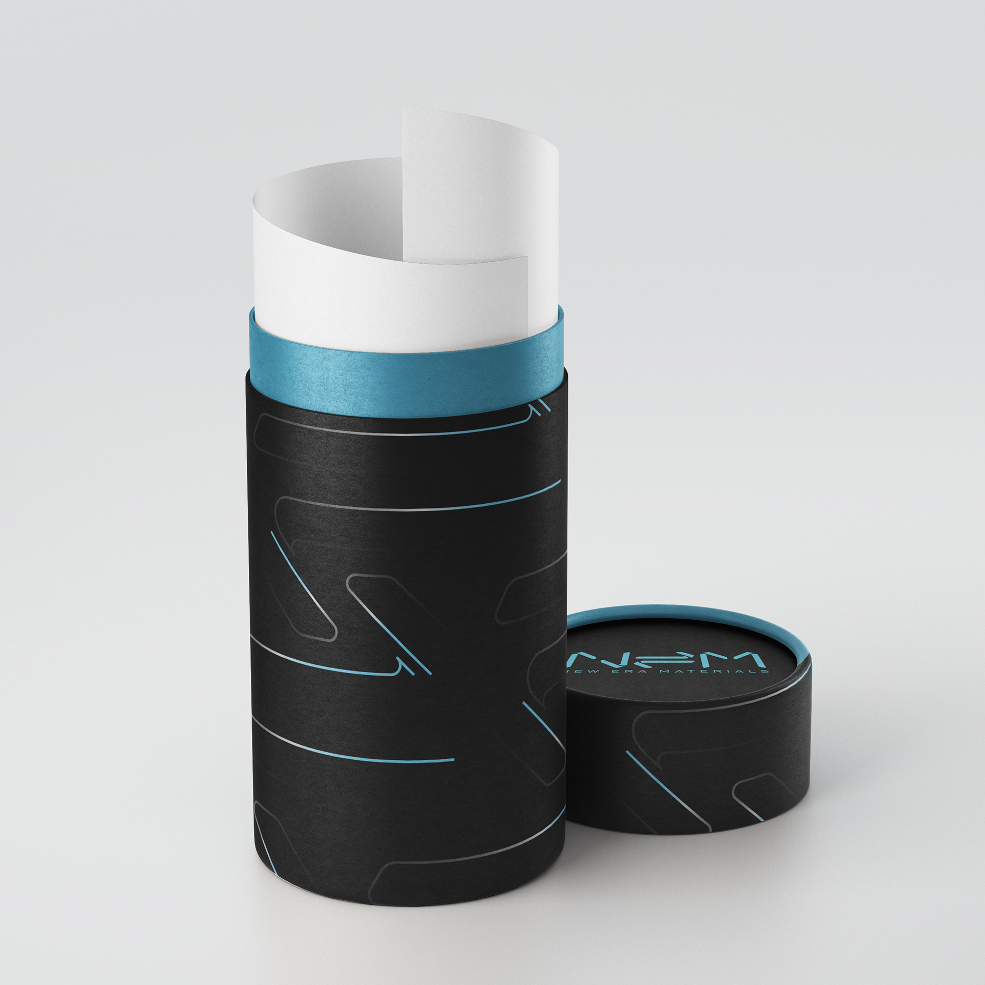
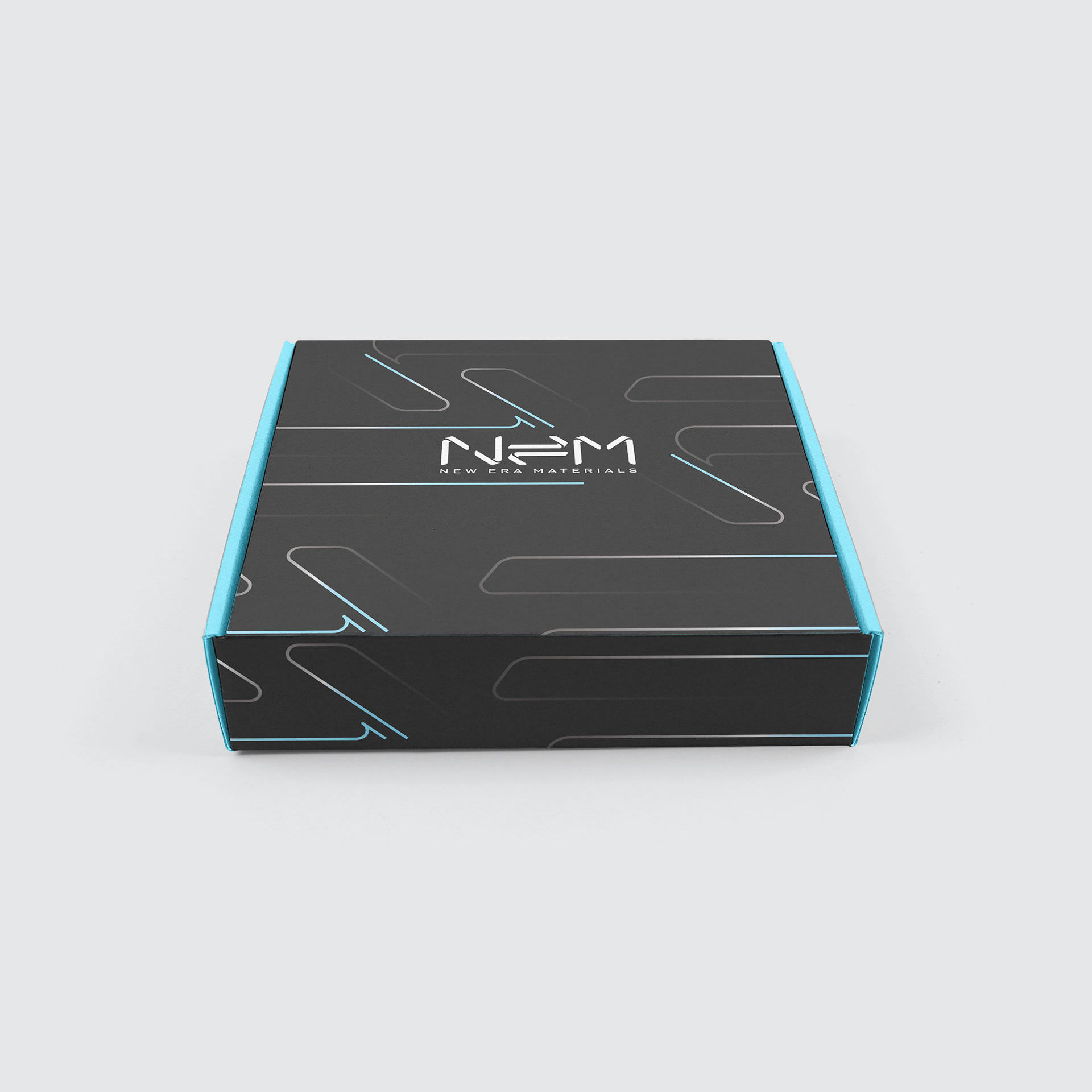
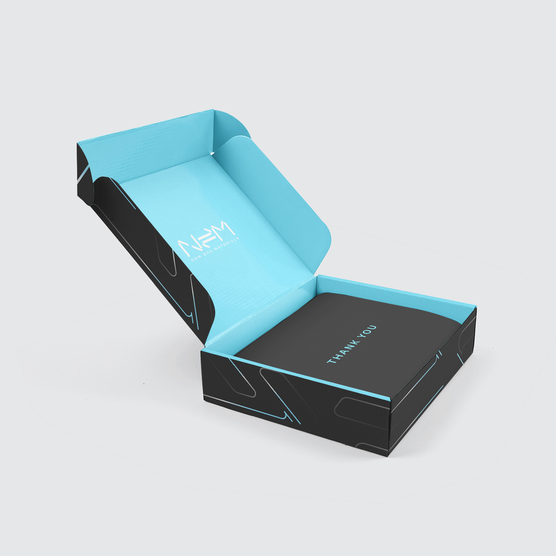
Corporate apparel and packaging design direction.

Promotional materials supporting marketing efforts in each key industries of New Era Materials.

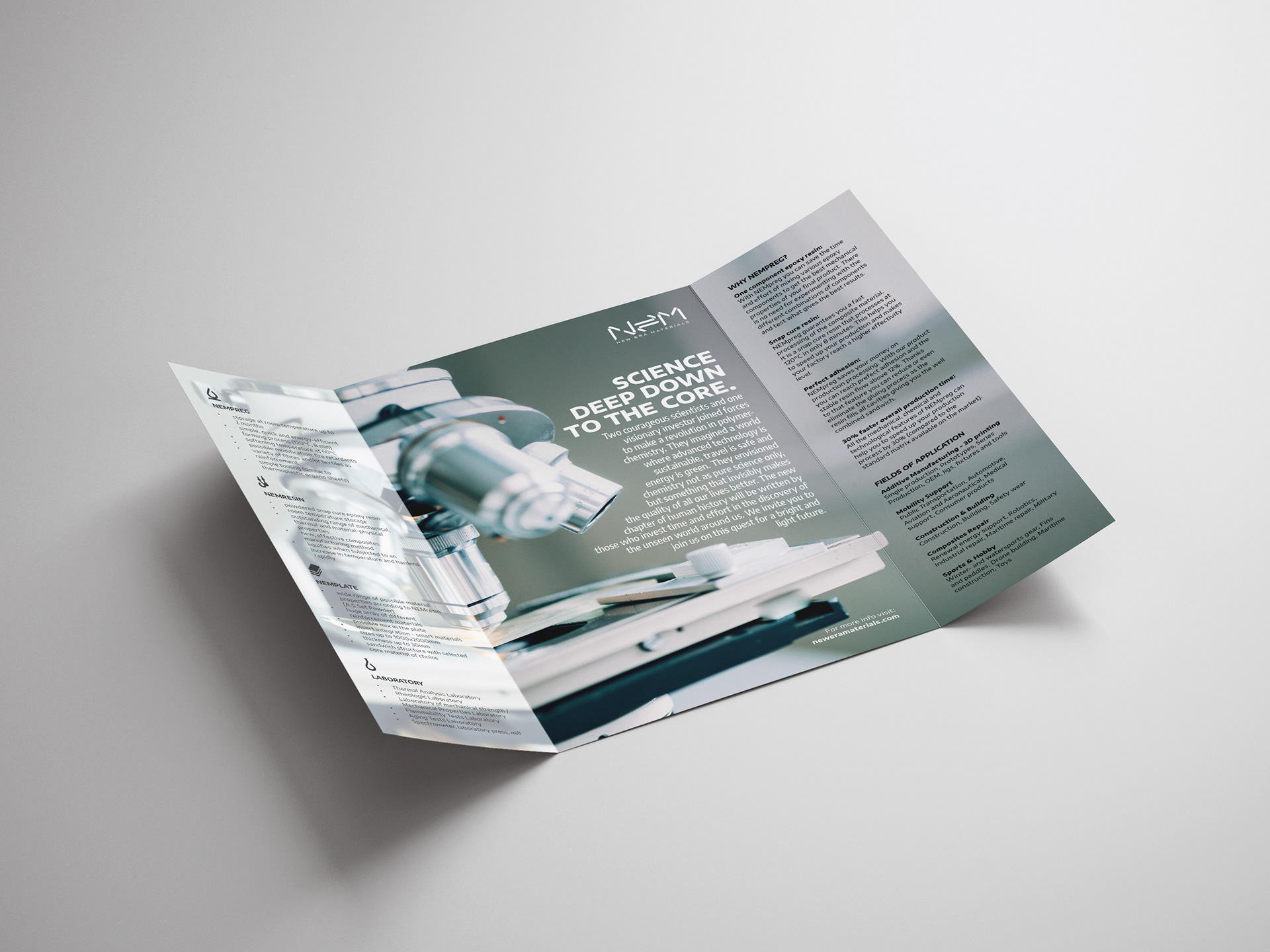
The long-term design strategy of NEM includes a unified, modern, yet timeless approach of handling imagery and rules on building up visual assets using a minimalistic grid. No matter of size, platform or format, the images all enhance a puristic, undisturbed, technical and balanced perception in the viewer. The typography and the layout grid is created, constructed and tested thoroughly to support a clear and legible structure of information and give a calming, yet confident feel to the audience of understanding the given knowledge. As the language of the composite industry is often too scientific for non-professionals, we have put an effort in making it accessible for everyone.
One of the key feature of the images is the use of visible light and perspective, so as the usage of vibrant colours in mix of a pastel palette.
The layout features a structured hierarchy of typography with up to two corporate fonts of the same family, accompanied with various weights, sizes and punctuation methods.
New Era Materials is the proud member of the Michal Solowow Group, one of the largest private investment portfolio of the Central East European economic region.