
Jastrzebie-Zdroj is a municipal city in south Poland, situated close to the Czech border with around 90.000 inhabitants. Its name comes from the Polish words jastrzab ("hawk") and zdroj ("spa" or "spring"). The area is populated since the 14th century and until the 20th century it was a spa village. It gained city rights in 1963. In the 1960s it also became a center of coal mining. Jastrzebie, which was one of the centers of the workers' protests has played a special role in the political transformation of Poland at the end of the 1980s.

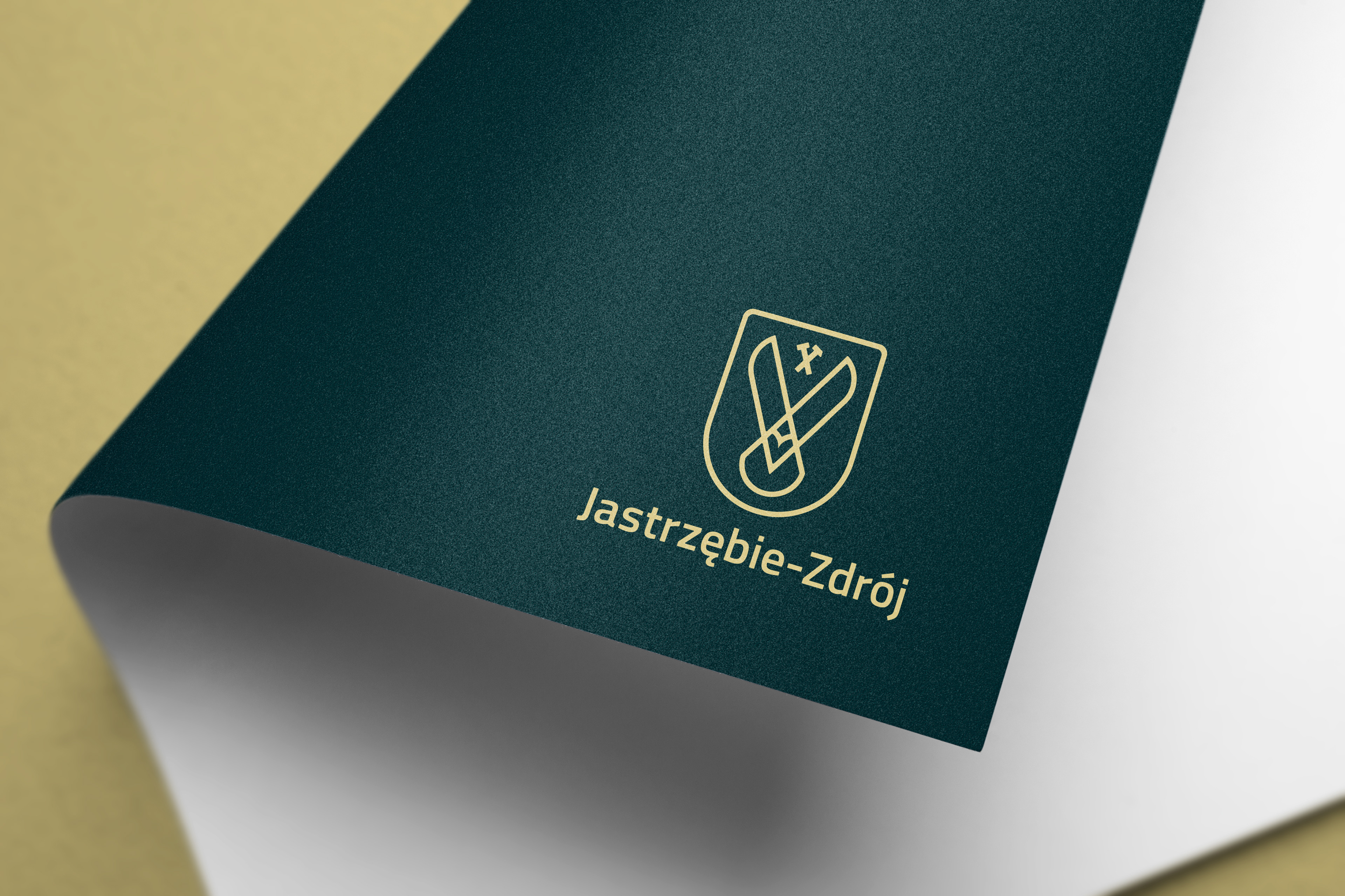
The logo is built up from two key elements: the symbol and the wordmark. The wordmark phrases the name of the city and comes with additional pretags, while the symbol is a simplified version of the historical shield which was given an additional meaning through forms and shapes during the design process.
All edges and corners are rounded to make sure that all printing techniques would result the same quality, legibility and also would function well in the digital world on various platforms. The lineweight of the symbol and the weight of the font correlate, creating an aesthetic and crisp impression.

Old logo - New logo.
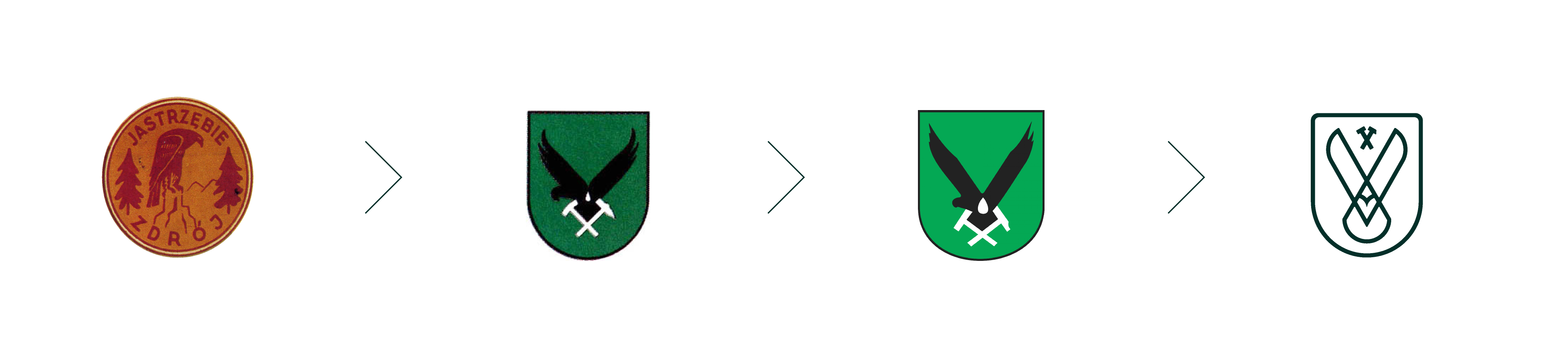
The main inspiration for the entire rebrand was the rich visual heritage of the city. On one hand Jastrzebie-
Zdroj, as its name also shows, once was a spa city famous from its water filled with various minerals. On the
other hand it has also a long tradition in mining and heavy industry and identifies itself as a place to combine
tradition with modernity. The old logos and the historical shield were a huge help in creating the entire visuals of the new identity. Both played their role to revitalise the Golden Eras and bring on a new one.
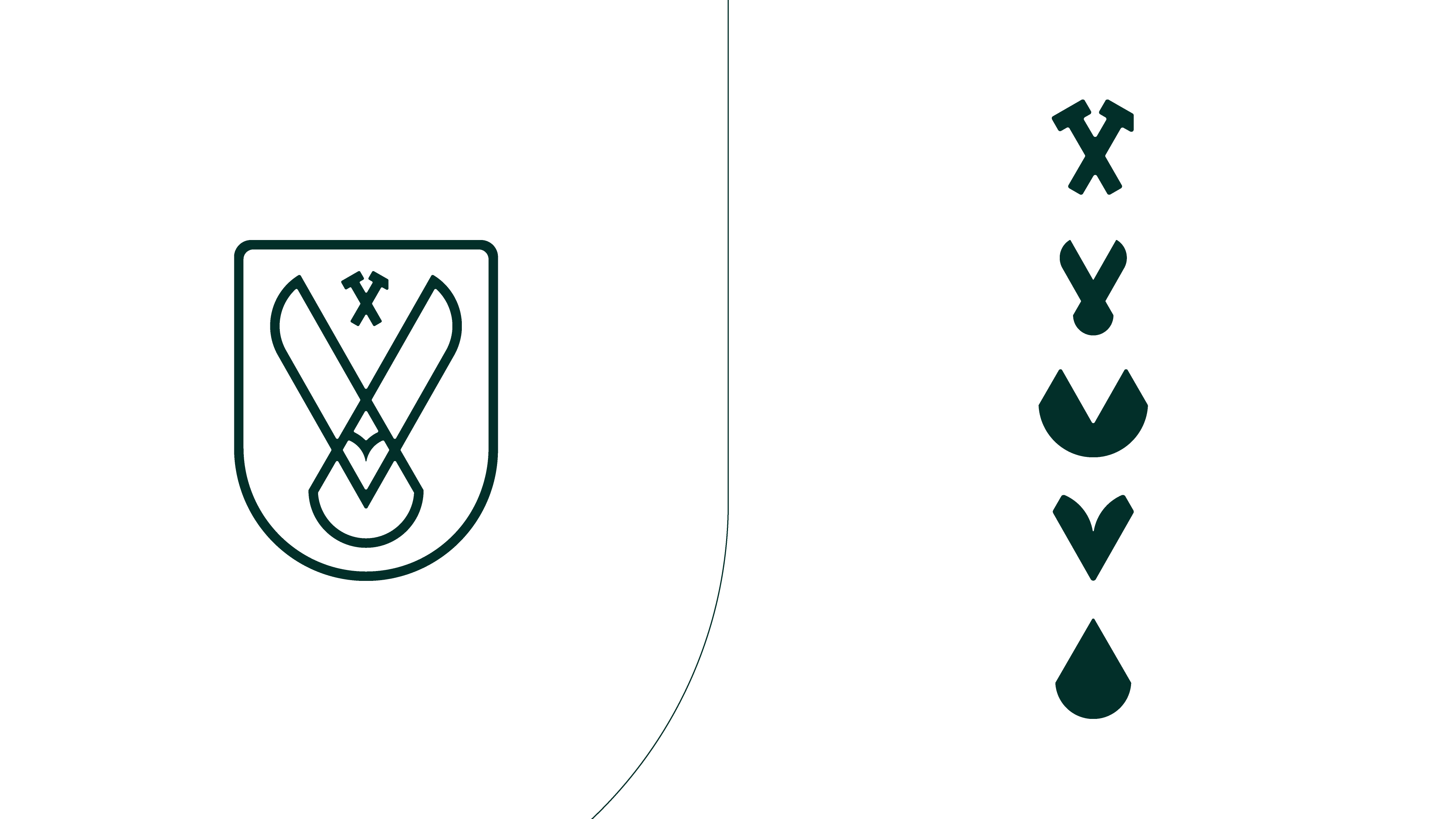
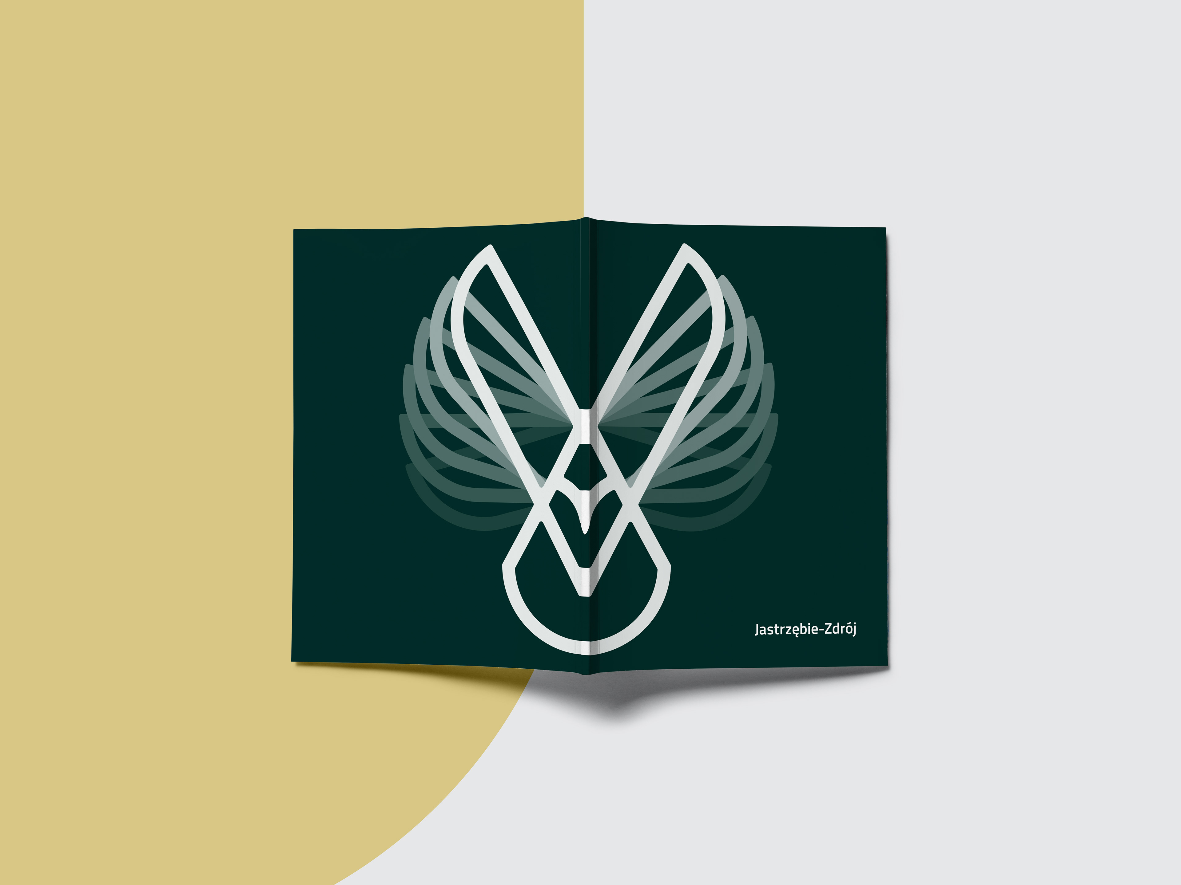
The symbol features the hawk which bird the city has its name after, the modernised version of the hammer and pick, the traditional sign of mining, a drop of water, a heart shape and two mountains.
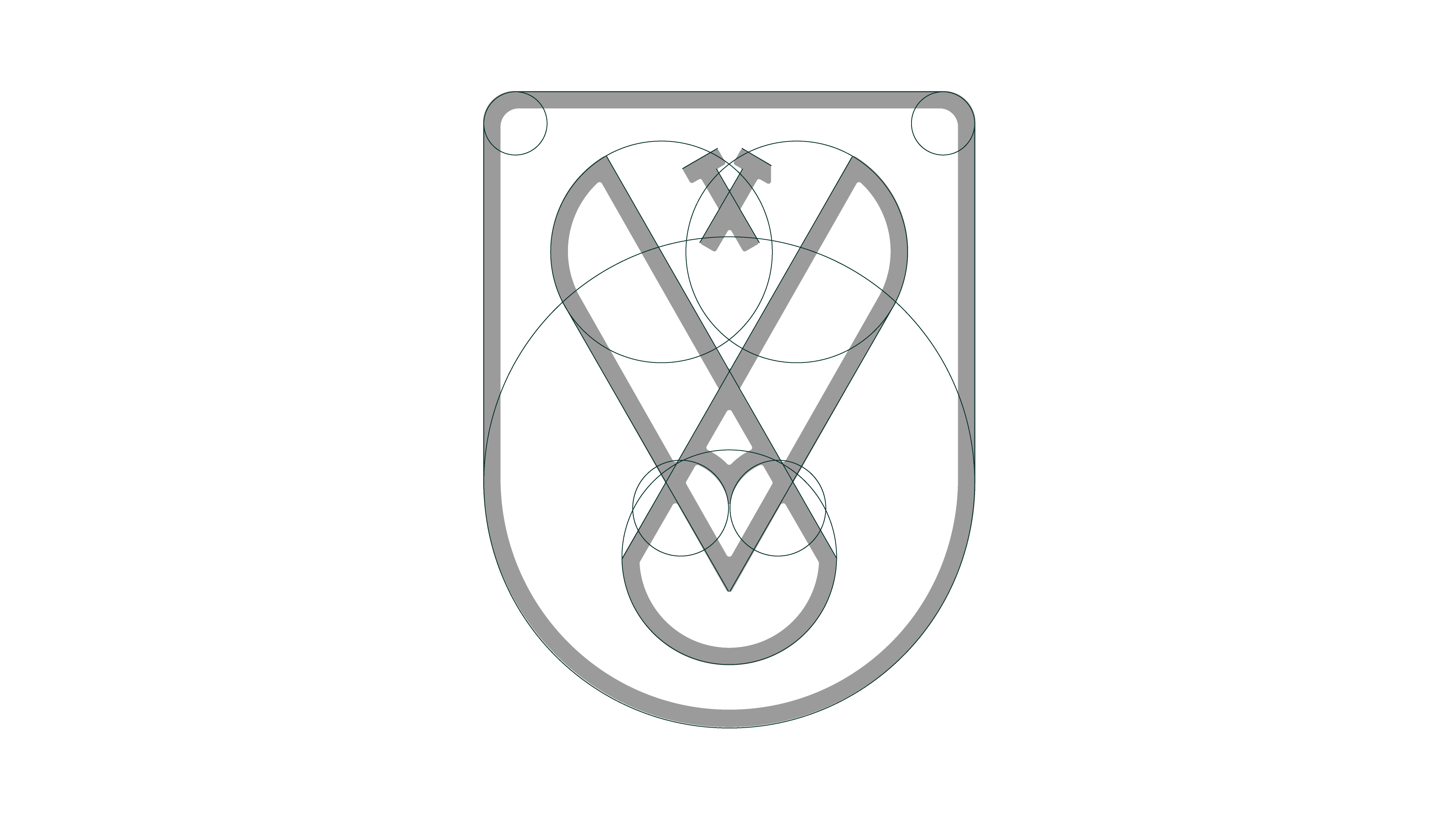
Logo anatomy.
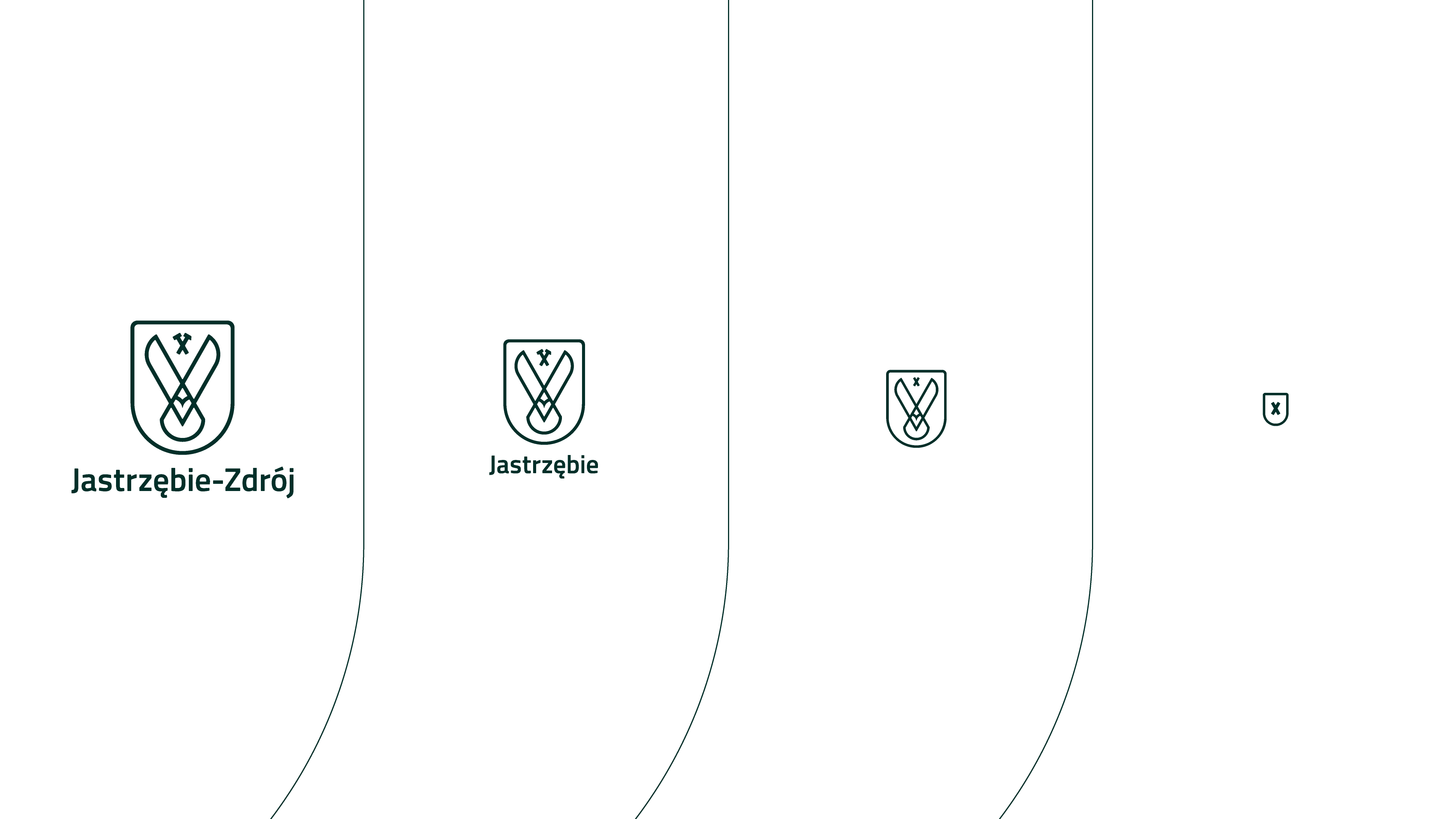
The new logo of Jatrzebie is dynamic. It changes its content and elements when is scaled down to serve the best legibility of the logo and still remain recognisable to carry the brand message on all platforms in all sizes
possible. This is especially important in the times of multiplatform digital accessibility and unlimited variety of sizes of screens and resolutions.
possible. This is especially important in the times of multiplatform digital accessibility and unlimited variety of sizes of screens and resolutions.
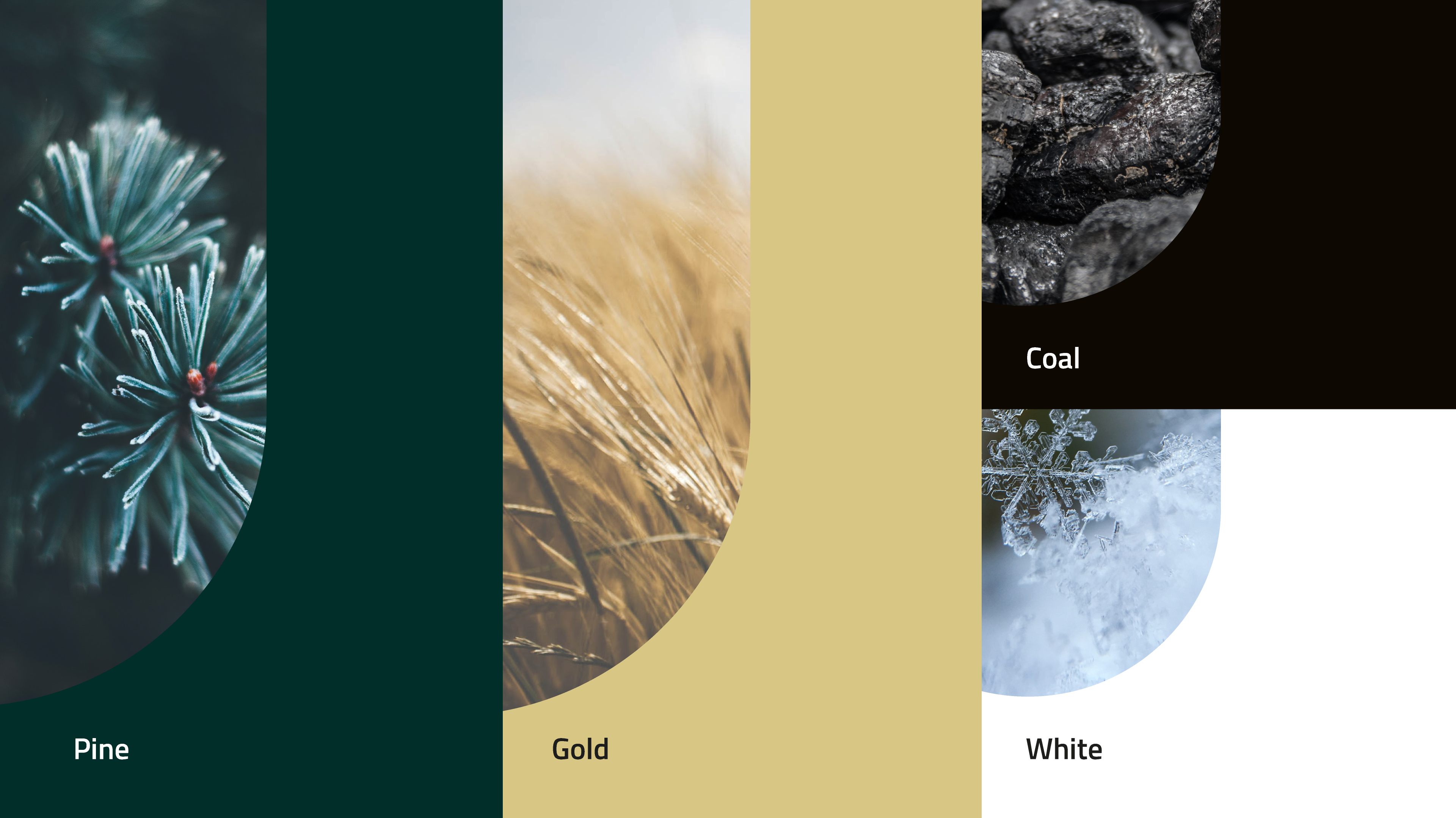
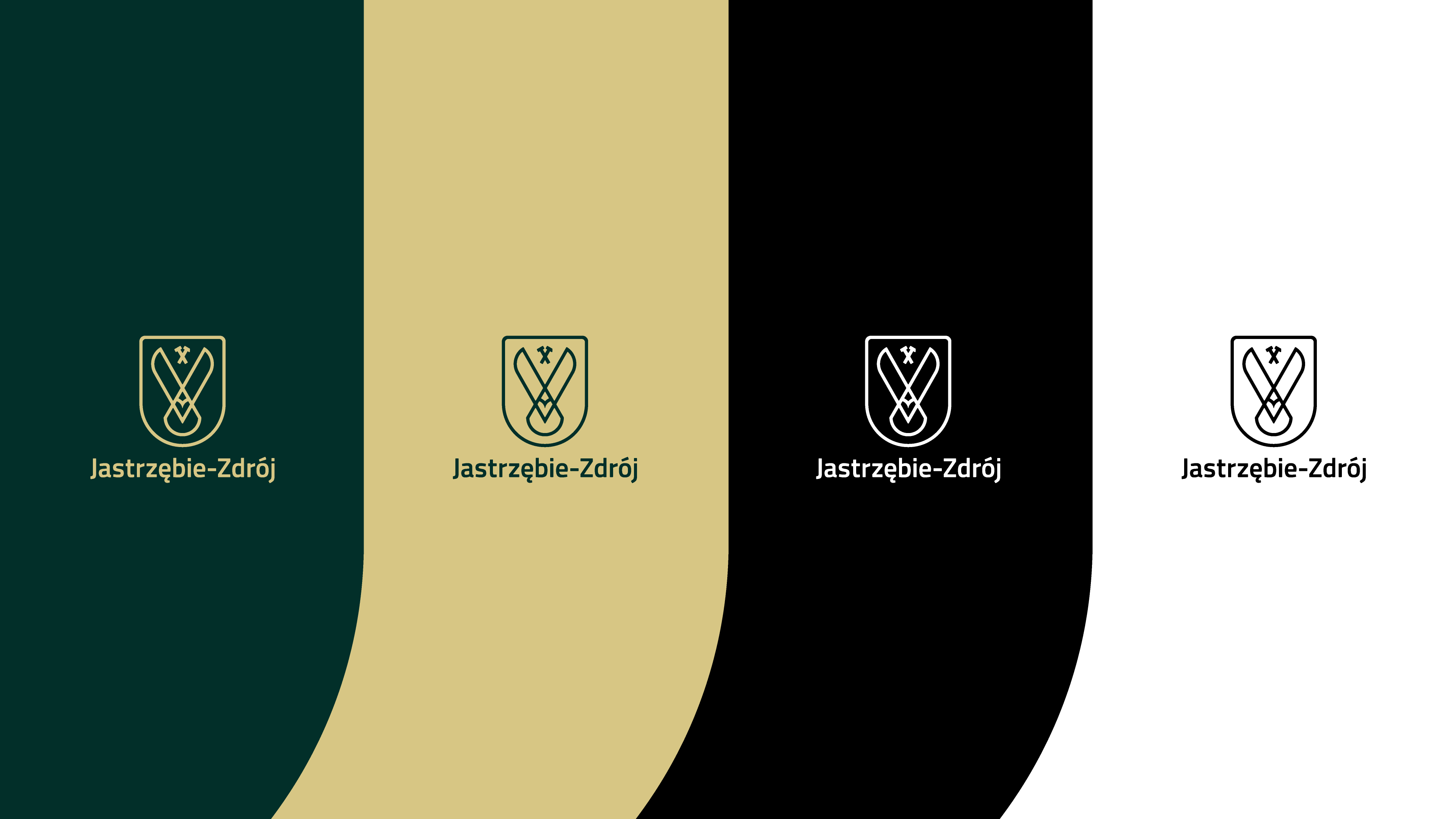
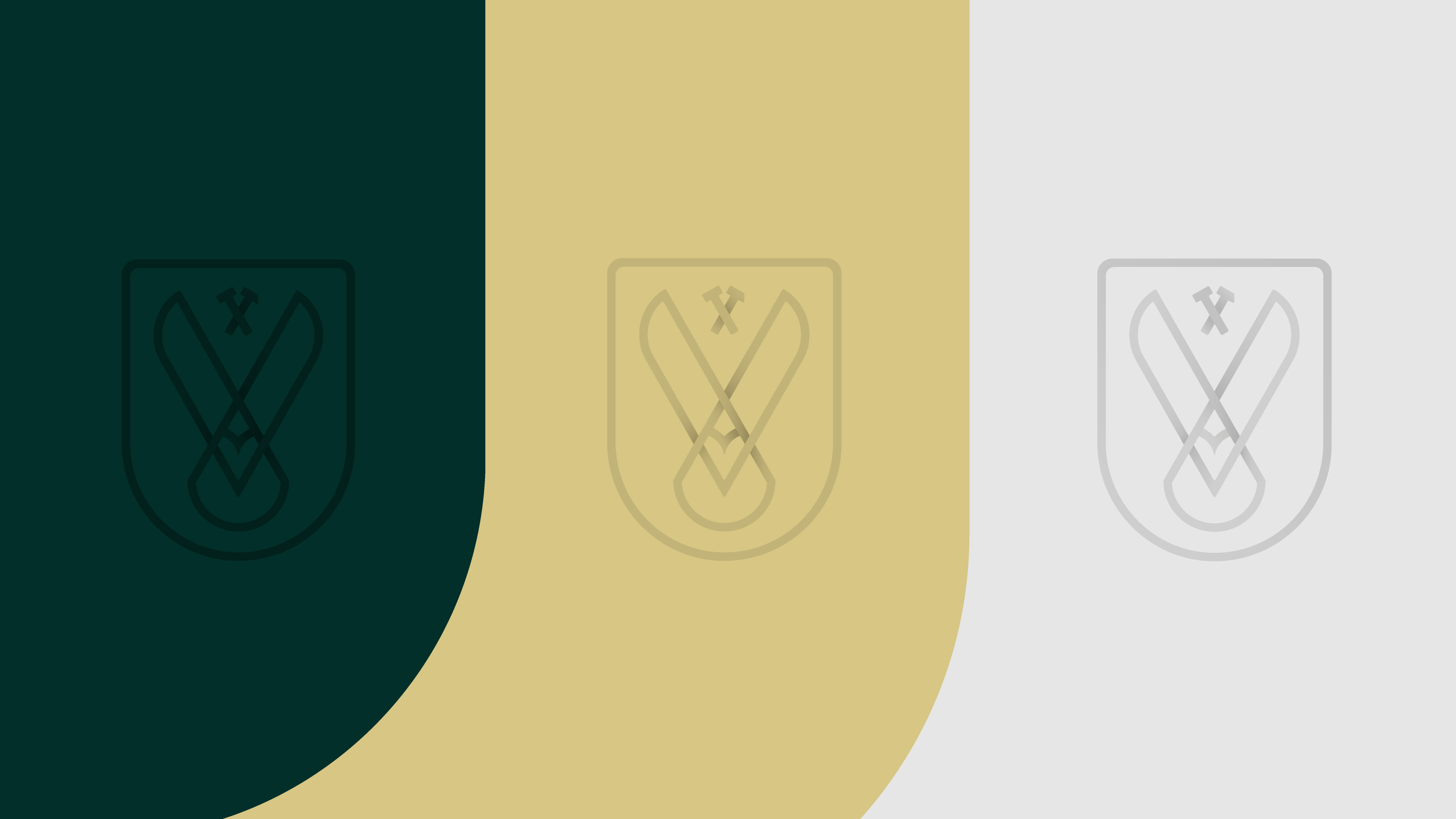
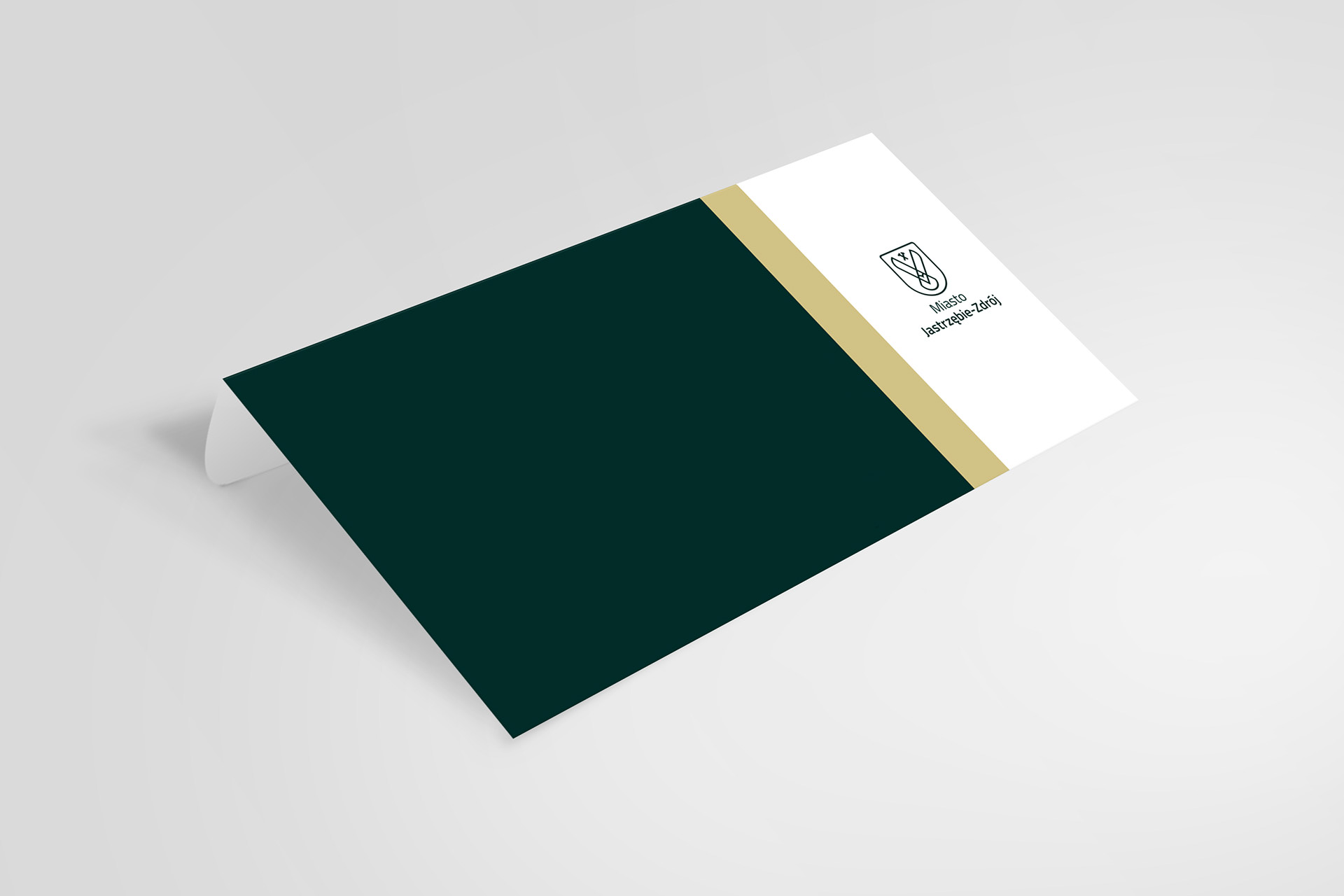
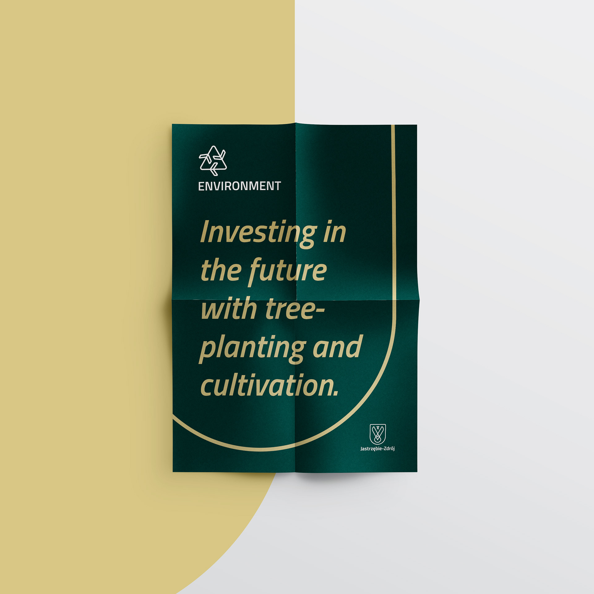
Jastrzebie-Zdroj as a city featured for decades a Black-White-Green flag and a historical shield. These colours were often accompanied with Yellow or Gold. The new identity uses two main colours, Pine and Gold and two secondary colours Coal and White. The Pine colour stands for nature, the Gold symbolises a new, prosperous era of our times. The Coal usage is rooted in mining traditions and the White refers to the spa city times and fresh springwater.
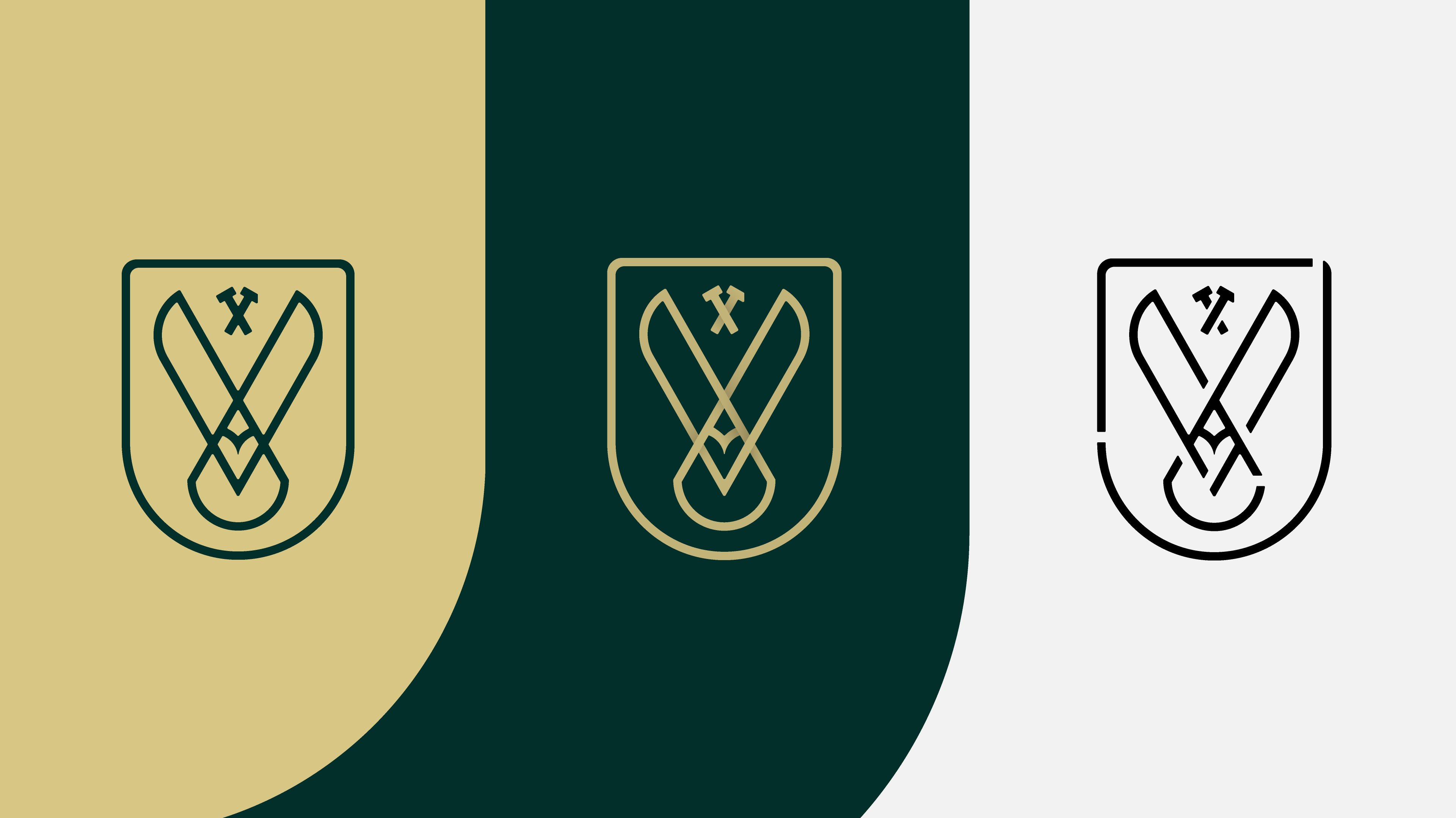
Symbol variations: Standard - Gradient overlay - Stencil; Colour options; Tone-on-Tone solutions.
When it comes to differentiation, it is important to keep some level of cohesion. The best practise is through design.
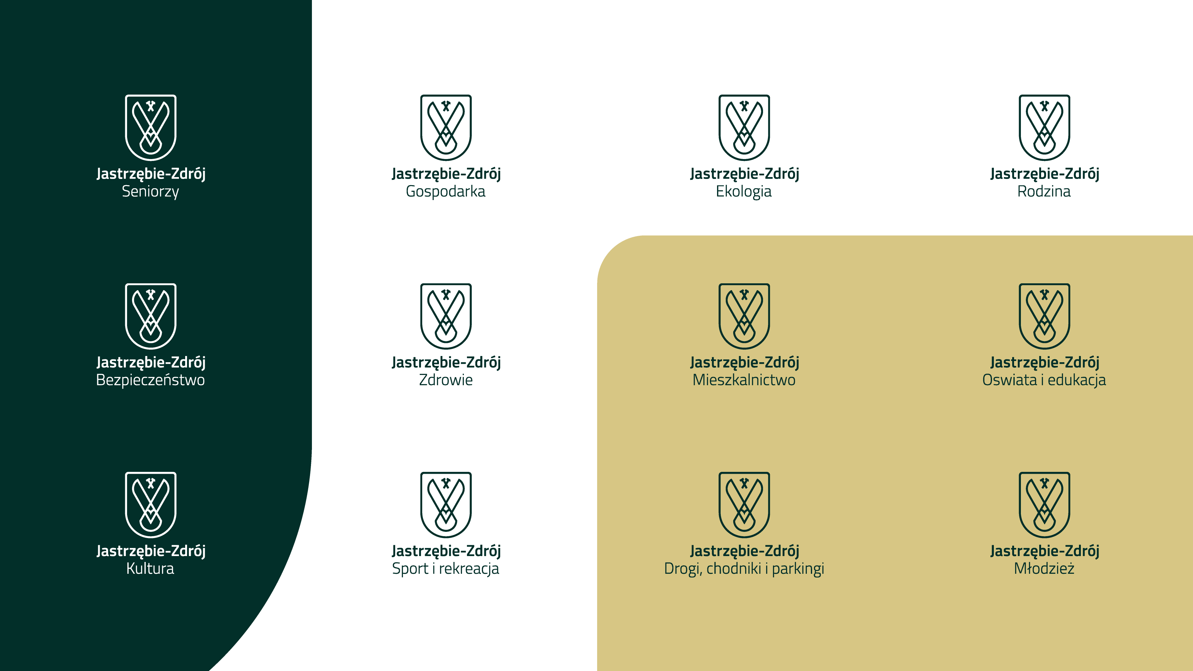
The Department logos keep this cohesion and communicate the values of our city though a unified look. They feature the symbol, the wordmark and additionally the Department’s name as a pretag.
The Department logos keep this cohesion and communicate the values of our city though a unified look. They feature the symbol, the wordmark and additionally the Department’s name as a pretag.
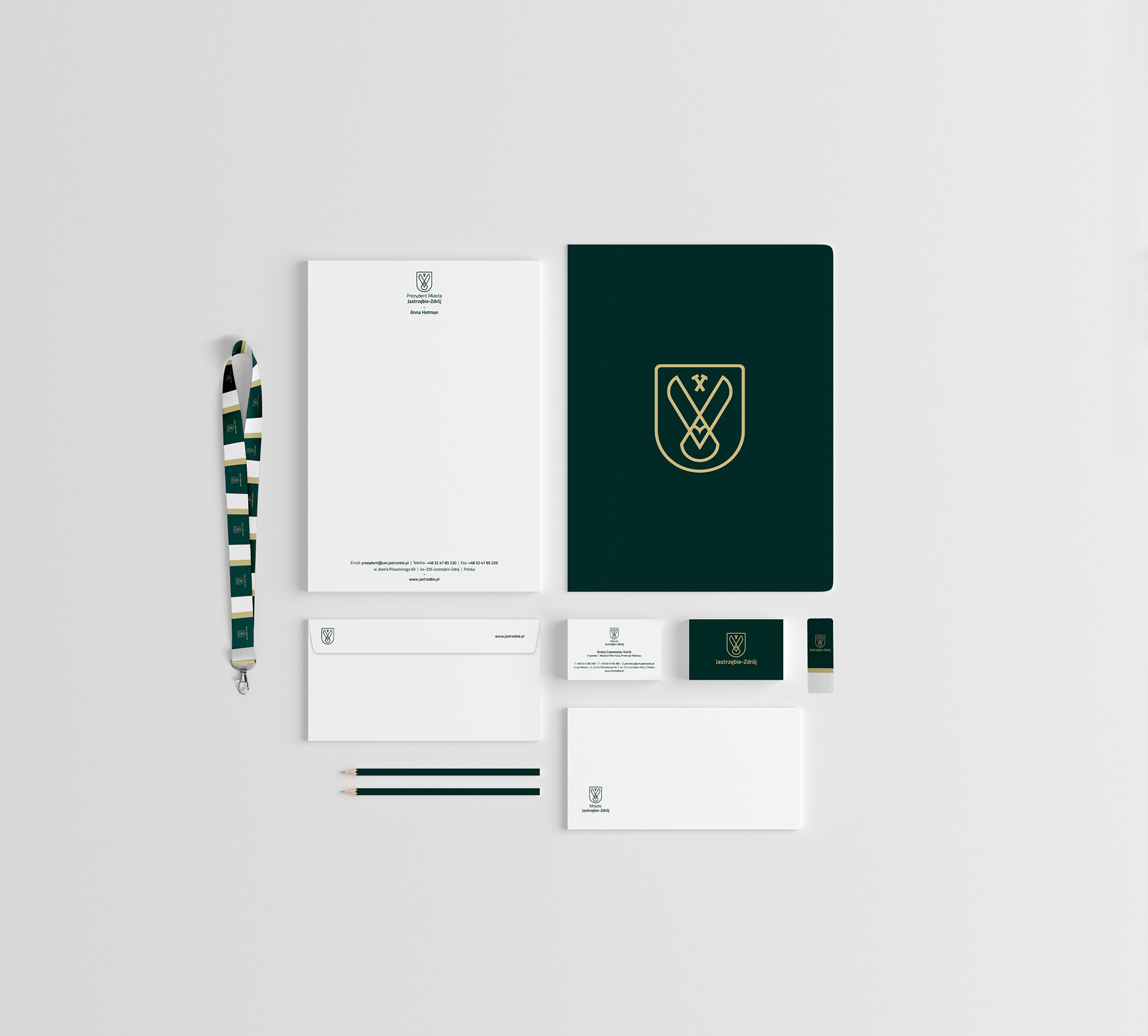
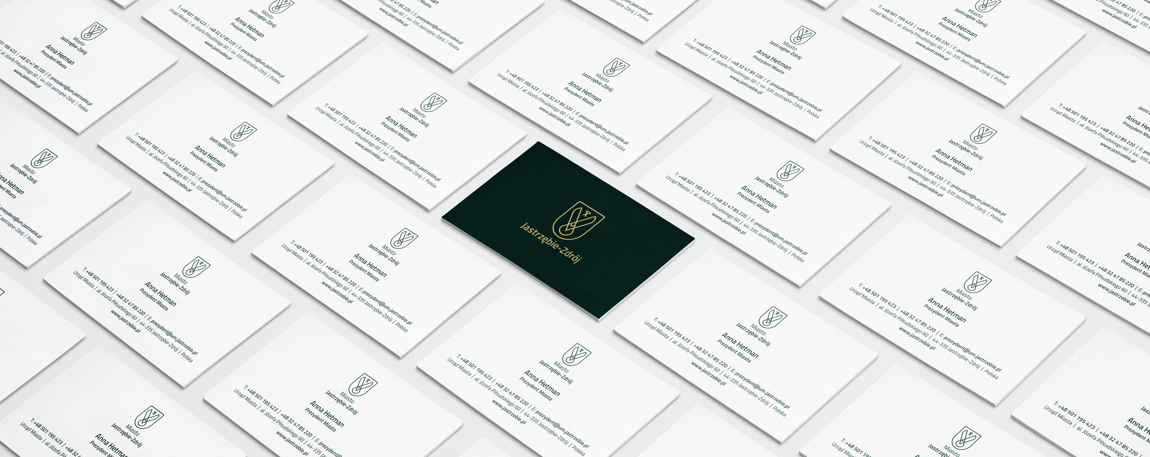
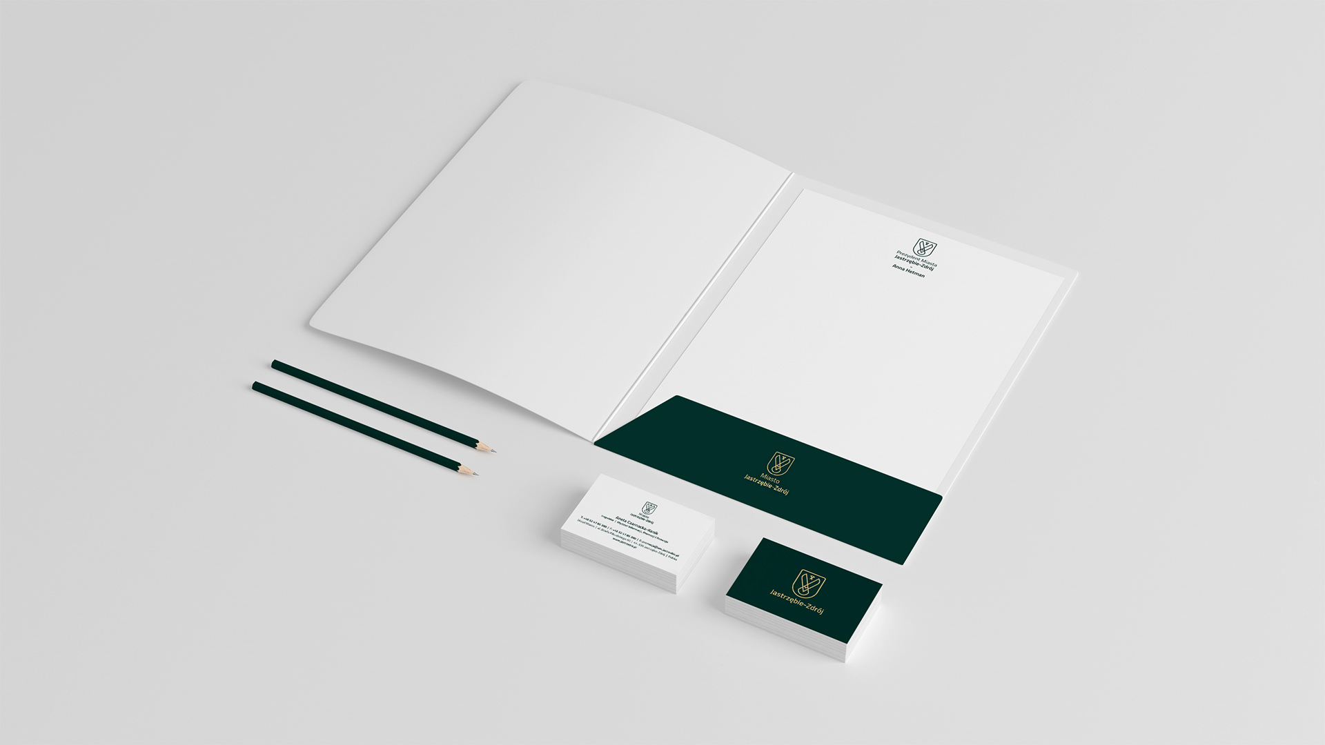
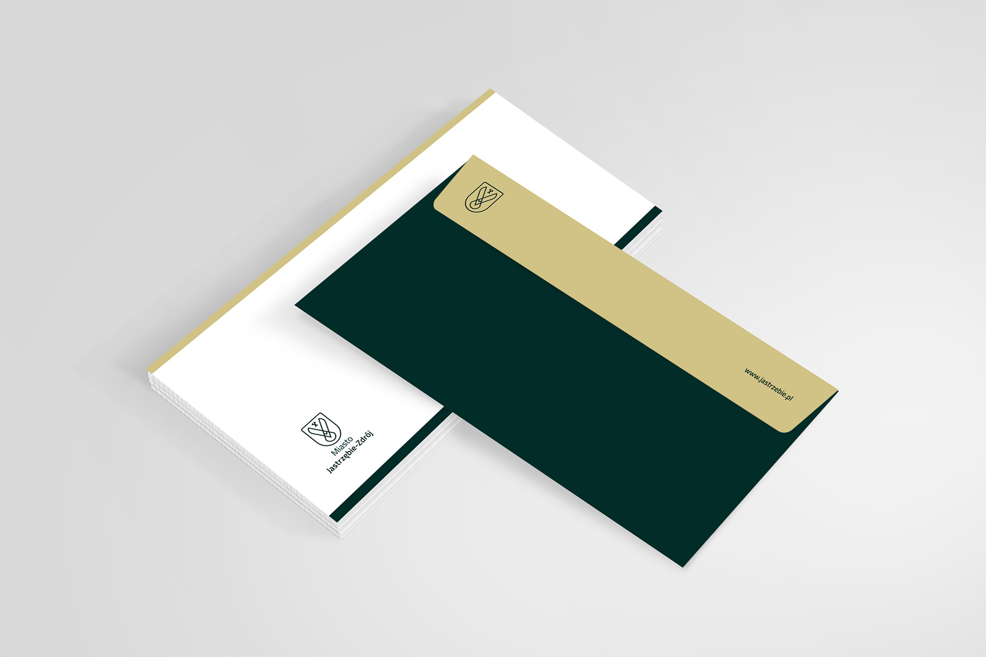
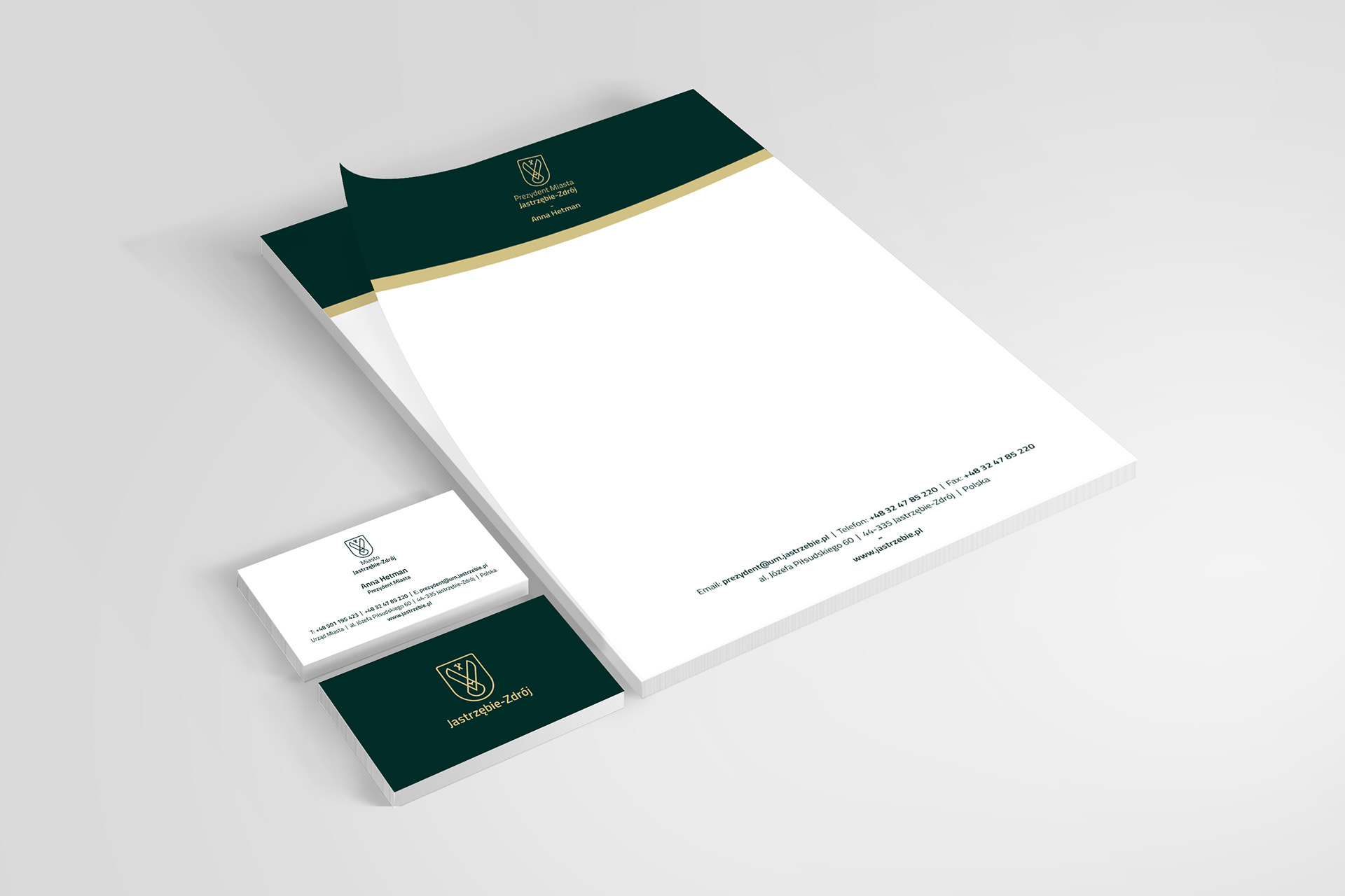
Standard stationery.
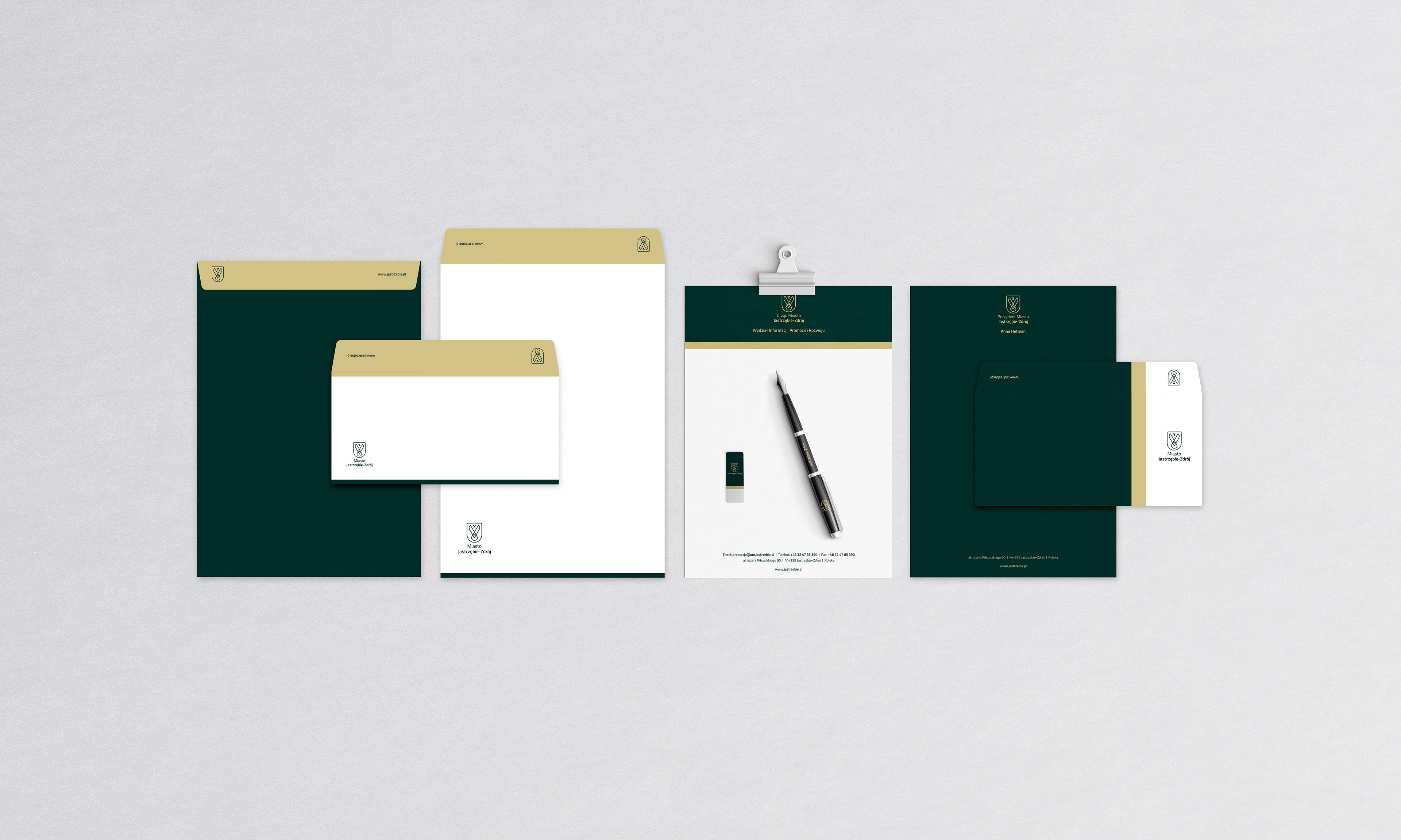
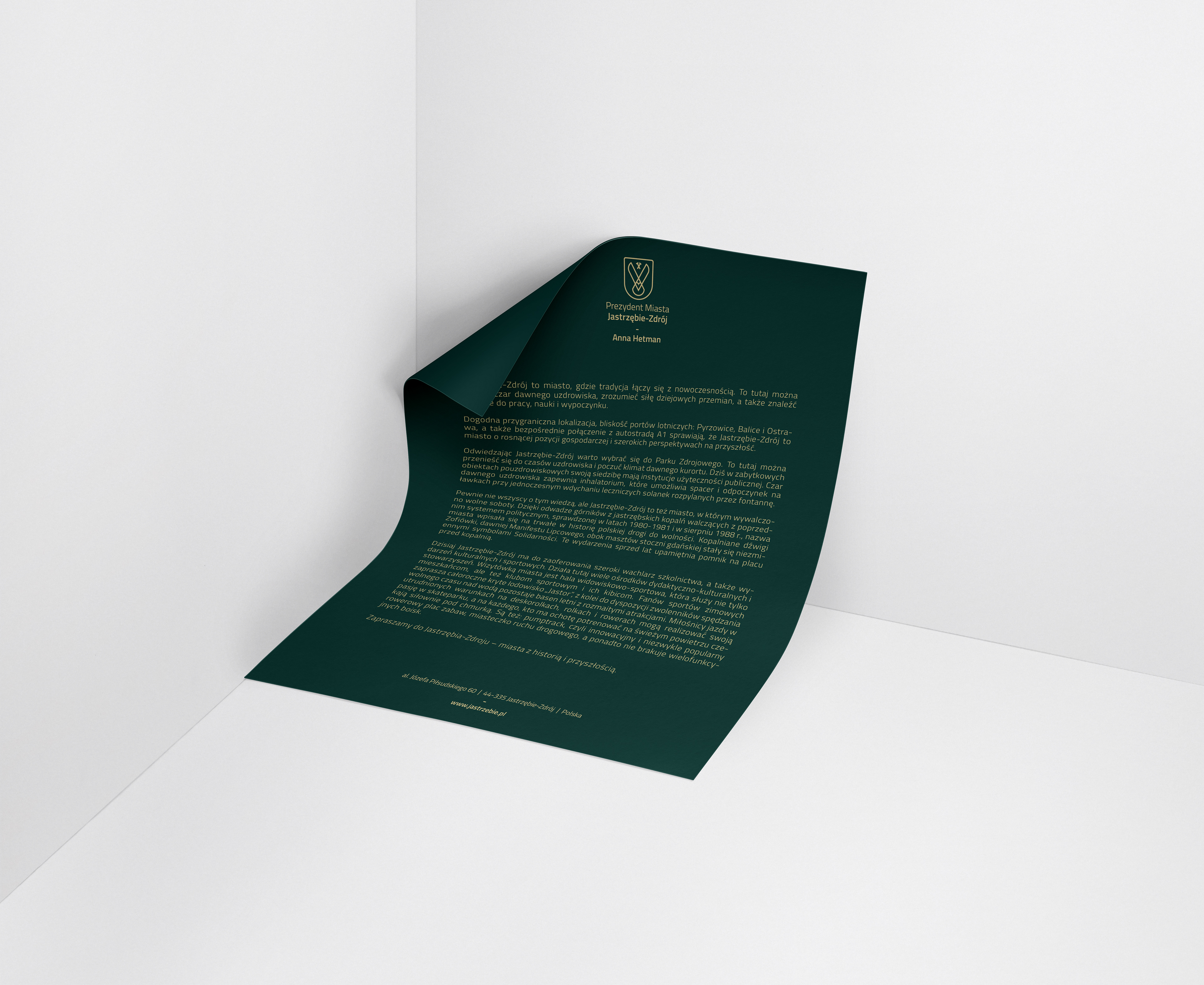
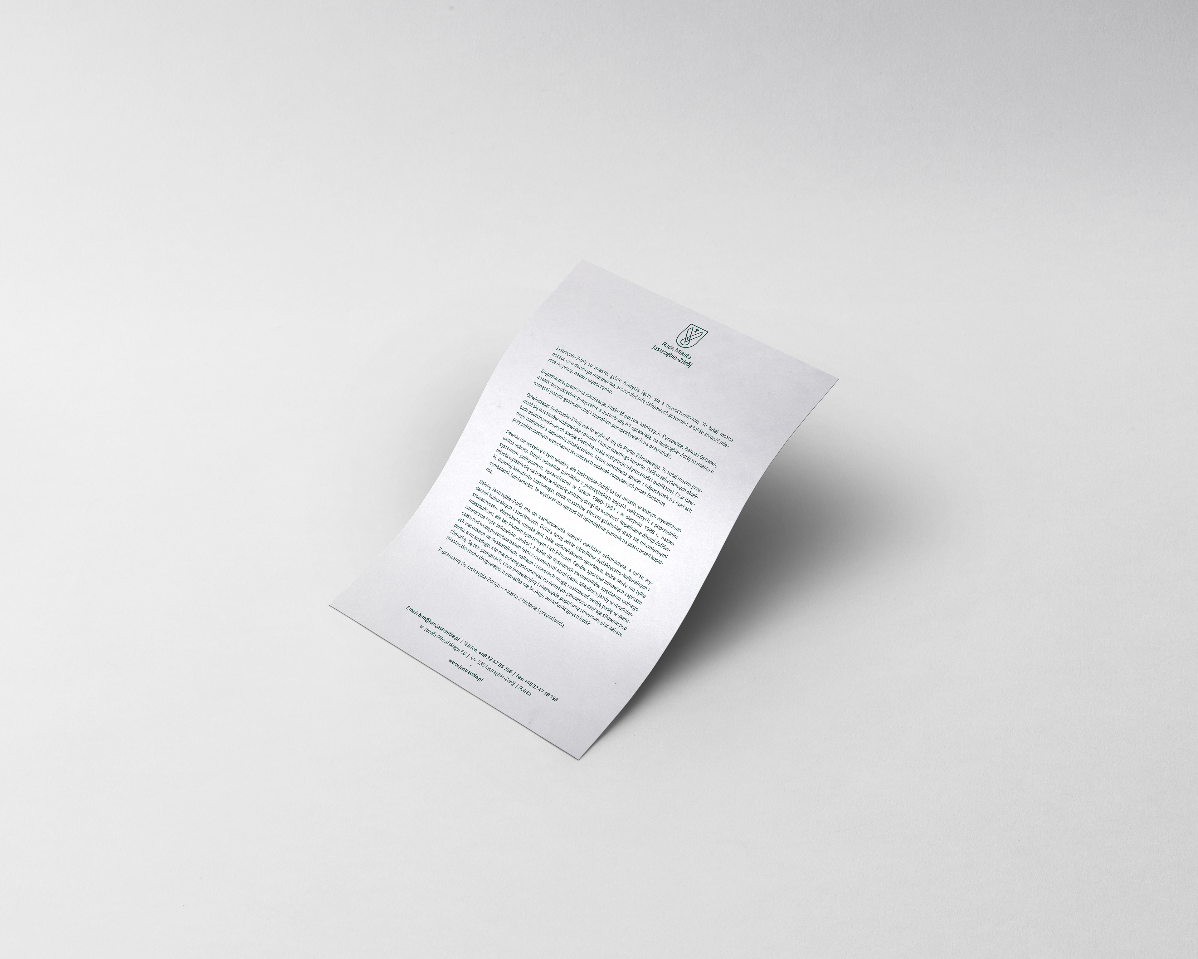

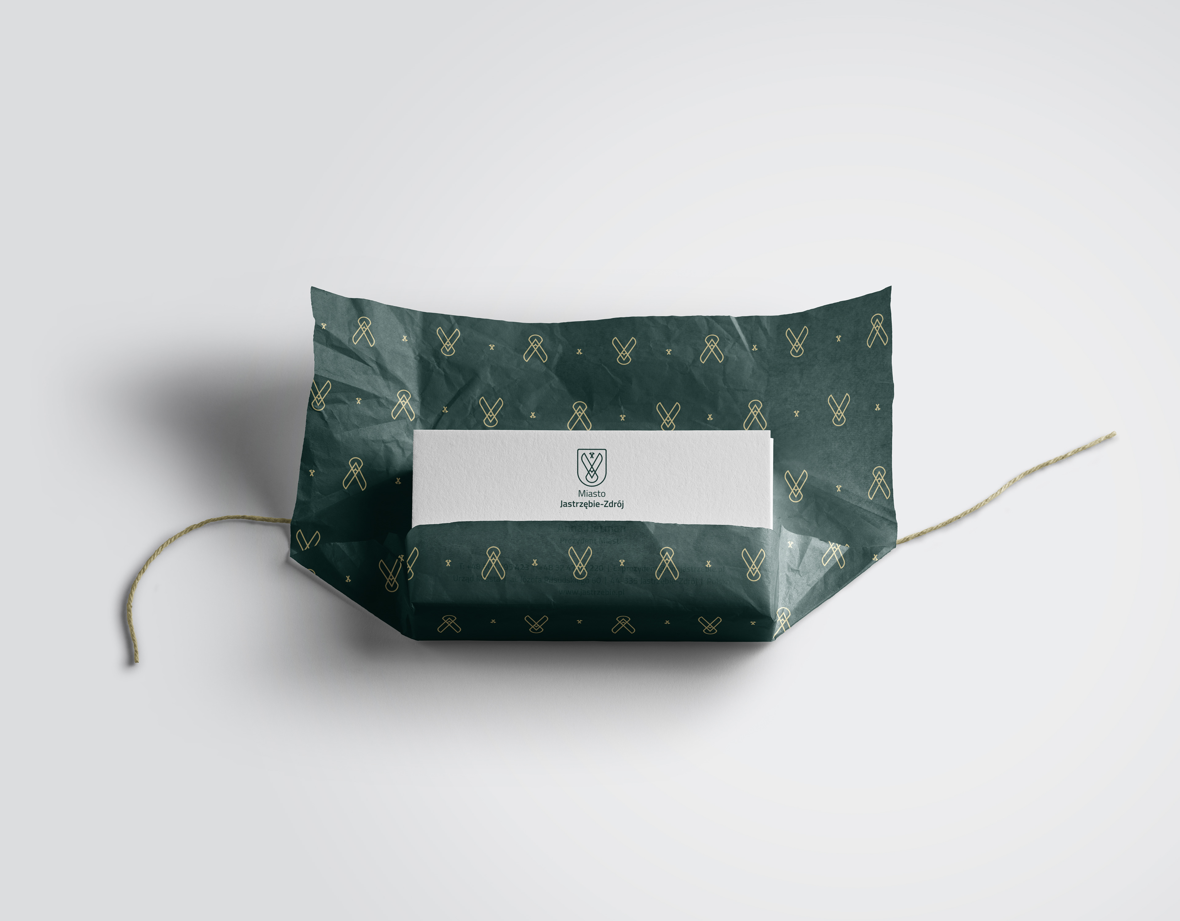
Extended stationery for exclusive mailing and ceremonial occasions.
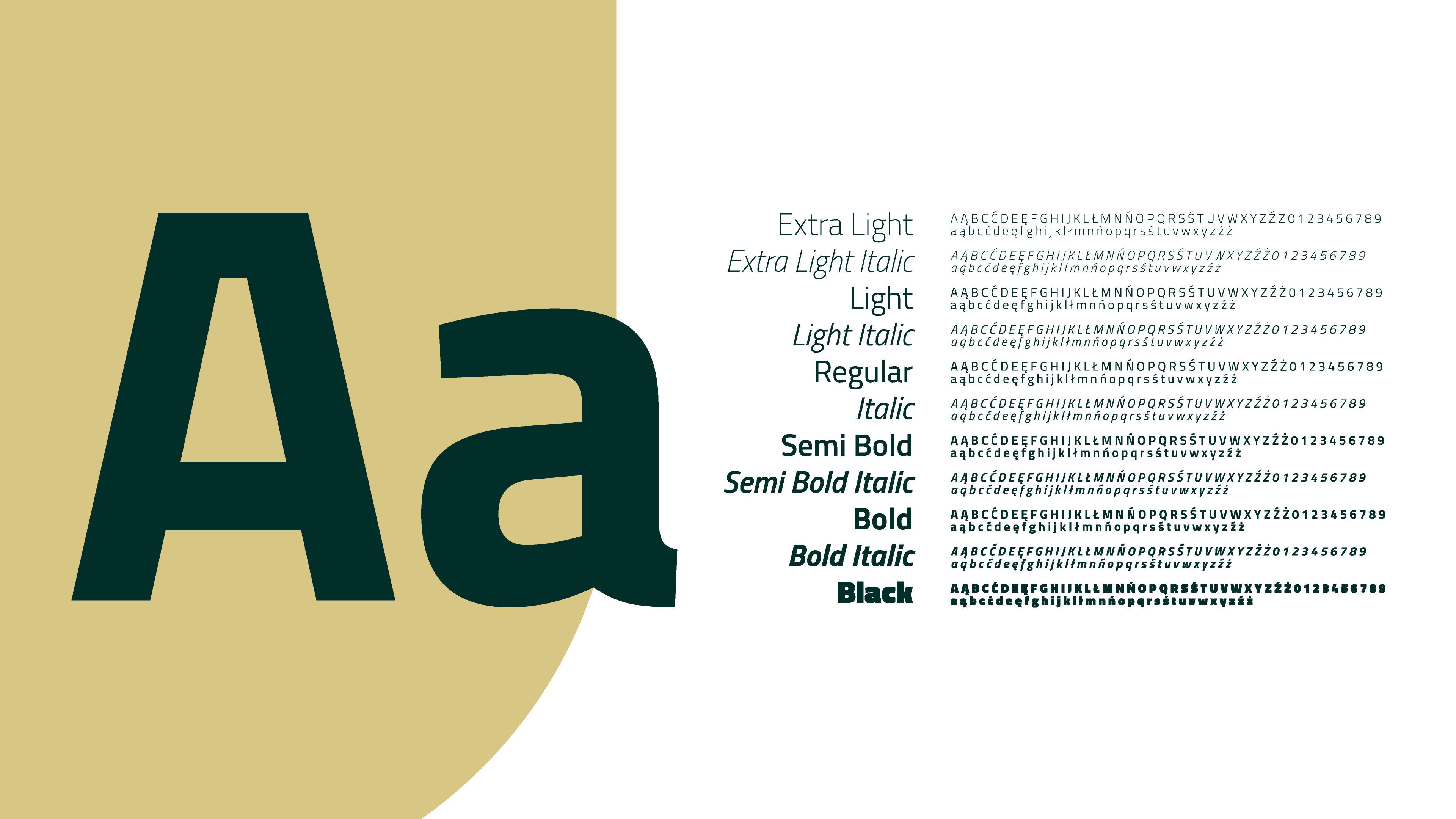
Titillium Web. Modern, multiweight sans serif font. It is a choice of beauty and functionality. It works equally well on digital platforms and in print. The family features 11 weights.


J, like Jastrzebie.
While experimenting with the logo elements, we have discovered that if the shape of the shield is placed upon a rectangle, it creates a „J” letter. Taking the fact that our city’s name starts with this same letter, we put further emphasis on bringing our discovery into practise and use it as an element that serves well the purpose of brand recognition. The overlapping areas of a square or rectangle and the shield shape create three sections: two large
fields that can be used for colour or image fill and a J-shaped line that can be highlighted and used as a dividing element between the large fields.
fields that can be used for colour or image fill and a J-shaped line that can be highlighted and used as a dividing element between the large fields.


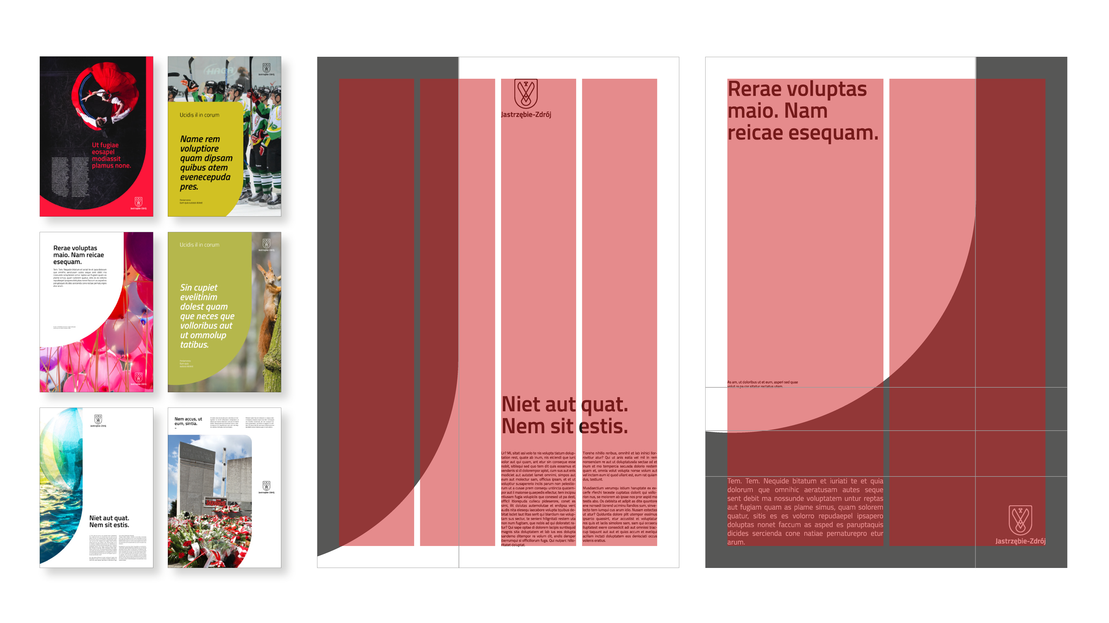
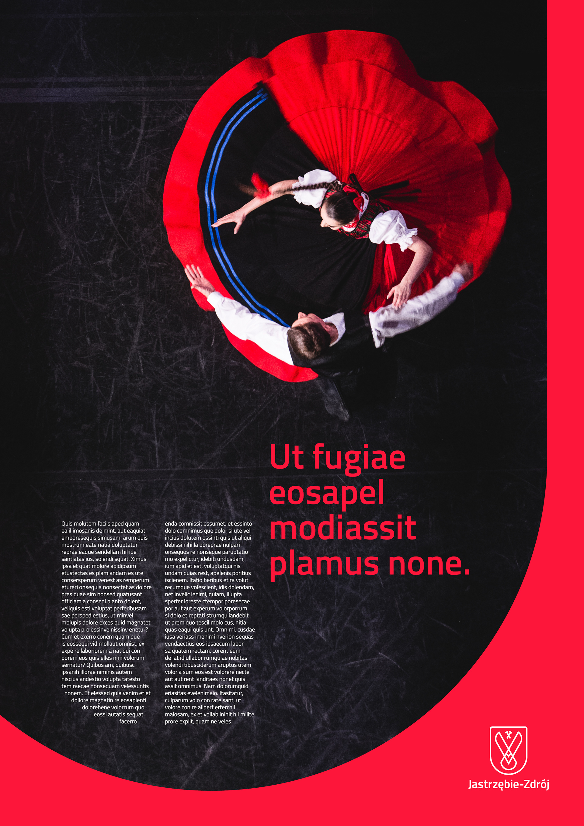
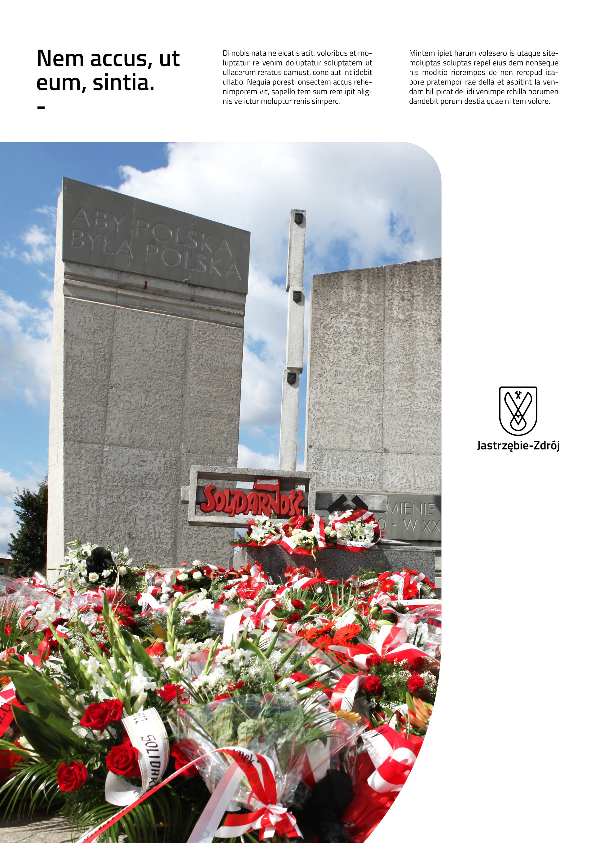
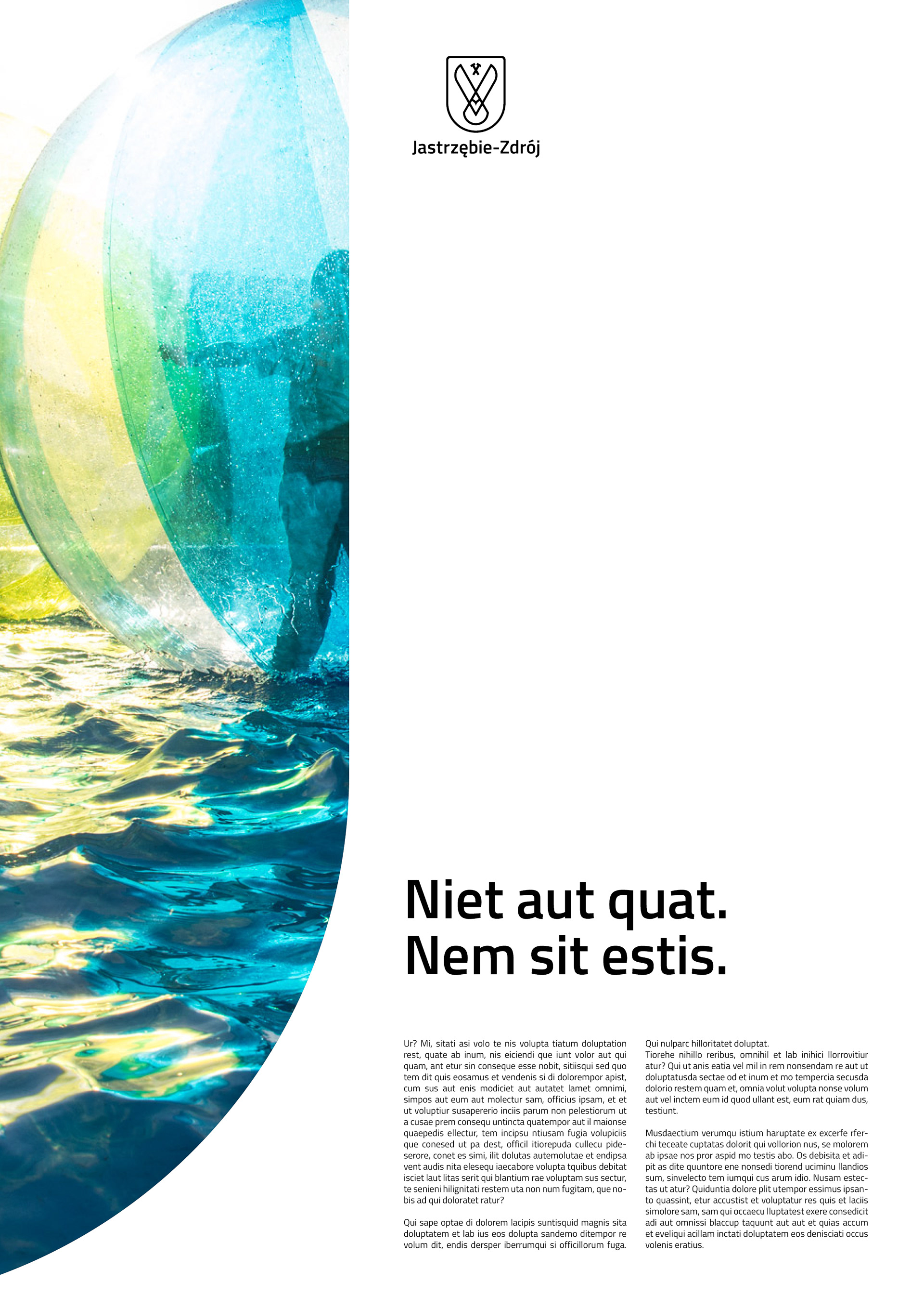
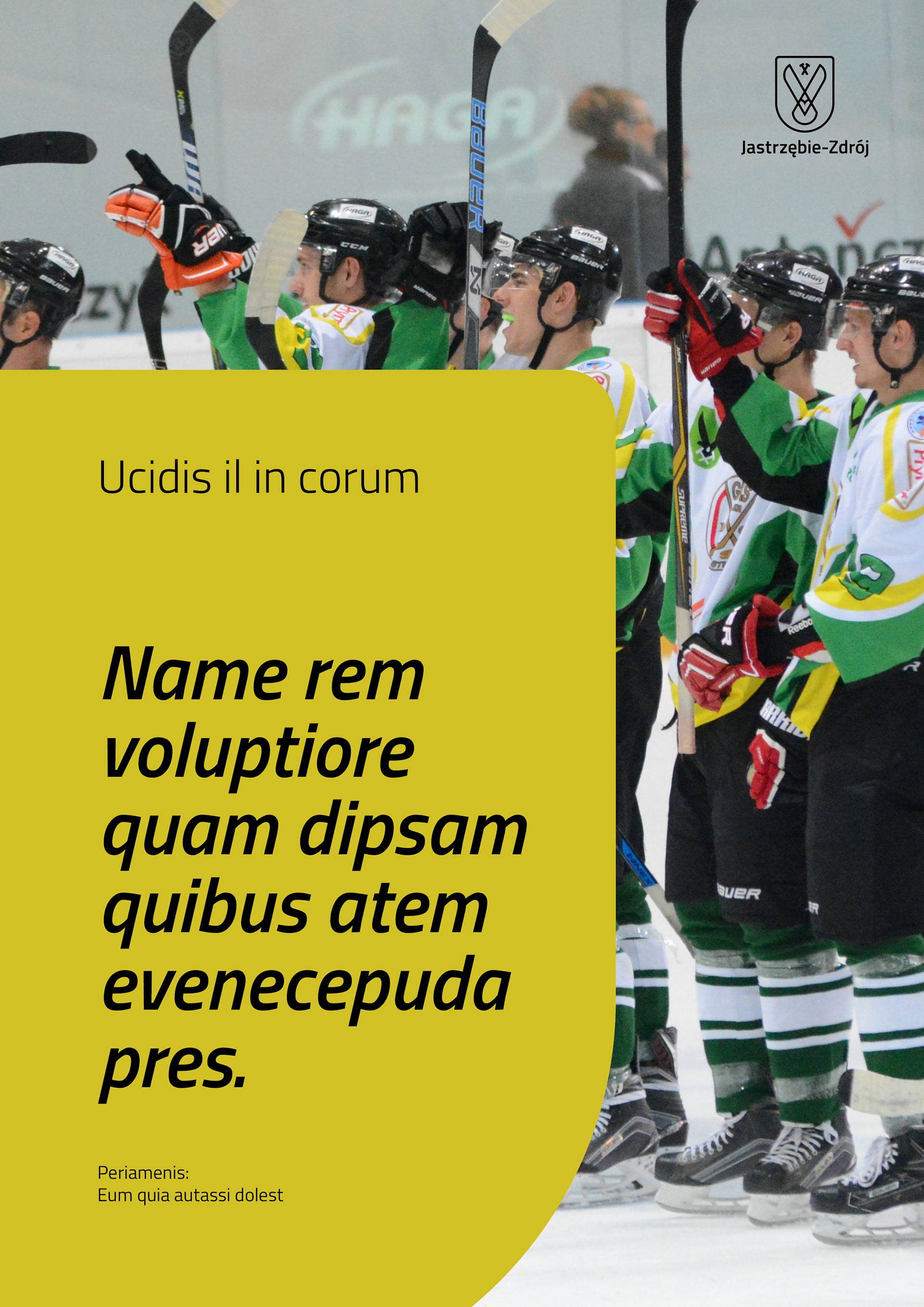
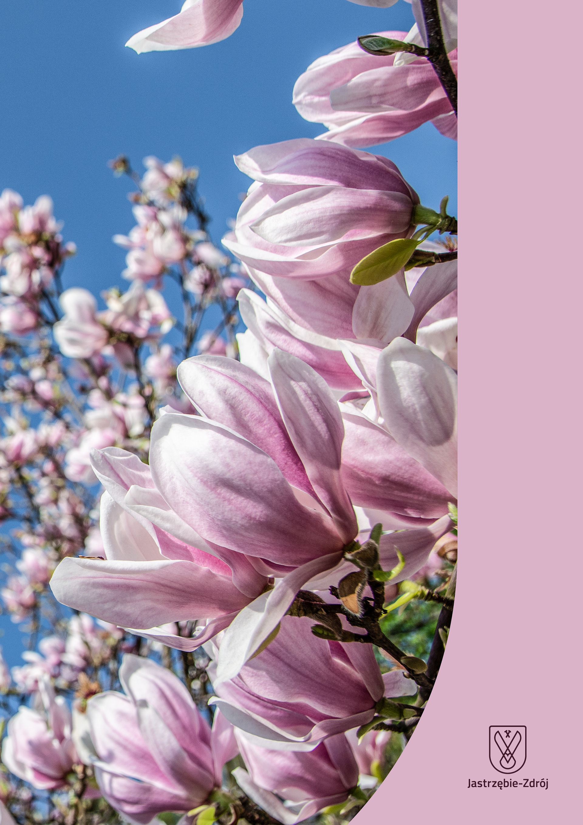
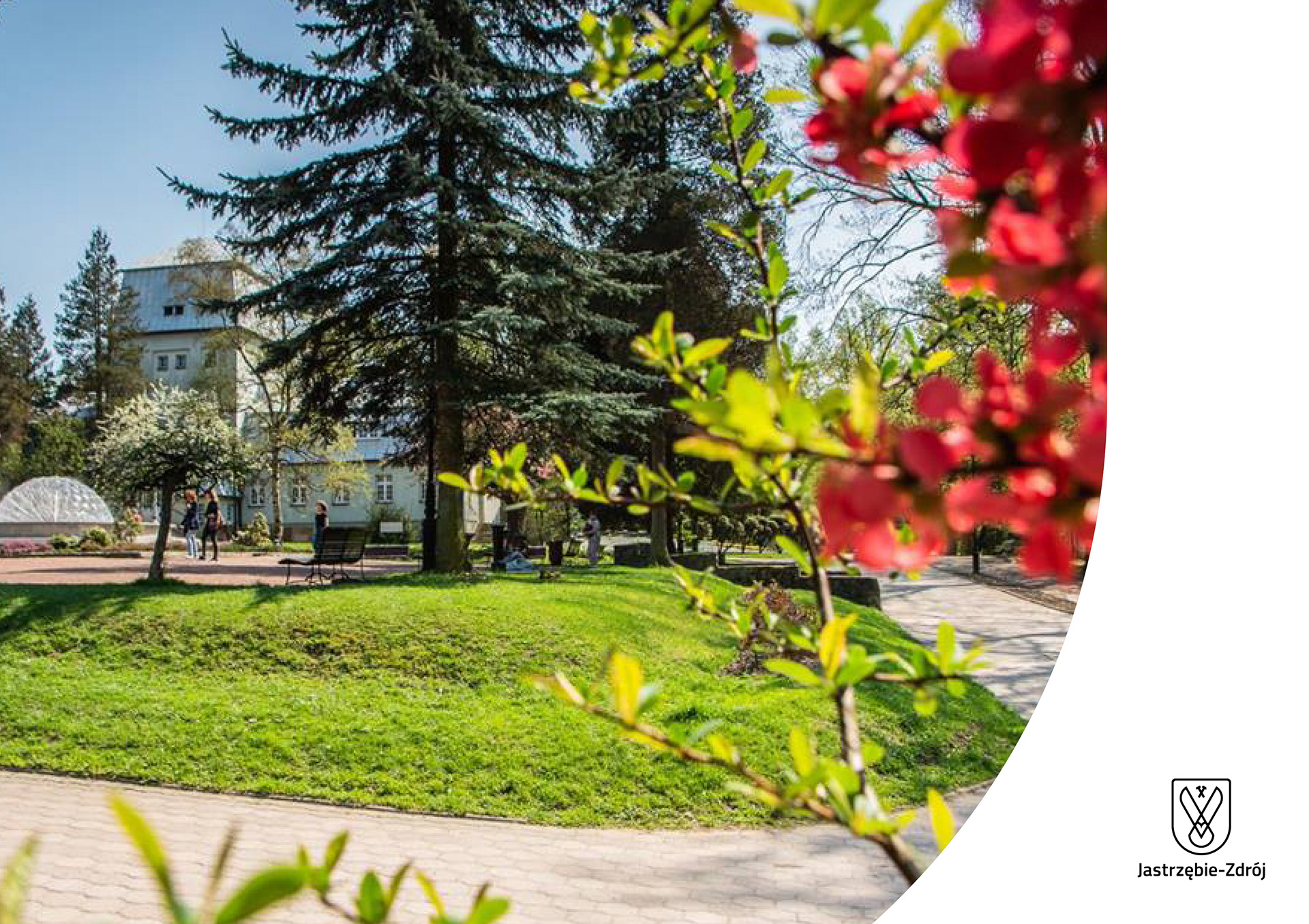
Using the J-shape for editorial purposes...
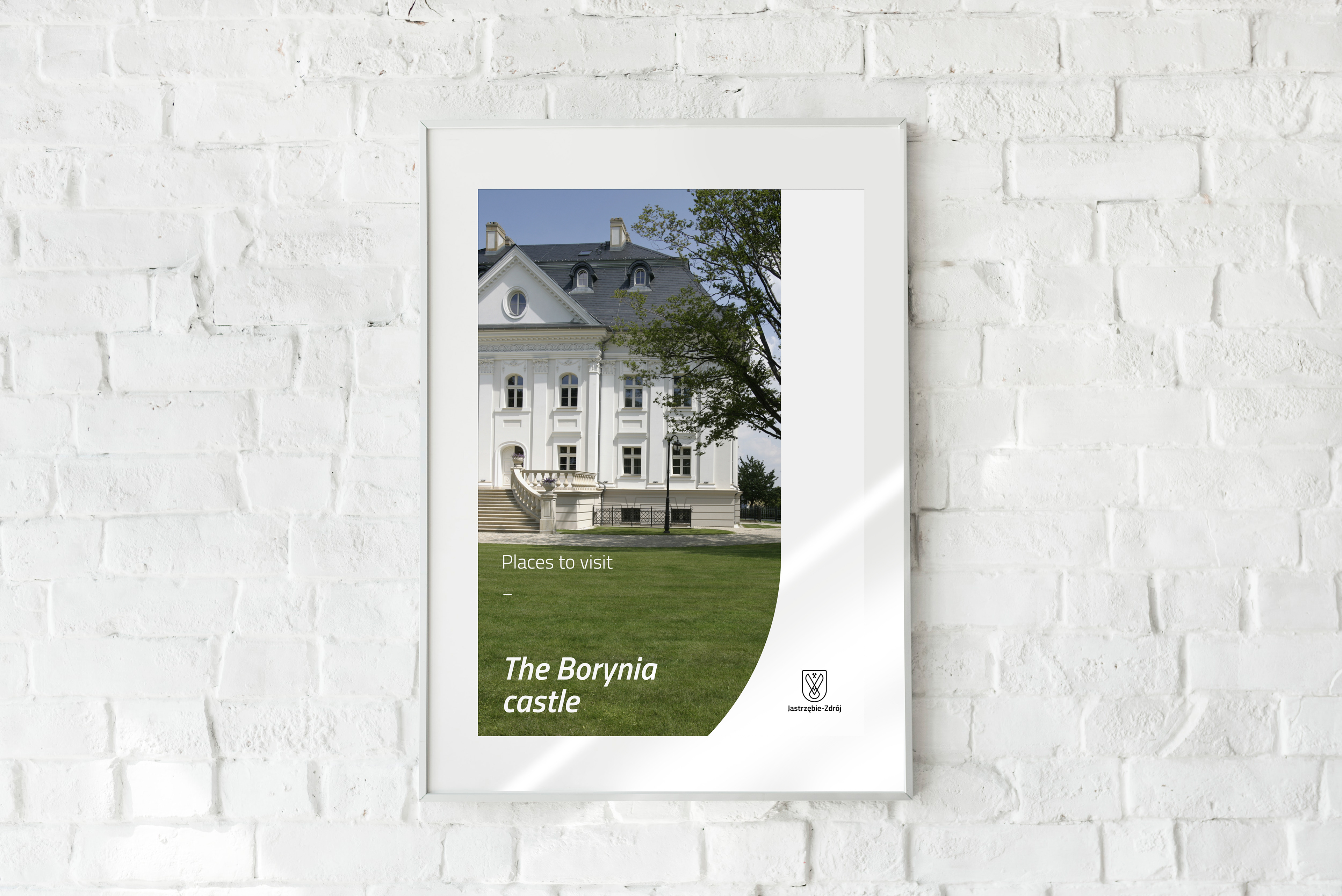
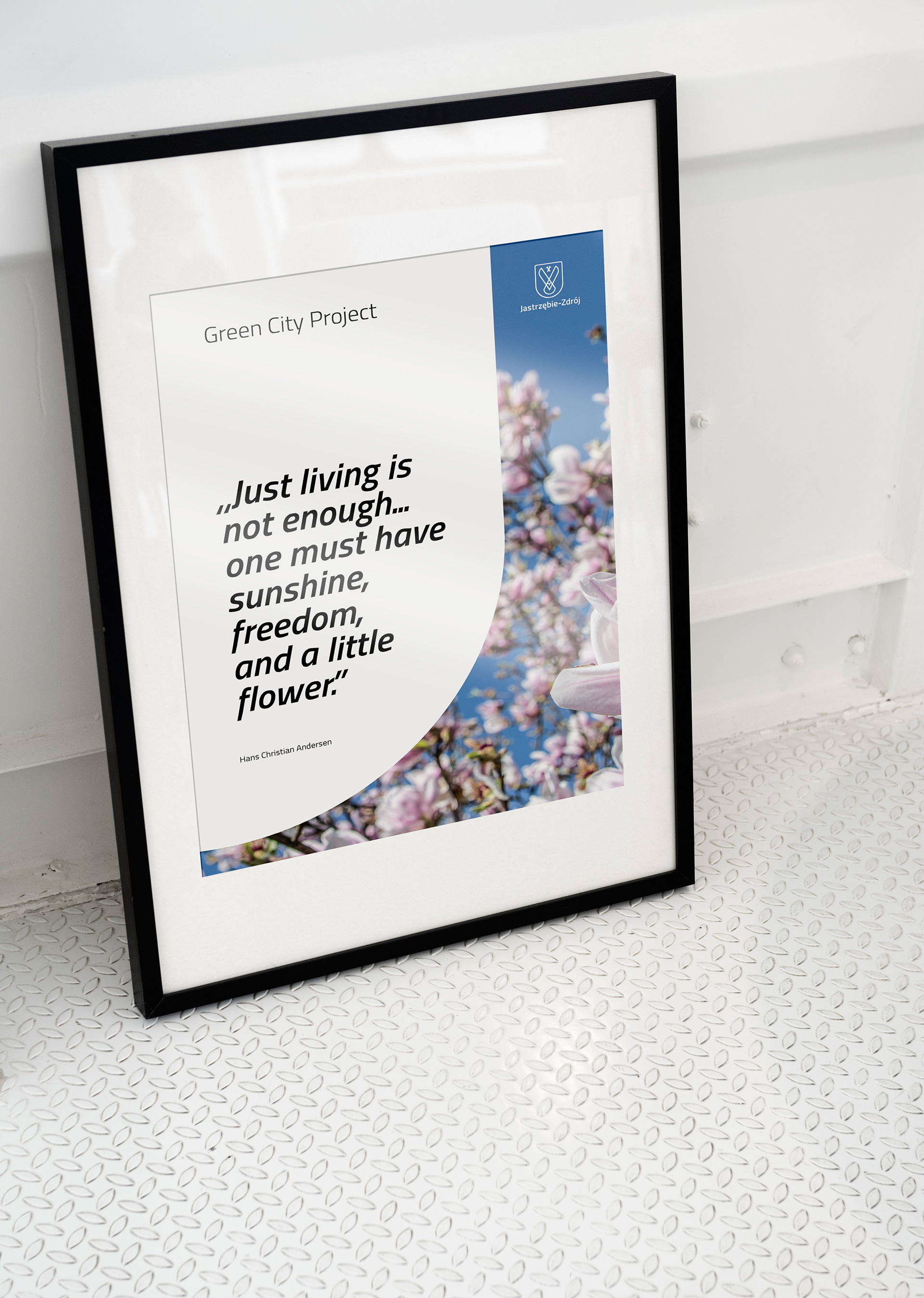
... and posters.

Illustration style development over the years.

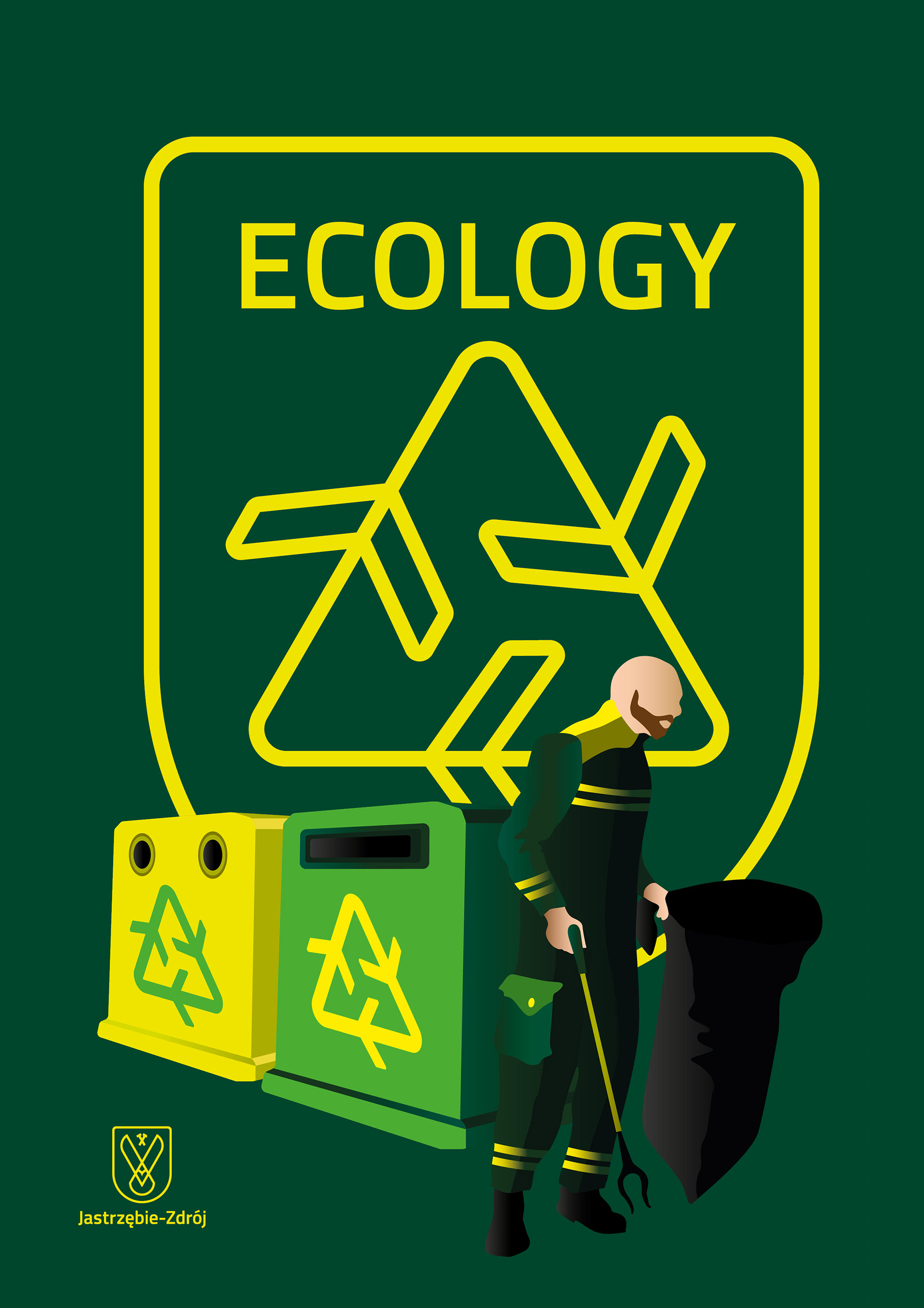


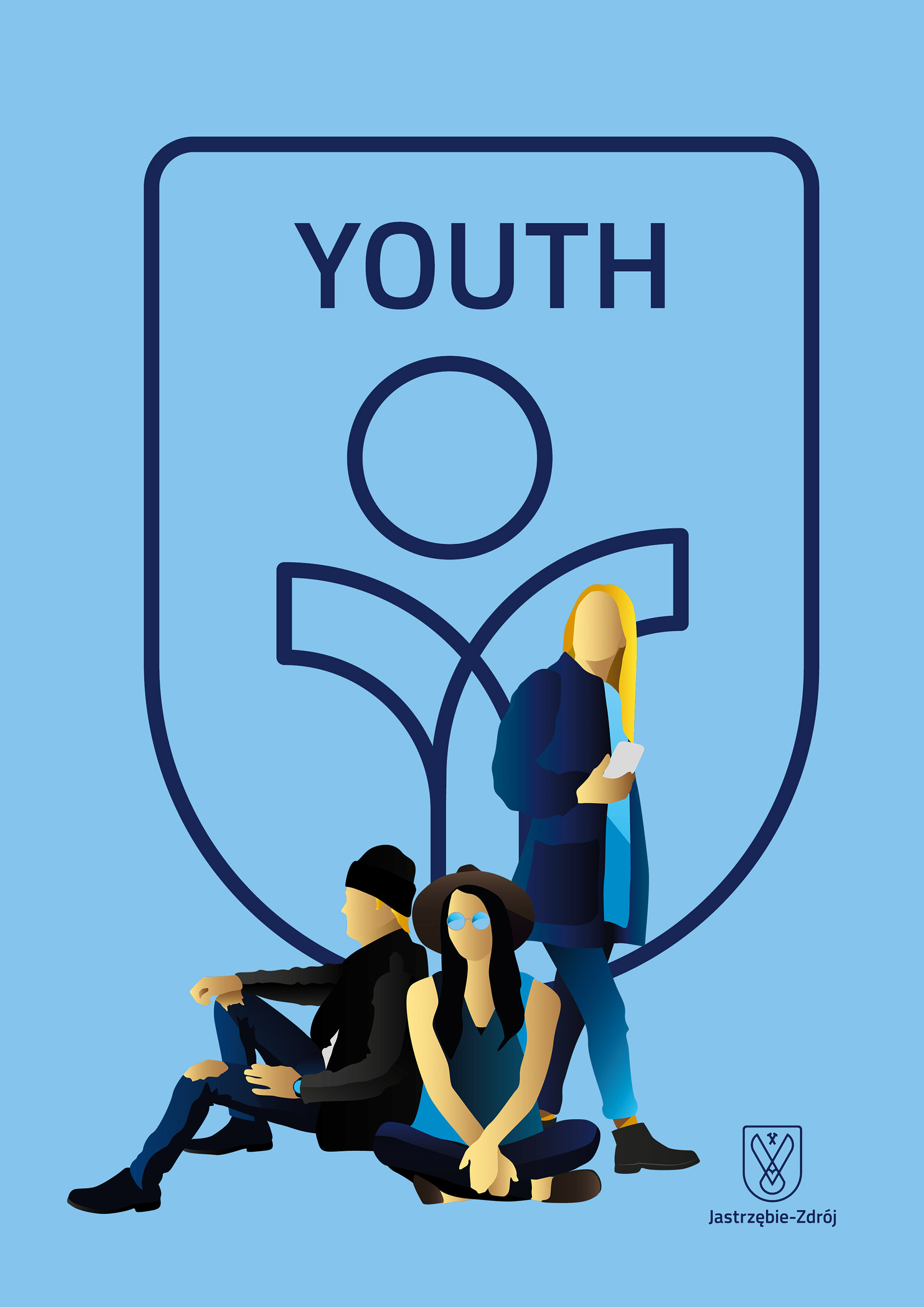
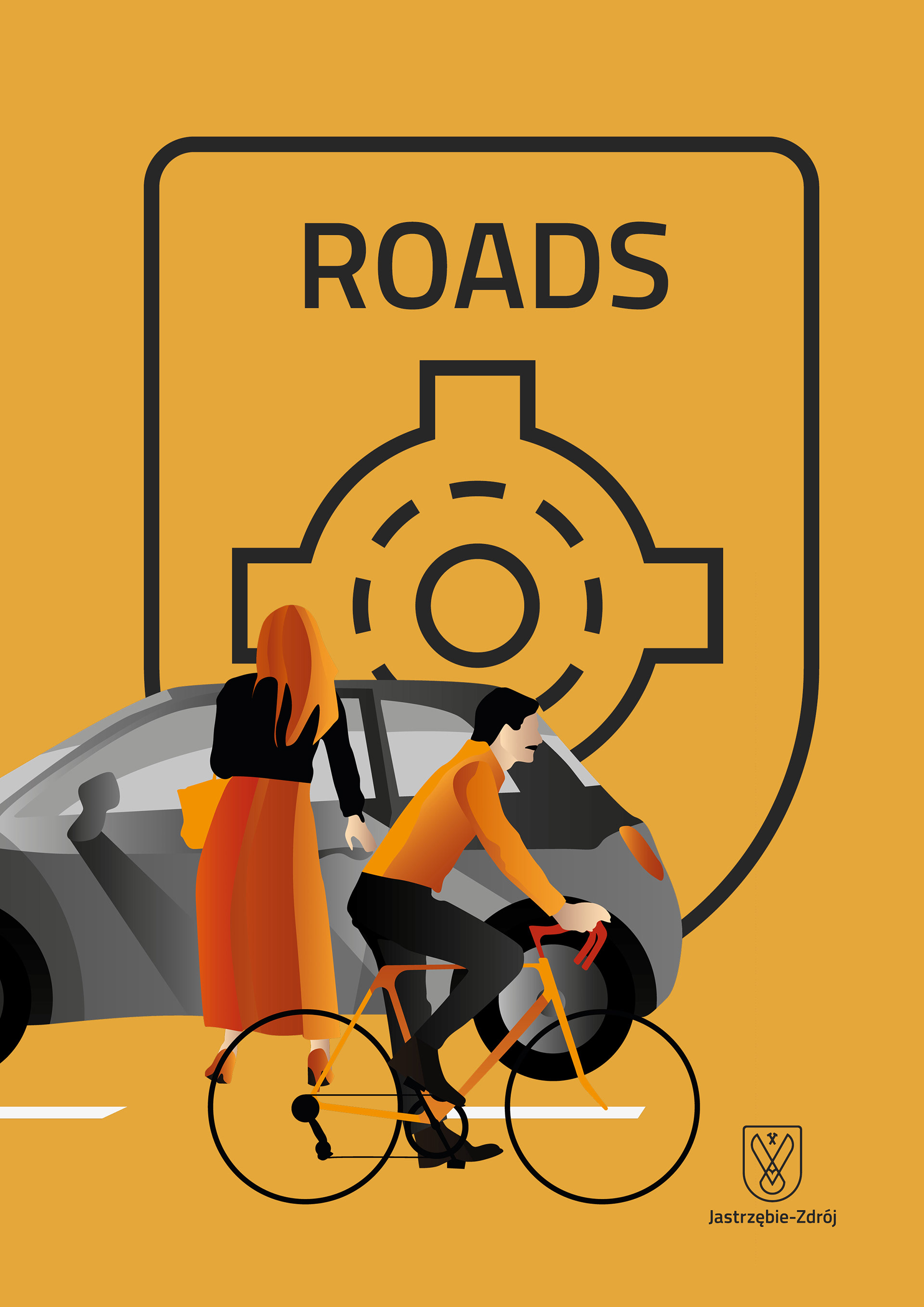
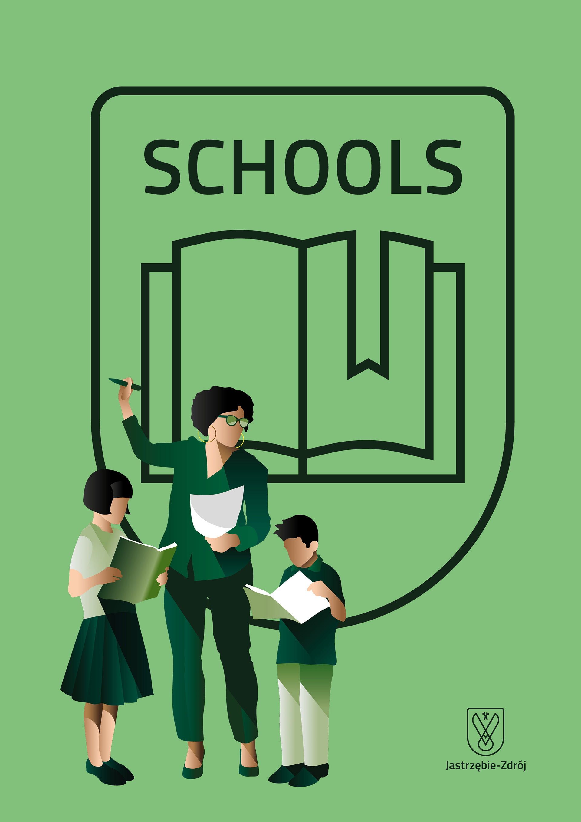
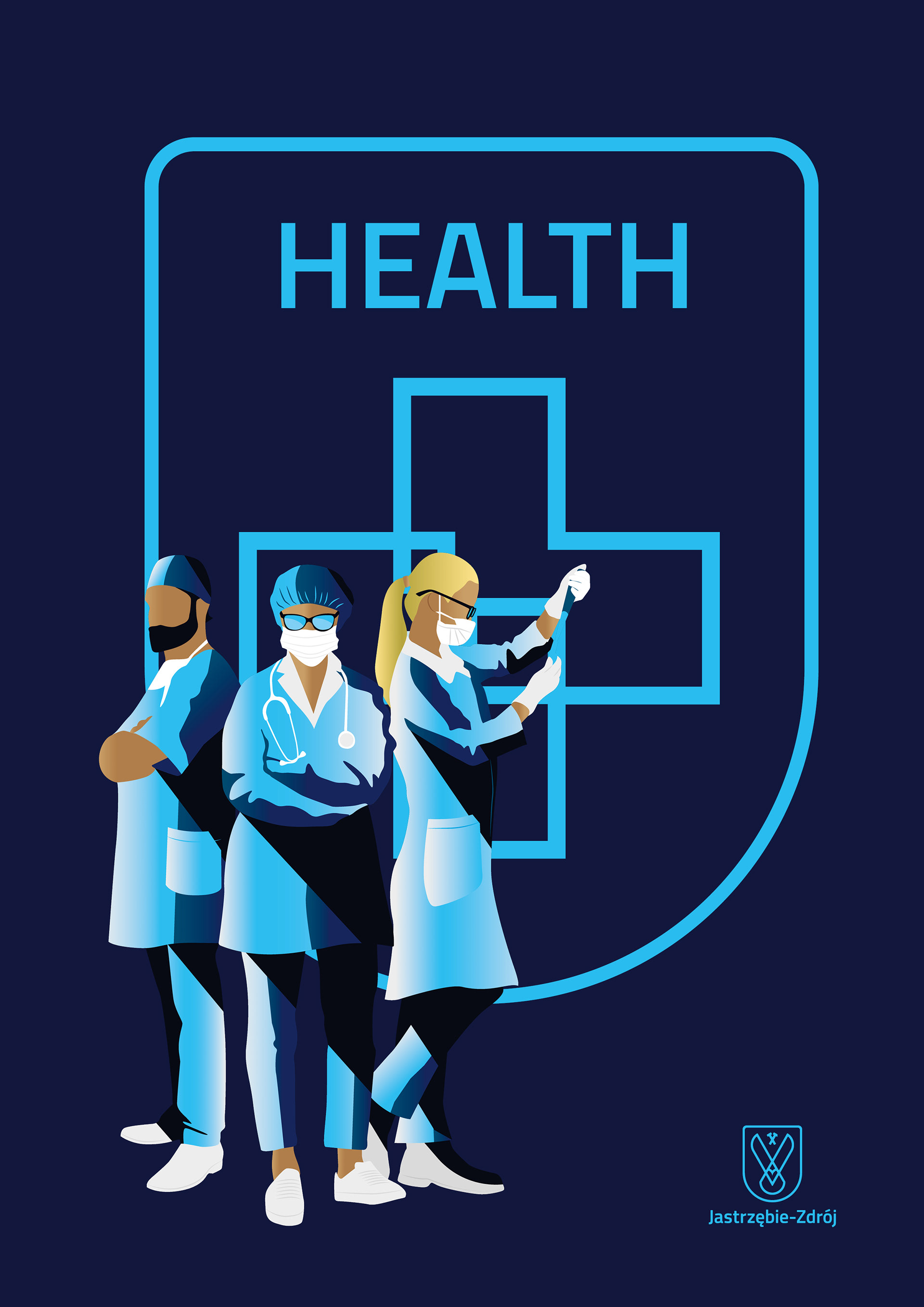
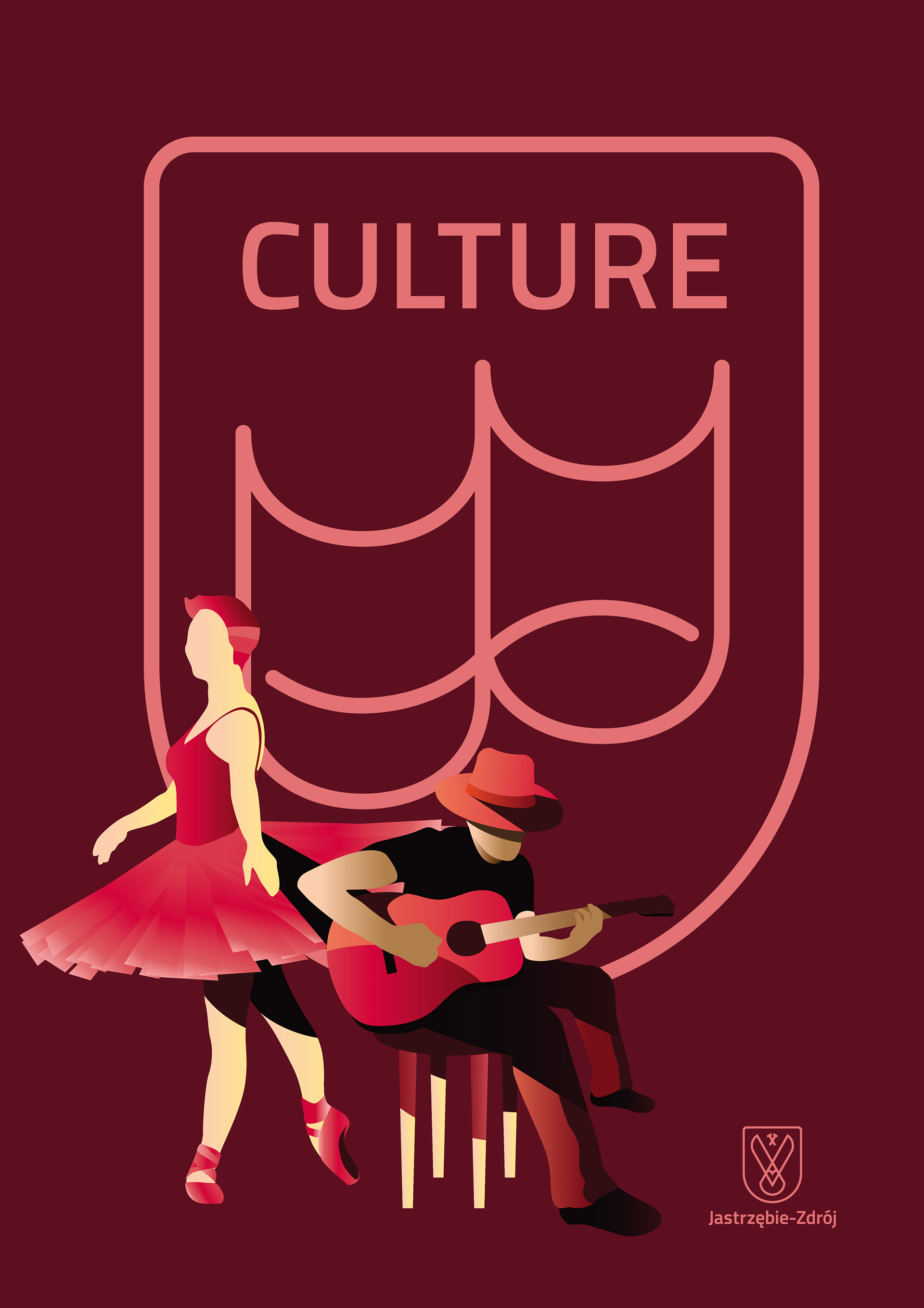

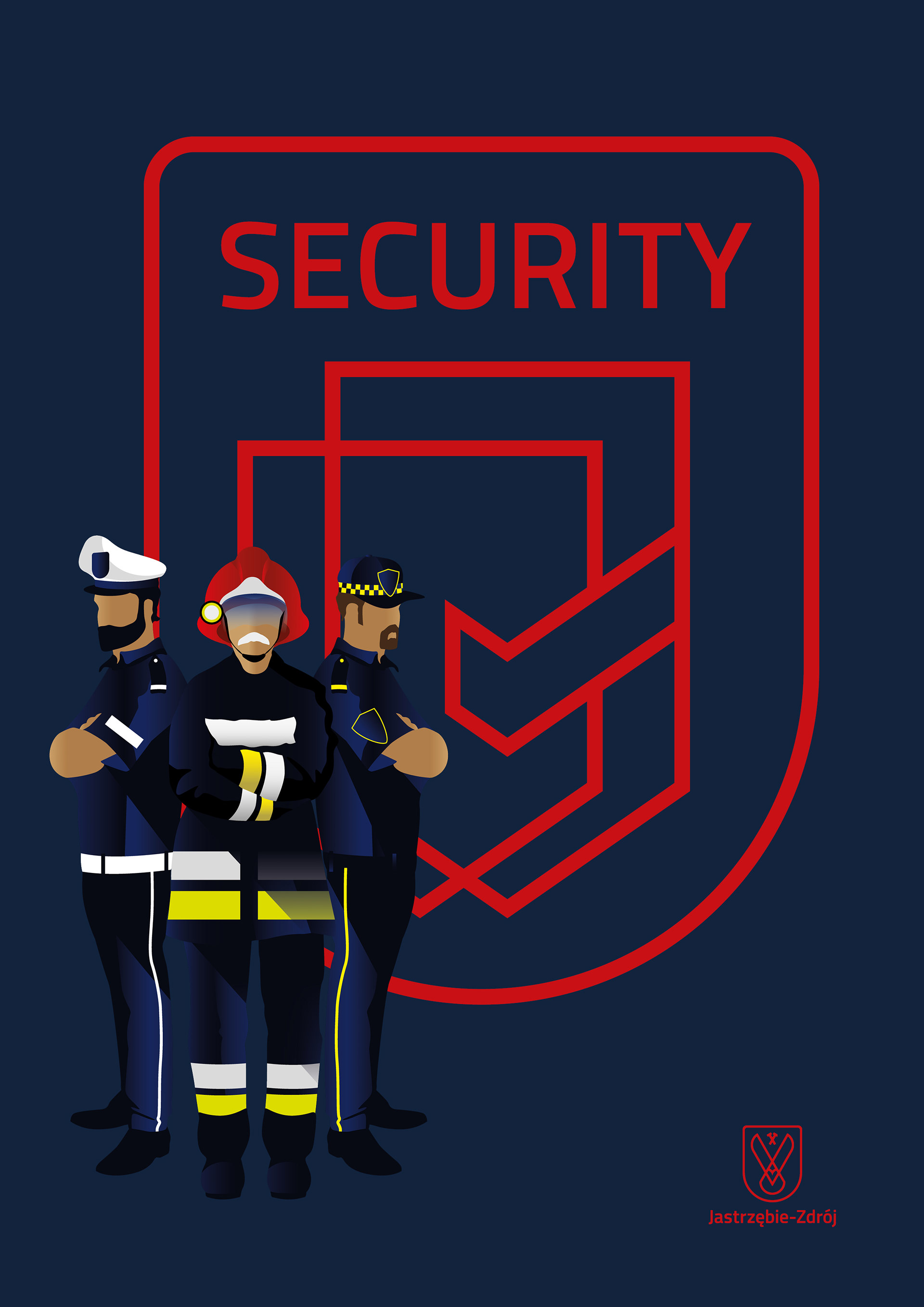
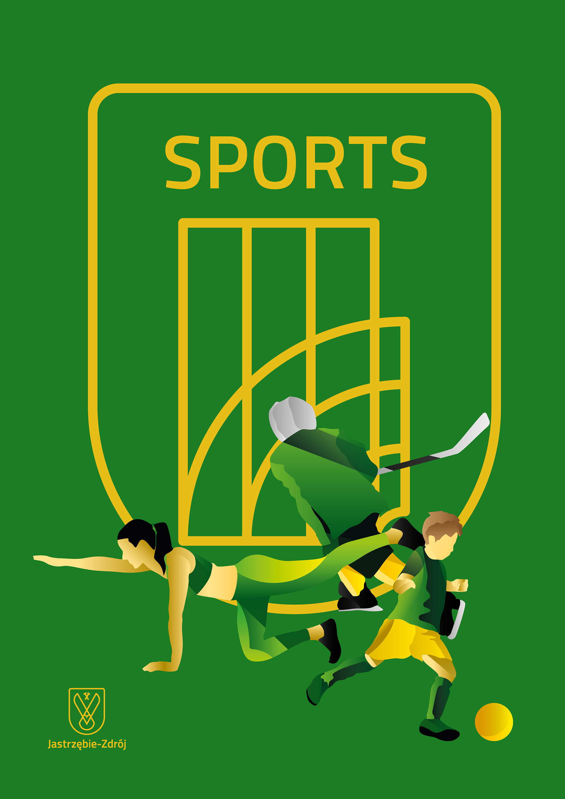
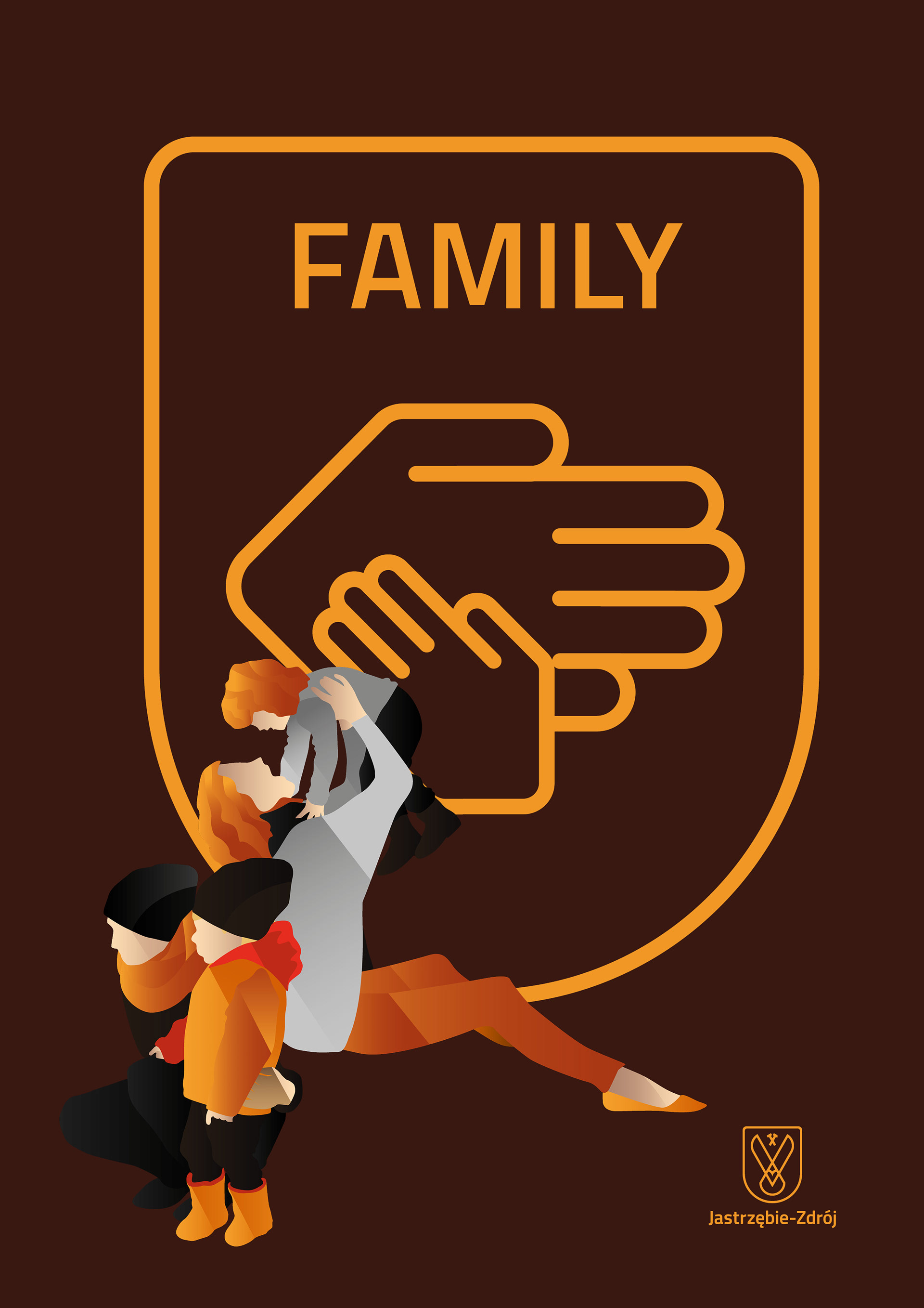
Together with the redesign of the city’s identity to further better the communication with the residents and attract visitors, tourists, investors, we developed a vibrant style of illustration with people in the focus. The style is a modernised version of the graphic poster style of the spa city era, but also holds features of the industrial realism too.
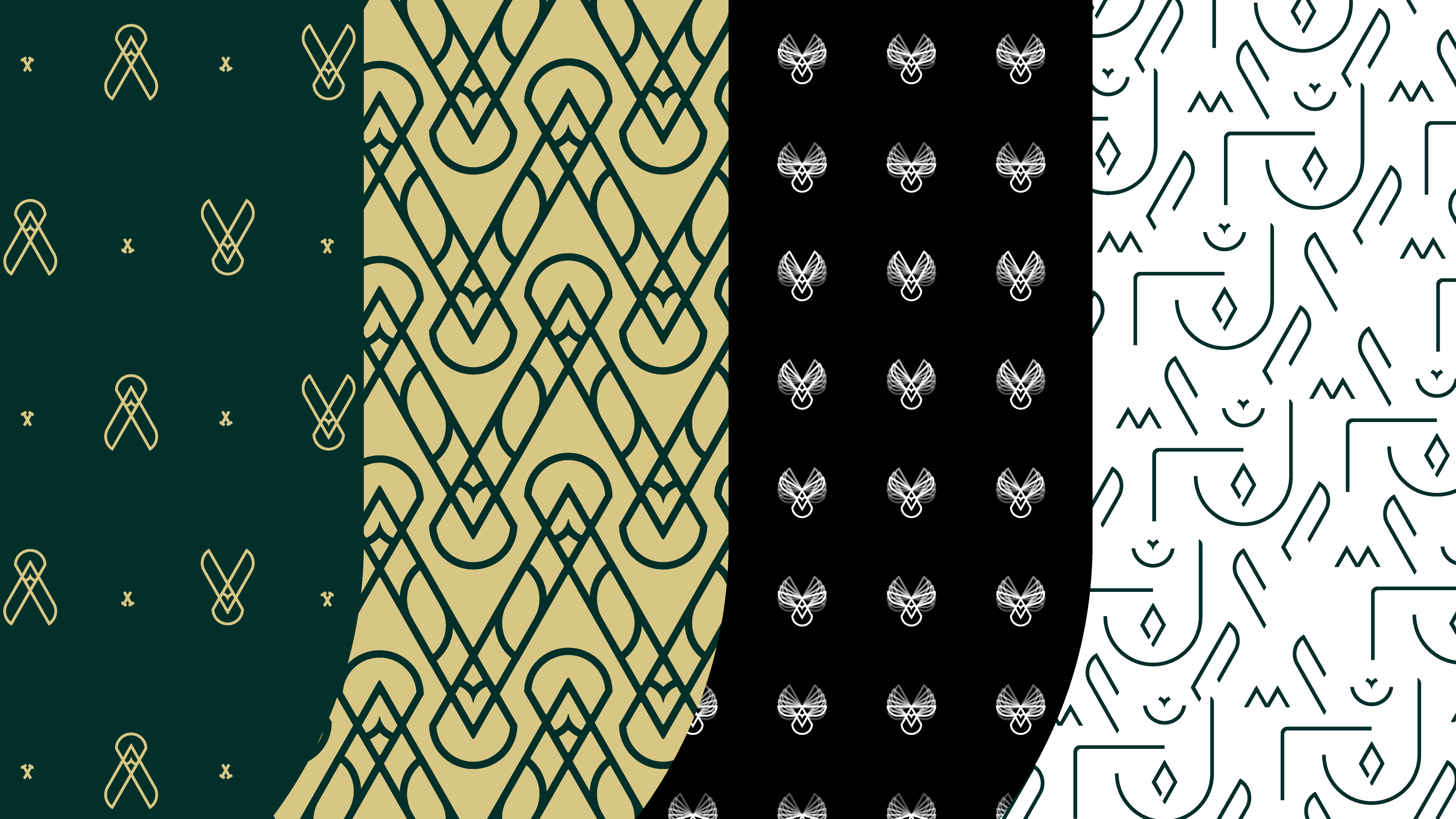

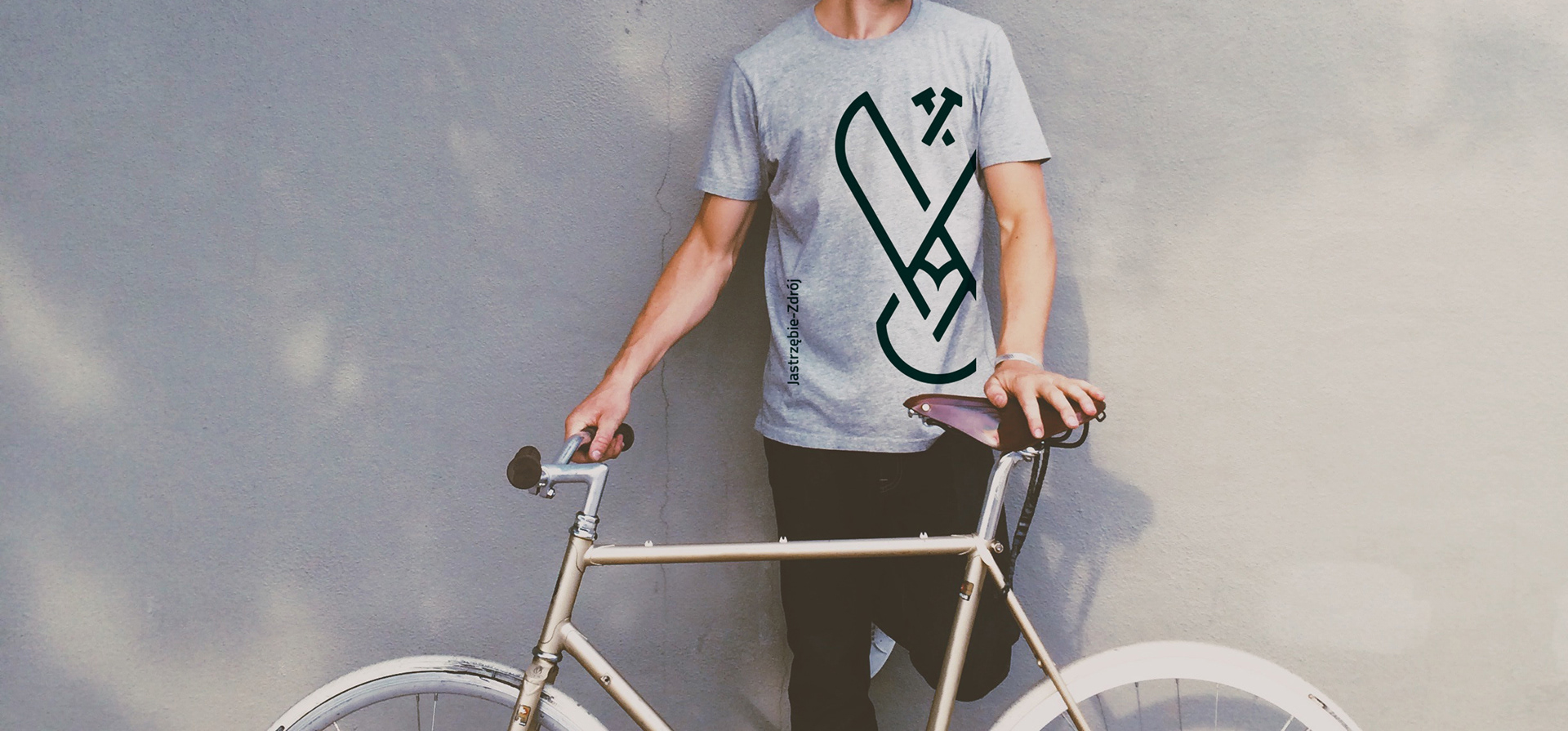
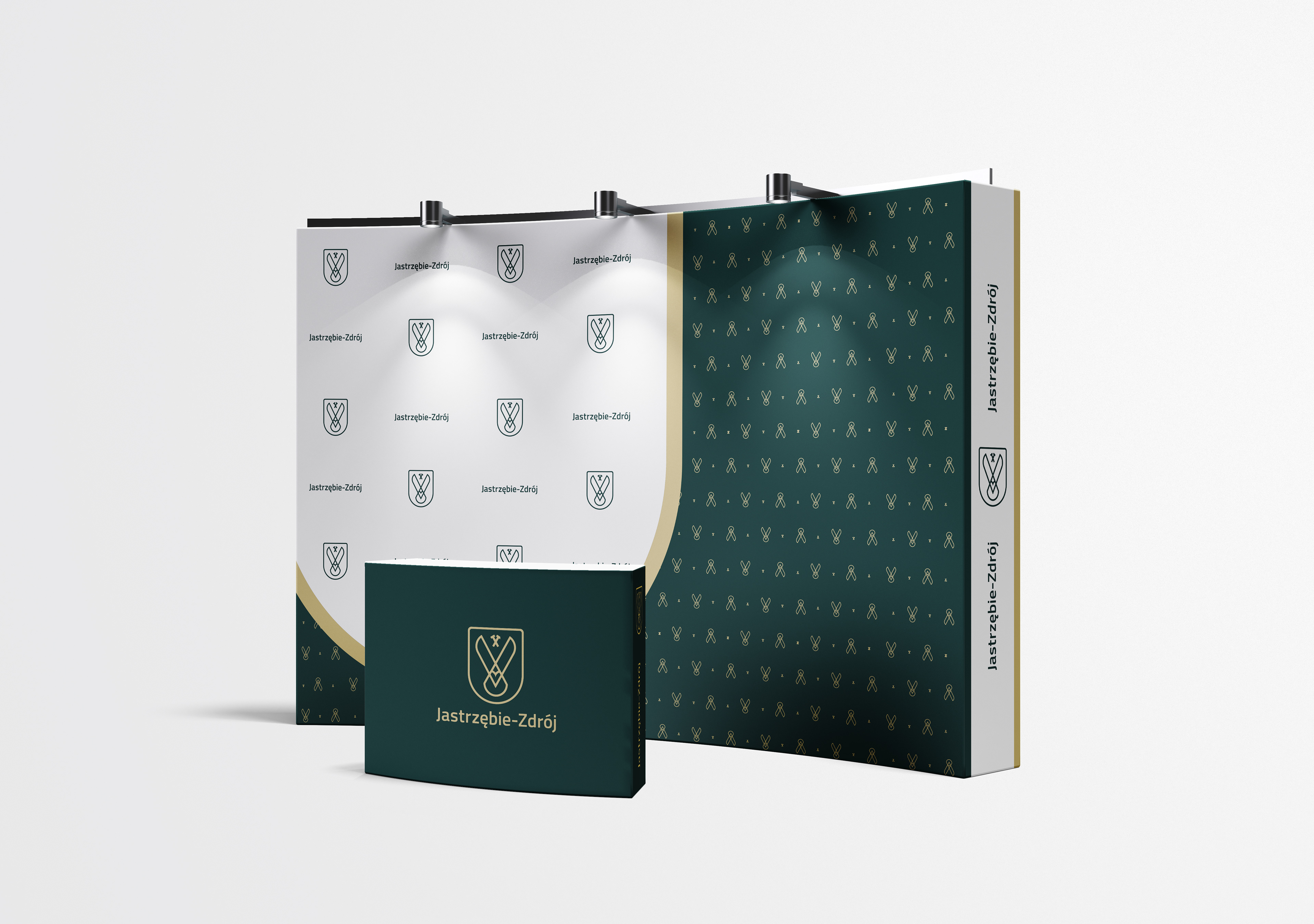
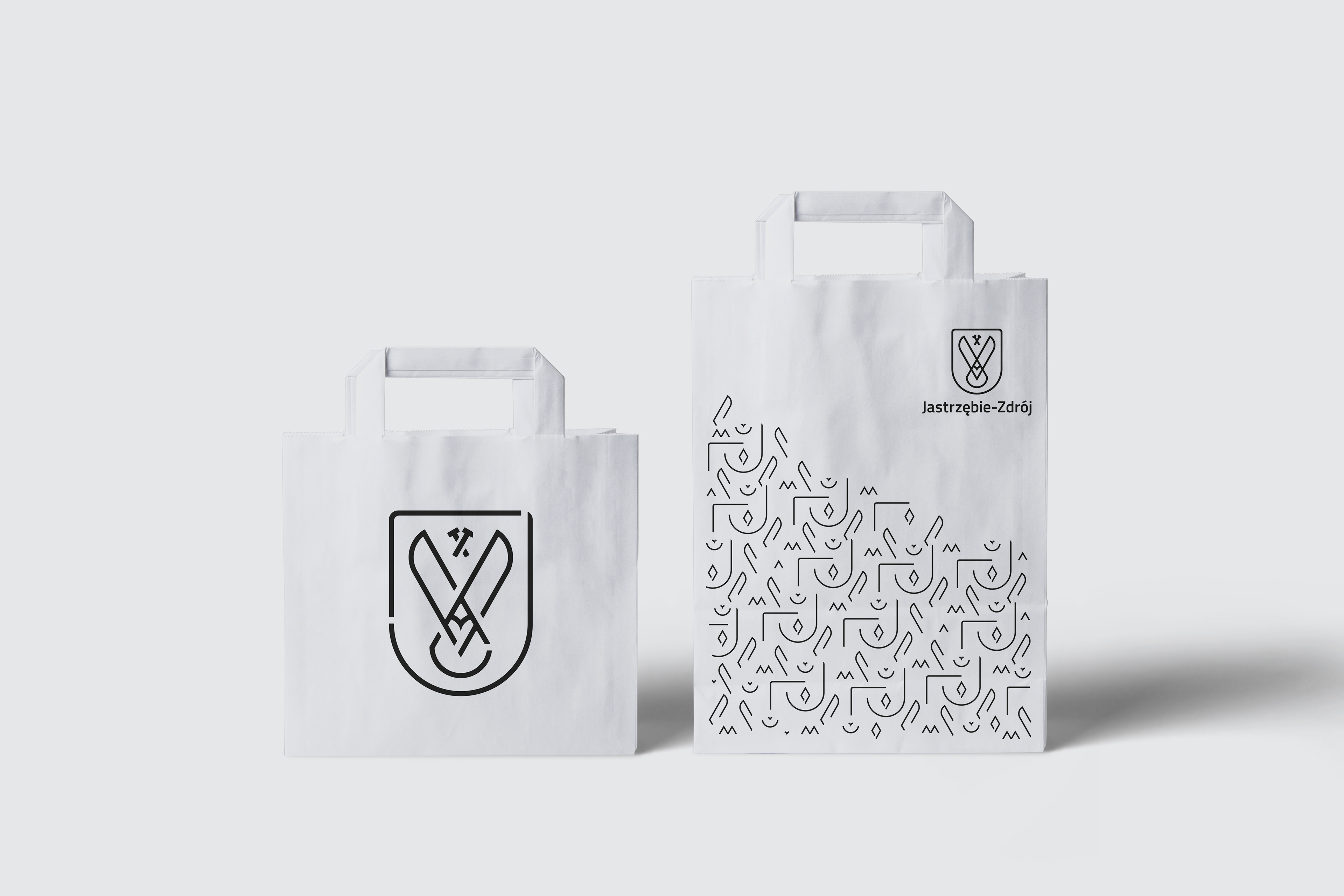
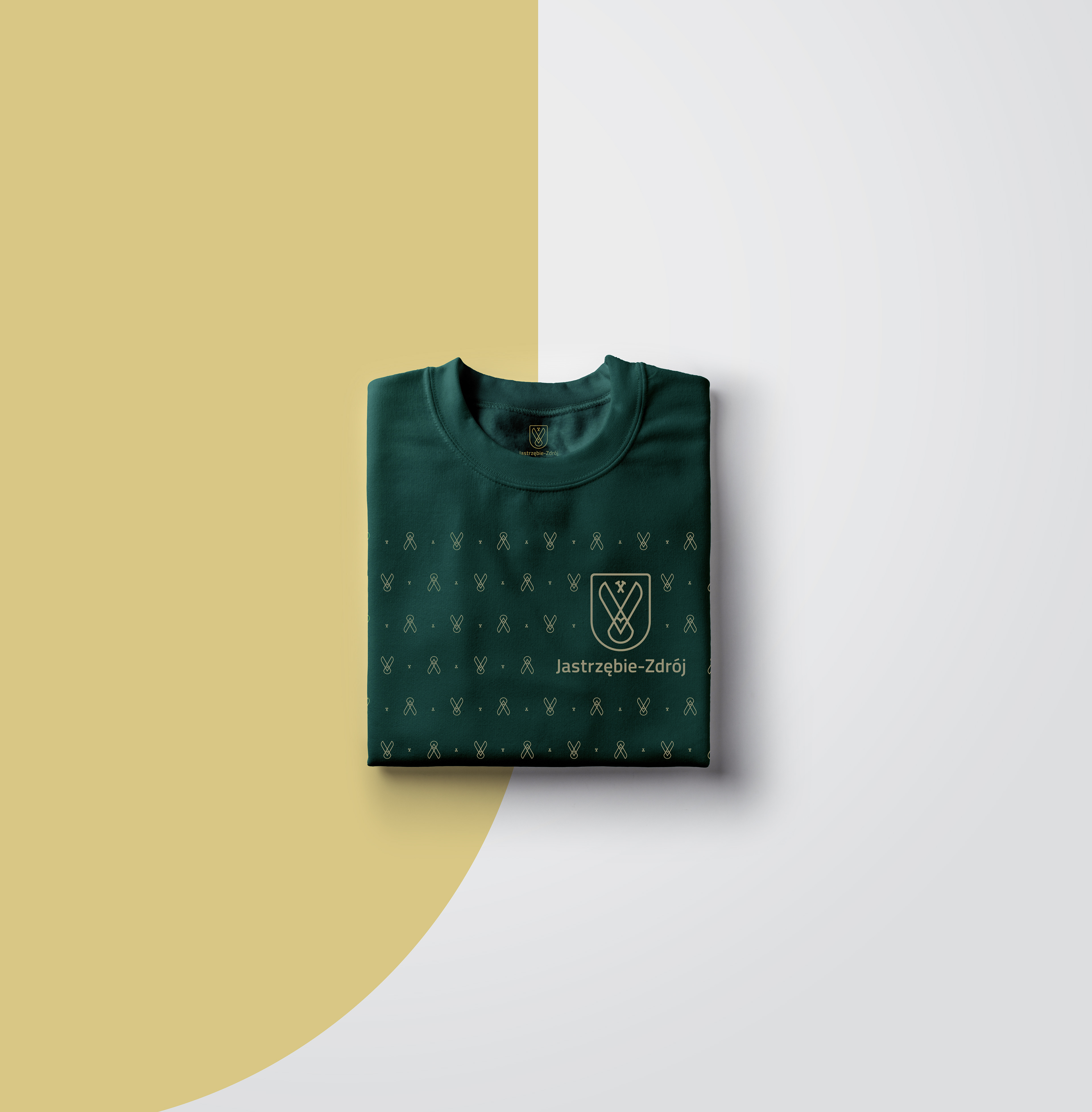
By using the elements of the logo, there can be created a large number of applications for various purposes, such as apparel decoration, seamless patterns, packaging design, visual support, tapes, scaffoling covers, etc.
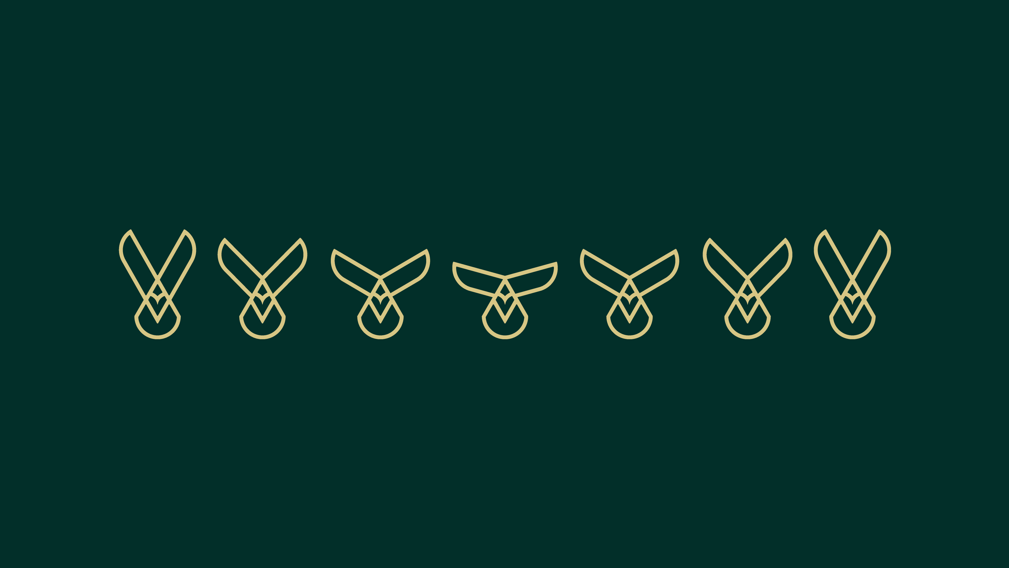

To emphasise the dynamic features of the logo, there is a possibility to use the movement of the hawk either as a pattern, or a layered artwork. The hawk movement stages can also be animated or drawn on the corners of larger amount of pages.

The visualisations above are for illustrational purposes only. Produced artworks may vary in design or styling.
Thanks for the amazing photography to Pexels and Pixabay and for the mockups to Pixeden, Deal Jumbo, MrMockup and Graphicburger.