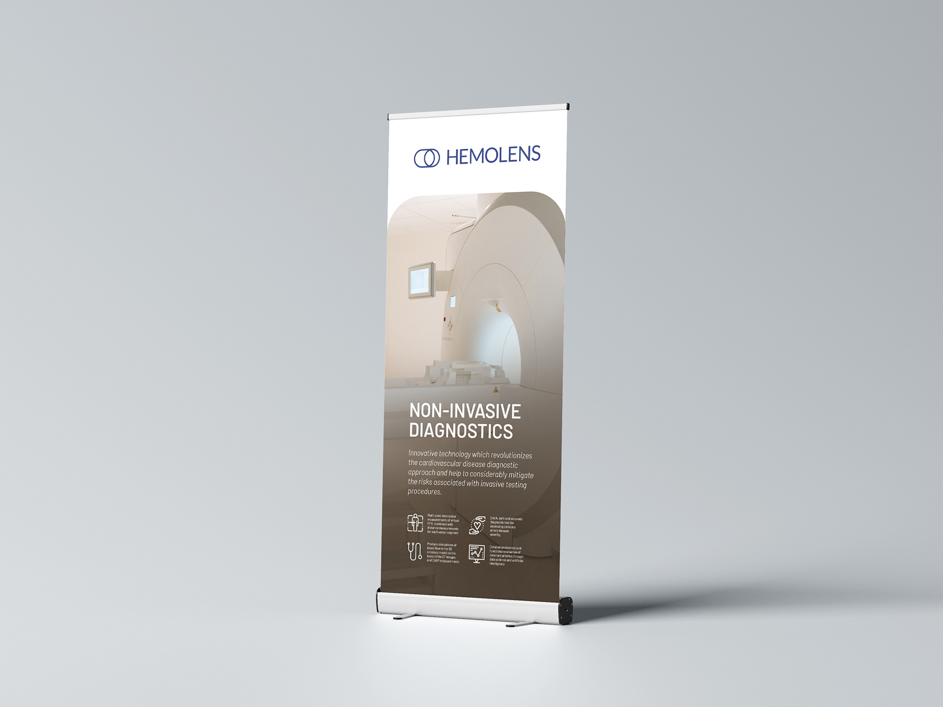
The vast majority of people worldwide are afraid of scalpels, needles, painful operations and long-lasting rehabilitations. Hemolens Diagnostics offers them a safe and accurate diagnostics tool that reduces the need for the above mentioned.
Building on expert medical knowledge and advanced technologies, Hemolens diagnostics (formerly LifeFlow) have created a new alternative diagnostic tool in cardiology – an innovative software that provides functional and quantitative information about coronary artery stenosis severity. They help physicians and health care institutions to get to the forefront of digital transformation in diagnostics, making the process fast, accurate and safe.
Hemolens provides its technology for personalised, harmless, and accurate diagnostics to reduce invasive procedures in healthcare. The team believes in innovative medicine that is transformed by AI technology from invasive procedures to patient-friendly, precise, and 100% safe methods in diagnostics and treatment, without the need of hospitalisation.
Hemolens' field of expertise covers the following fields: Cardiology and Cardio-radiology, Neurology, Oncology, Pulmonology and Angiology.
When Hemolens Diagnostics approached us, we received a very challenging topic: to dig deep into the core of their existing company culture and history, discover their mission, vision and values, set up a brand tone of voice and build a visually appealing identity. As well as to help articulate the benefits of their services in a way that is clear and understandable for doctors and patients equally.
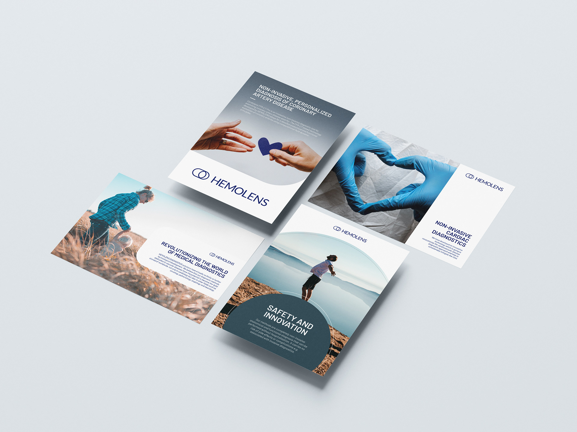
Hemolens - a Software as a Service biotechnological company - developed a solution to turn big-data into visuals. Namely such graphics that precisely show the circulation of fluids in the organs and helps doctors find diseases and failures early to avoid painful and long-lasting invasive medical procedures. All in real-time, with the help of artificial intelligence, from anywhere on the planet.

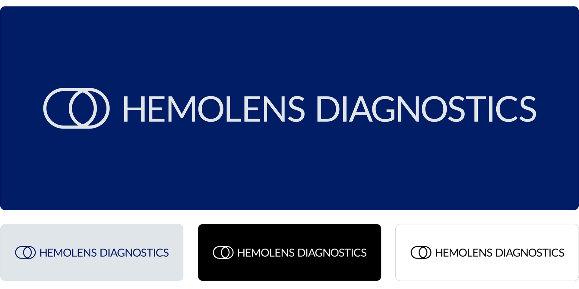
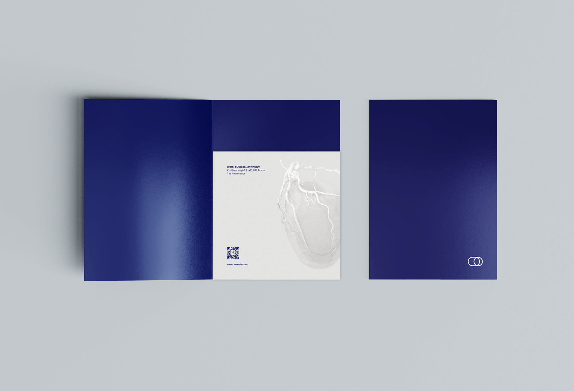
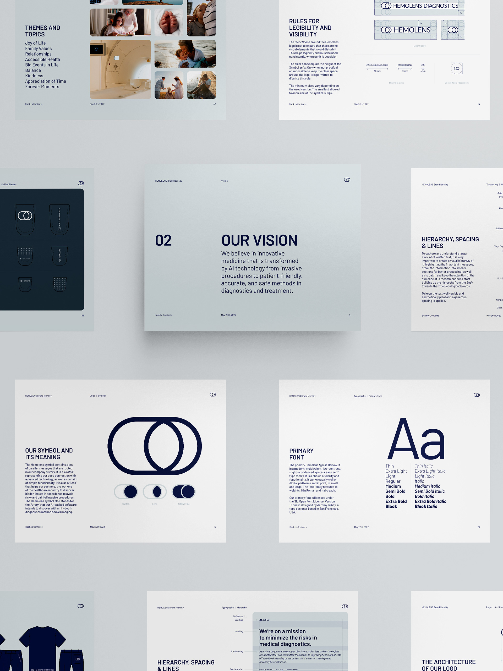
The Hemolens logo is the main visual representation of their mission, vision and values. Its a statement in itself about how the team sees the world, as well as how they want to change it. It stands for clarity, simplicity and effectiveness.
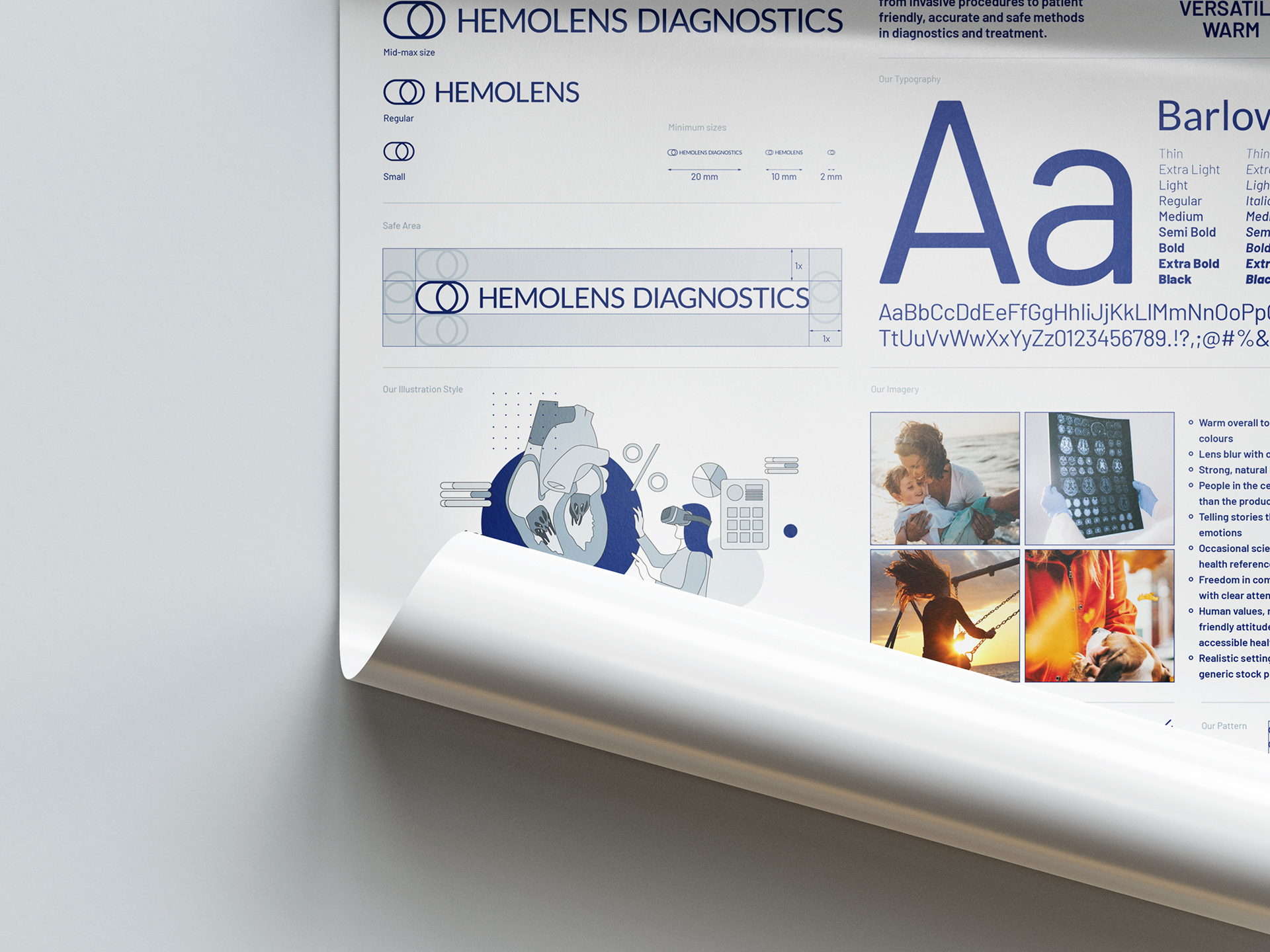
The Hemolens logo is built up from two components: the Symbol, as the standalone graphical object, and the Wordmark that states the name of the company. The latter is to be divided into another two smaller segments and can be used in a short or full form respectively.
To symbolise the harmless method of the non-invasive technology the company offers, we decided to visually communicate this by rounding particular edges and corners of the wordmark, especially the M, N and S letters. Relevant edges and corners are rounded also in order to carry over the design language of the Symbol and to maximize legibility and versatility accross all platforms, digital and print likewise. The lineweight of the symbol and the font correlate with each other, creating an aesthetic impression.
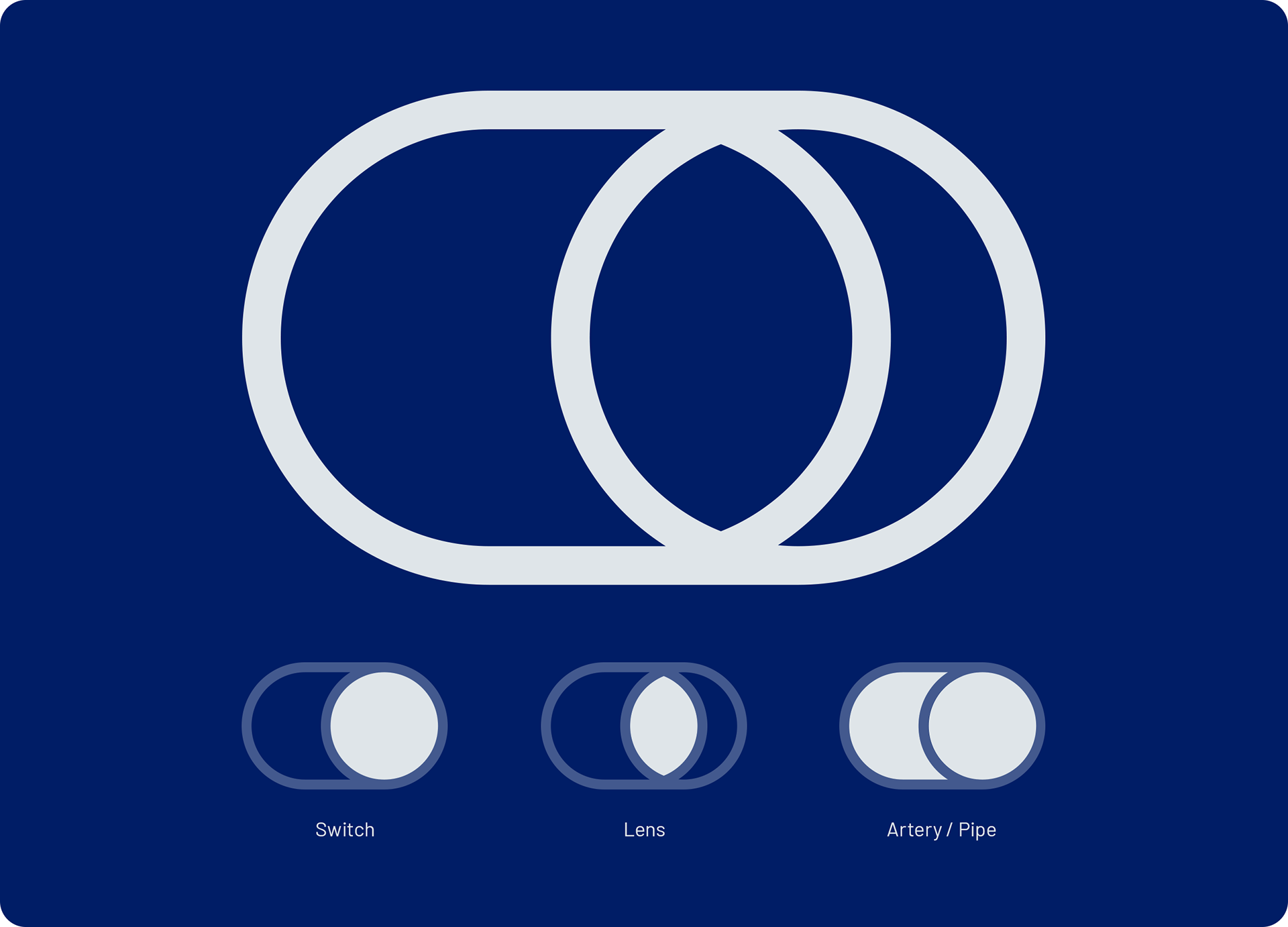
The Hemolens symbol contains a set of parallel messages that are rooted in the company's history. It is a ‘Switch’ representing their deep connection to advanced technology, as well as their aim of simple functionality. It is also a ‘Lens’ that helps Hemolens diagnostics' partners, the workers of the healthcare industry to discover hidden issues in accordance to avoid risky and painful invasive procedures. The Hemolens symbol also stands for the ‘Artery’ that their AI-backed software intends to discover with an in-depth diagnostics method and 3D imaging.
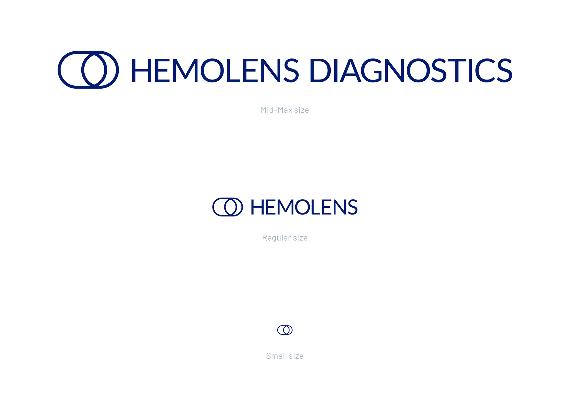
We have developed a logo system that is dynamic and responsive to all possible sizes and platforms. It changes its elements when scaled down in order to remain legible and recognisable regardless of size and where it appears. The logo dynamics serve the purpose of high-contrast and clear legibility.
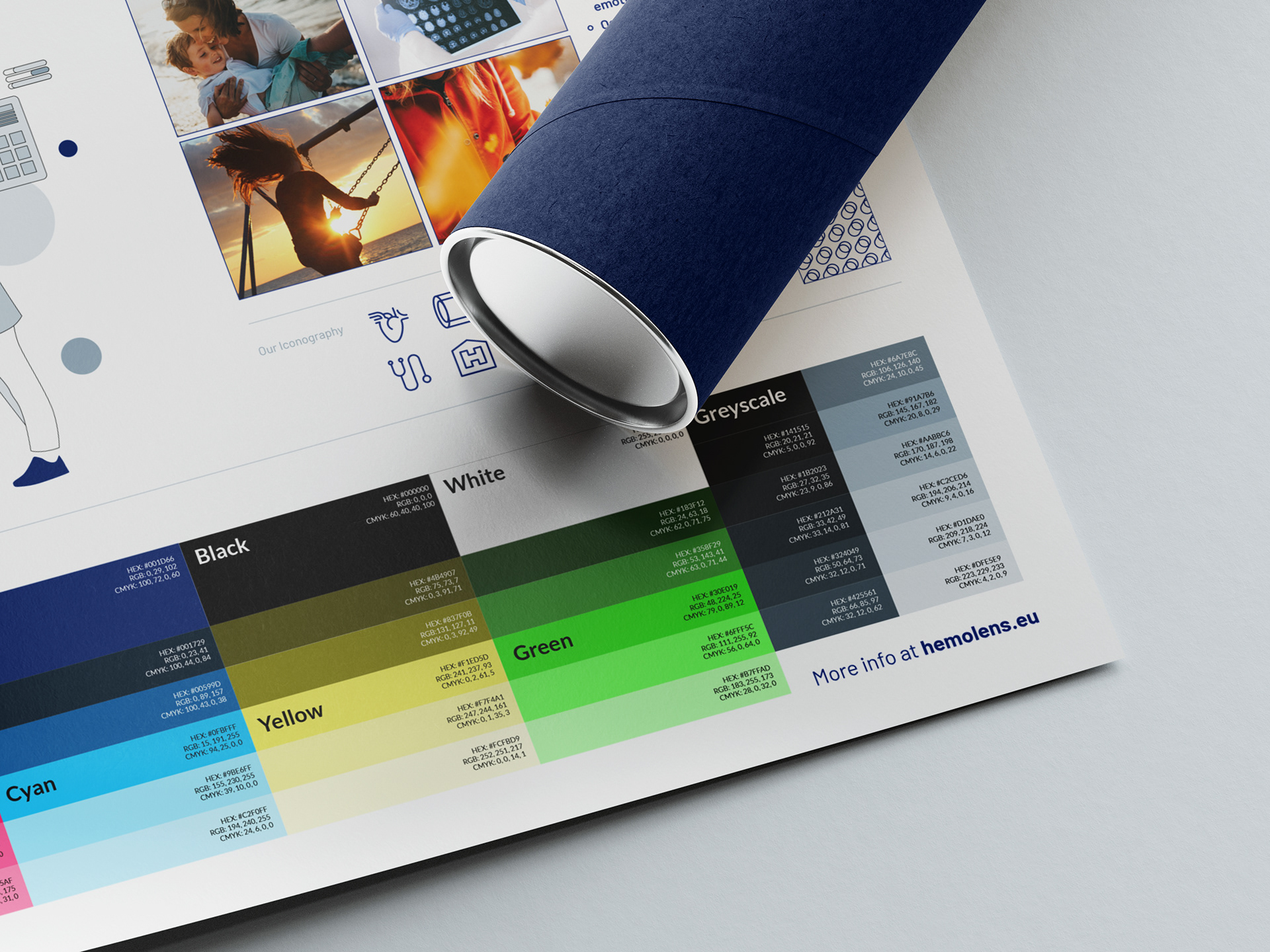
The Hemolens palette reflects the brand values and calls out its characteristics with expressing professionalism, trust and clarity. Proper use of colours helps to create a distinctive and recognisable brand, while allows Hemolens to be accepted among its target groups.
Hemolens has thirteen Primary Colours. The Main Colours are blue, black and white. Their Secondary Palette contains four colours, Cyan, Magenta, Yellow and Green. The purpose of these colours is to support accenting the Primary Colours, as well as to help differentiate future subbrands and software tools of Hemolens Diagnostics. The Extended Palette gives a depth of the Secondary Colours by giving it lighter and darker shades.
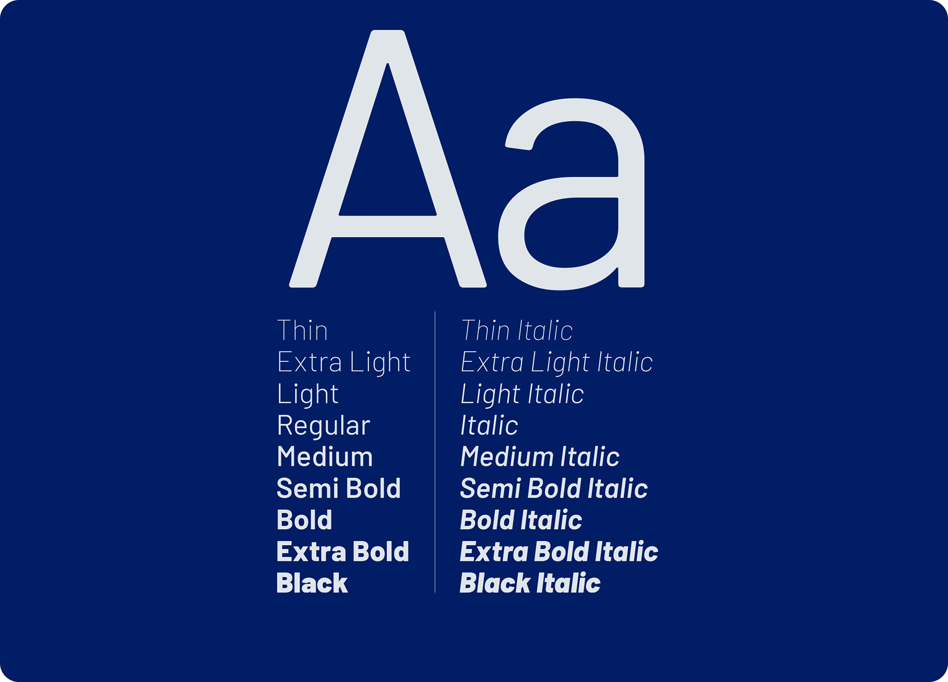
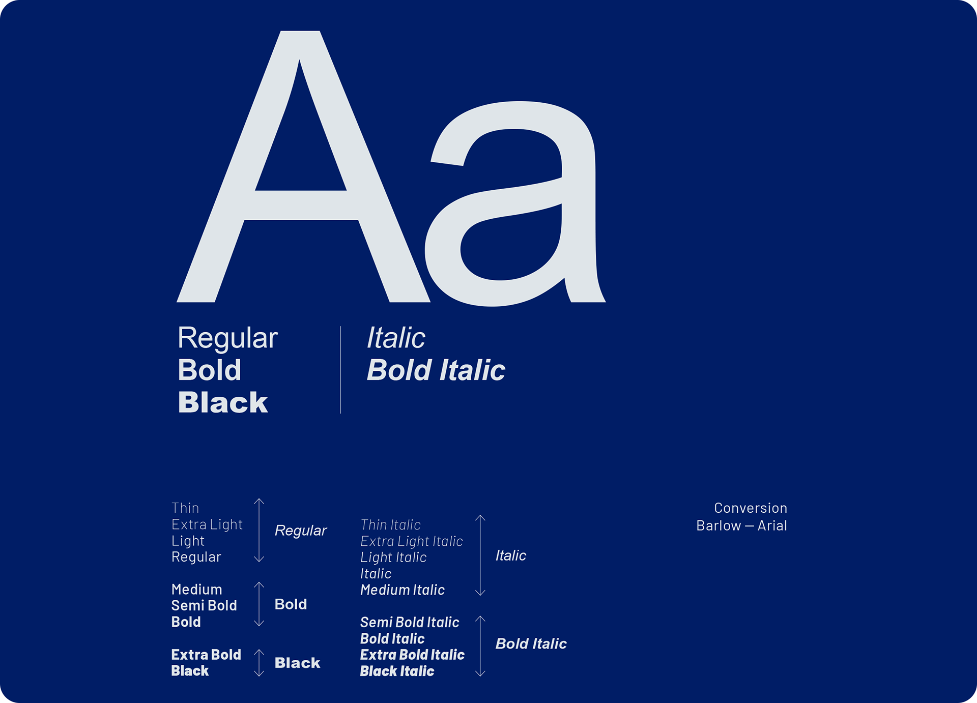
The Hemolens typeface has been carefully selected in order to carry out the core brand message of being gentle, clear and professional. The official font family is Barlow, with the fallback option being Arial. Their typeface also serves the purpose of being recognisable and distinct from other brands, while also being legible, structured and have a generous spacing.
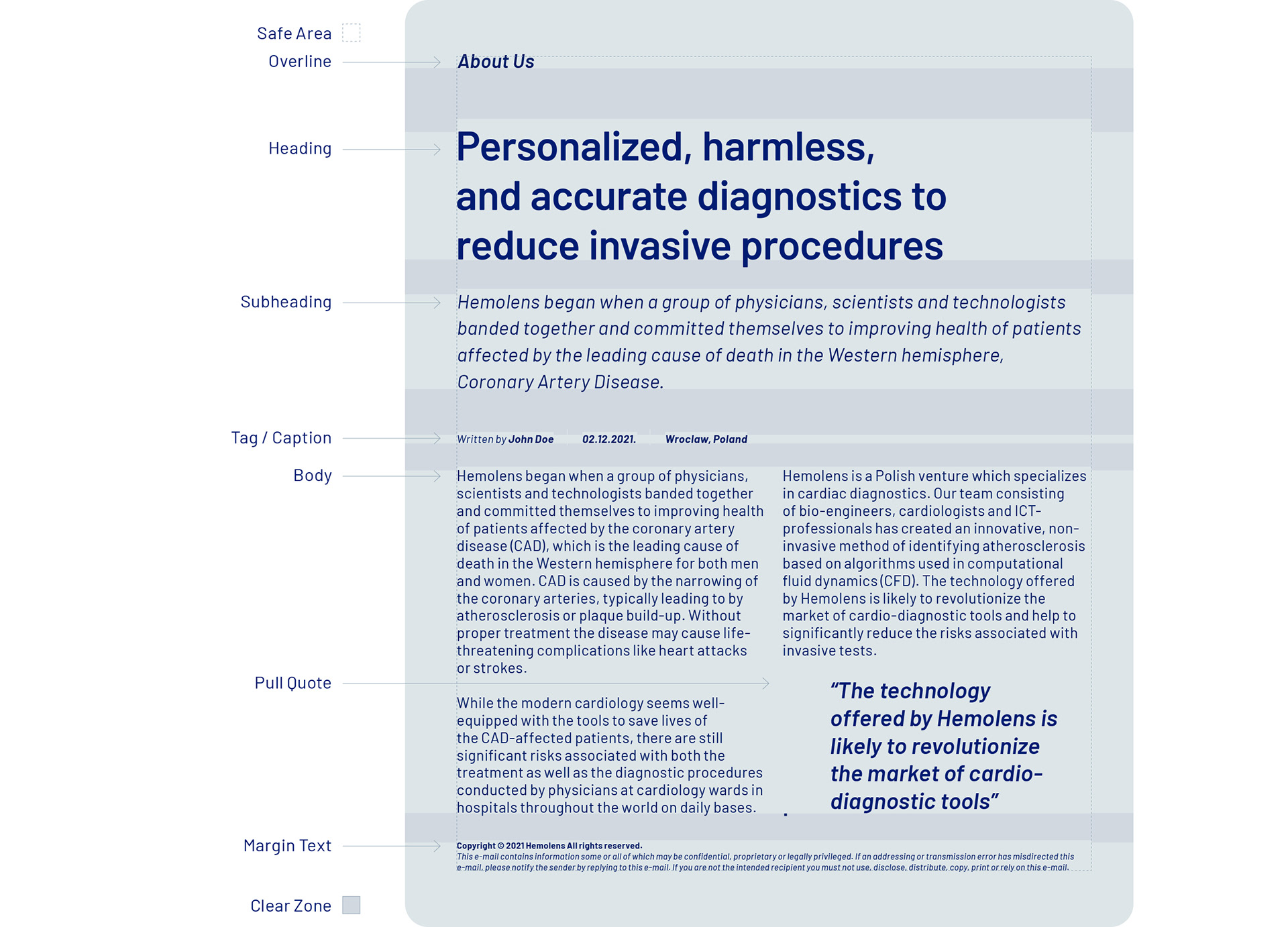
To capture and understand a larger amount of written text, it is very important to create a visual hierarchy of it, highlighting the important messages, break the information into smaller sections for better processing, as well as to catch and keep the attention of the audience. We have developed a typography system with starting to build up the hierarchy from the Body towards the Title Heading, backwards. To keep the text well-legible and aesthetically pleasant, fair spacing is applied.
The placement and size of the logo, correct use of typography and font hierarchy, as well as images and other graphics create the visual language of the Hemolens brand.
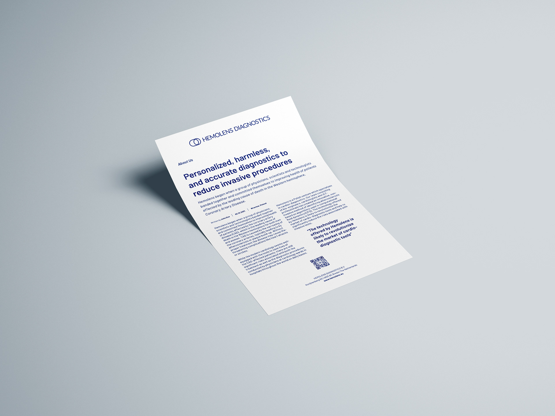
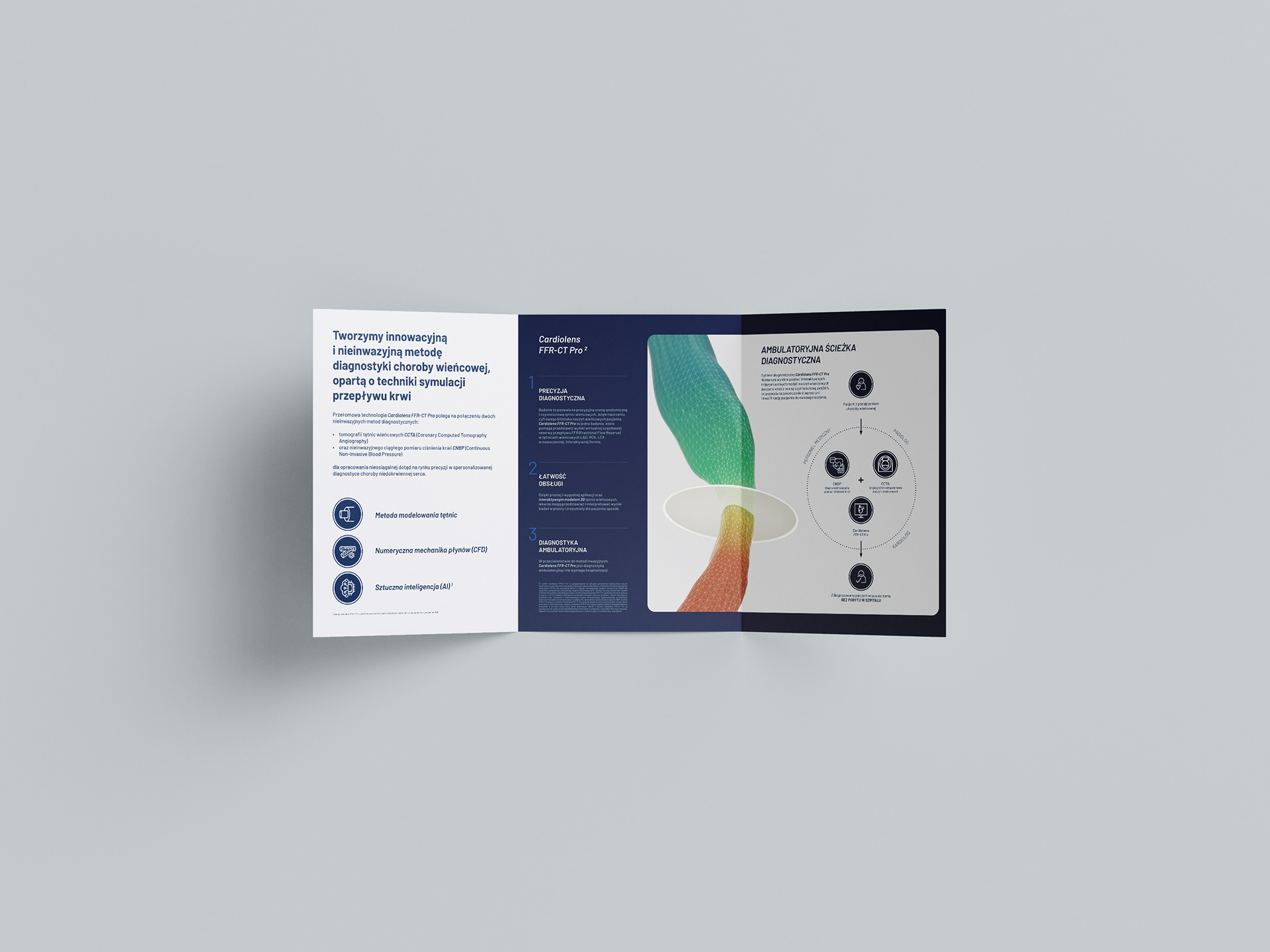
The Hemolens layout is structured, easy-to-understand and clean. When building up a layout, we focused on the following to achieve an effective and aesthetic artwork:
- Space: the layout had to have generous spacing between its components. We made sure to achieve visual harmony and order, by not overcrowding the layout and keeping copy as short as possible.
- Hierarchy: the layout must have focused on effectively communicating the most important information. Images, icons and other design elements support this goal. We prioritised the content according to importance.
- Simplicity: we made sure the layout is always as simple as possible to help the audience understand the message fast and act accordingly. The layout must have a clear focal point. That can be an image, or the header of the copy.

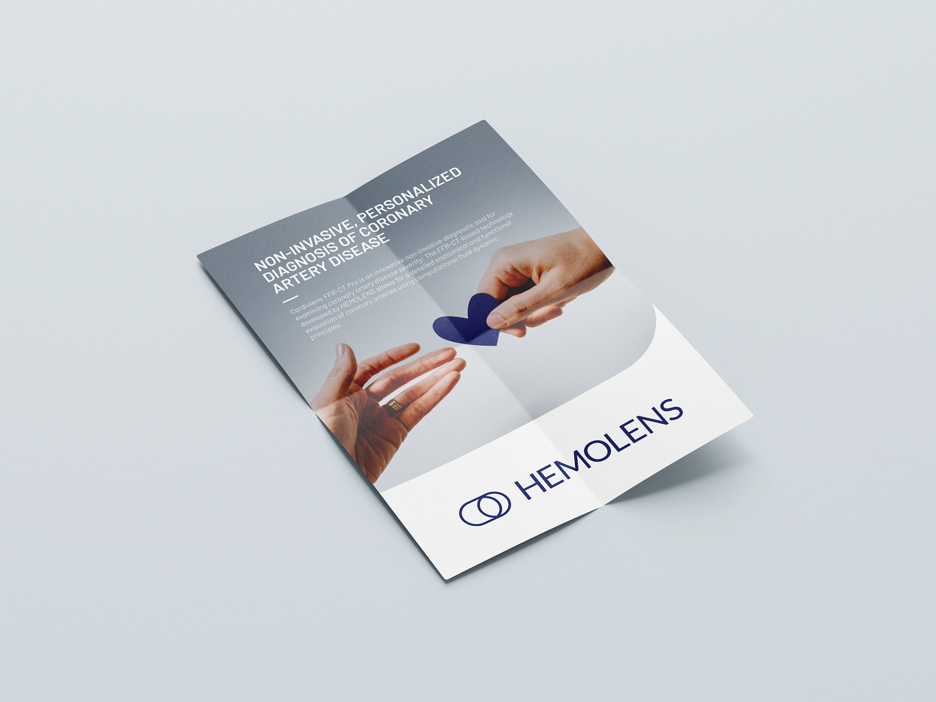
One of the most overlooked aspect of branding is form language. While often brands does not need to define it, for us it was crucial, because it communicates Hemolens Diagnostics' main message: gentle precision. Since their aim is to replace invasive methods with non-inavsive diagnostic procedures, we decided that forms would speak out for this too. Therefore we opted for round shapes, often with a large radius and tried to avoid sharp edges - as visual references for scalpels, needles etc. - whenever it was possible.
During our exploration of the brand we found out that Hemolens' form language is a great identificator, it creates a distinct and recognizable visual context that can be easily understood, as well as generate visual consistency.


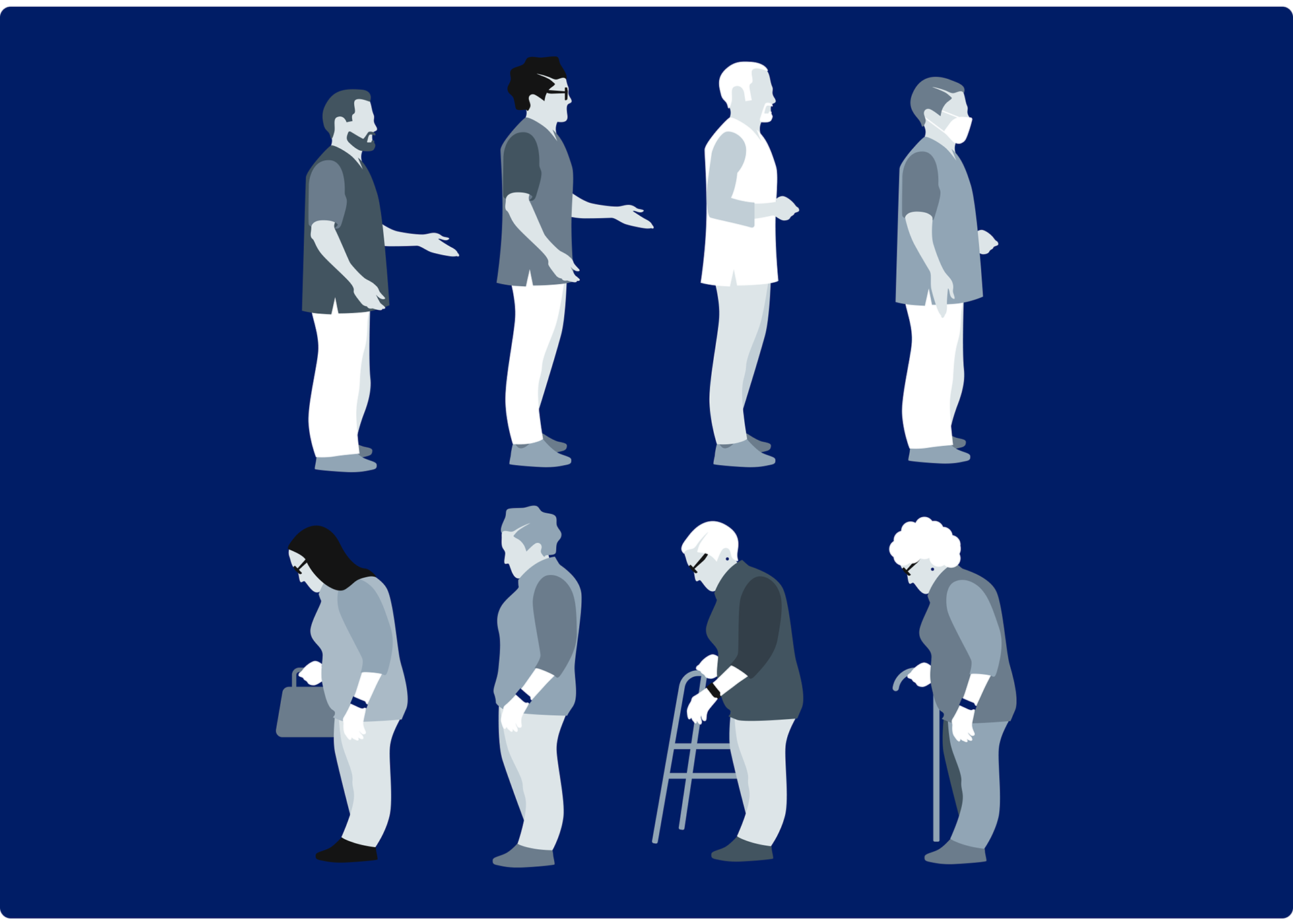
During the brand design process we created an illustration style that is minimalistic, yet detailed, where the scenes are telling a story about particular stages of the medical treatment and diagnostics, from a simple visit to the doctor to a thorough screening, from cardiology assessment to the check of blood pressure, from the CT scan to the 3D analysis. Every Hemolens illustration is built up from 3 components: the human component, the main medical object and the supportive elements and shapes.
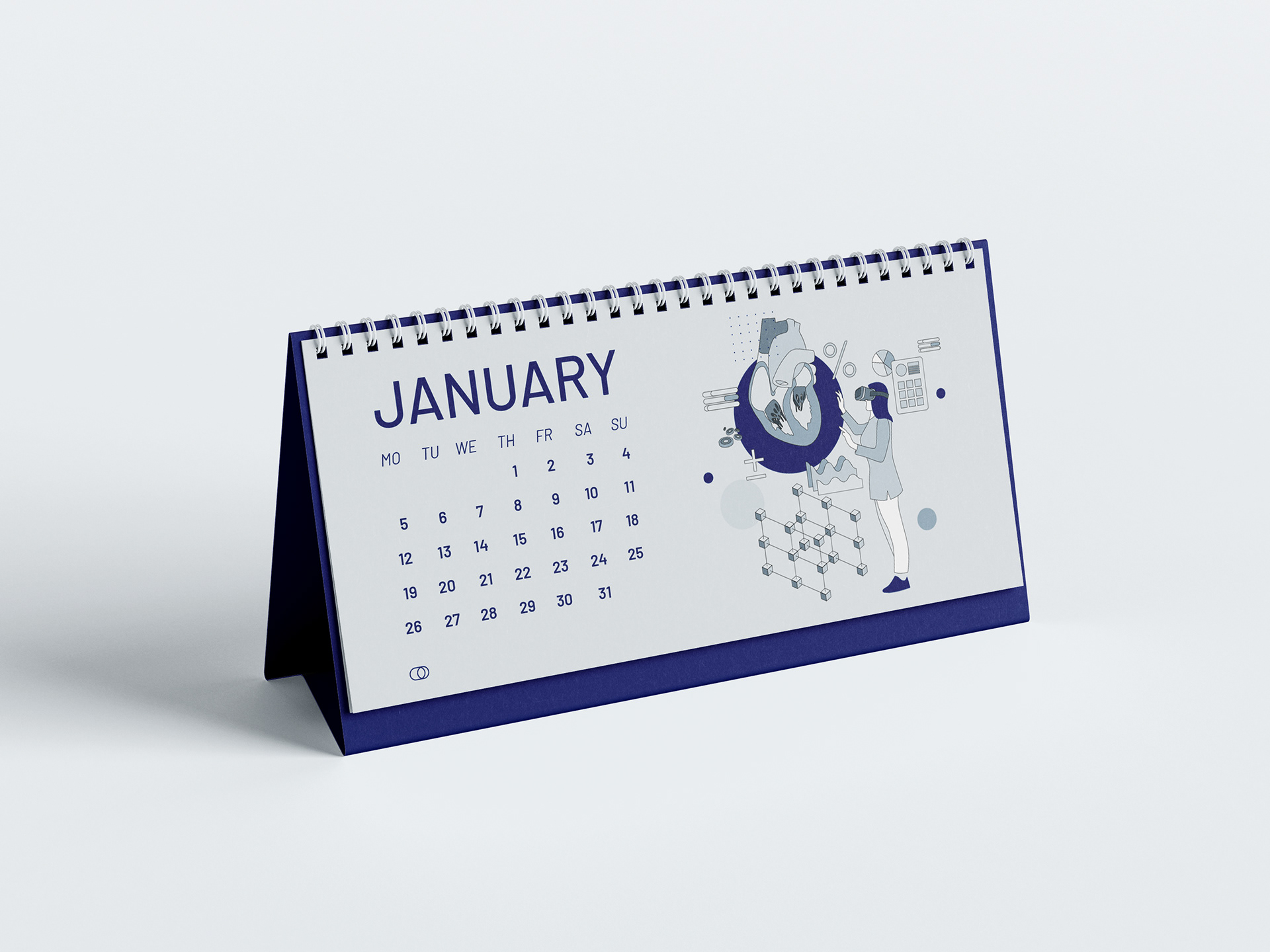
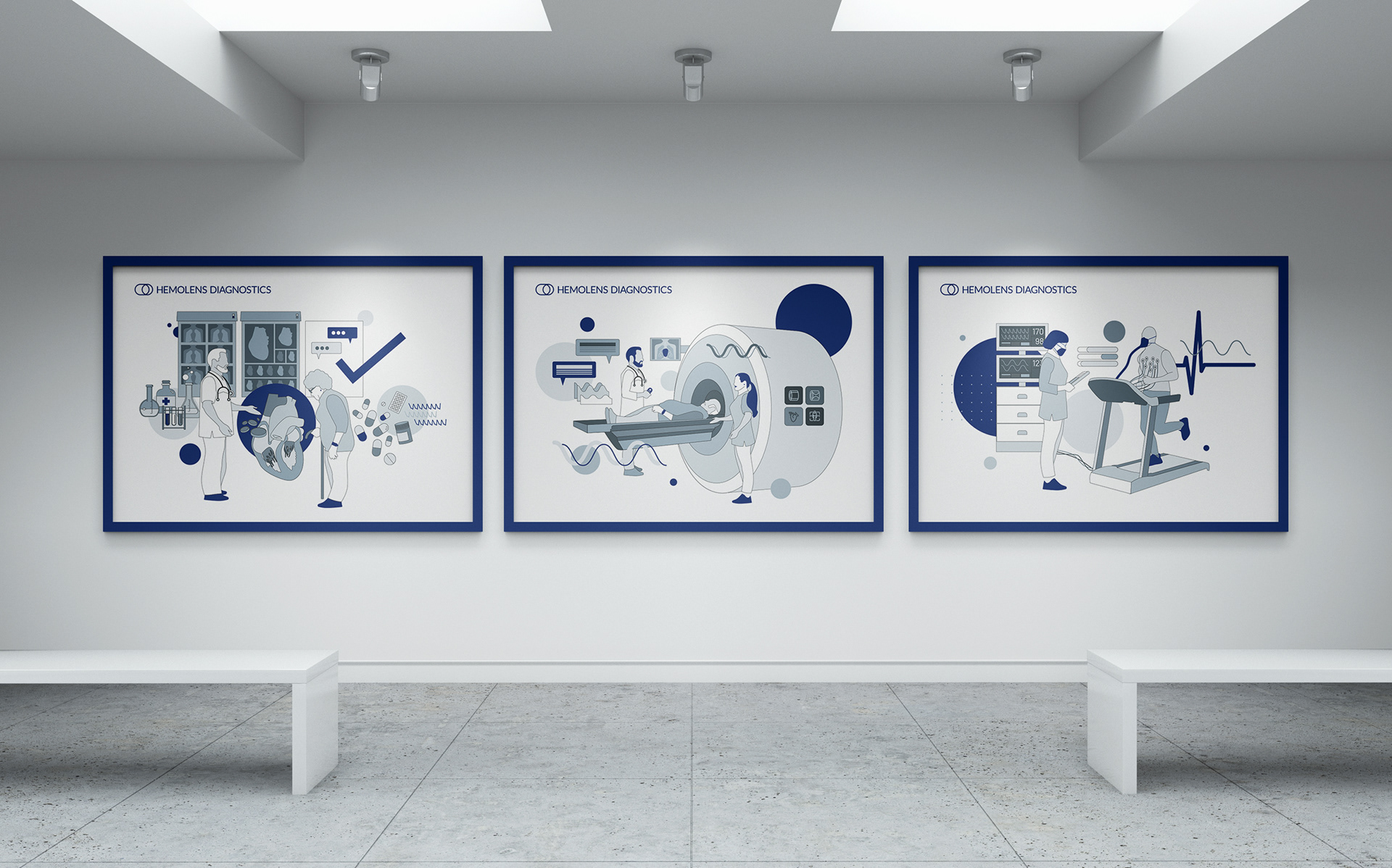
In the center of our illustration there is the doctor-patient relationship. Therefore we have developed a set of characters to feature in various scenes for various purposes and stages of the medical screening and treatment process. The characters can be easily customised to avoid being repetitive. To achieve a large group of different characters, simply change the hairstyle, clothes, accessories and colours.
Hemolens Diagnostics' primary world is the Healthcare Industry, therefore hospital uniforms, white overshirts and cotton tunicas are part of their corporate apparel rather than suits and ties or scarves.
The Hemolens Apparel is designed with visibility in mind: from all angle some kind of branding element is to be seen in a recognizable fashion.


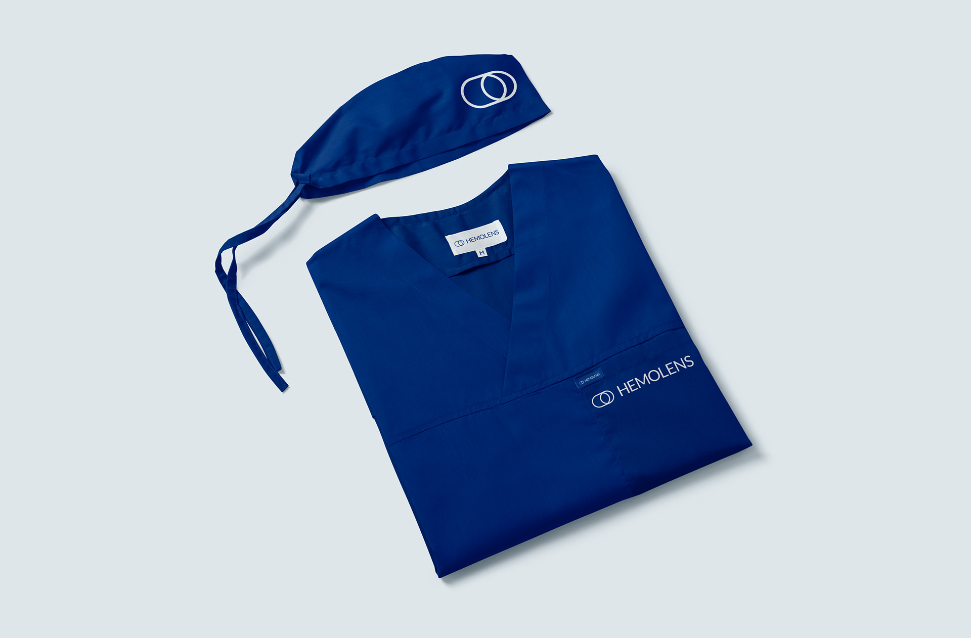
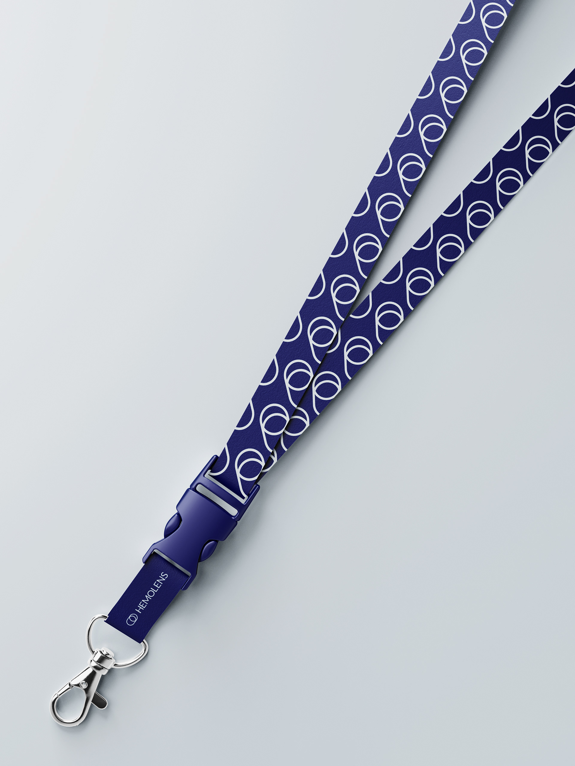
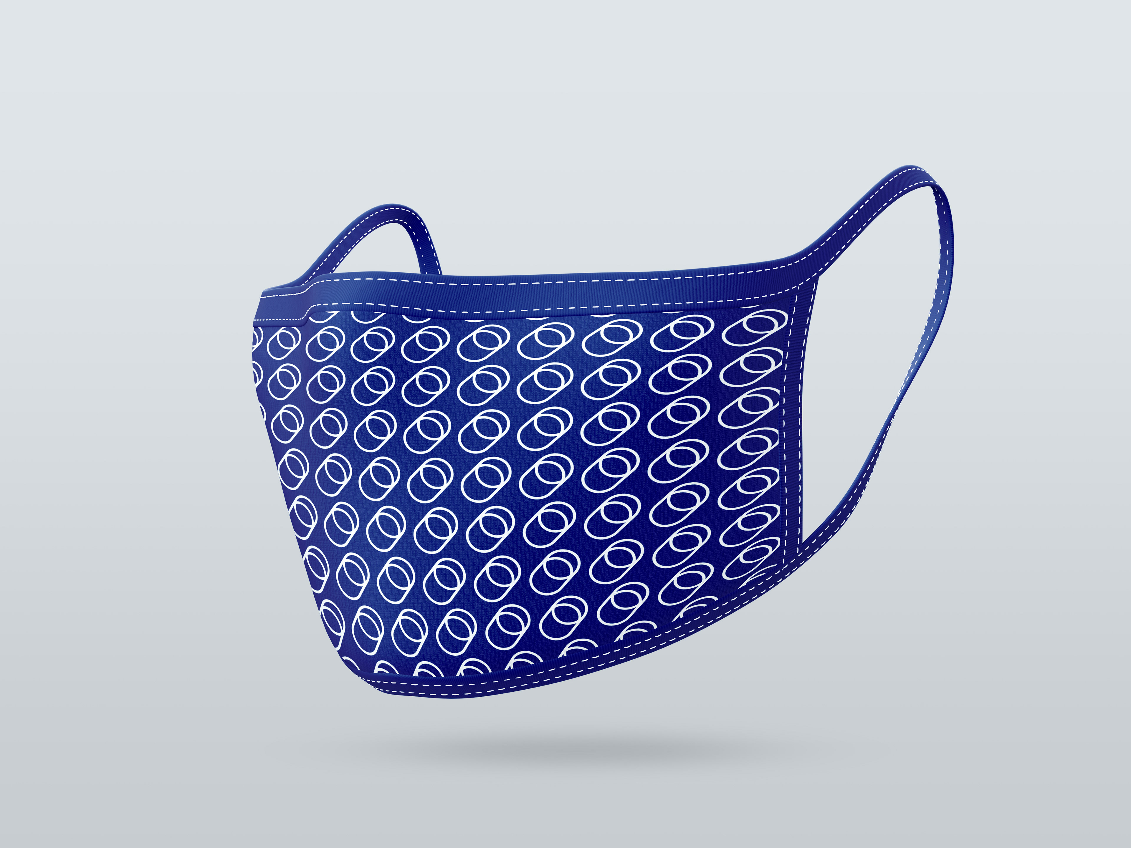
The Hemolens Apparel, as well as some of the giveaway items features the brand's own pattern that is created from the Symbol.
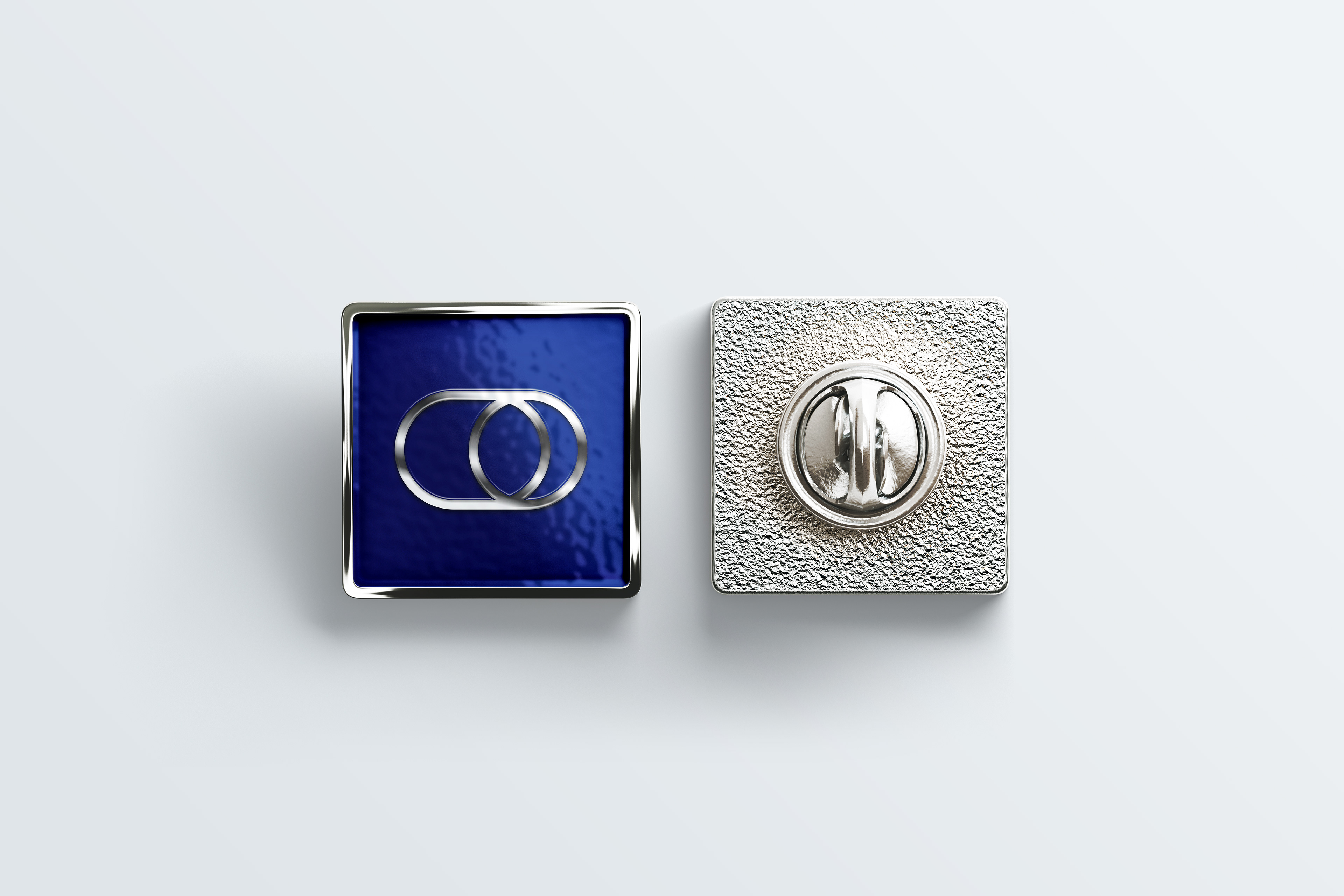

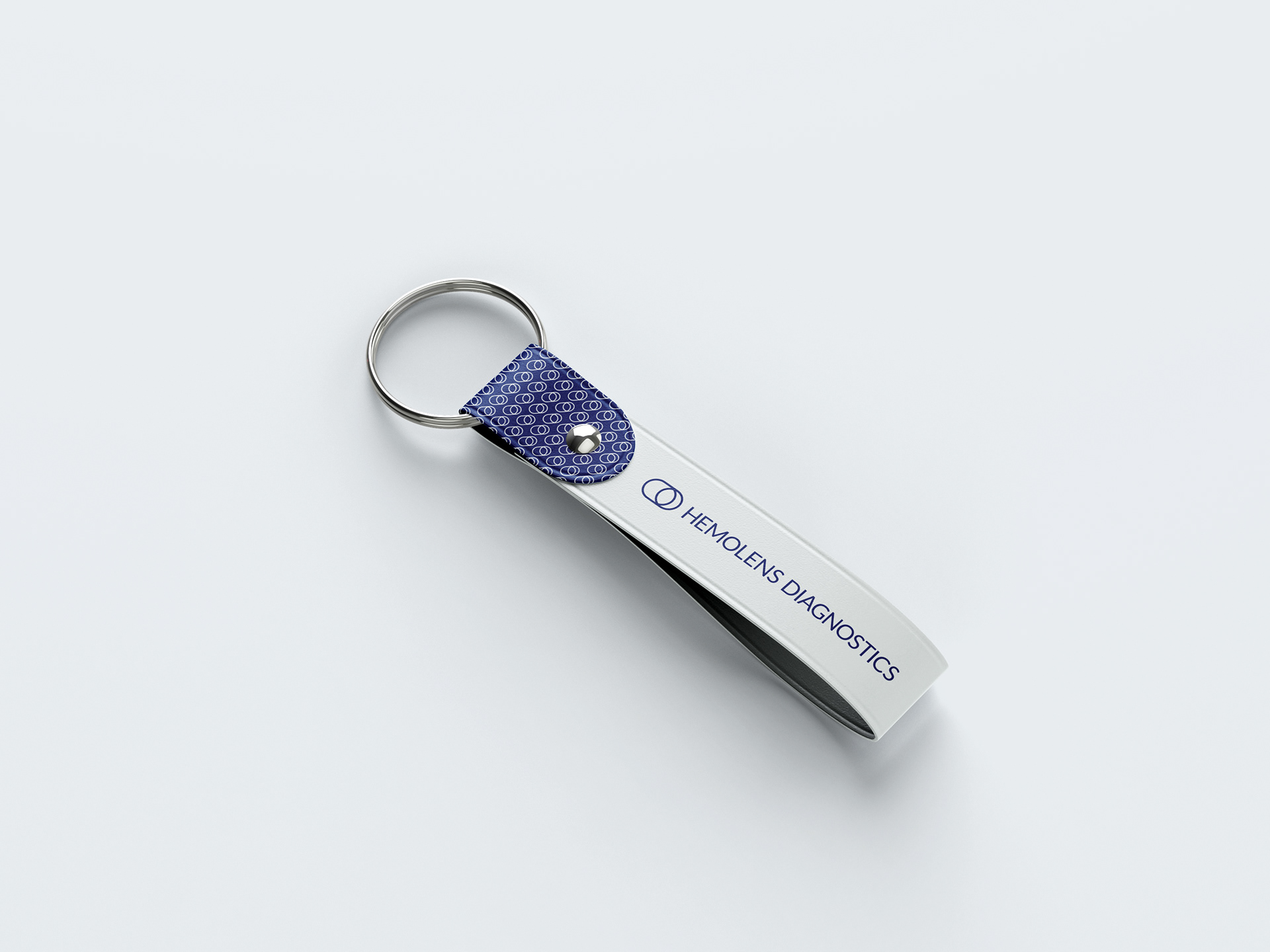
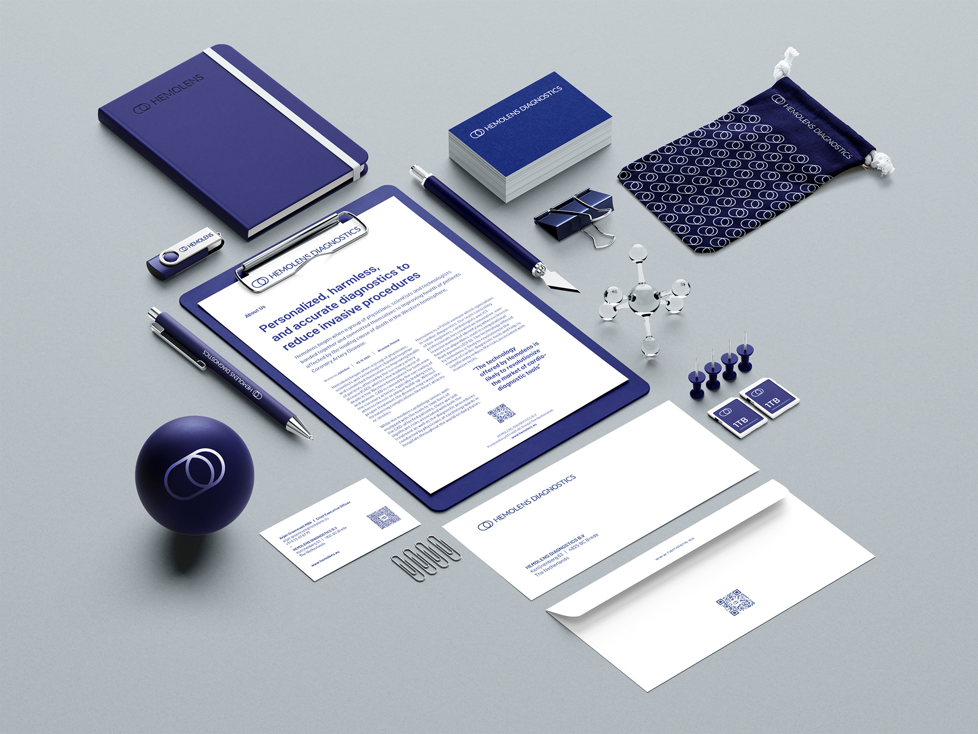
SWAG - Stuff We All Get - is a great tool to express the brand's dedication to its users, gifting them these precious little items. During our branding workshops with the Hemolens team, we have recommended specific gadgets that are not only appreciated by their recipients, but useful as well.
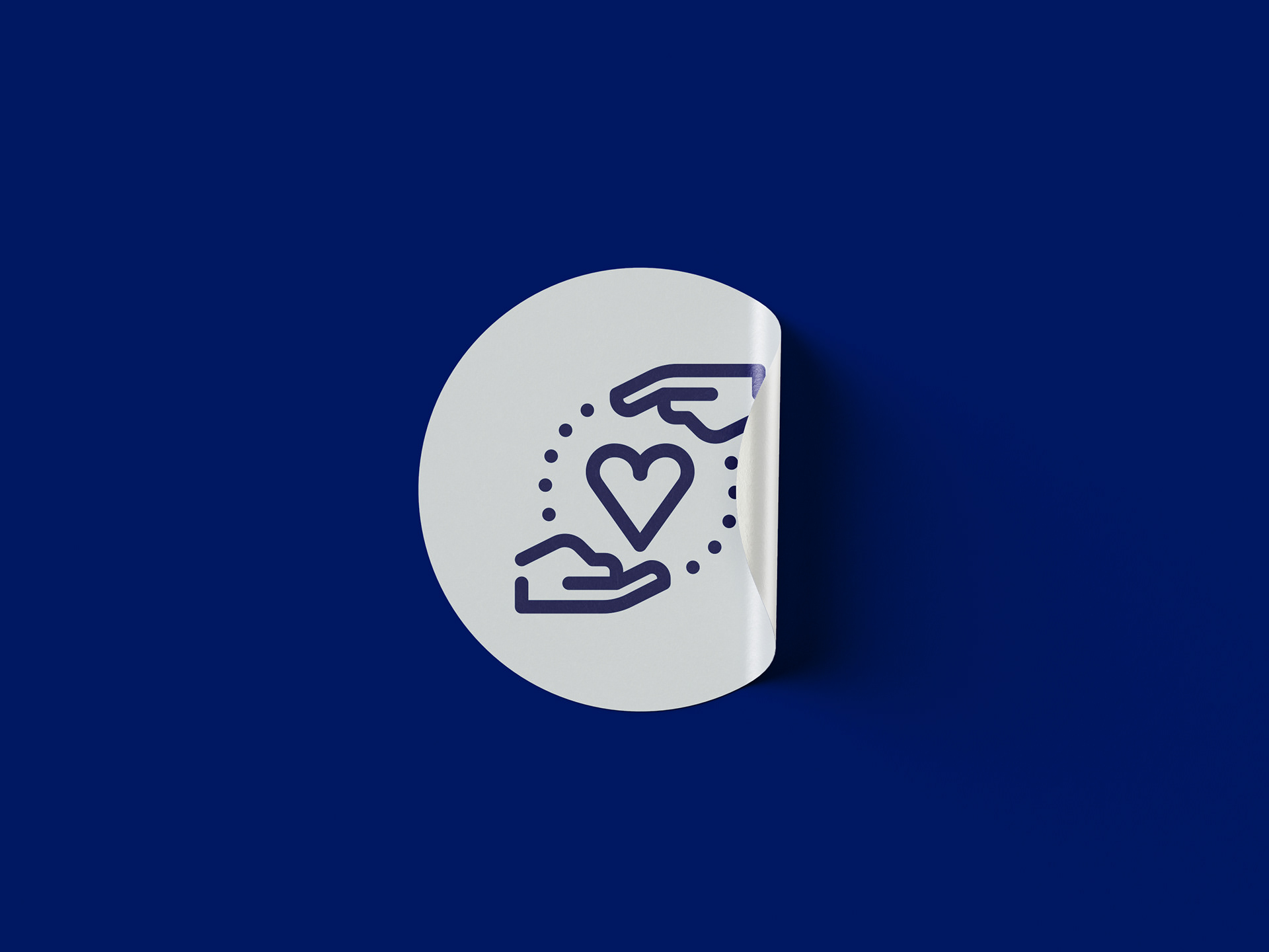
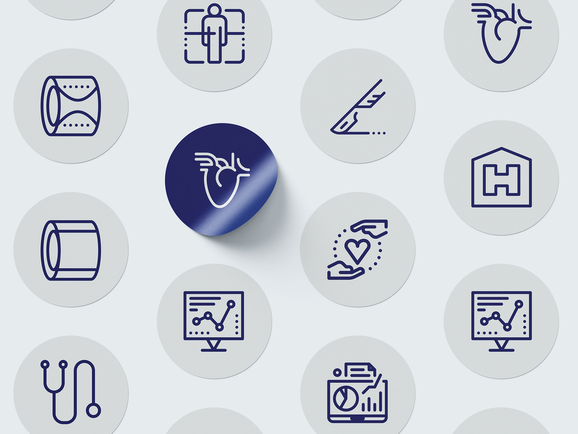
The Hemolens icons have a unified look and feel, based on the design language created to communicate on all channels with the highest effectiveness and clarity. To create a consistent impression accross all platforms, from print to digital, from marketing to product UI/UX we have developed a set of icons to support Hemolens' aim with a unique and recognizable style.
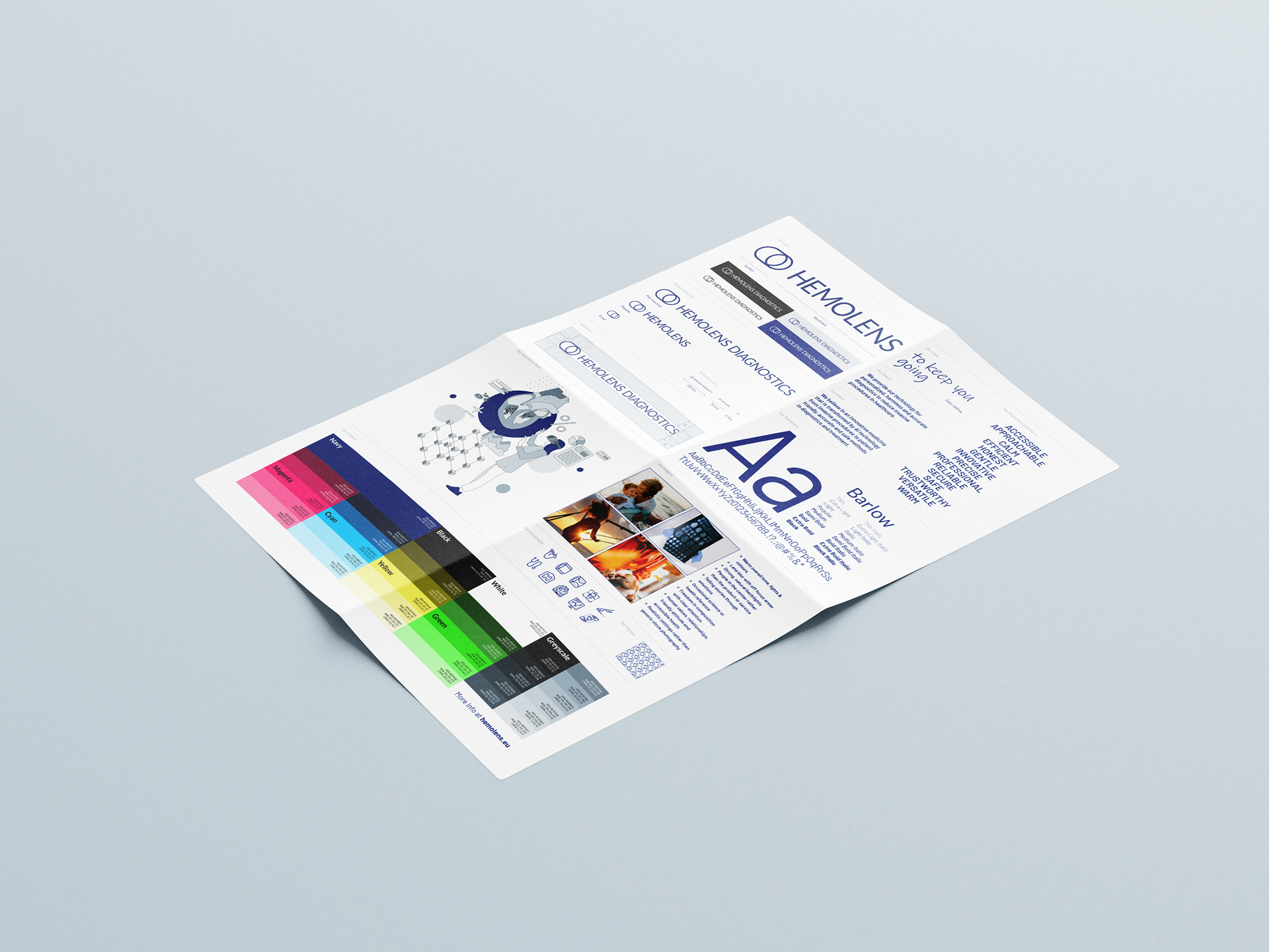
As we value internal communication and appreciate the power of Employer Branding, we made sure that the entire team would be on board with the application of the brand principles during their everyday work. For this purpose we have summarised our findings, as well as the general rules of having a consistent and effective brand communication in a Brandbook and also created a one-pager Style Guide.