
Cracow also known as Krakow is the second largest and one of the oldest city of Poland. For a certain time it was the capital of the country, therefore it still holds a key position in the nation's economy, culture, art and education. The city is surrounded by a number of smaller cities, castles and picturesque villages and parks. This makes the Cracow Region, the Powiat Krakowski such an exciting place.
In the Summer of 2017 the region decided to recreate its identity through a public contest. This rebranding concept is made for that occasion.
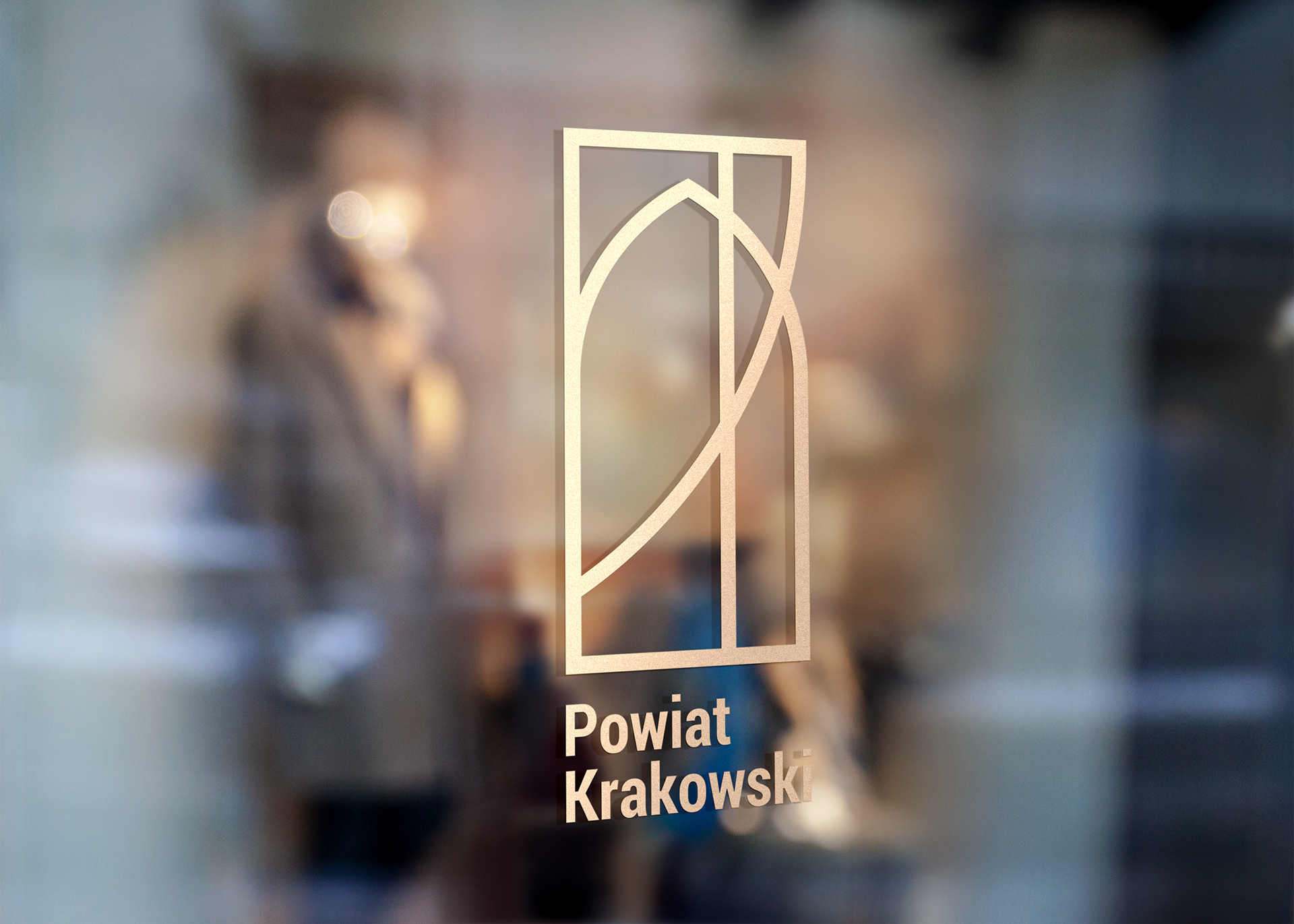
The window stands for an outlook to the golden age of the Polish Kingdom, when Kraków was the capitol of the country, therefore the region gave the infrastructural background to the flourishing city. The overlapping lines represent the roads, the golden brown the historical nobility, the upper curves the shields of the surrounding cities, the lower arch the gates and windows of the classical era's architecture.
The message of this logo is not only that history lives with us, but also gives the viewer the insight of the fact that the Powiat Krakowski is not only about Kraków, but everything else what you can see from your window. It makes the visitor feel like a king or queen looking to the beauty of the area from the busy palace, where she or he can escape from the everyday rush.
Also the upper curve draws a 'P', and the two curves together form a 'K'. The chosen lettertype is a condensed yet geometrical font, what stands for stability, readability and clarity.

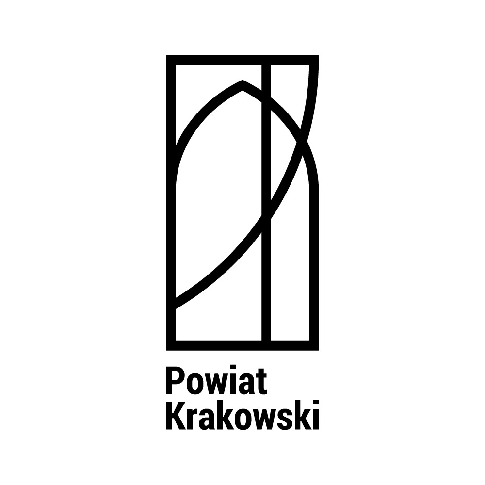
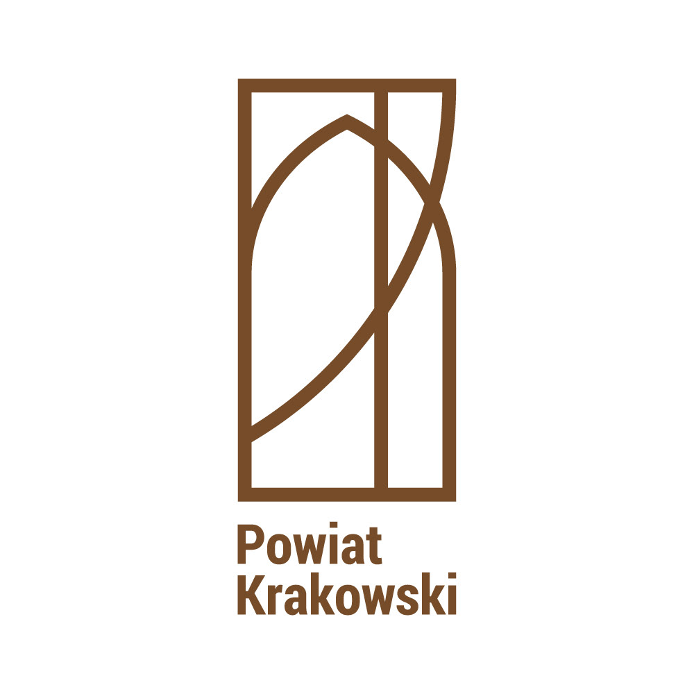
Powiat Krakowski logo in original, black and white and monochrome.
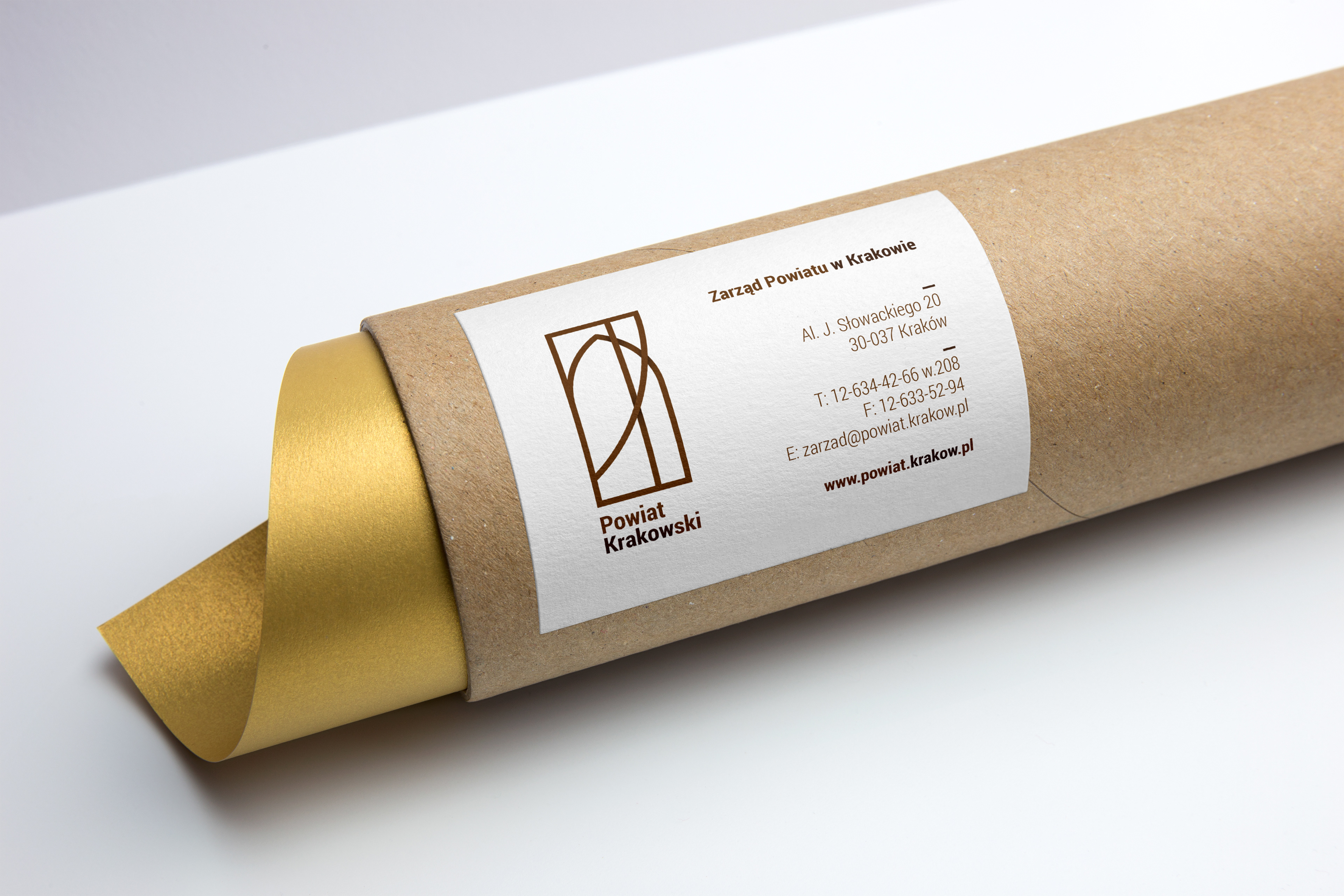
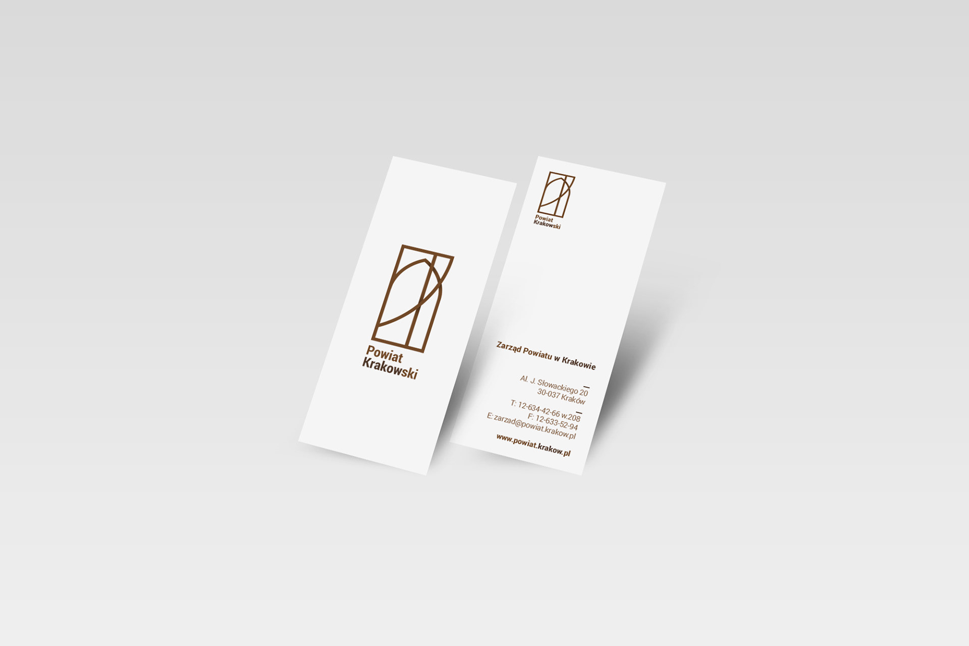
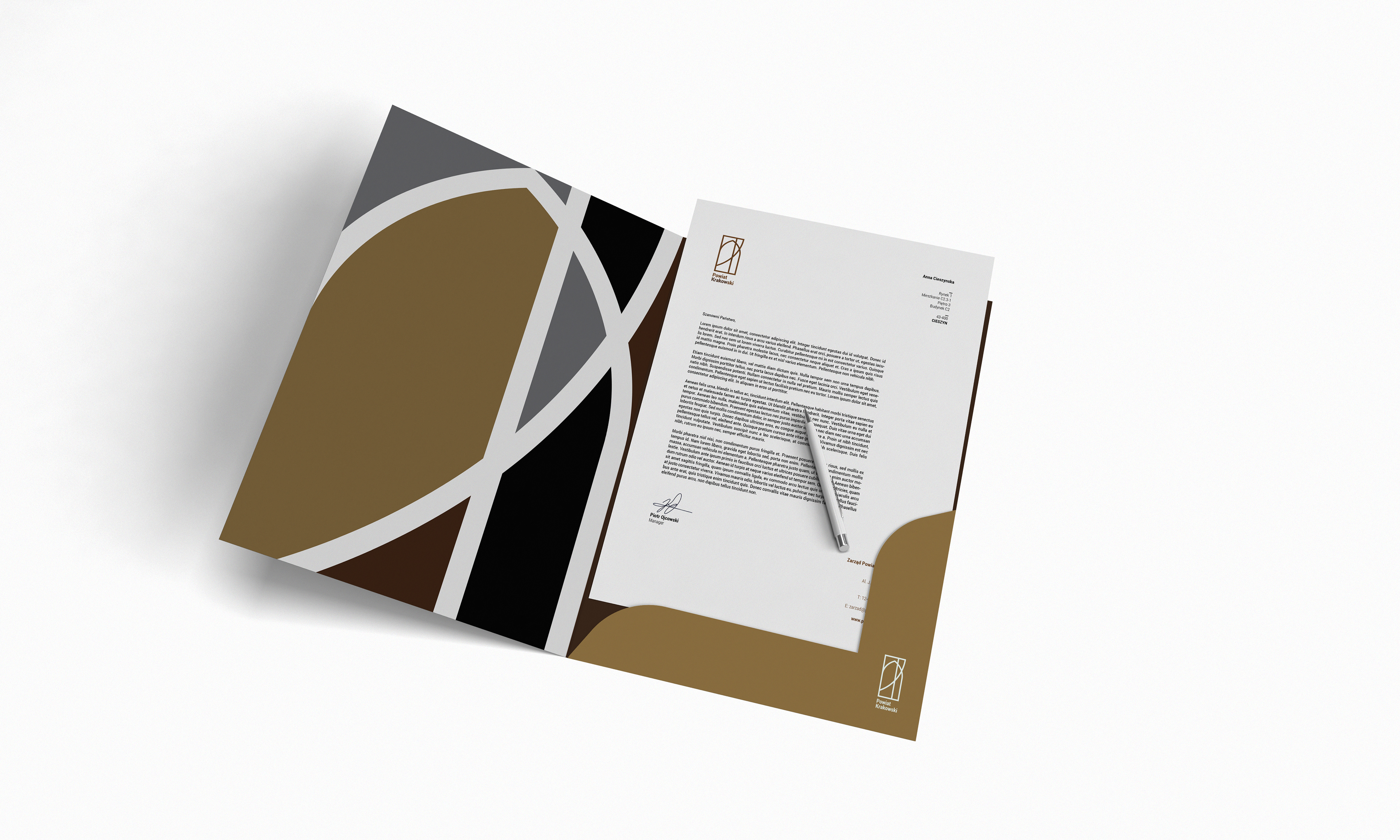
Basic stationery elements.

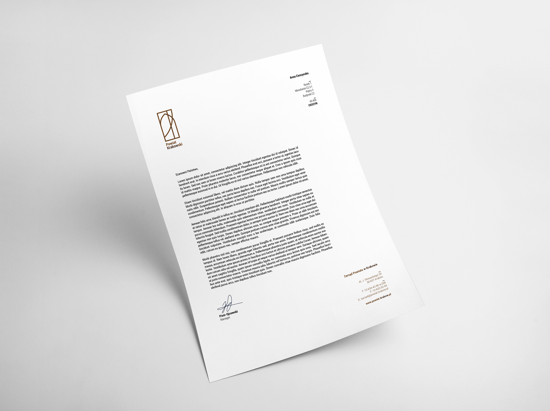
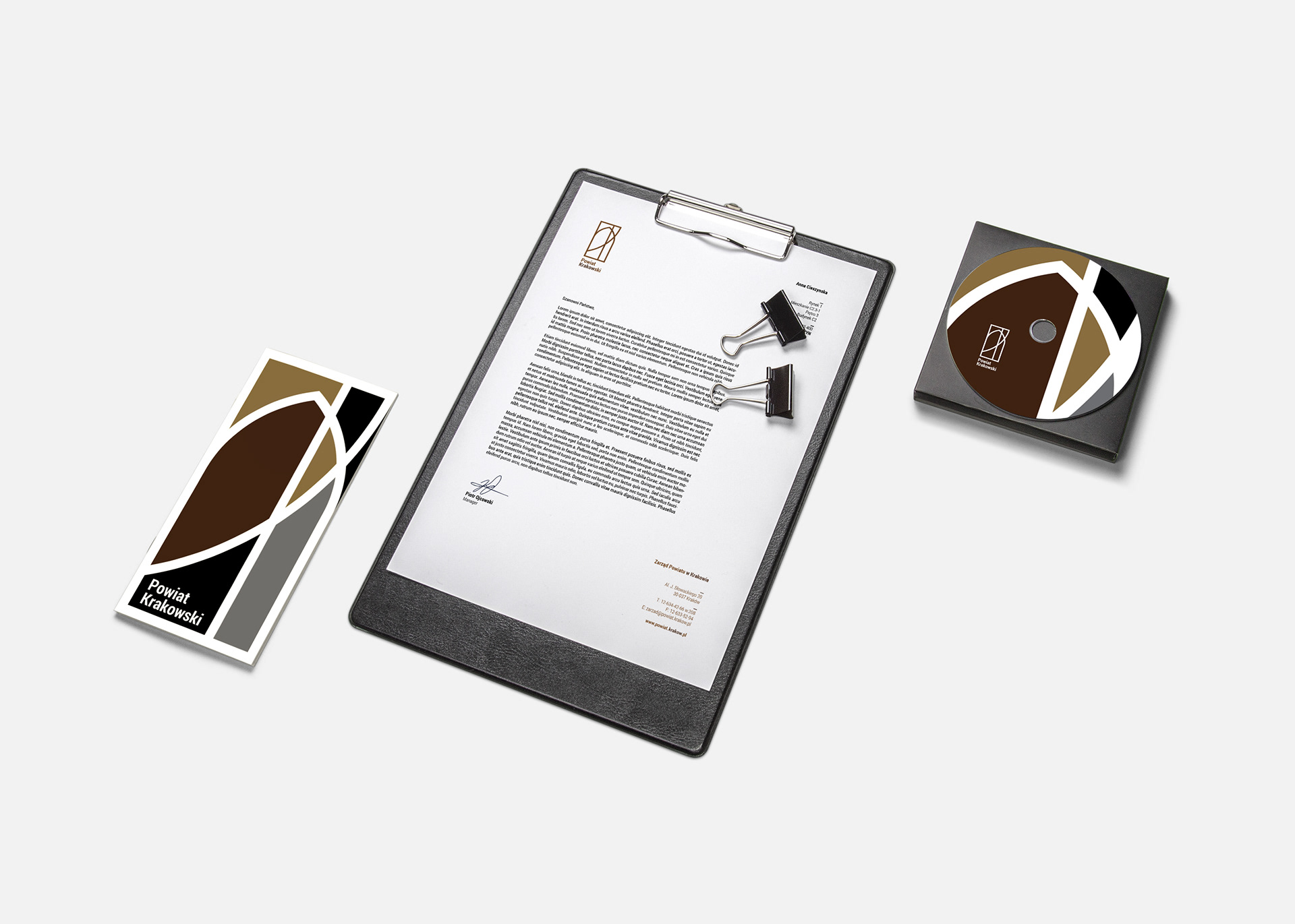
Extended stationery and signage.
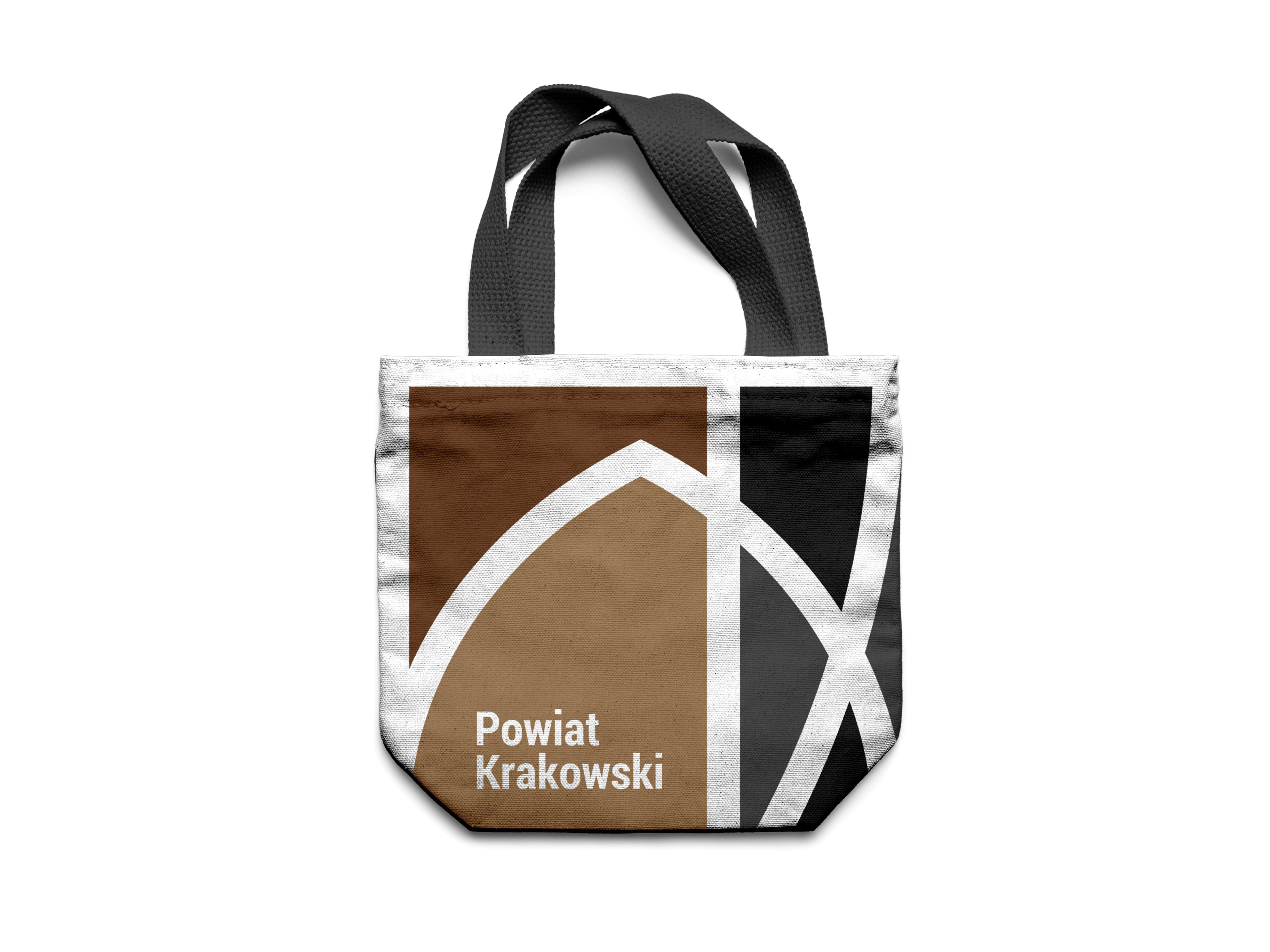
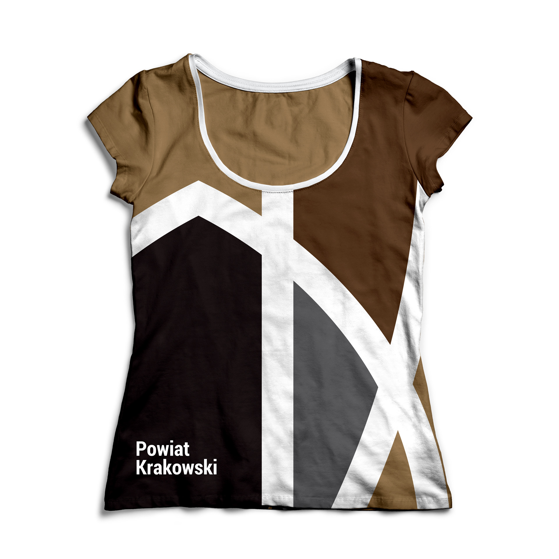
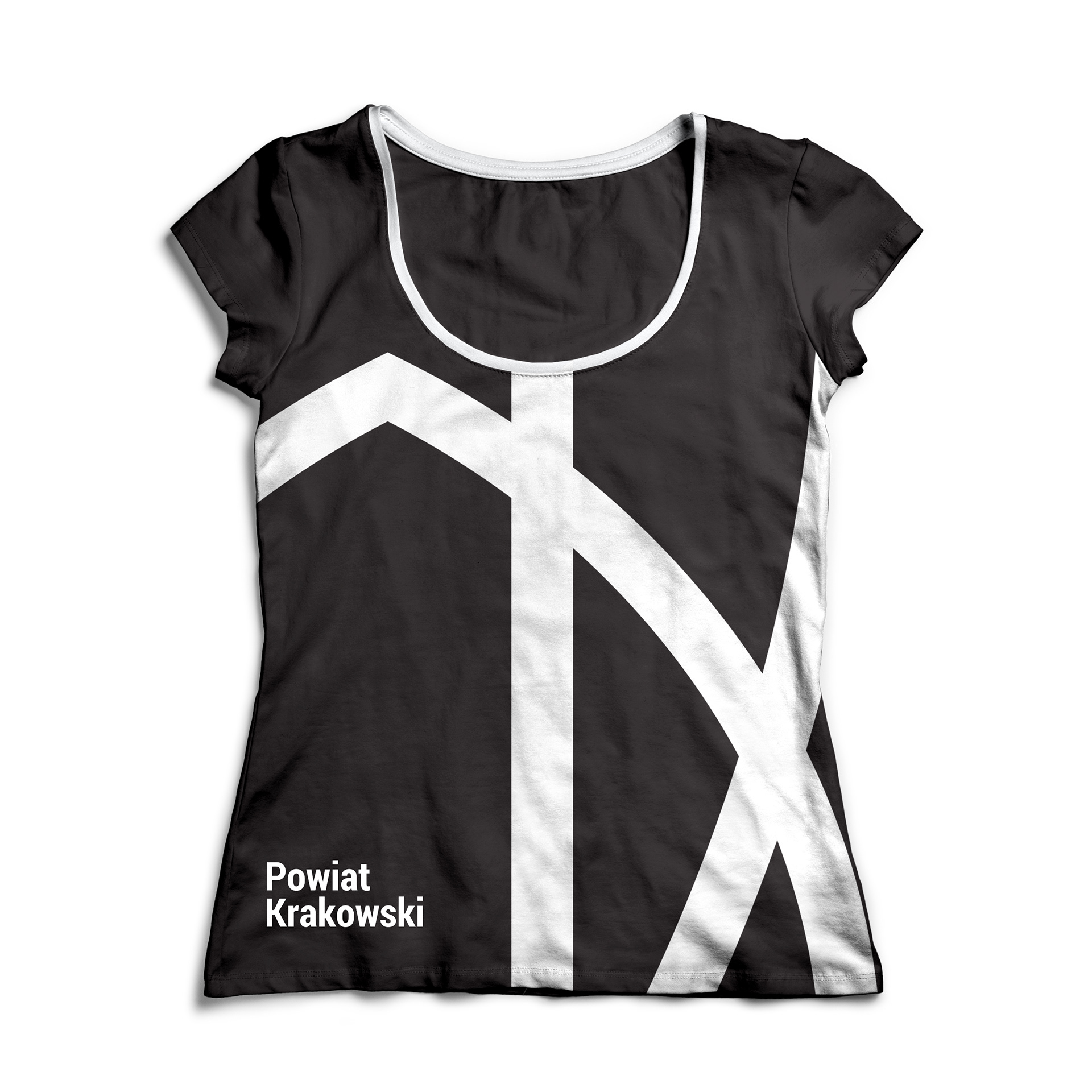
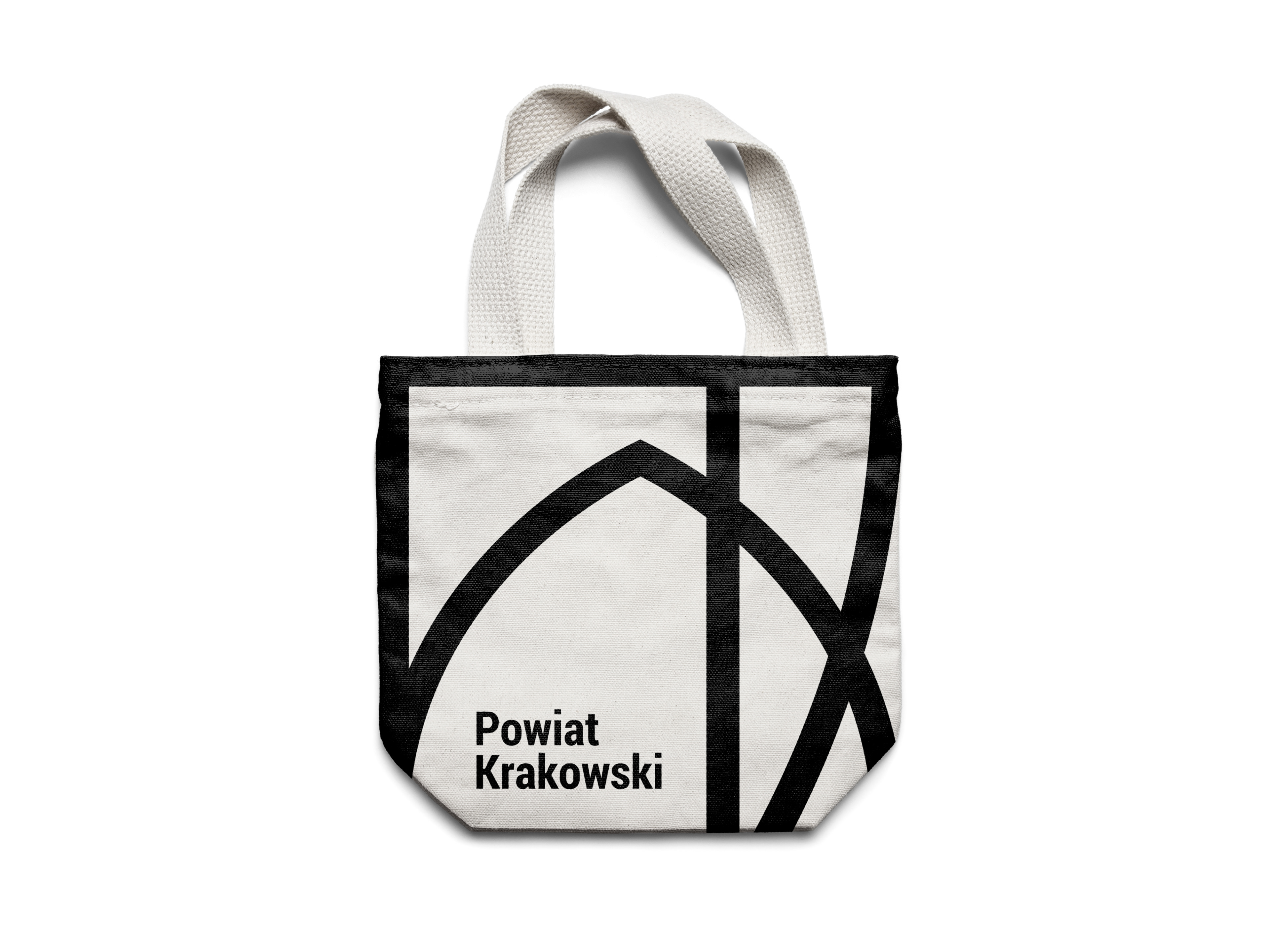
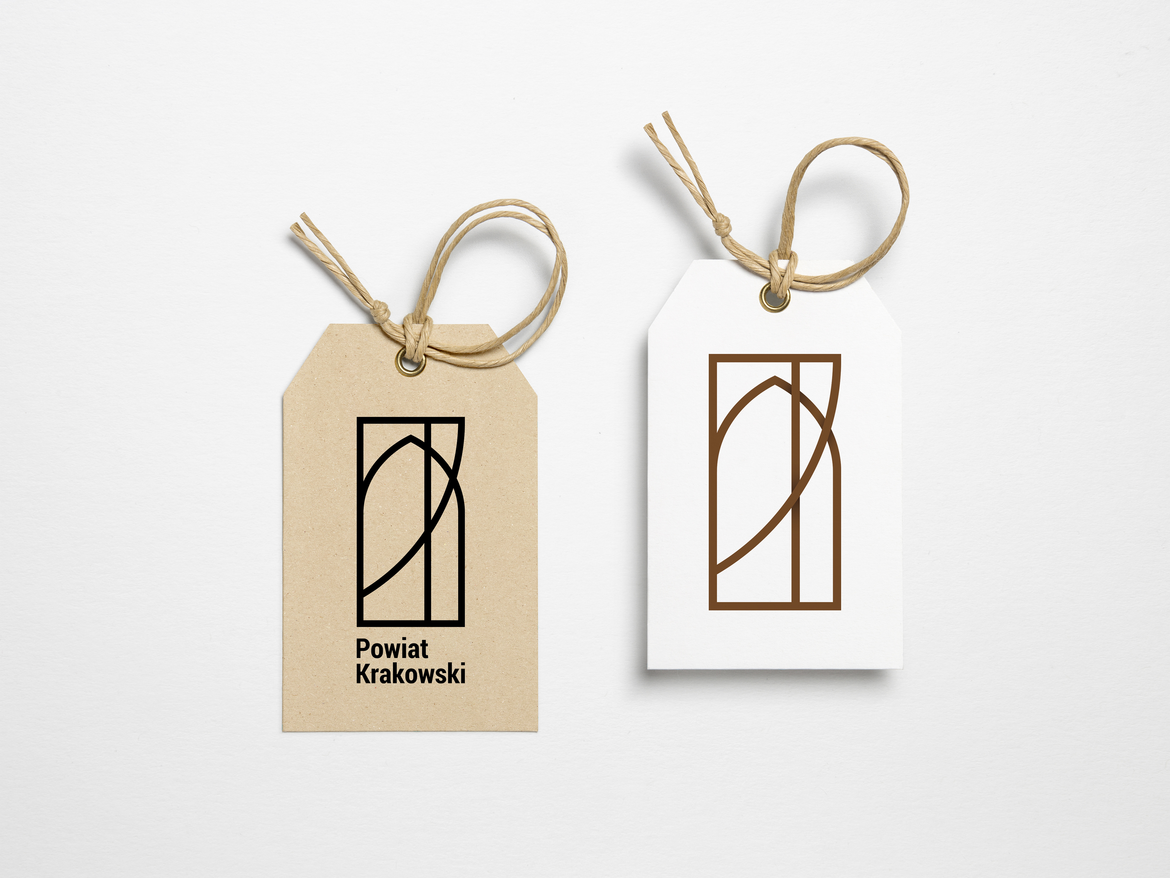
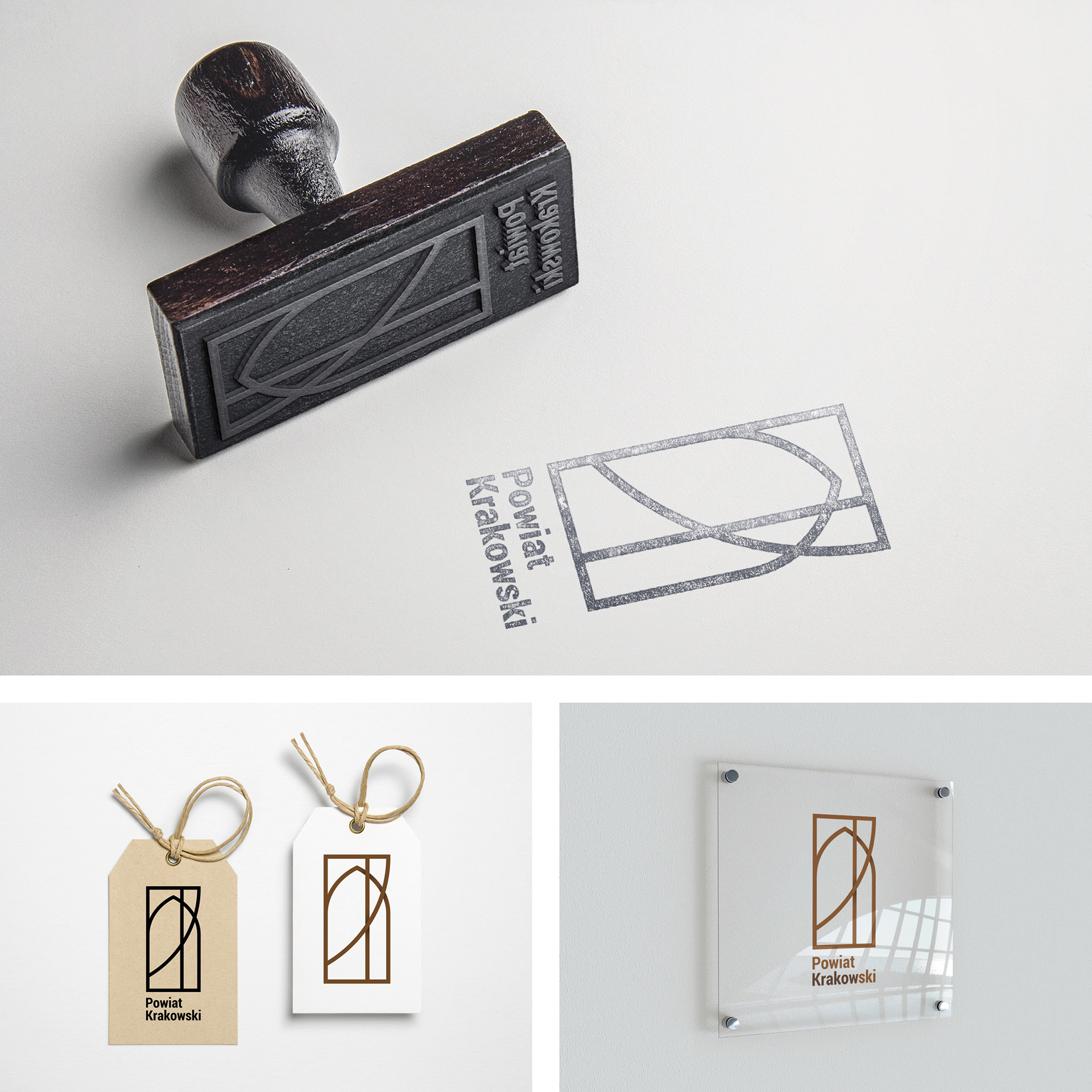
Promotional materials and merchandise.
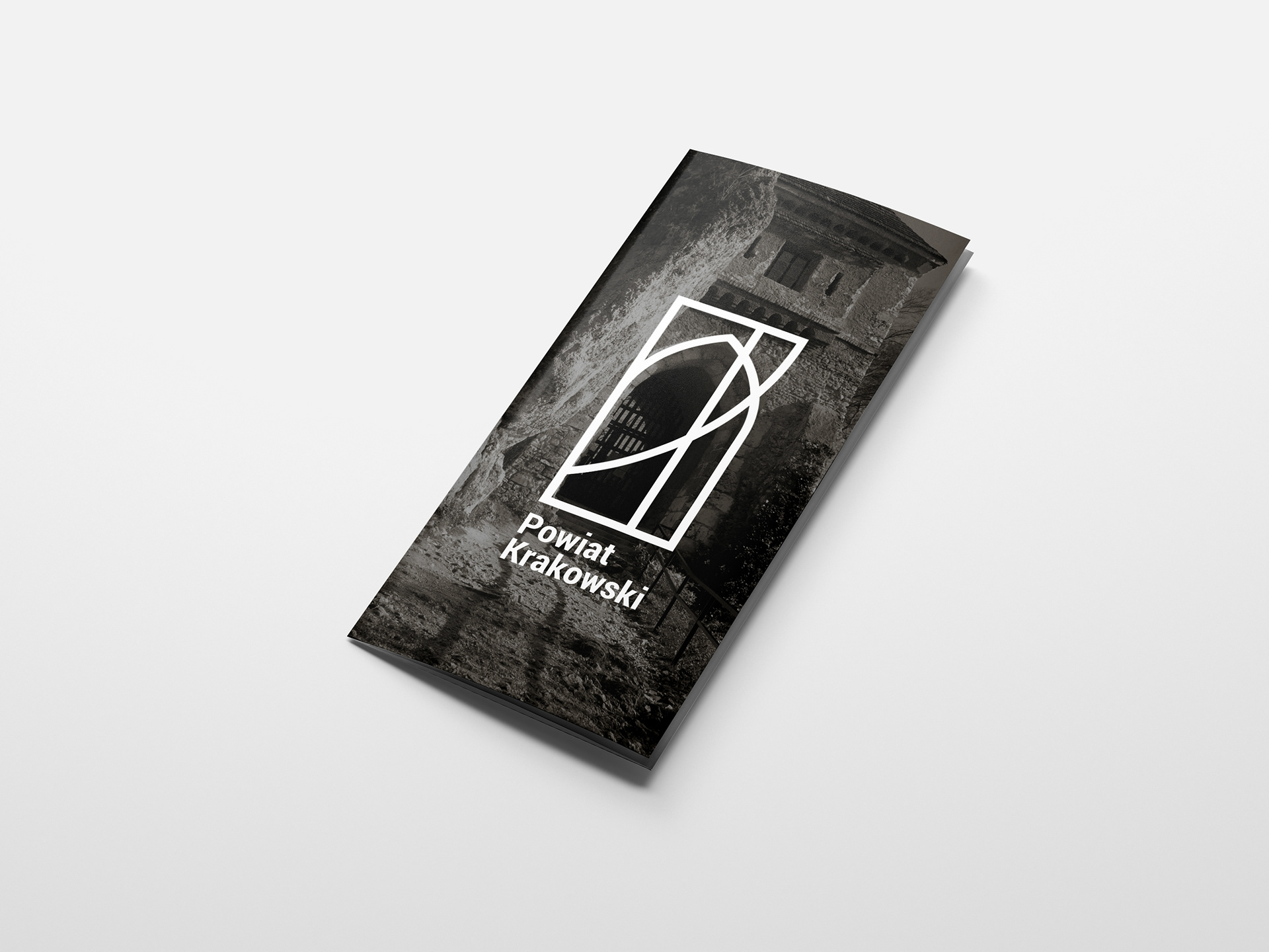
Flyer with logo explanation.
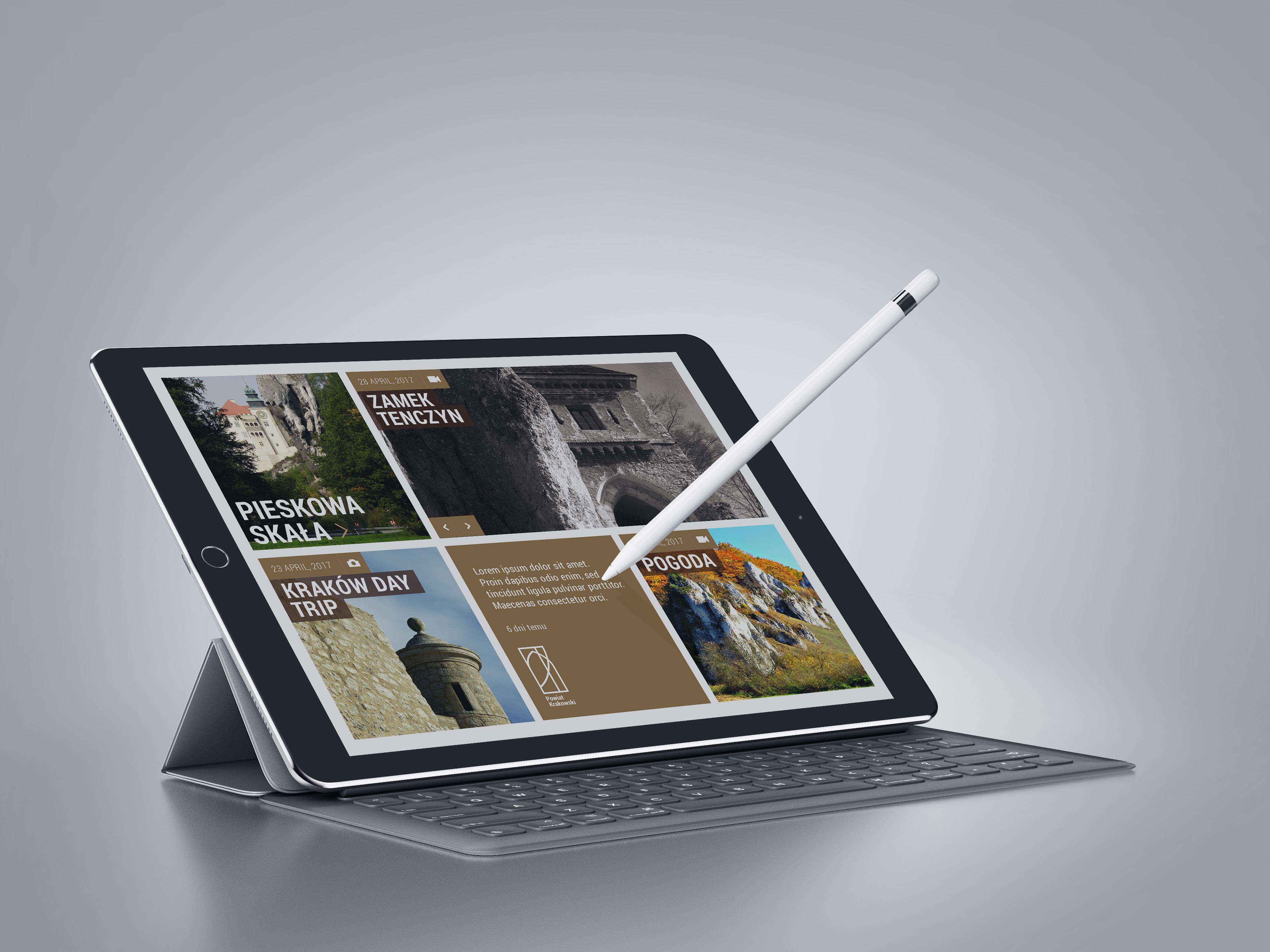
New responsive-grid-website.